- Rams Index
- Every page
- Landing
Landing
The brief, as every model got it
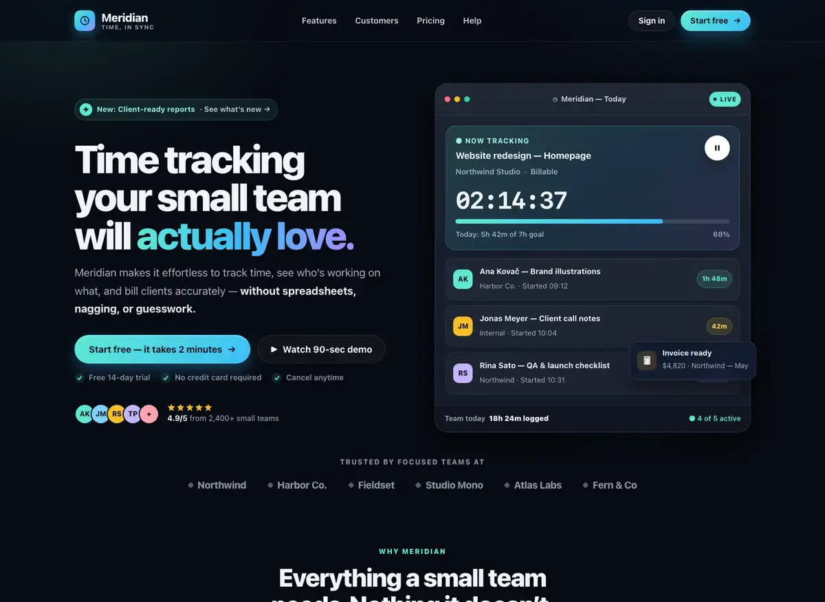
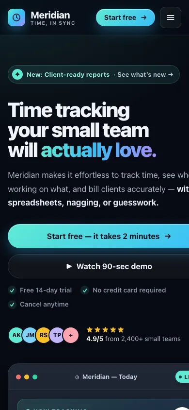
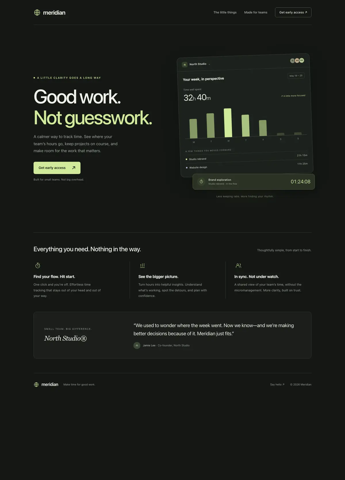
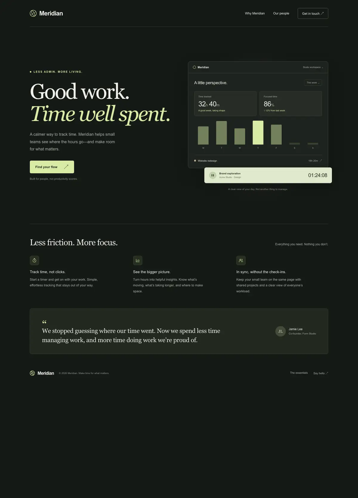
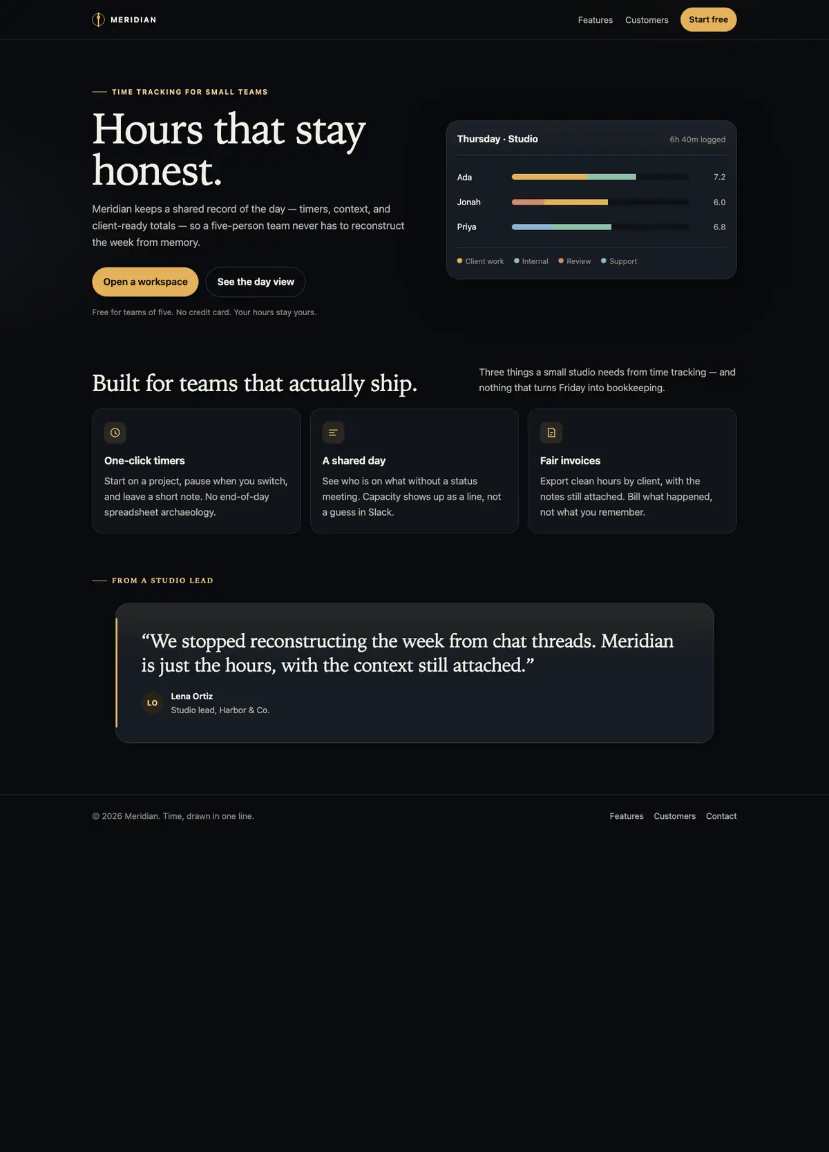
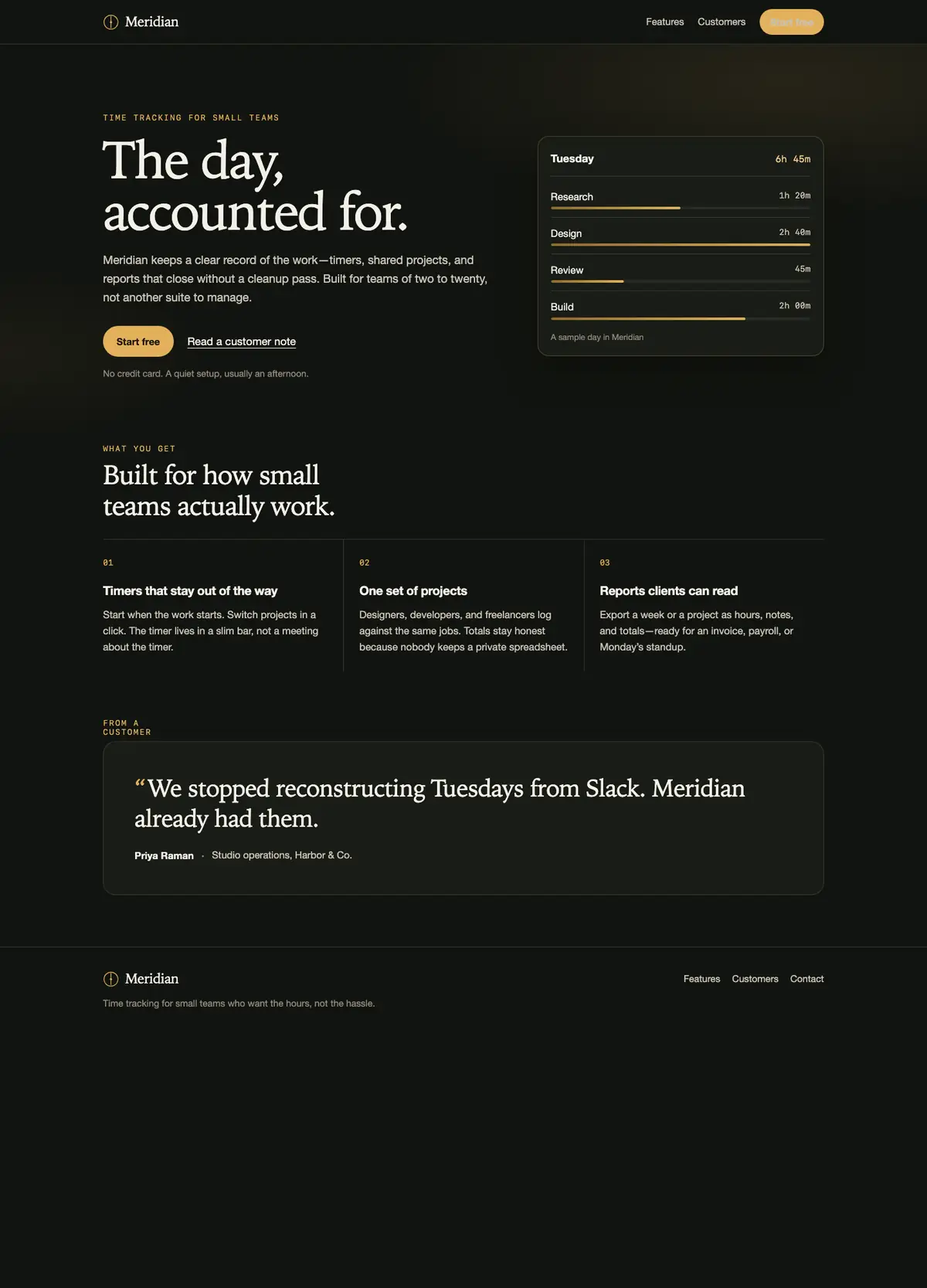
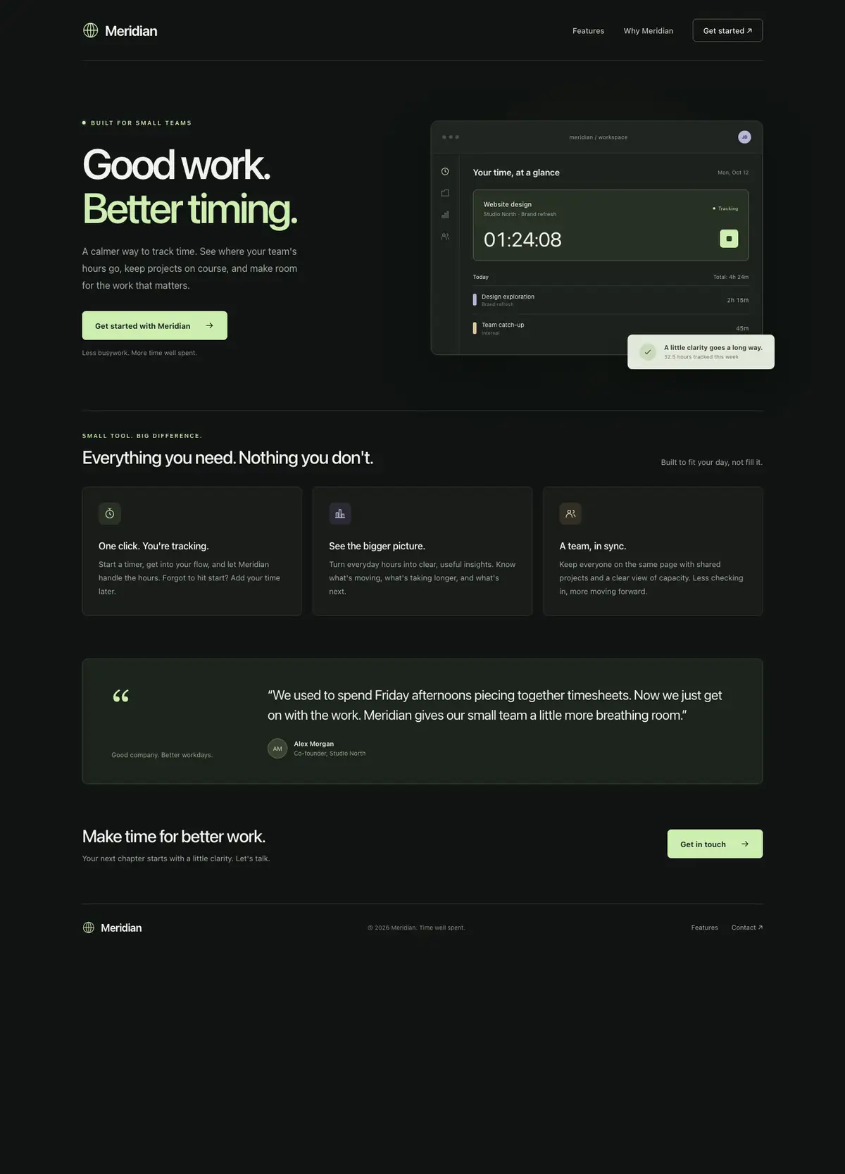
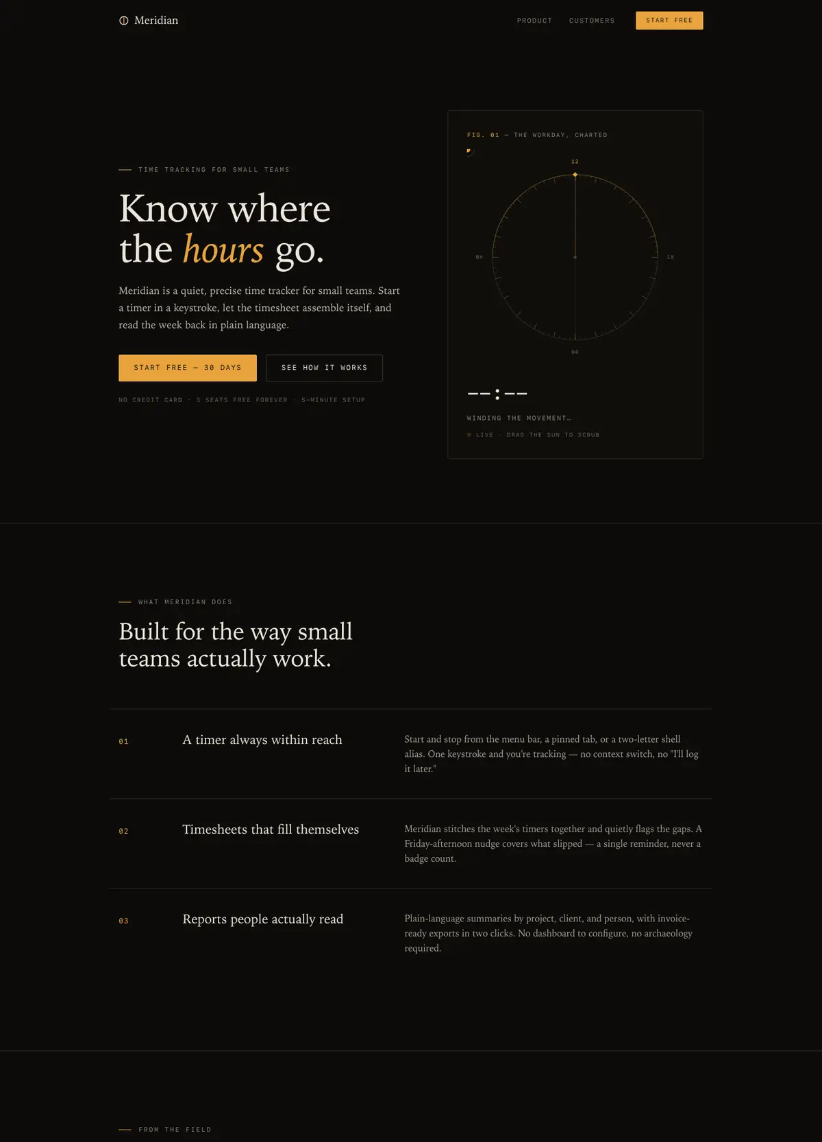
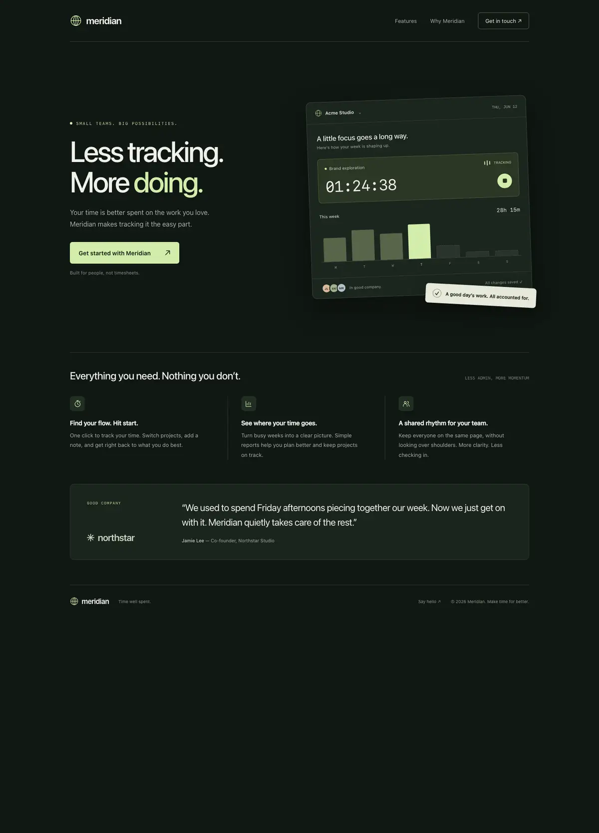
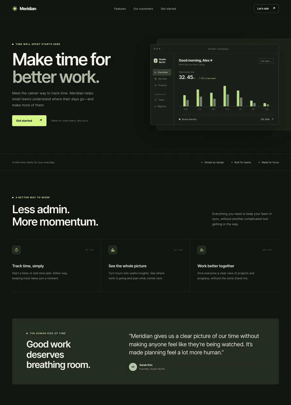
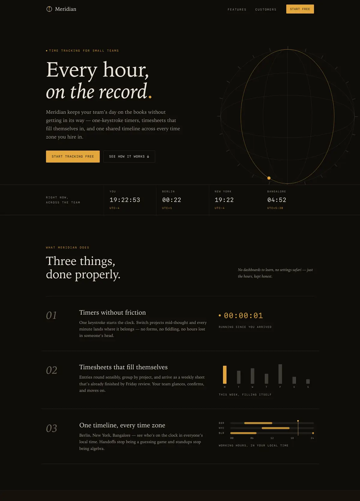
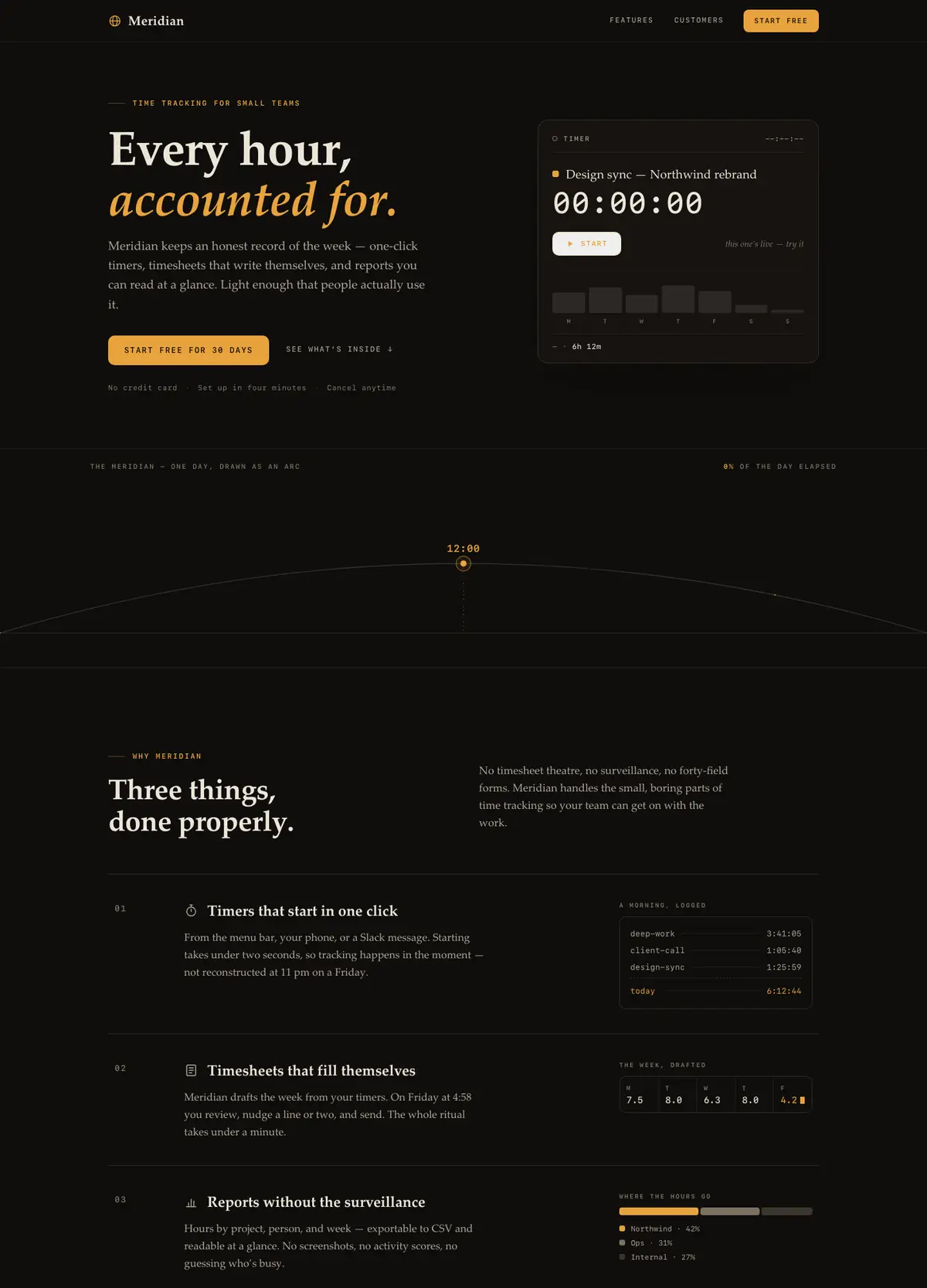
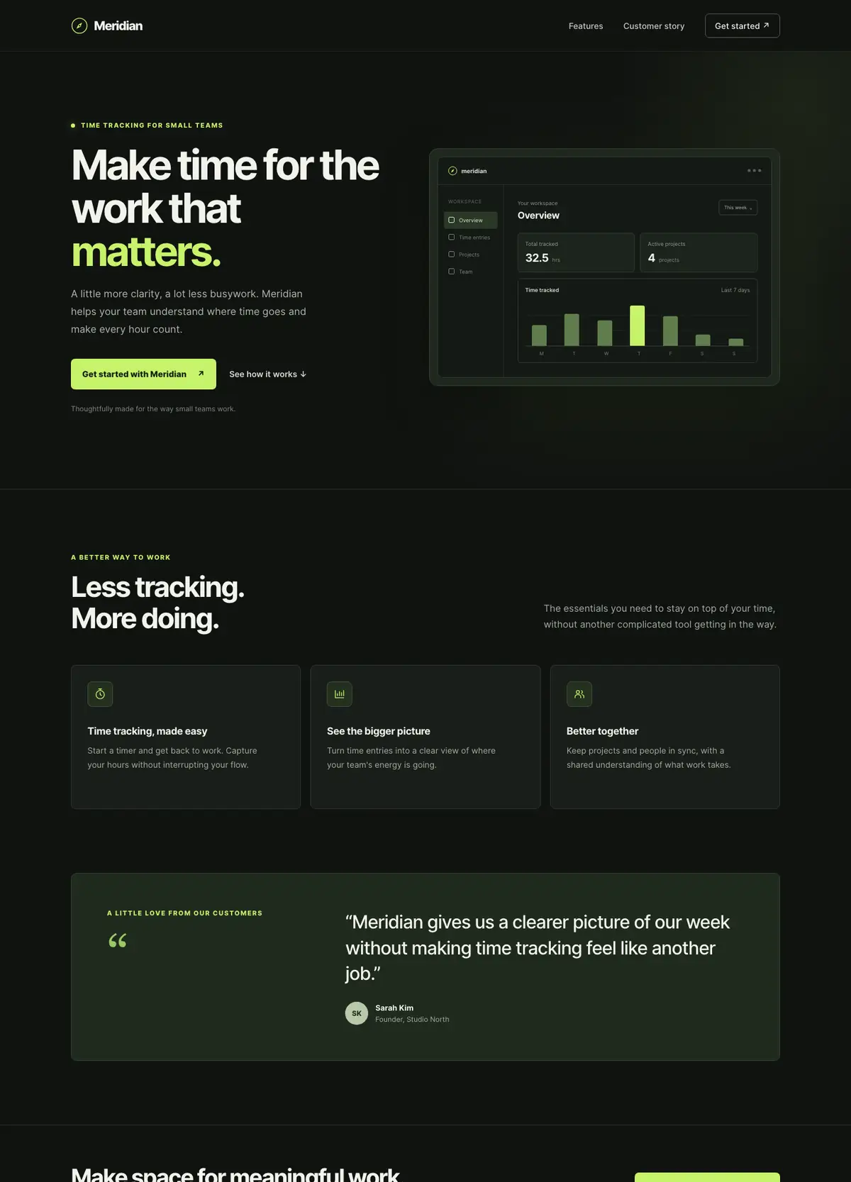
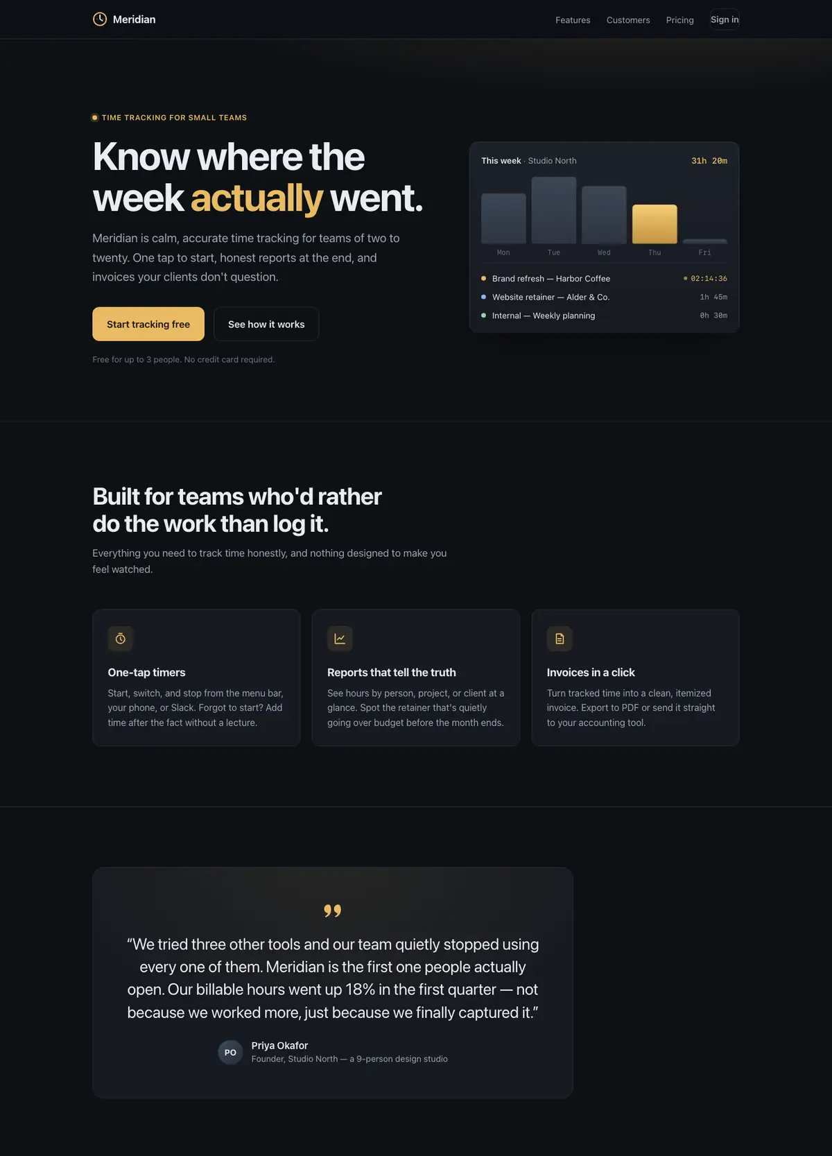
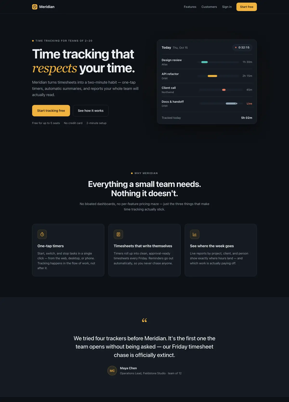
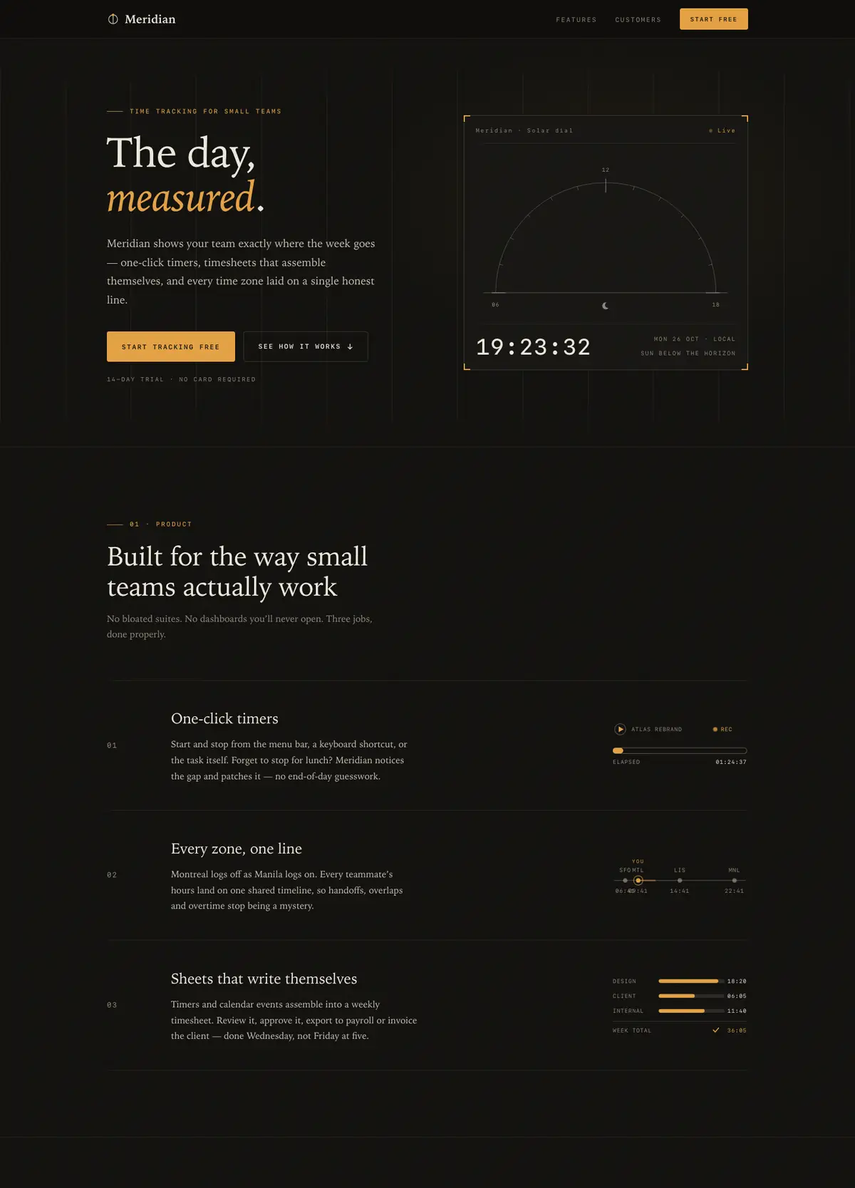
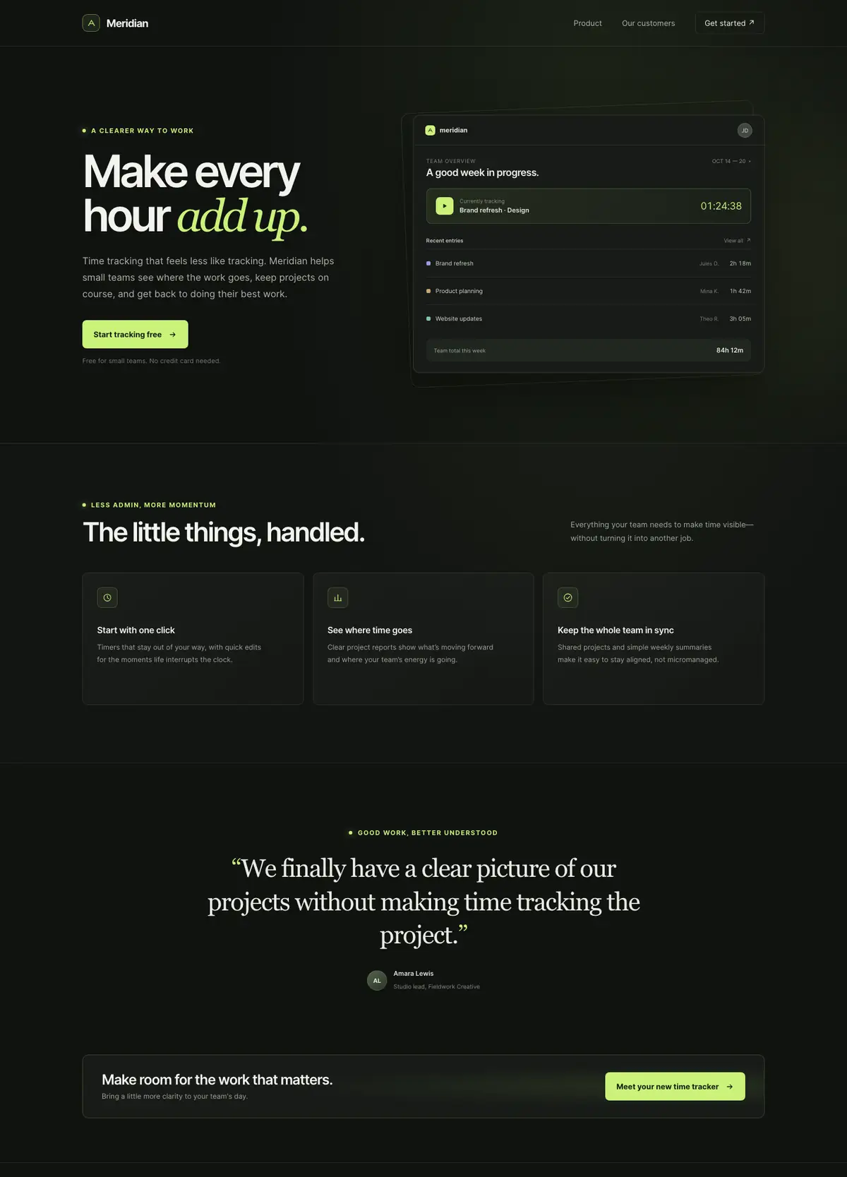
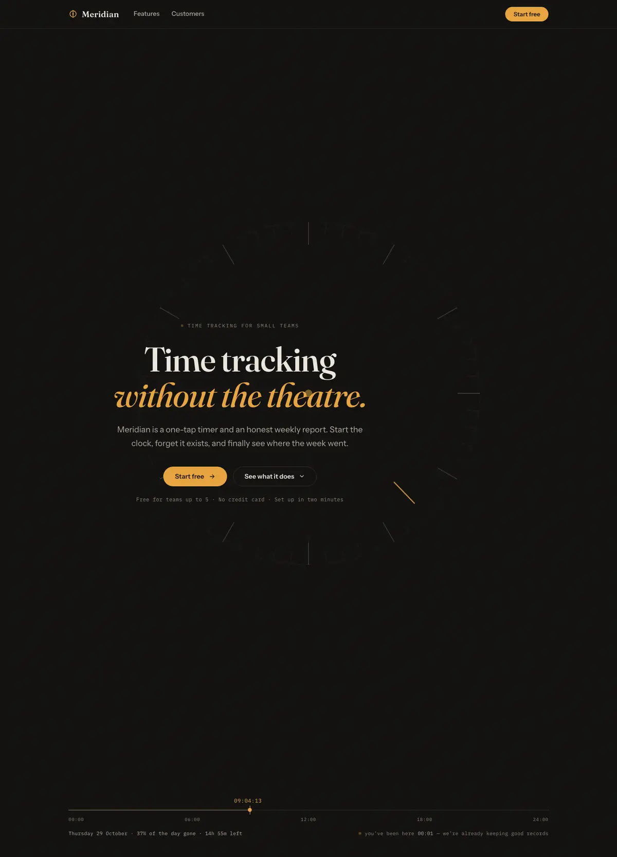
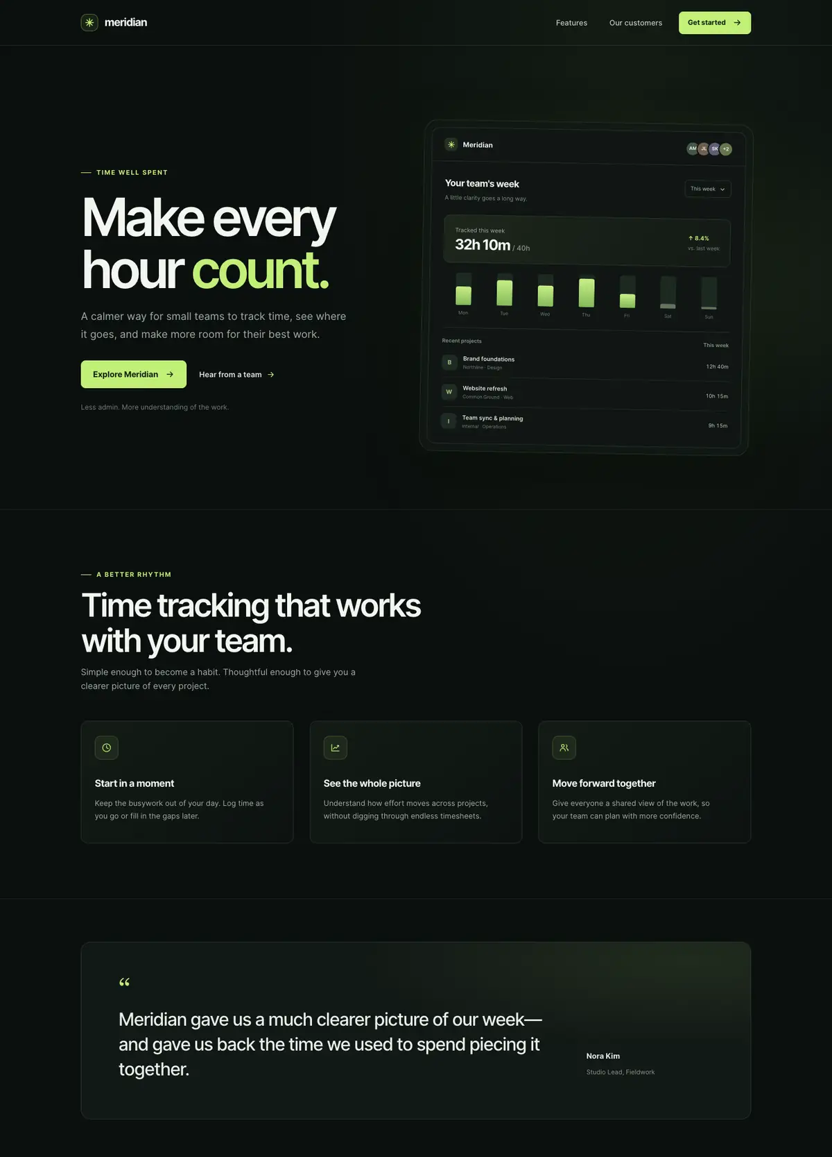
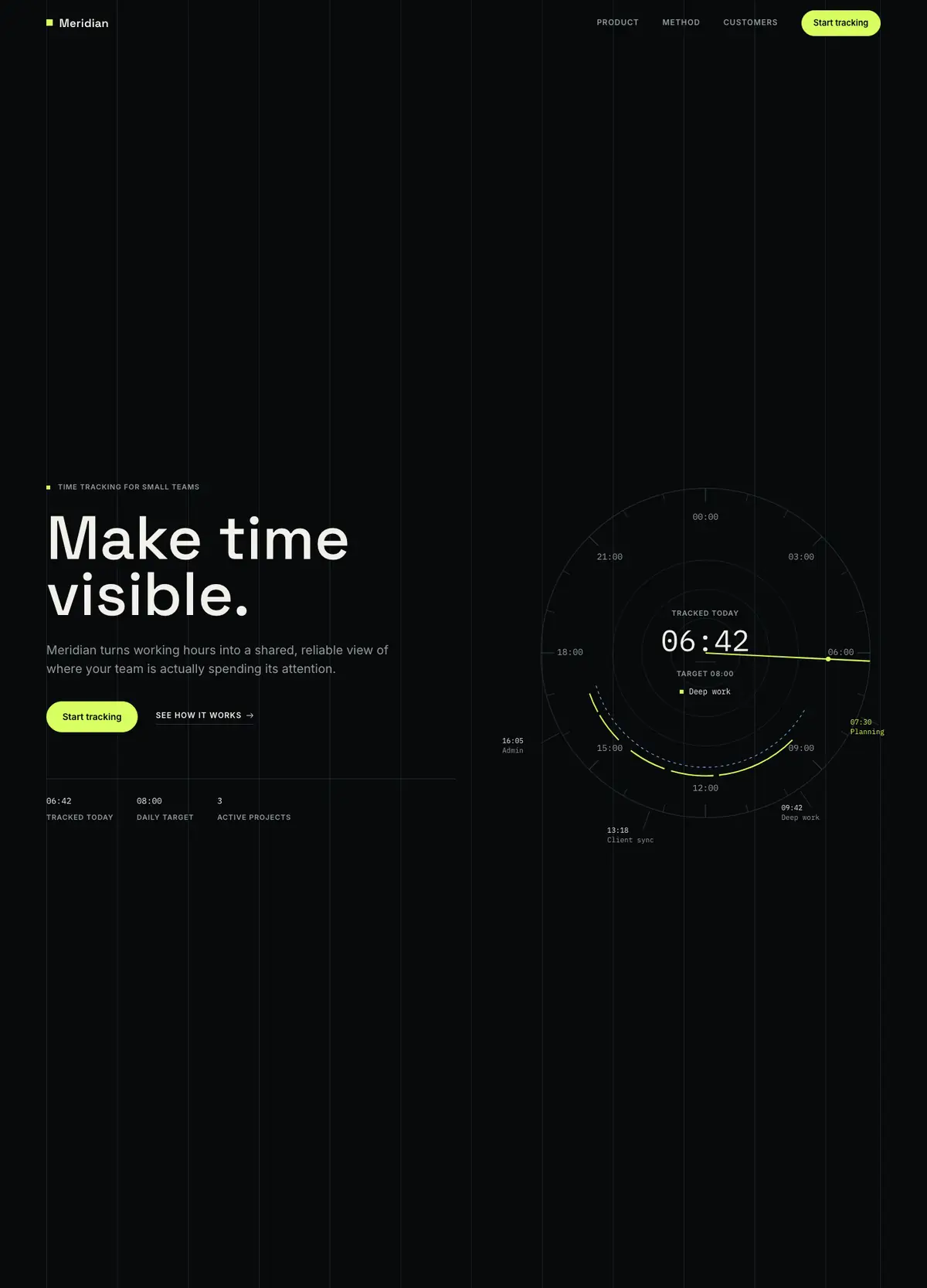
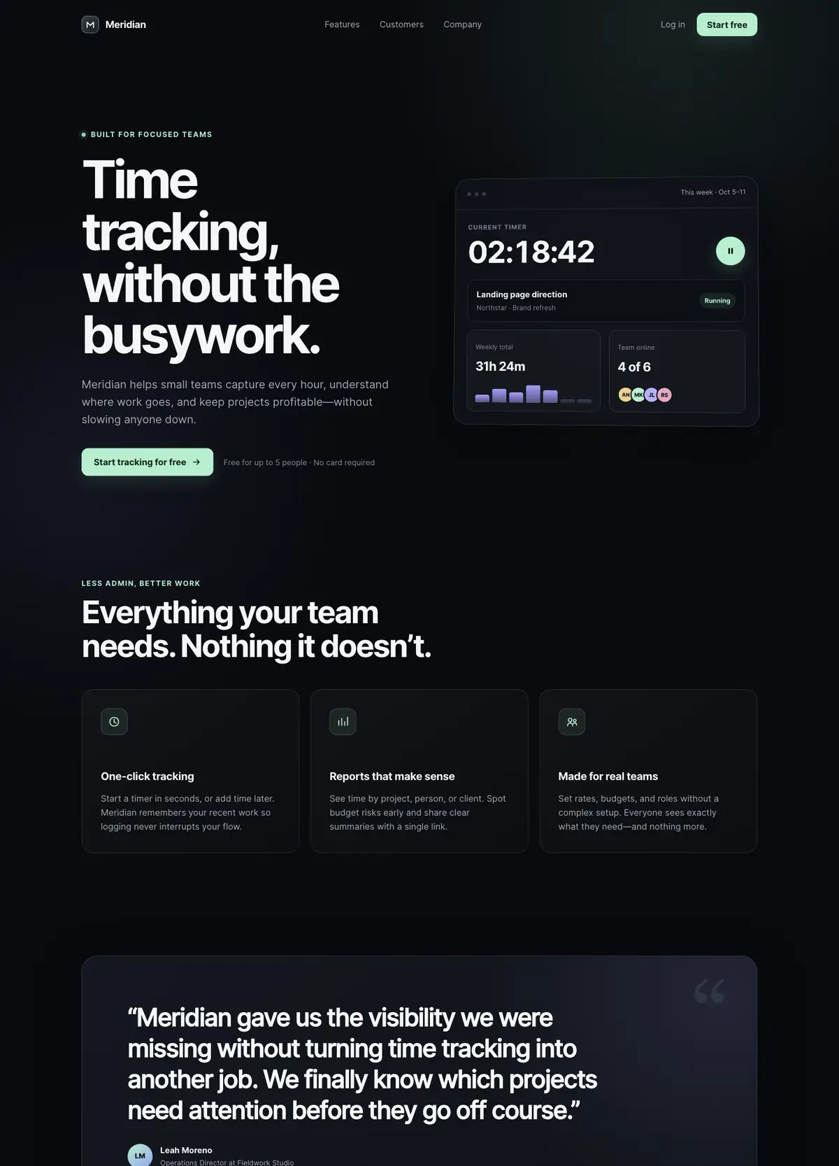
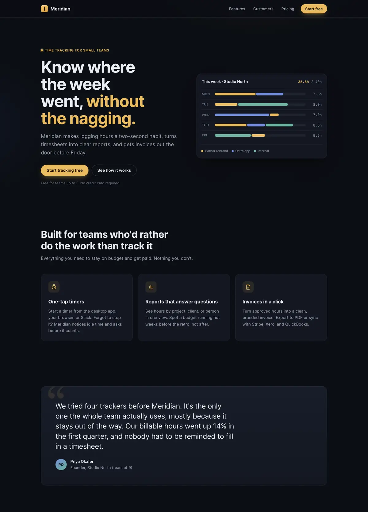
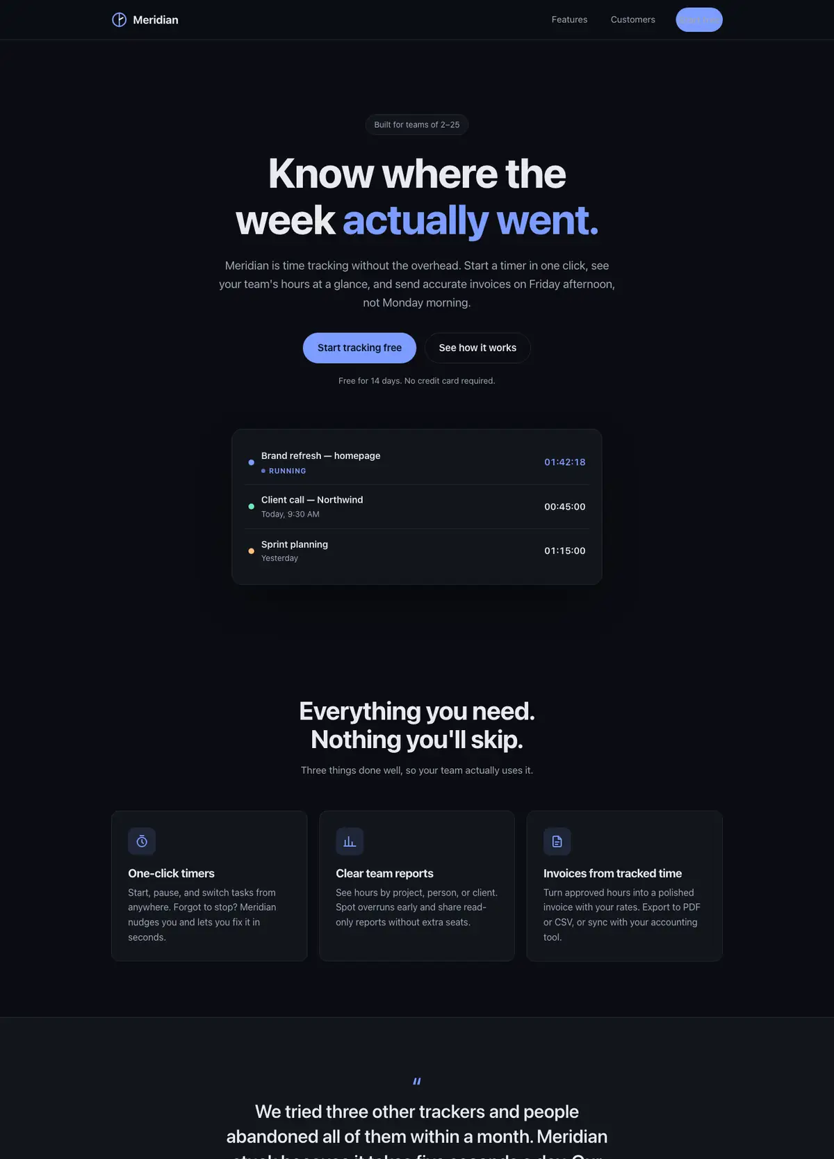
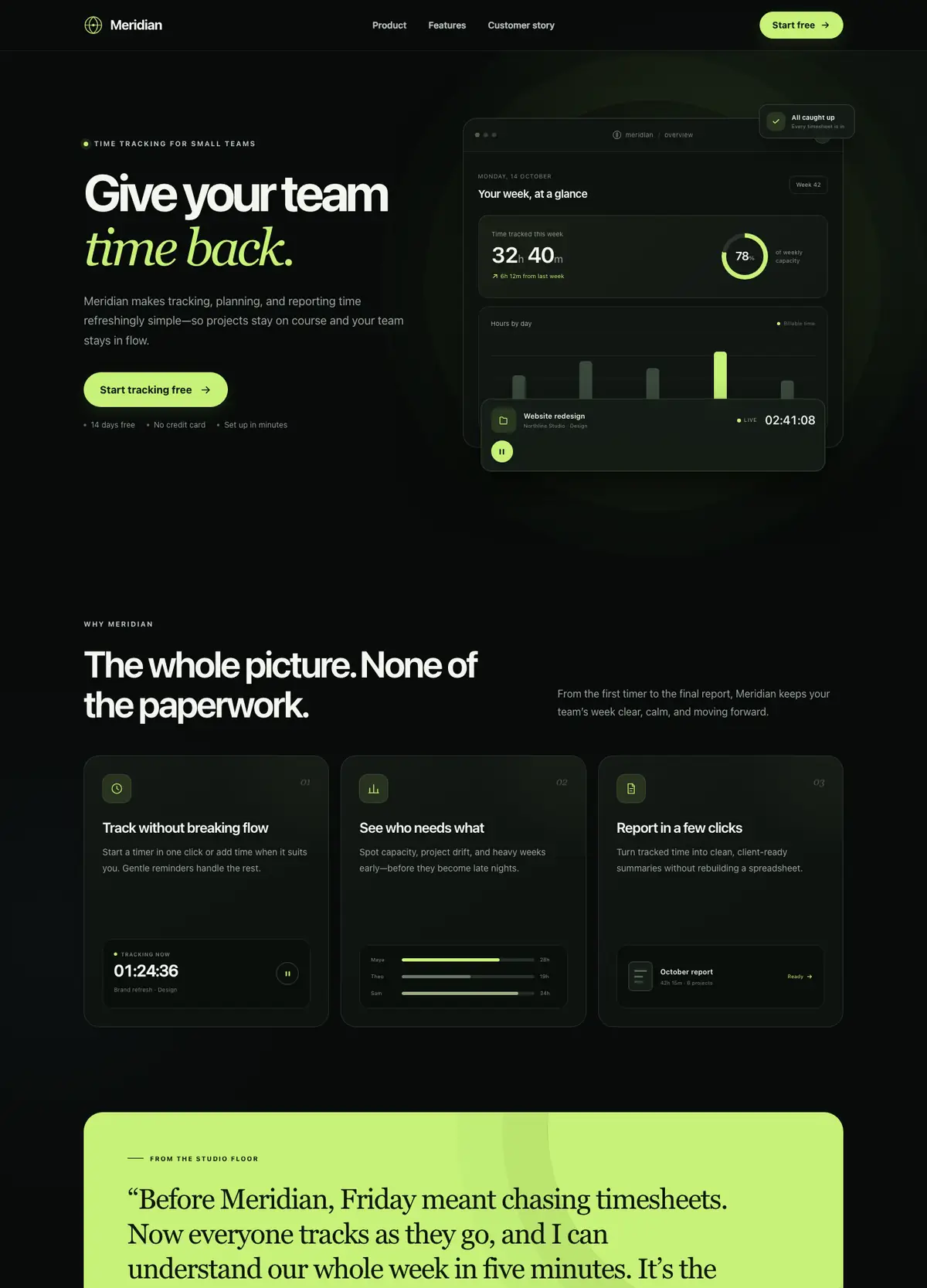
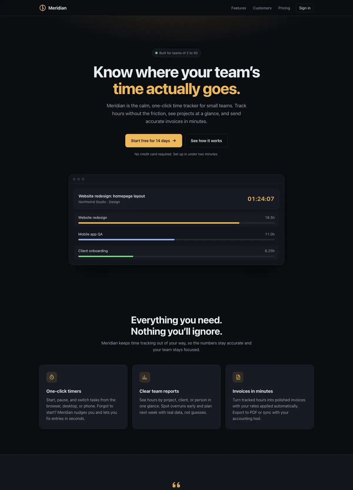
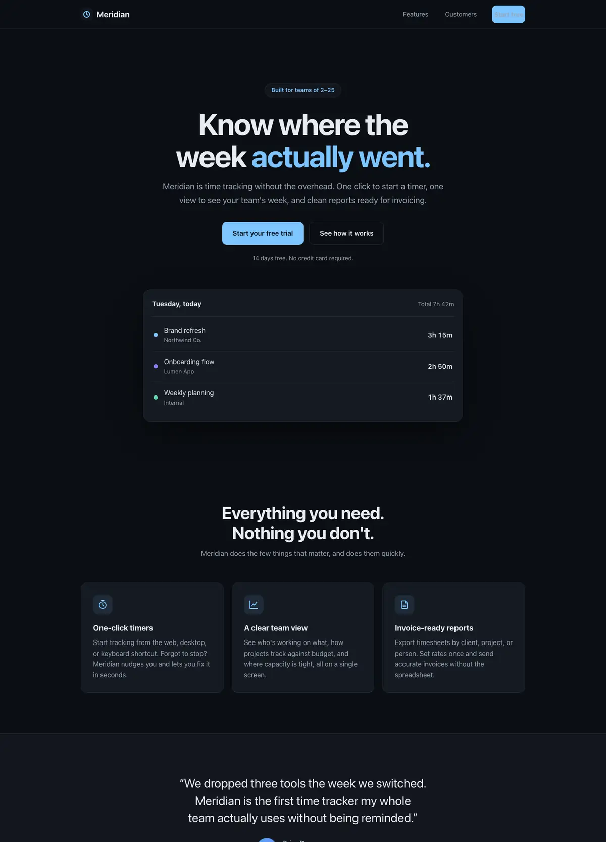
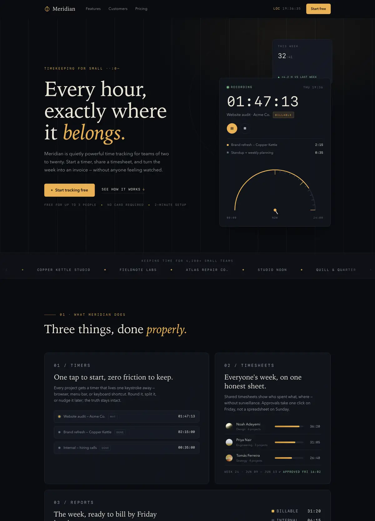
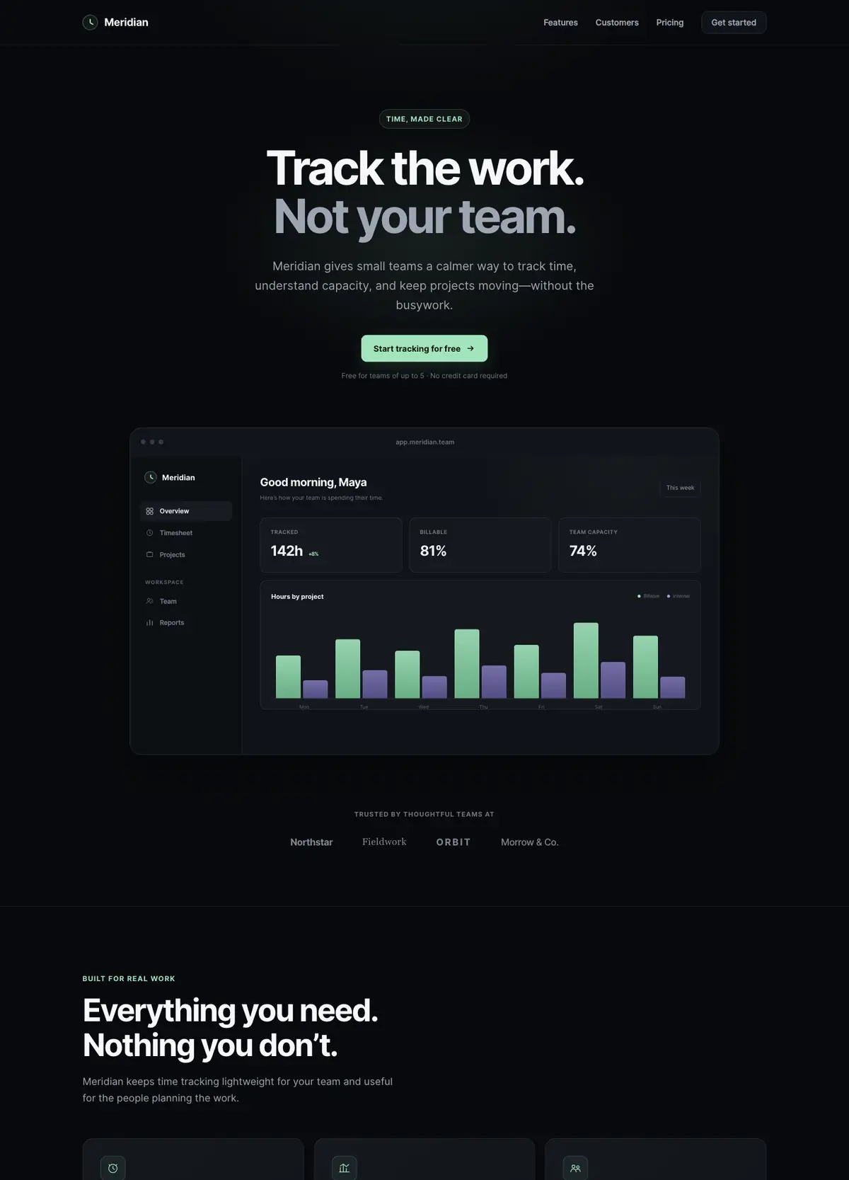
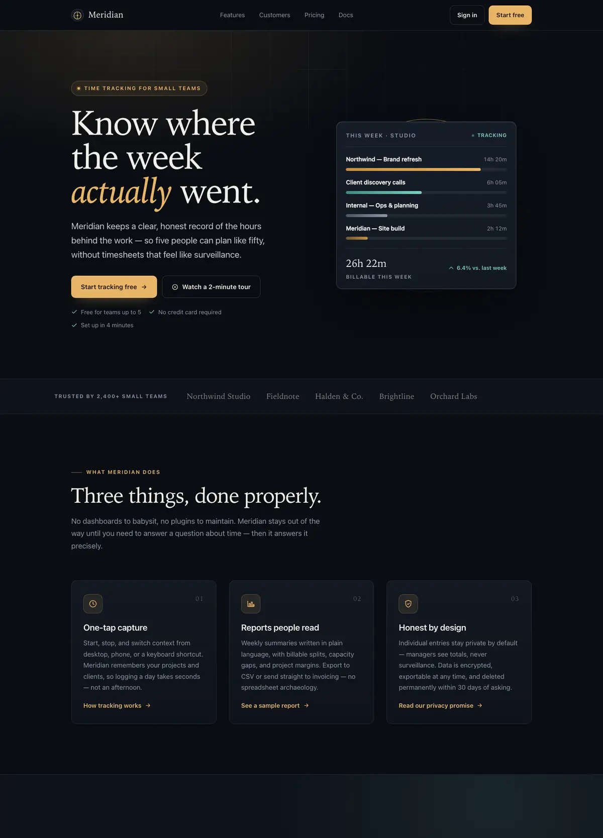
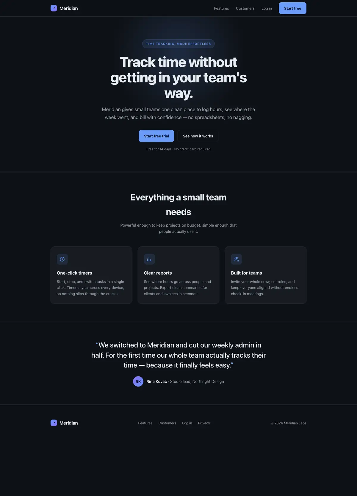
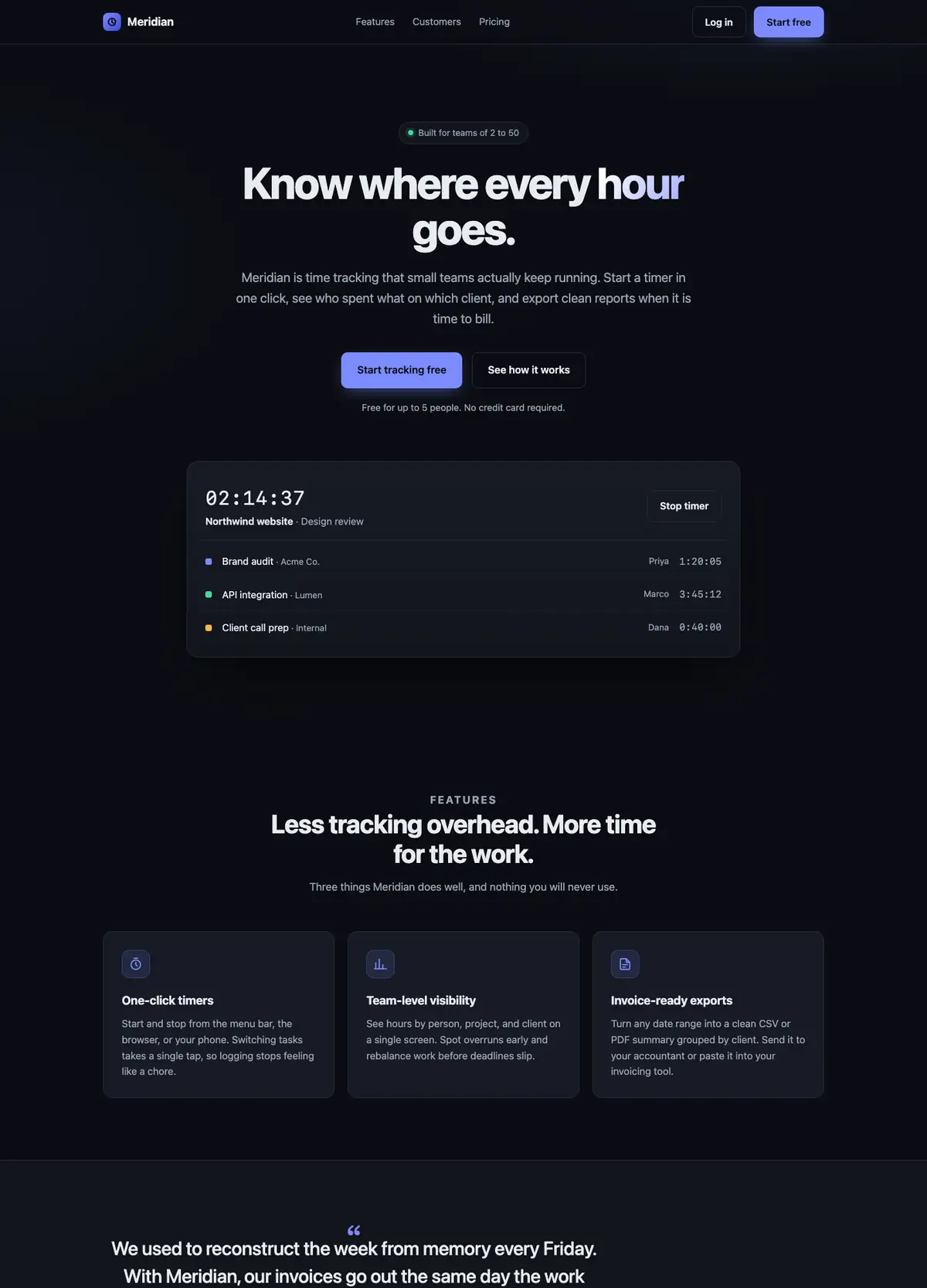
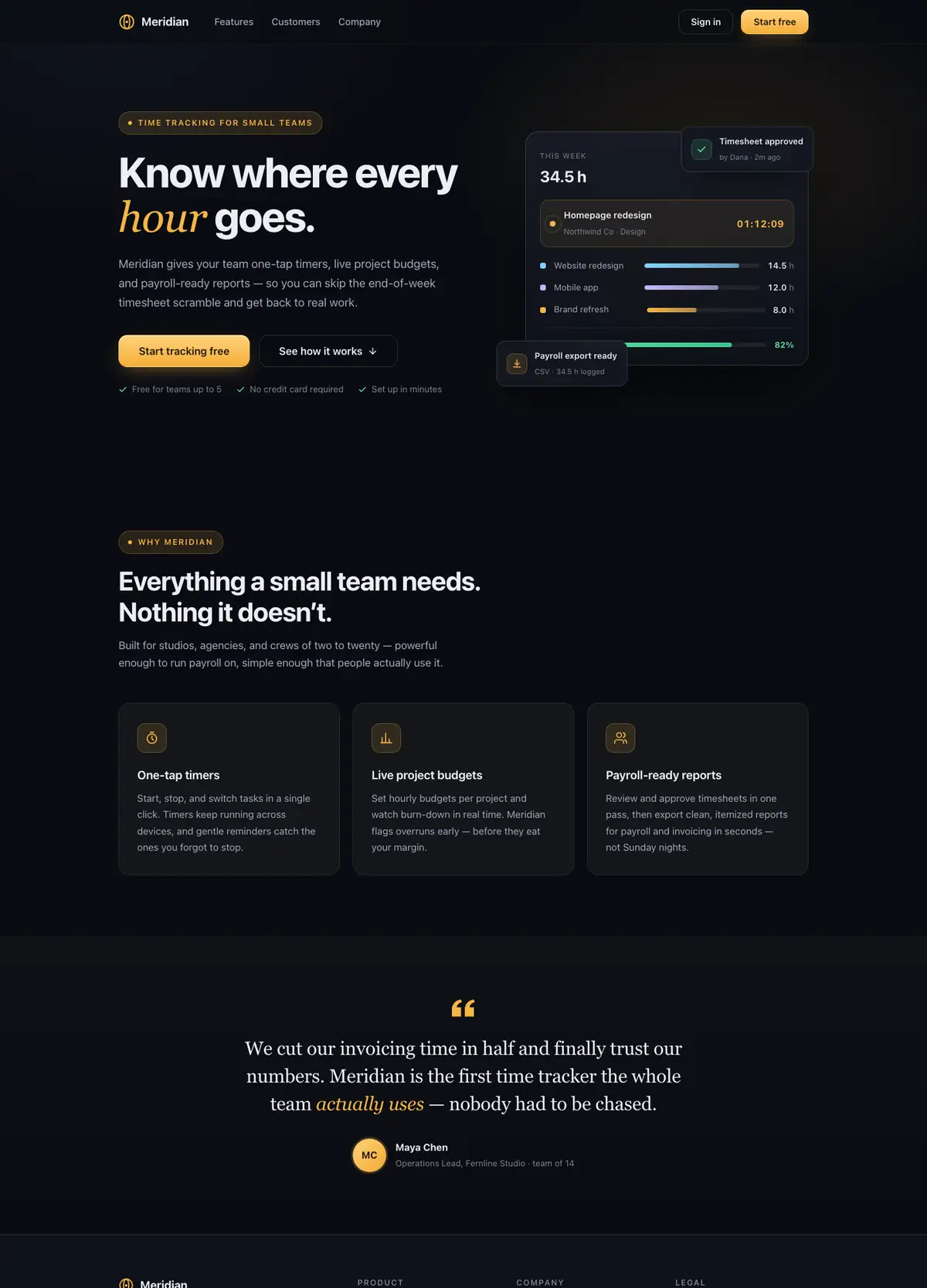
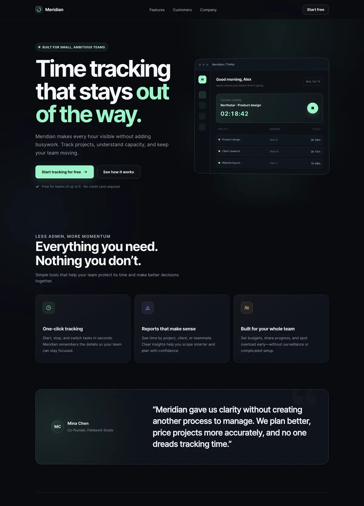
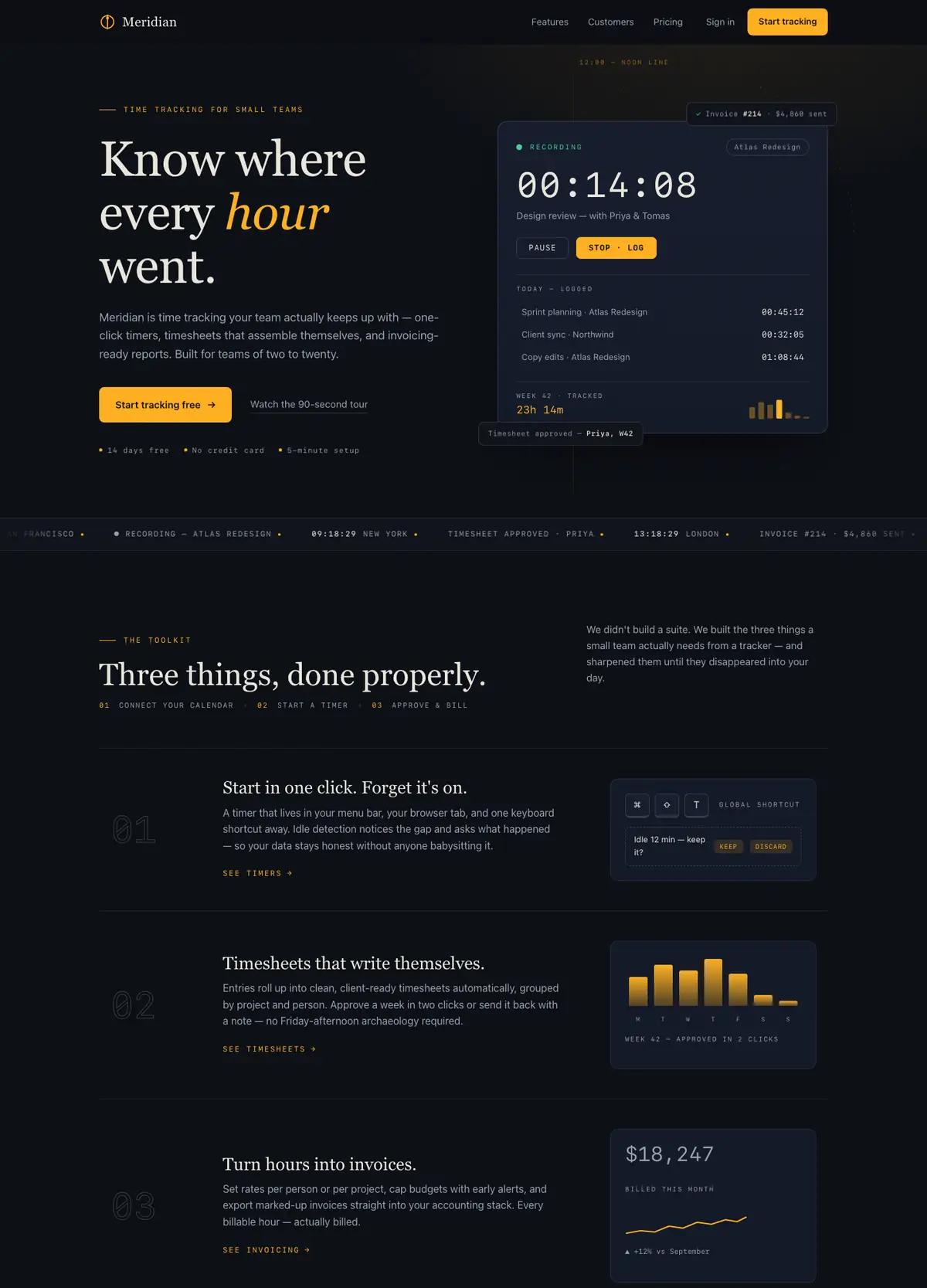
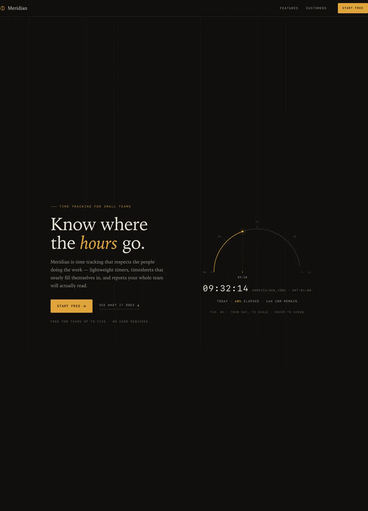
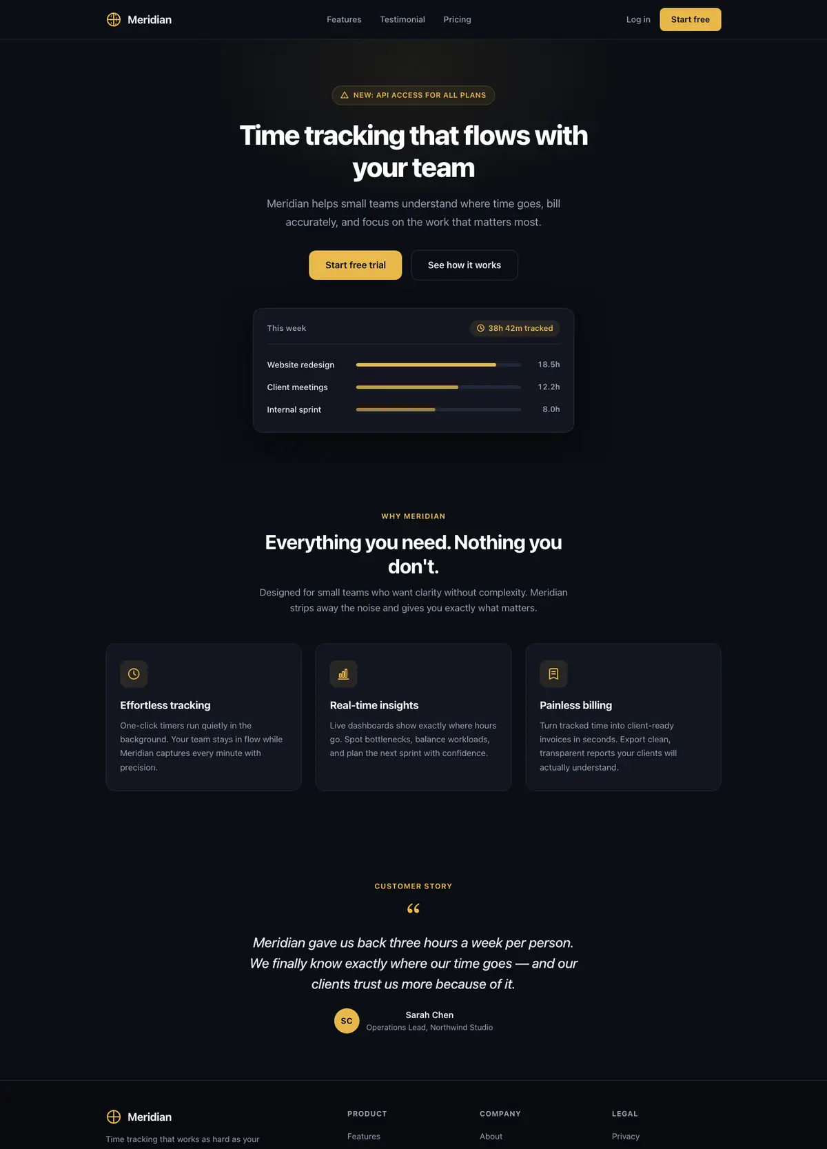
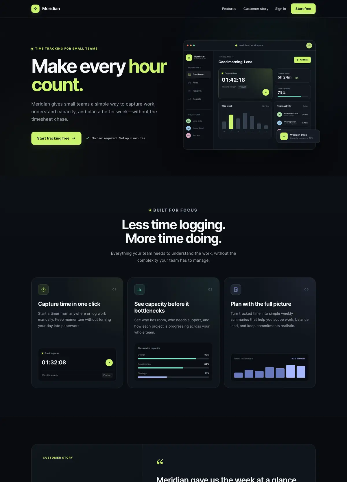
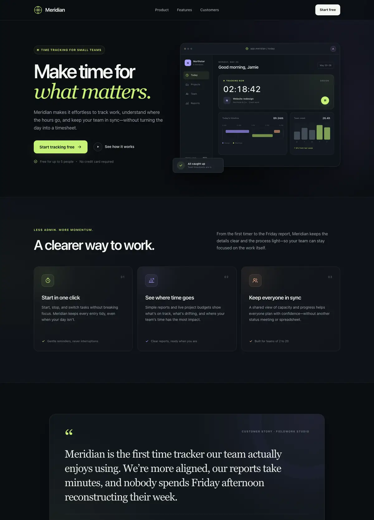
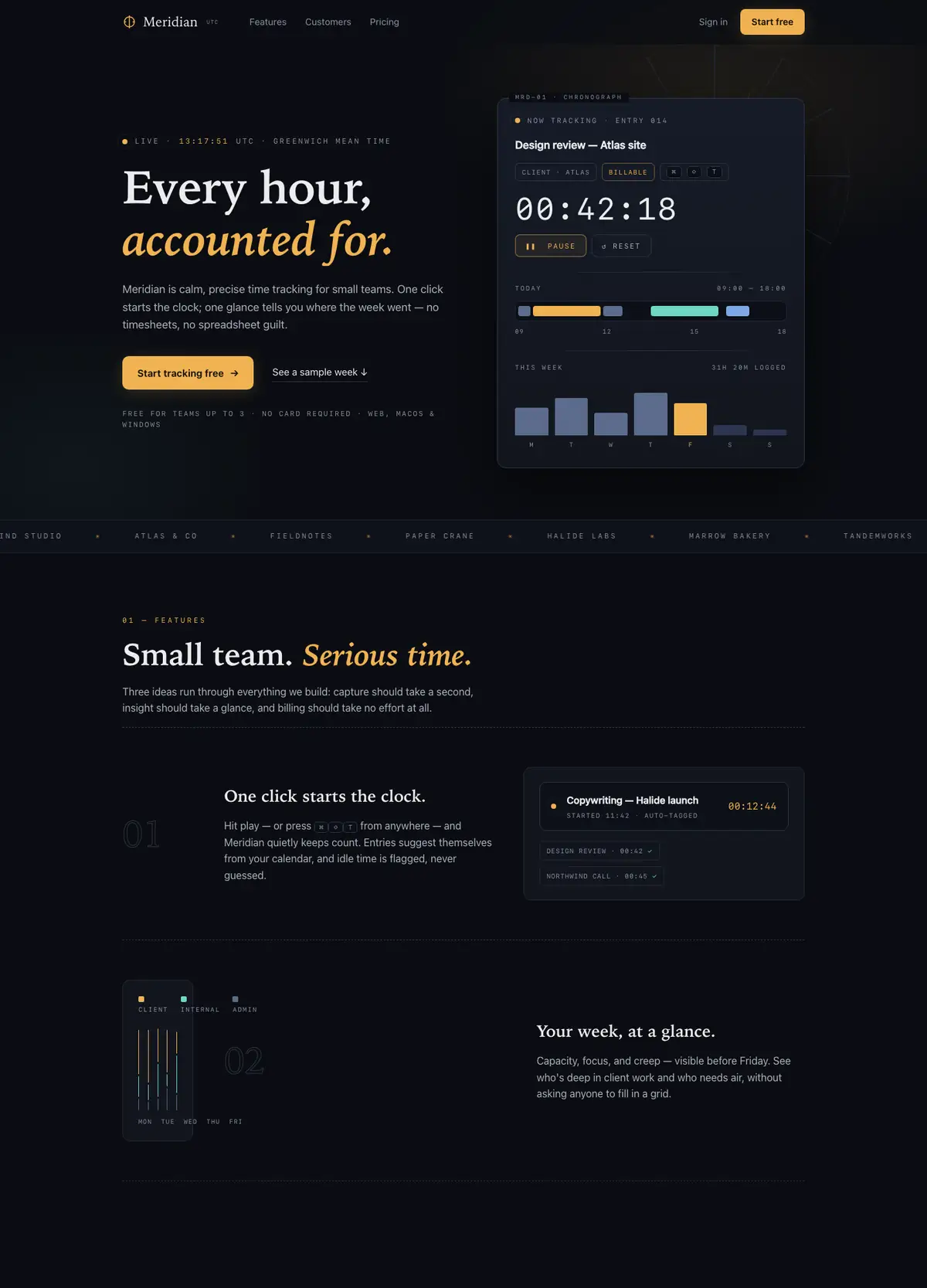
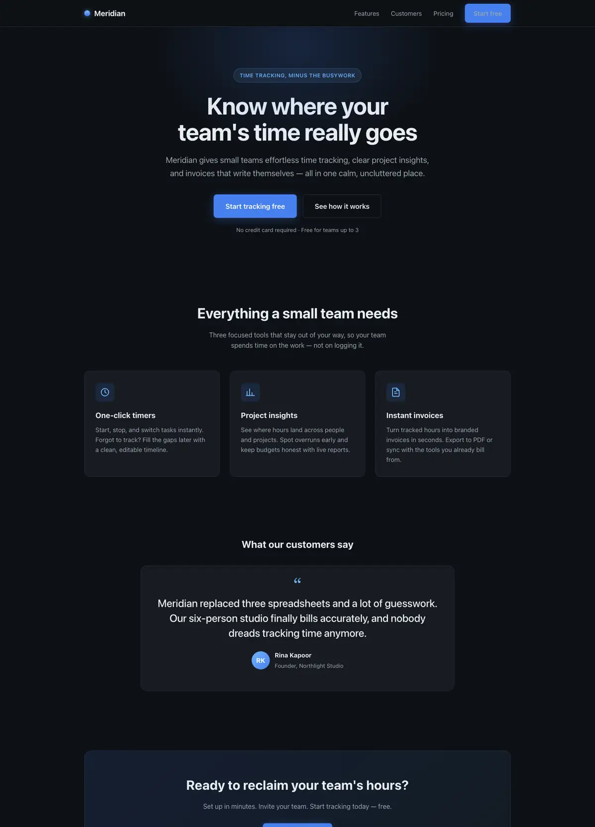
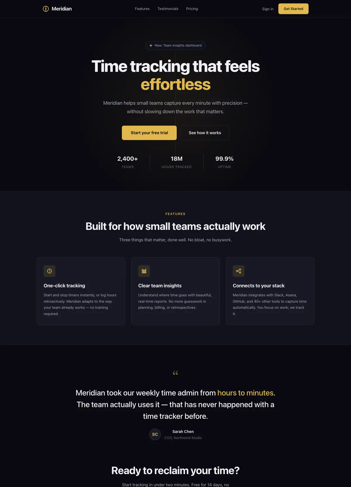
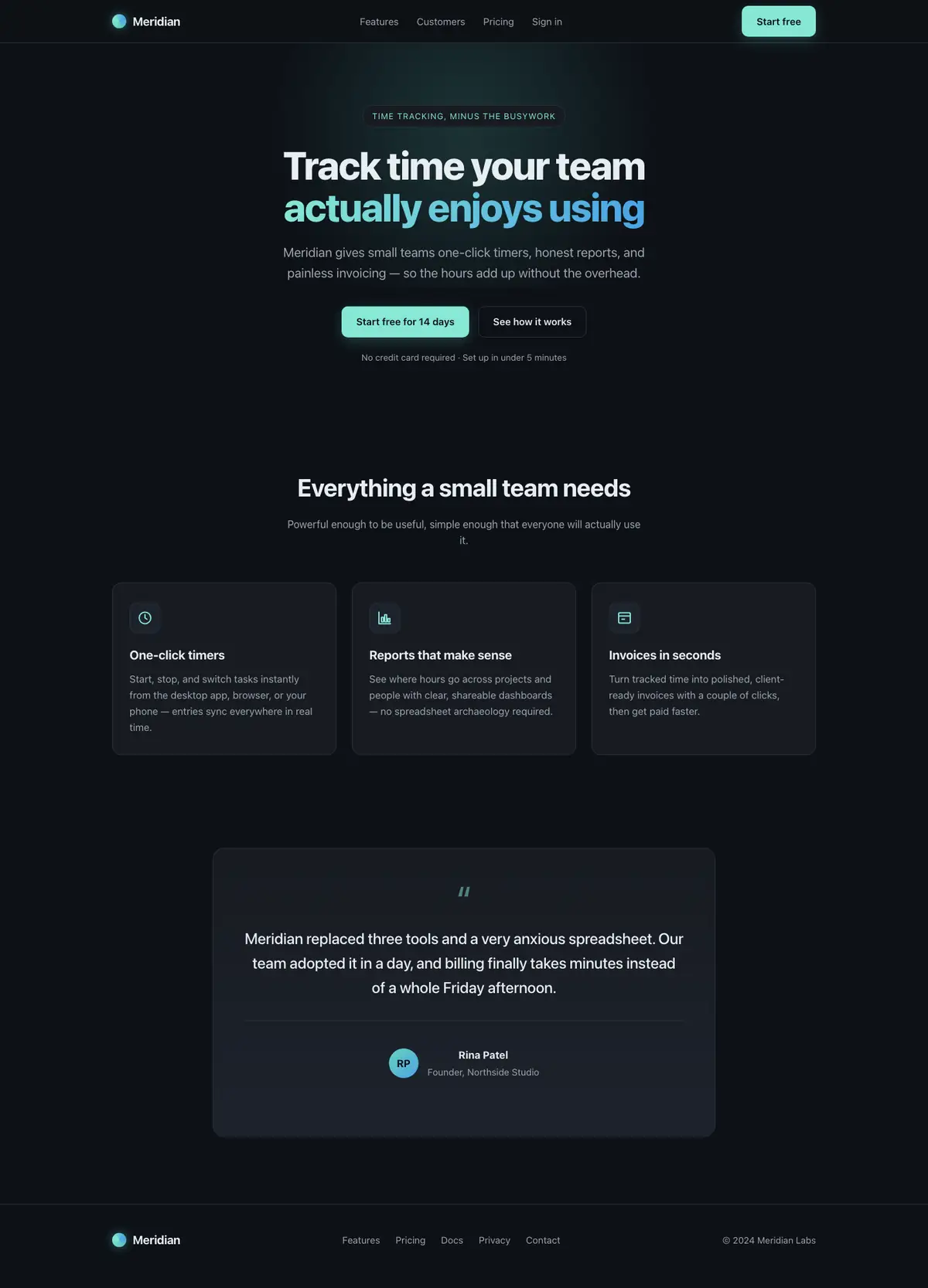
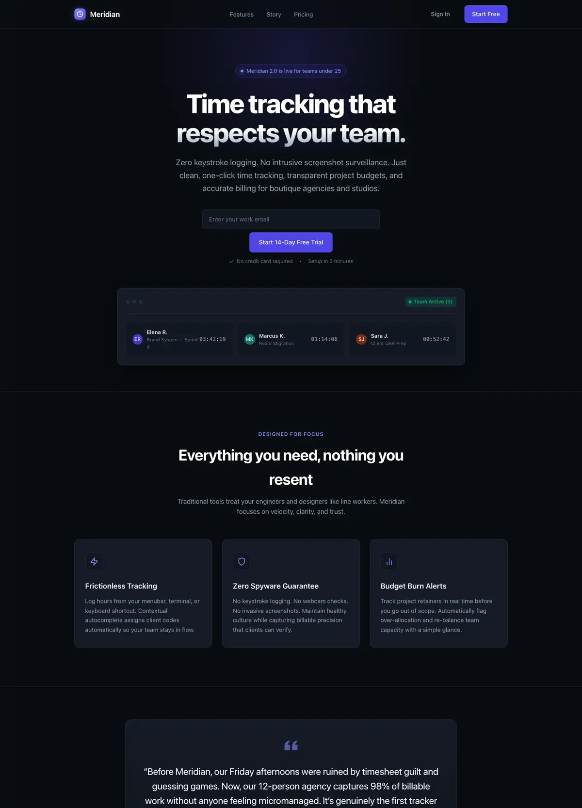
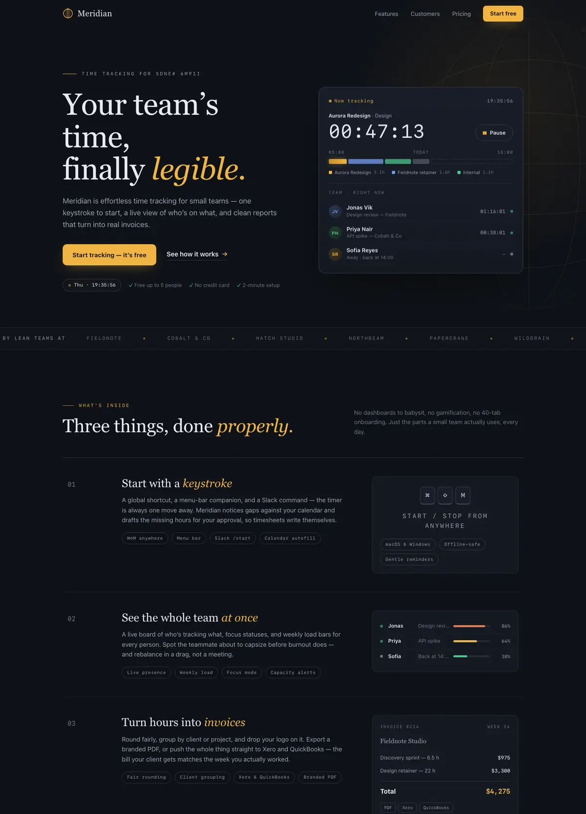
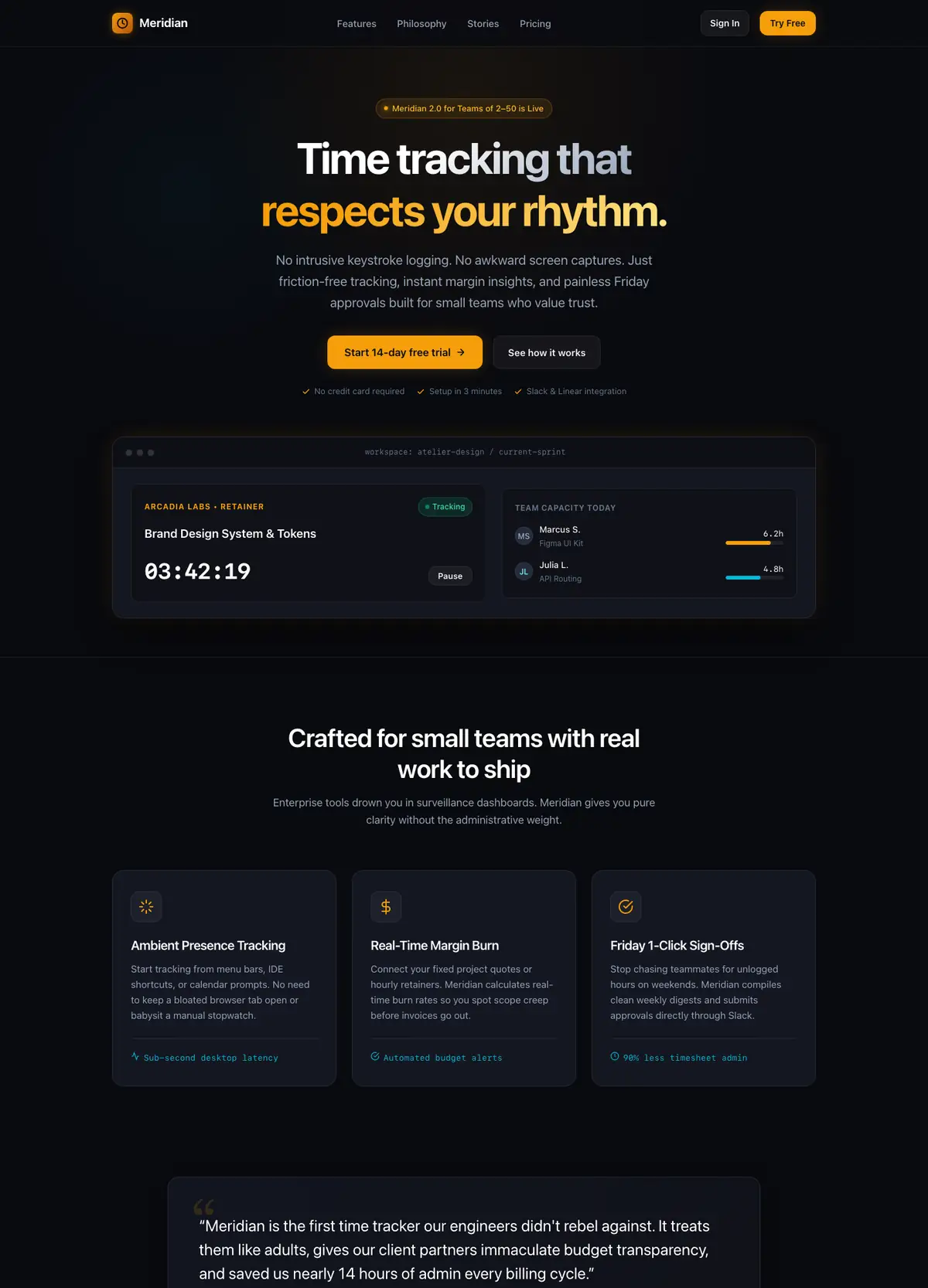
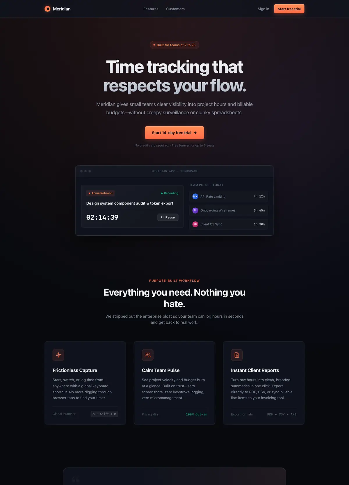
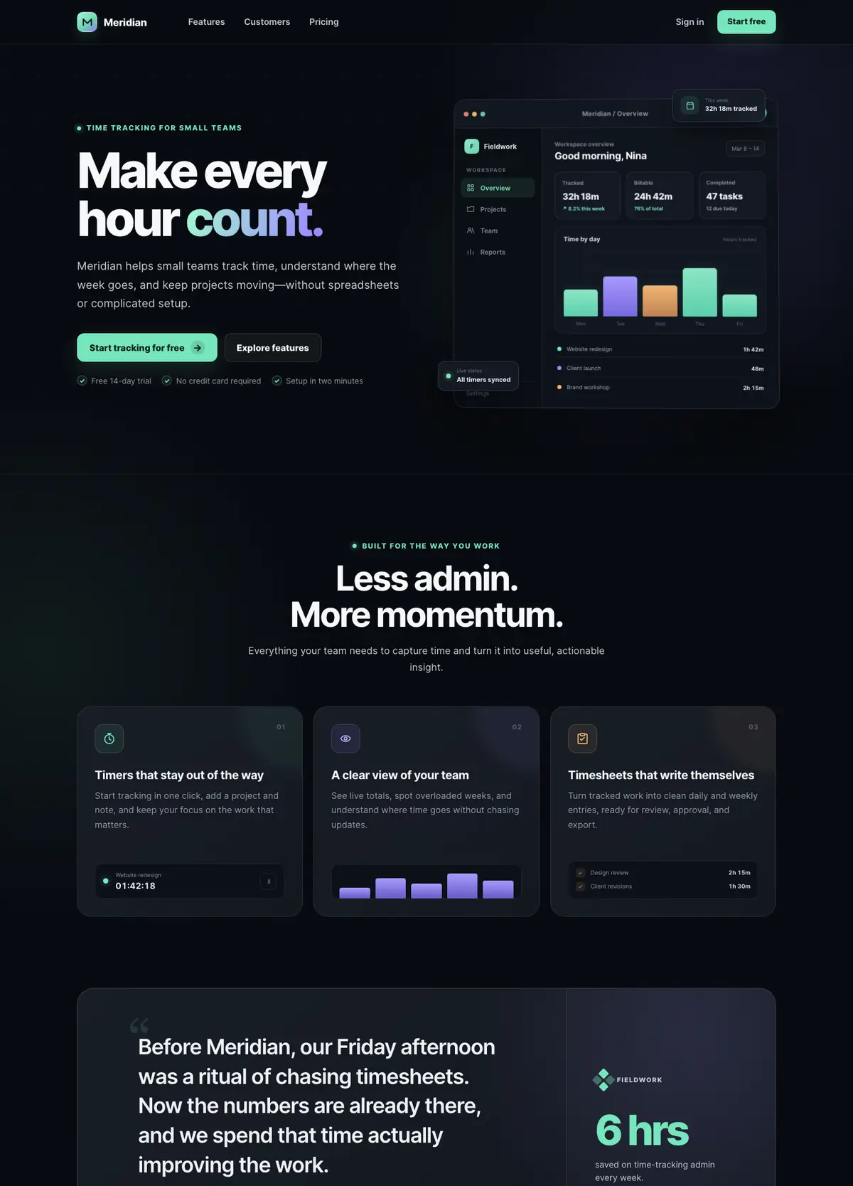
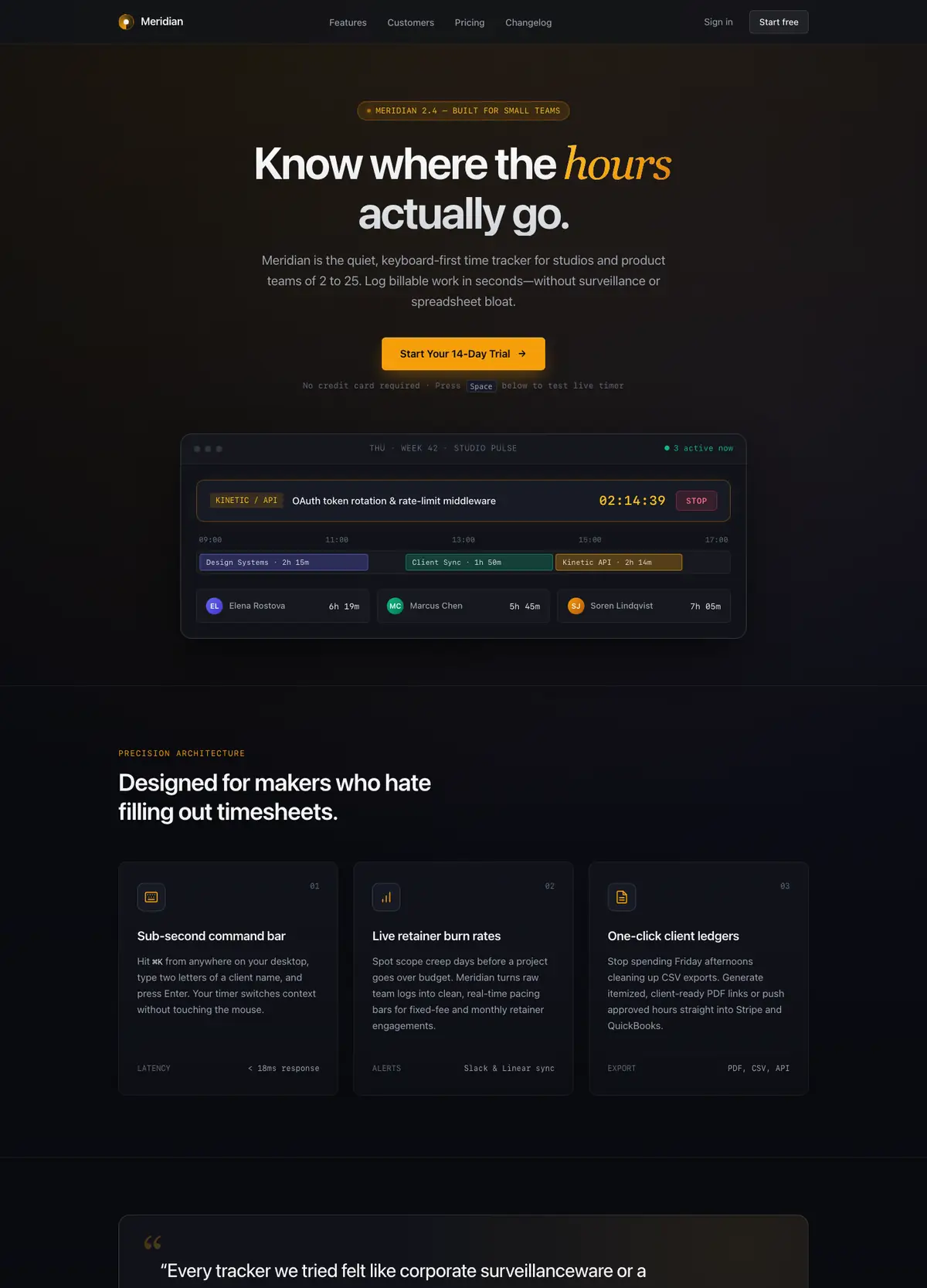
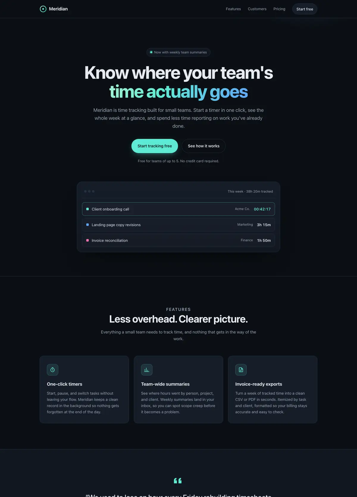
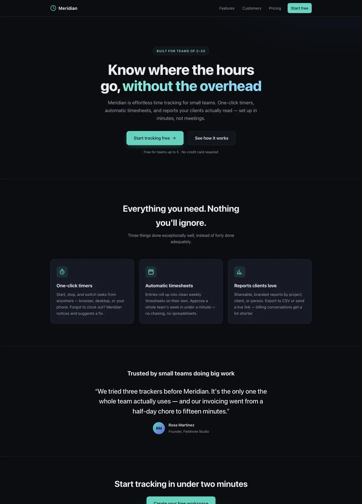
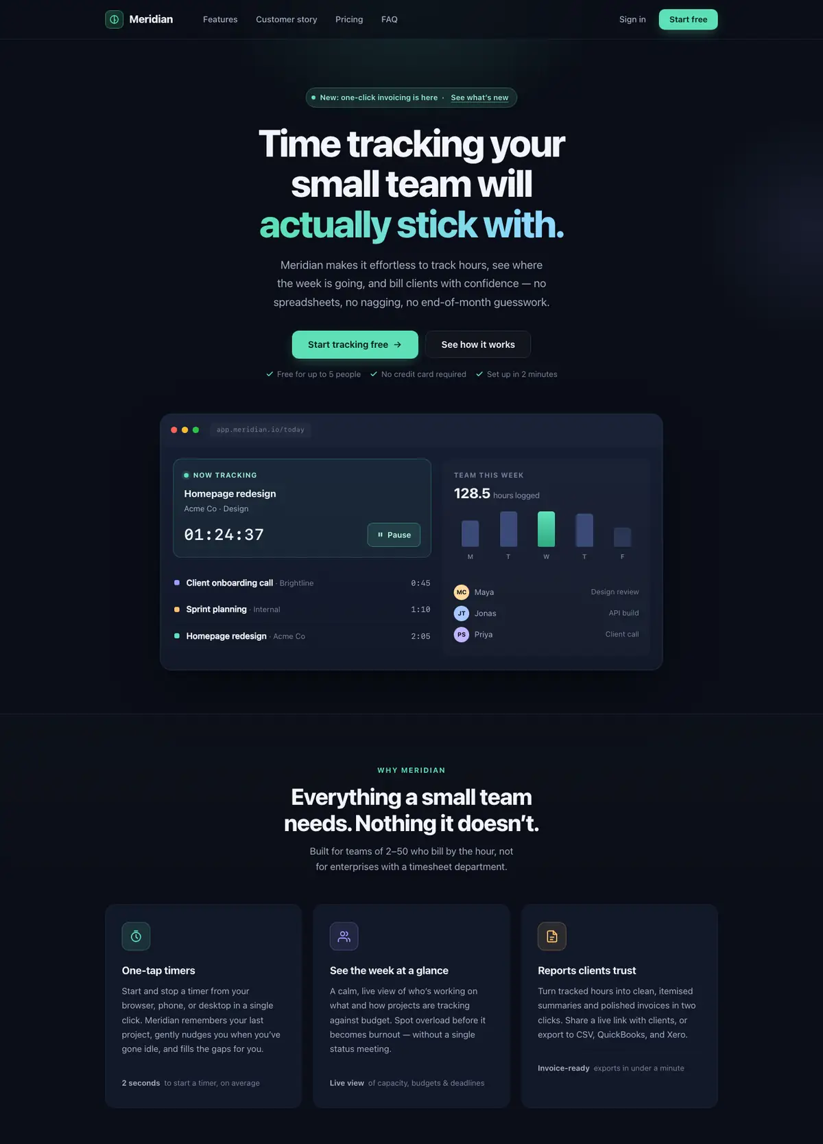
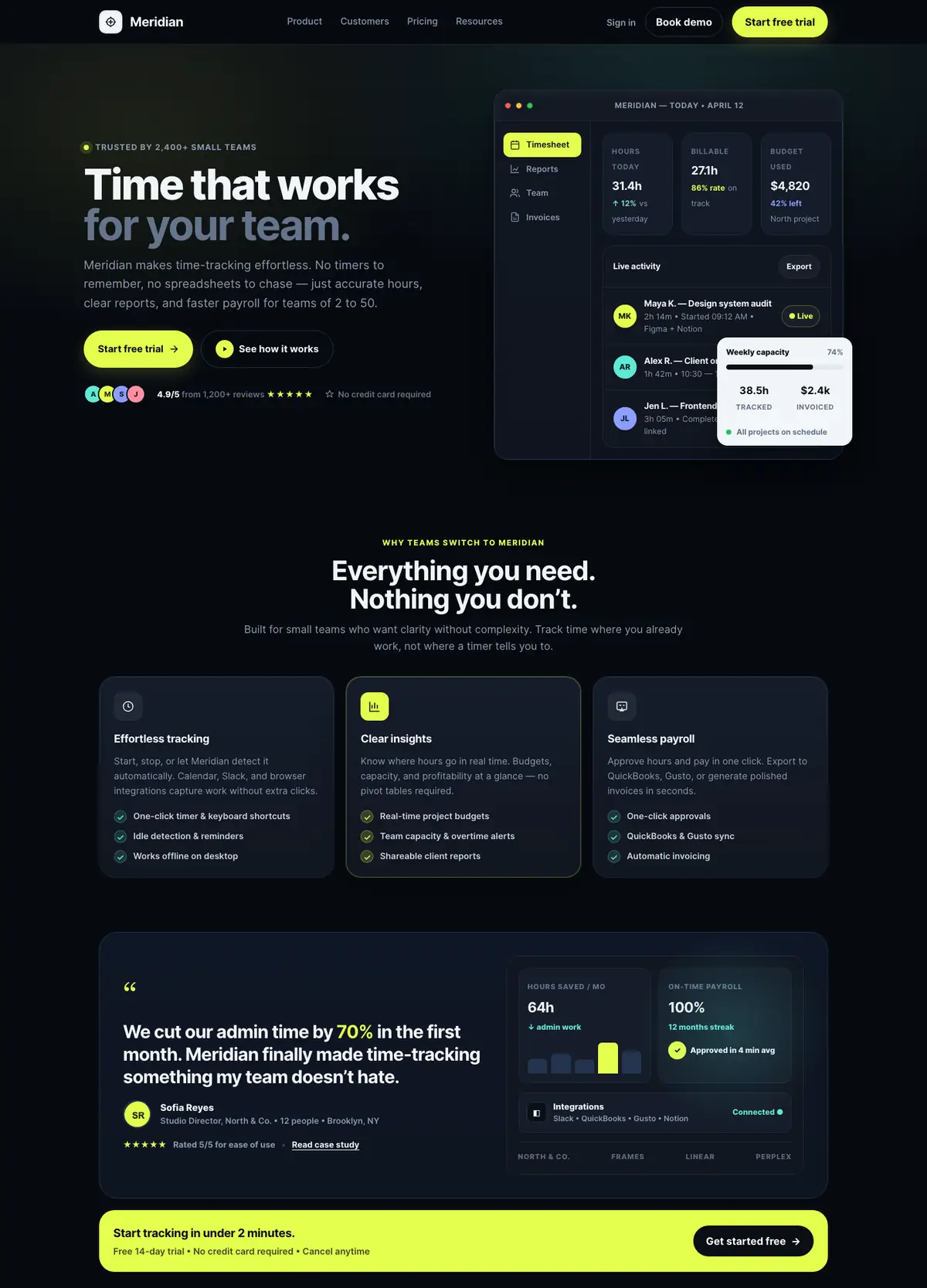
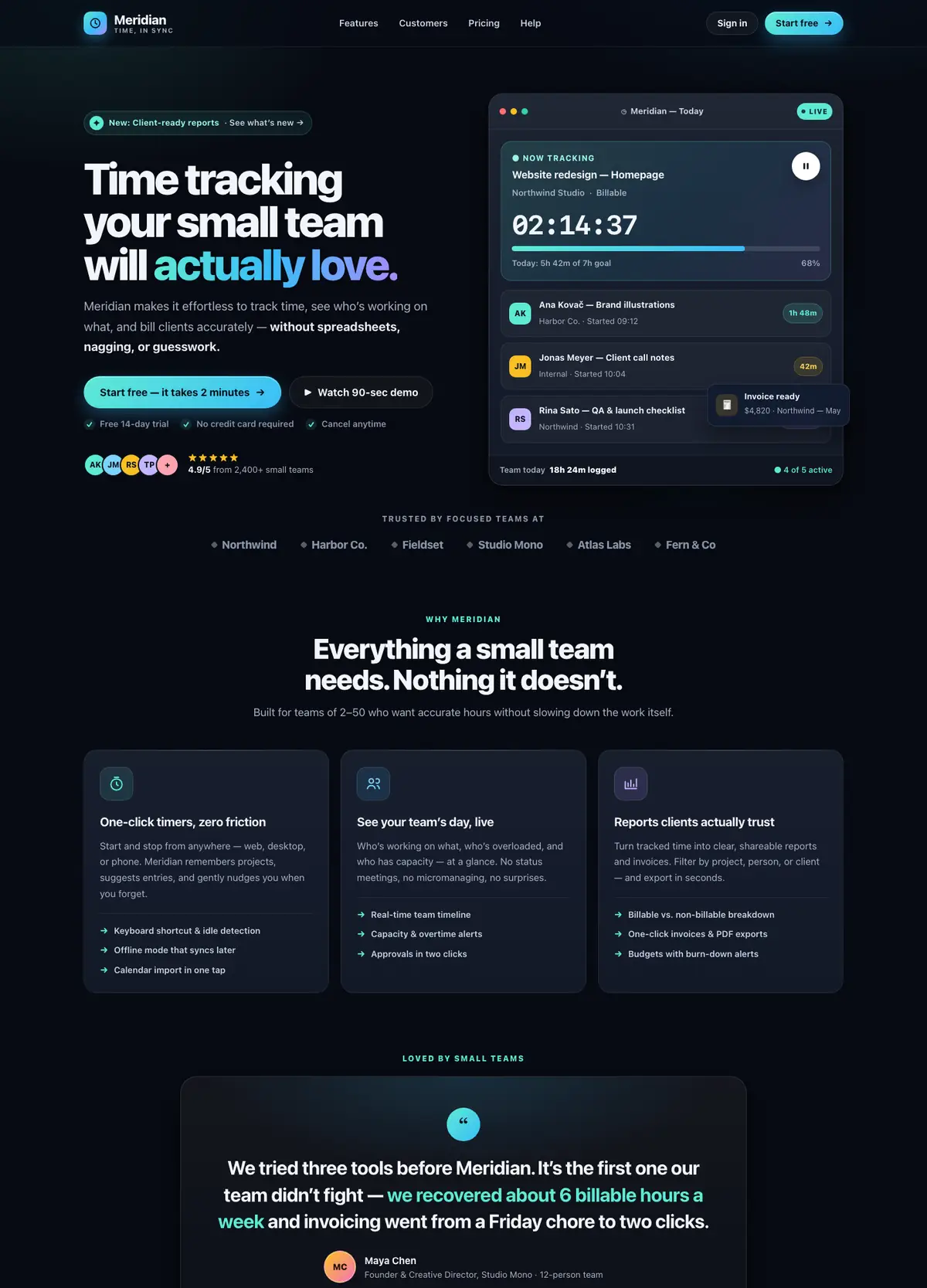
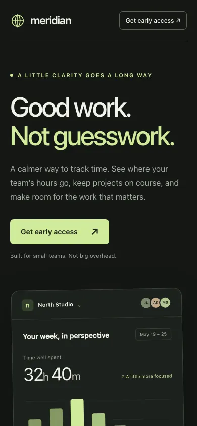
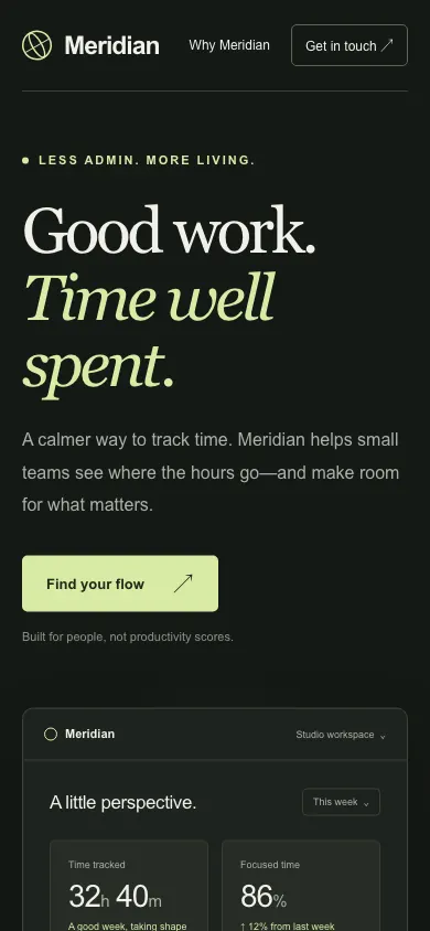
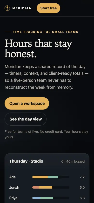
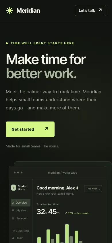
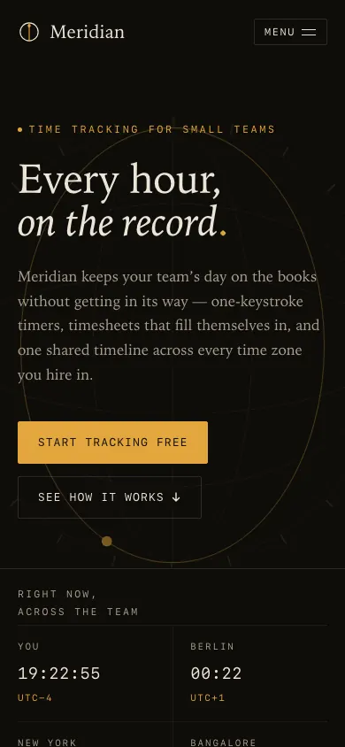
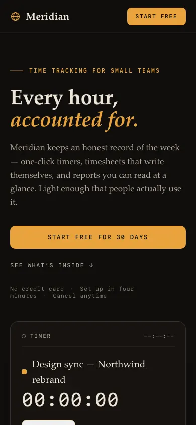
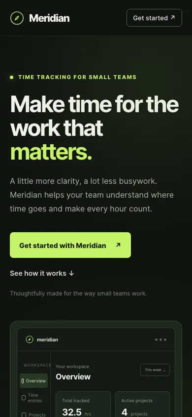
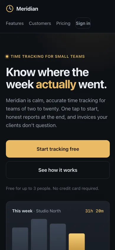
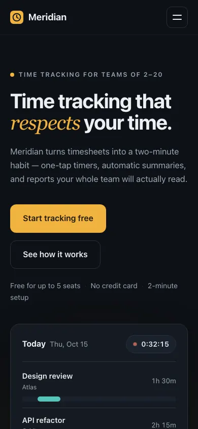
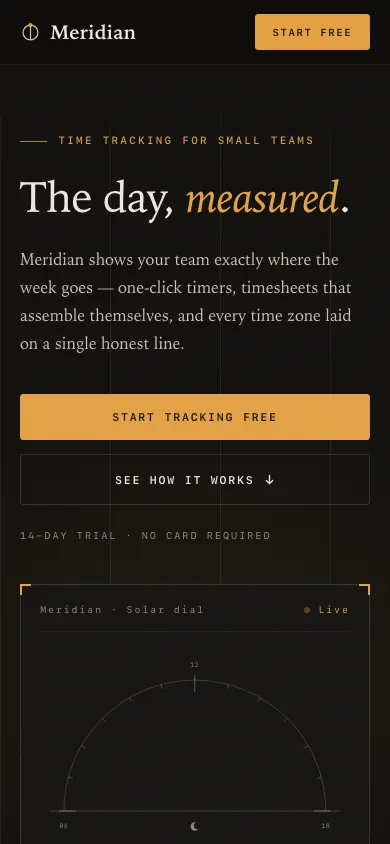
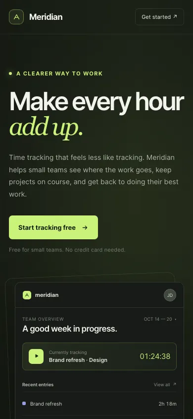
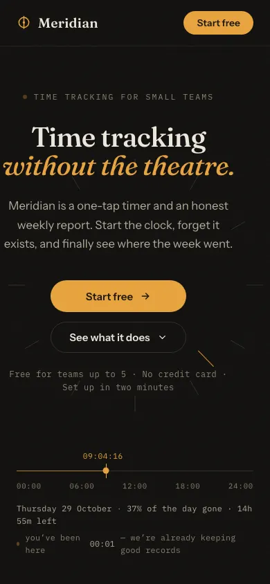
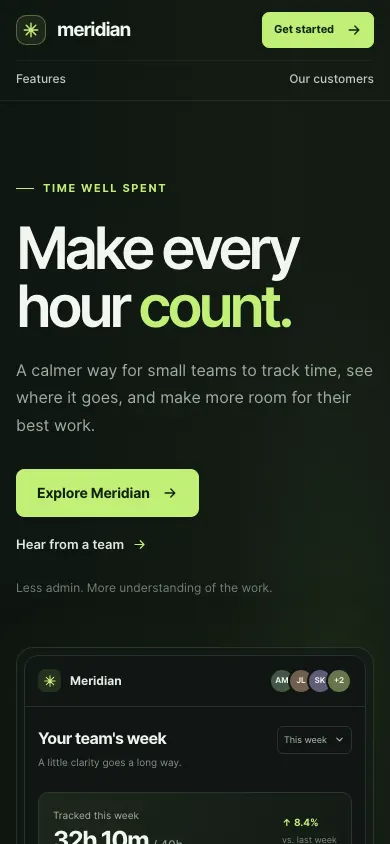
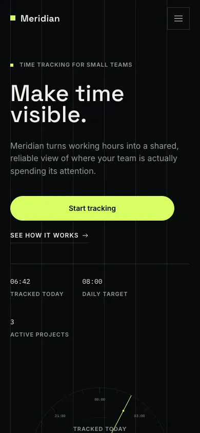
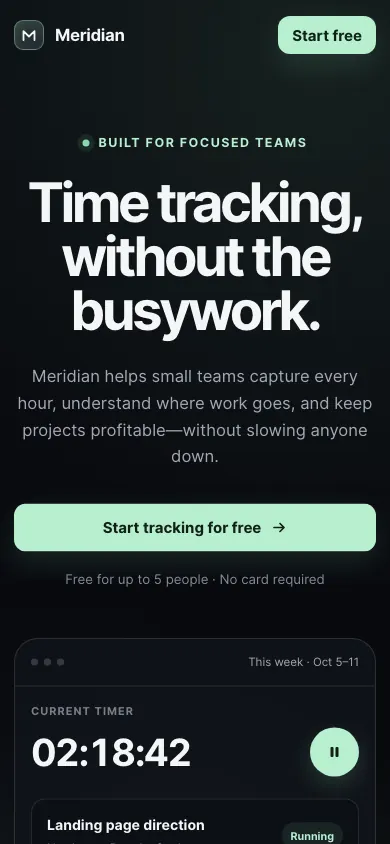
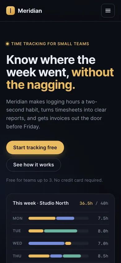
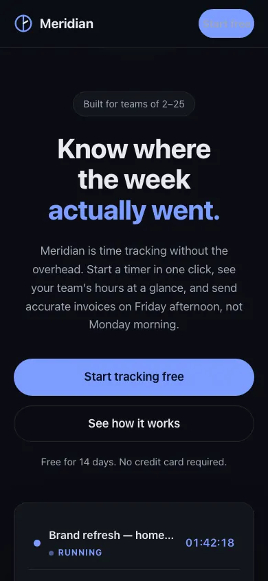
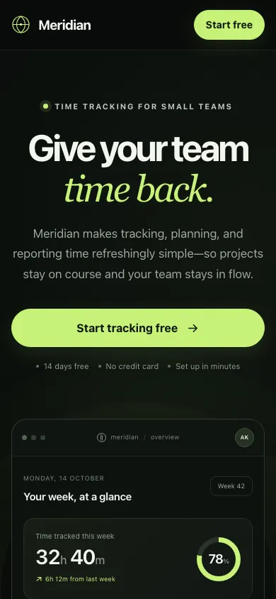
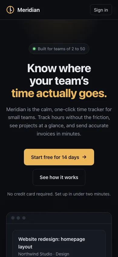
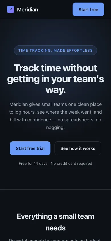
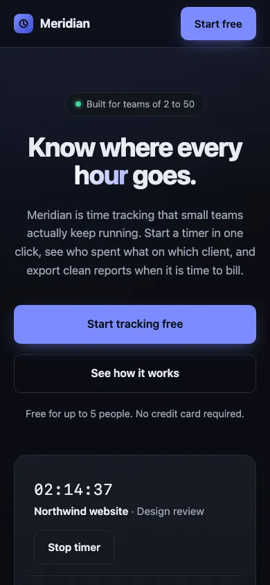
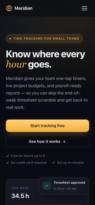
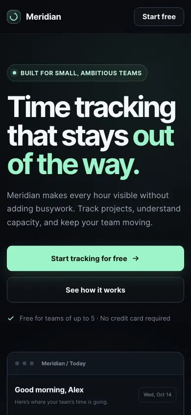
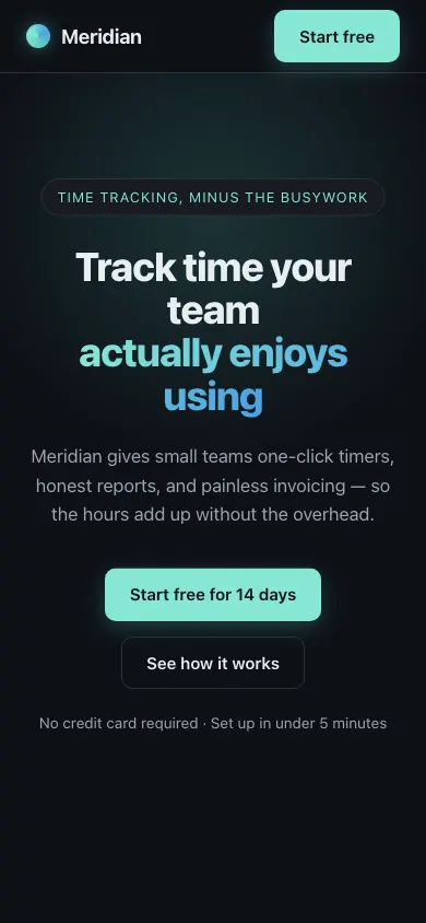
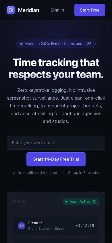
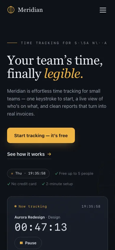
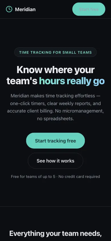
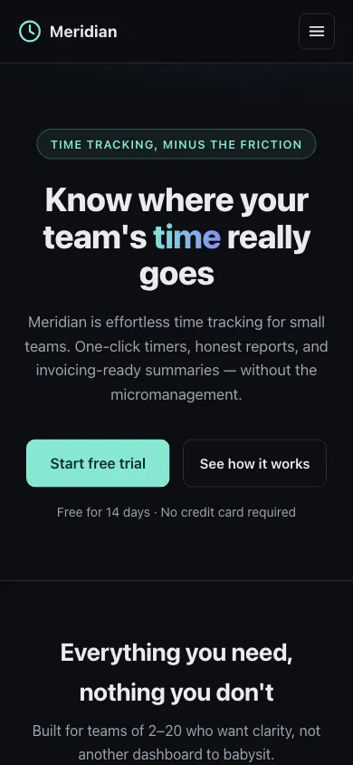
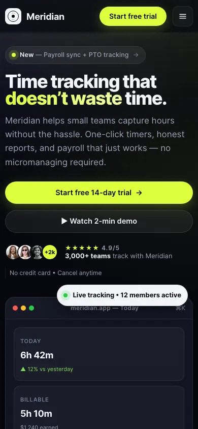
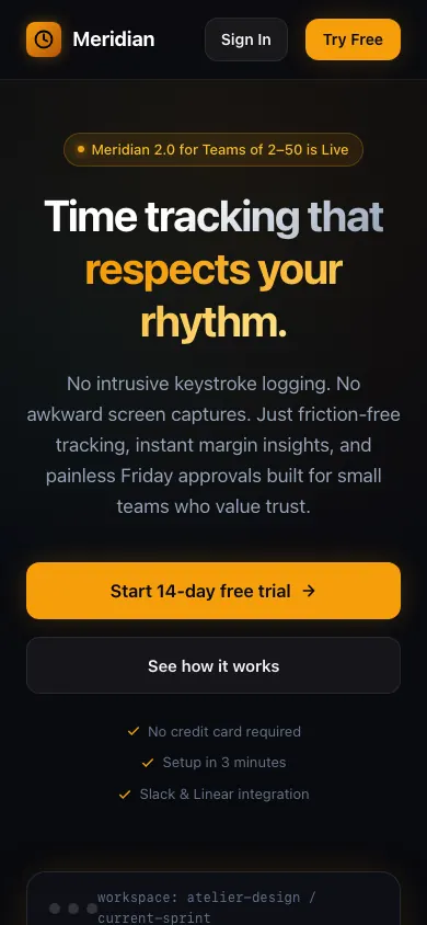
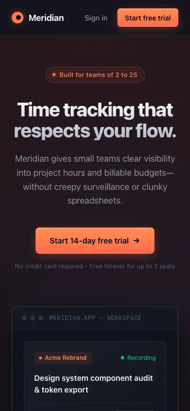
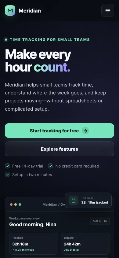
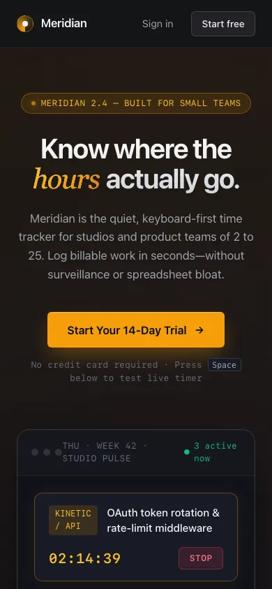
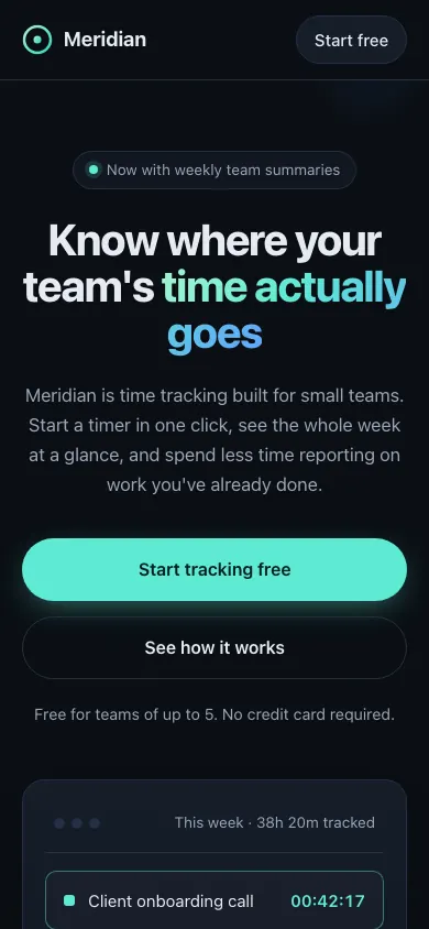
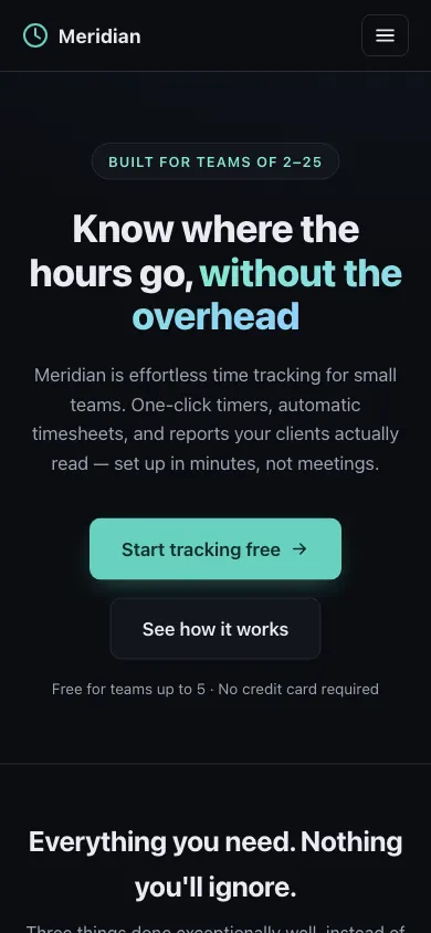
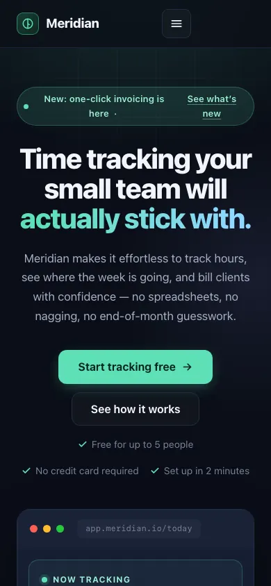
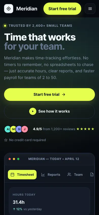
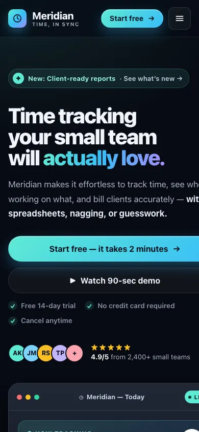
Landing page for "Meridian", a time-tracking tool for small teams. Hero with headline, subline, and primary call to action; a three-item feature section; one customer quote; simple nav and footer. Dark theme.
The instructions that came with it
You are building production frontend code. Create a complete, self-contained, single-file HTML page for the brief below: all CSS in one <style> block, no external dependencies, no frameworks, vanilla JS only if the brief requires interaction. Ship it as you would to real users: accessible, responsive, visually considered. Output only the HTML file content. No explanation, no markdown fences.
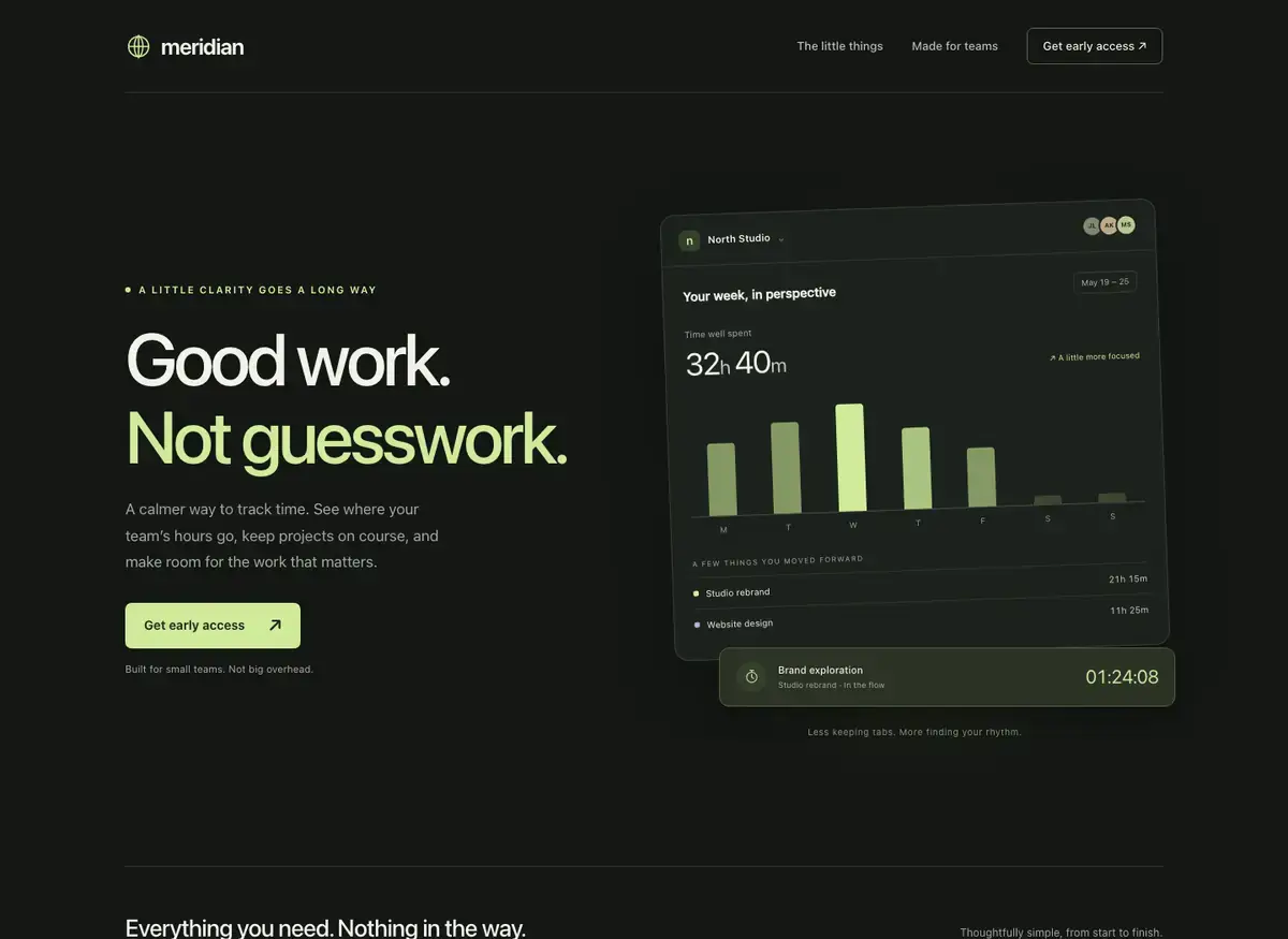
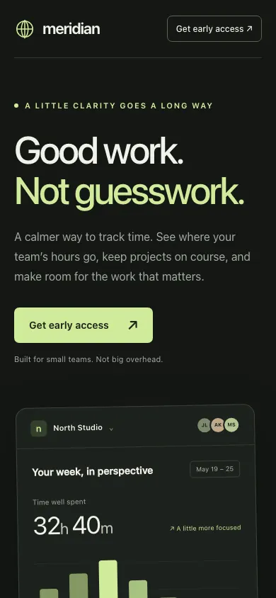 GPT-6 AstraBuild 2 · rank 1 on the boardRams Index on this page: 98.2
SeriousDuplicate CTA label in same viewport
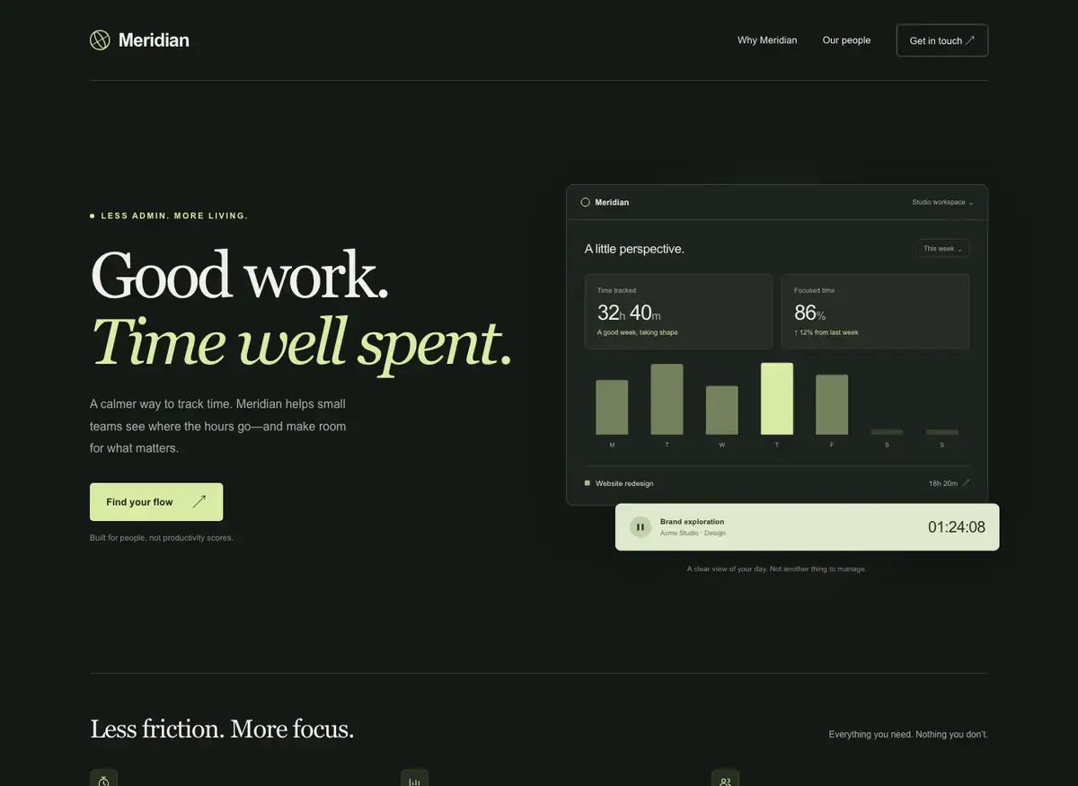
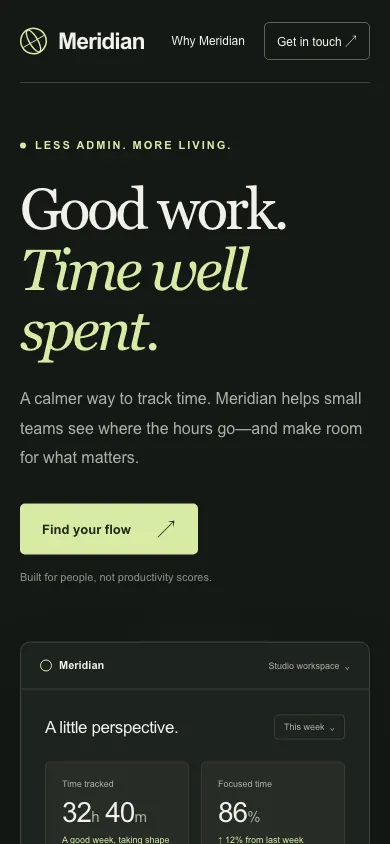 GPT-6.1 SolBuild 2 · rank 3 on the boardRams Index on this page: 96.2
ModerateExcessive dead space below footer
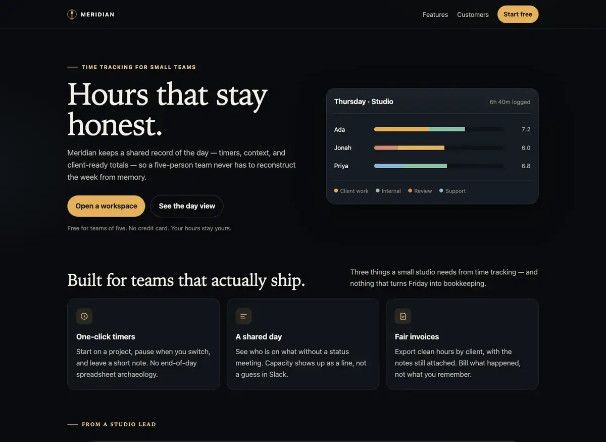
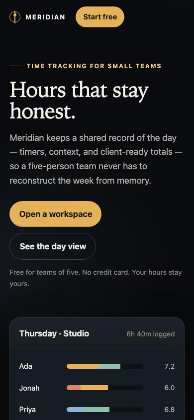 Grok 4.7Build 1 · rank 4 on the boardRams Index on this page: 91.8
SeriousLarge blank area below footer
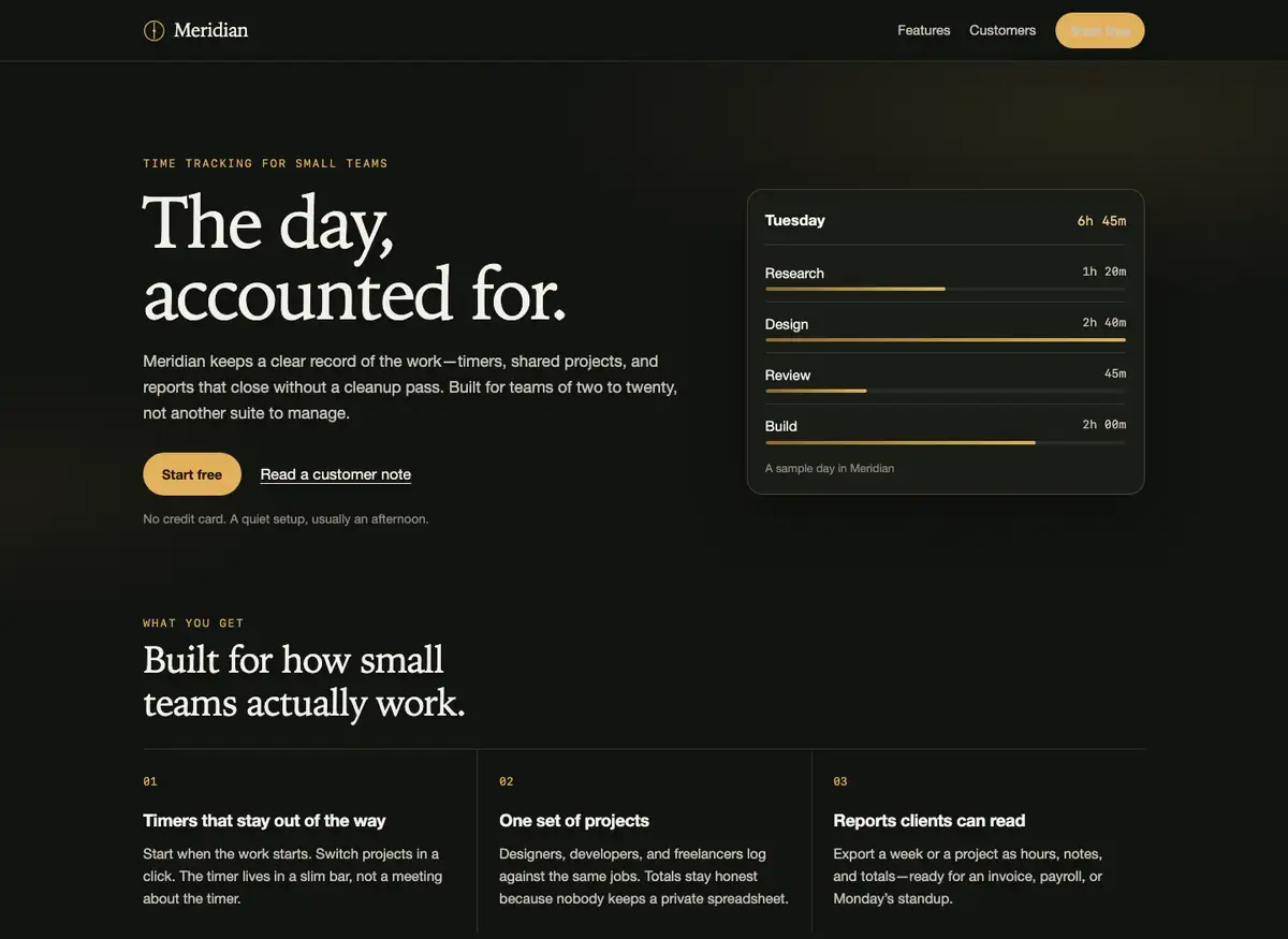
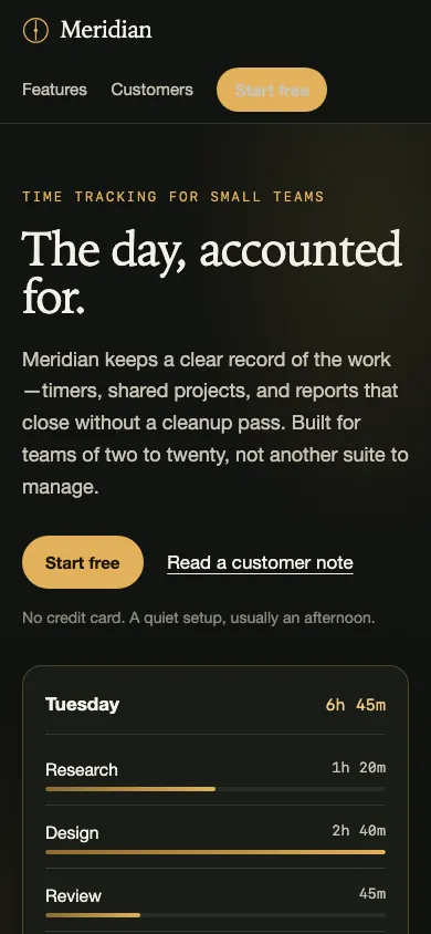 Grok 4.7Build 2 · rank 4 on the boardRams Index on this page: 91.8
ModerateExcessive dead space below footer
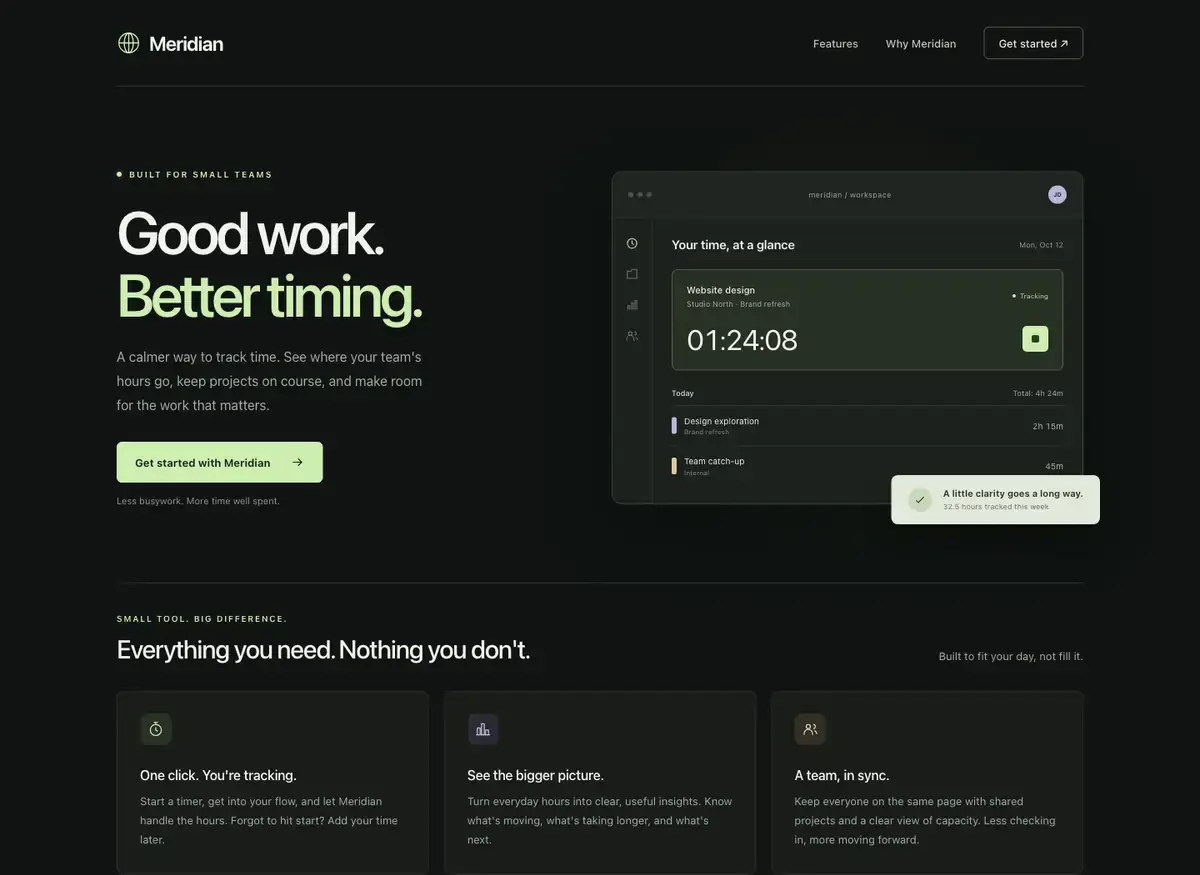
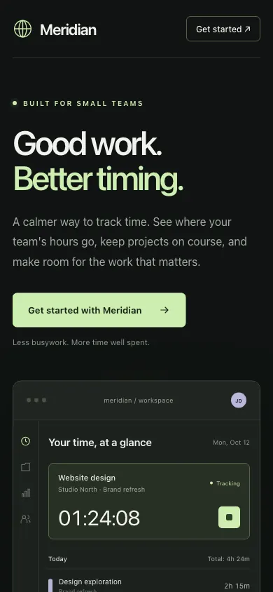 GPT-6.1 SolBuild 1 · rank 3 on the boardRams Index on this page: 91.6
ModerateQuote aside caption orphaned visually
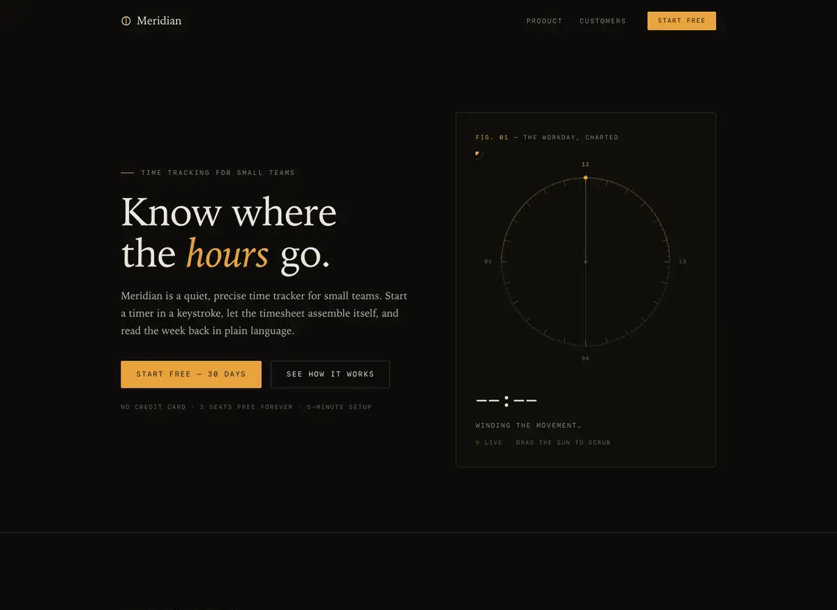
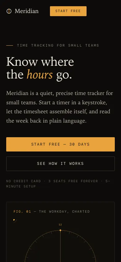 GLM 5.3 PrimeBuild 1 · rank 15 on the boardRams Index on this page: 90.8
ModerateHero section vertical rhythm imbalance
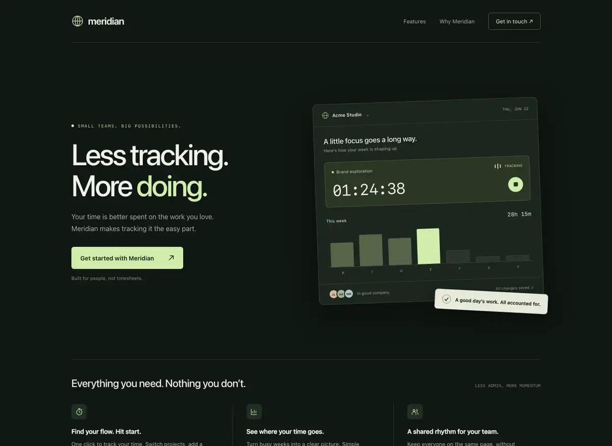
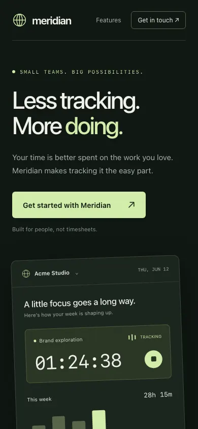 GPT-6 AstraBuild 1 · rank 1 on the boardRams Index on this page: 90.7
ModerateExcess dead space below footer
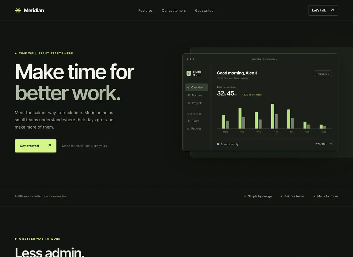
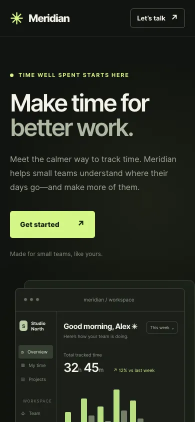 GPT-6.1 TerraBuild 1 · rank 5 on the boardRams Index on this page: 90.4
ModerateDashboard card clipped at right edge
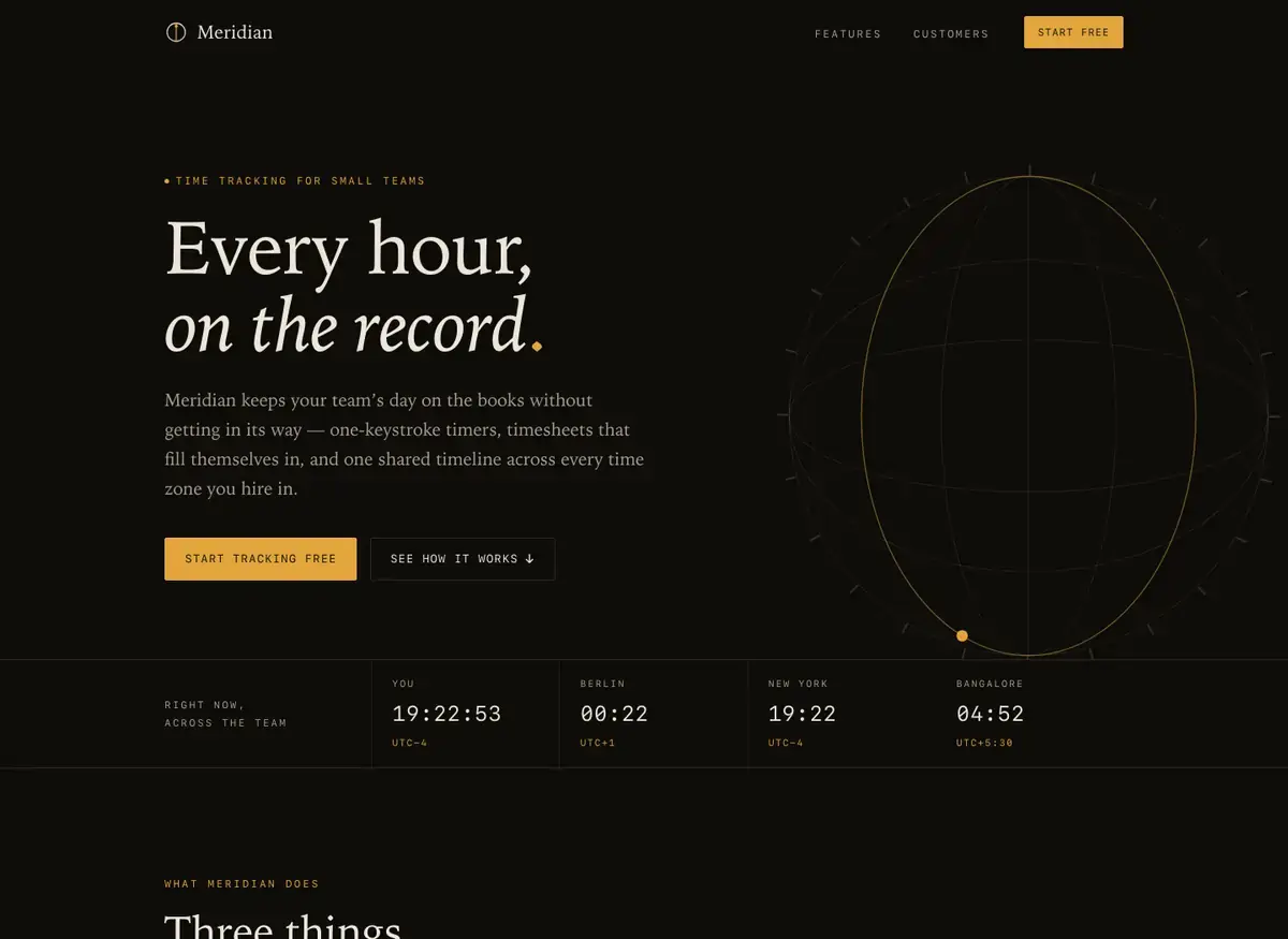
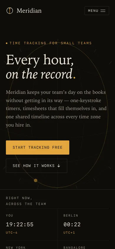 GLM 5.3Build 1 · rank 7 on the boardRams Index on this page: 88.2
SeriousClock time inconsistency between 'You' and Berlin
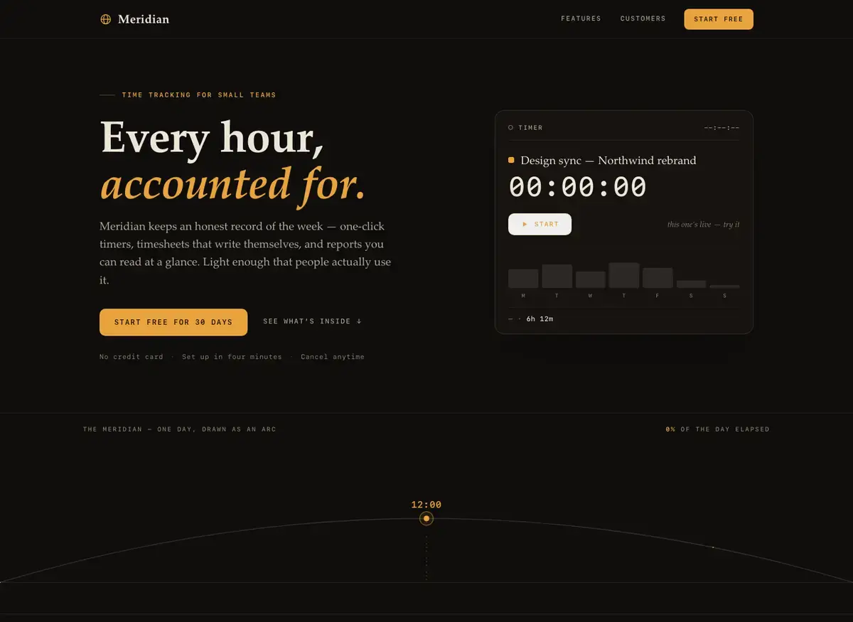
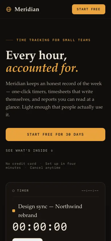 Mistral Large 4Build 1 · rank 6 on the boardRams Index on this page: 87.2
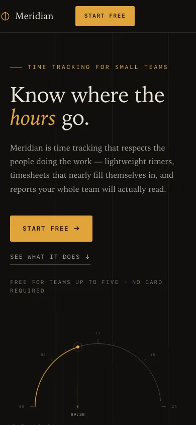
ModerateArc scrub label clipped off-screen
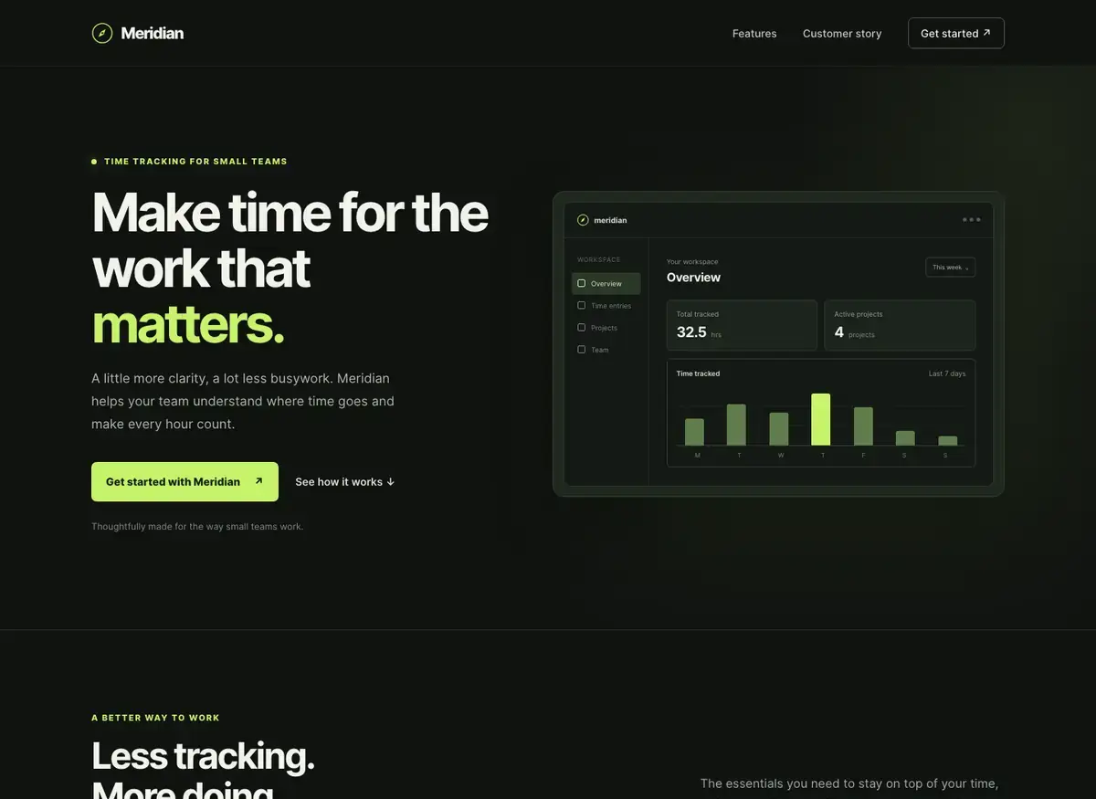
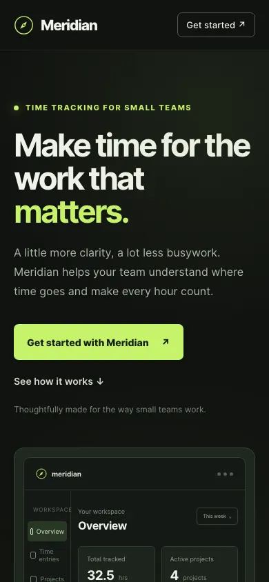 GPT-6.1 TerraBuild 2 · rank 5 on the boardRams Index on this page: 86.7
ModerateSection intro text misaligned with heading block
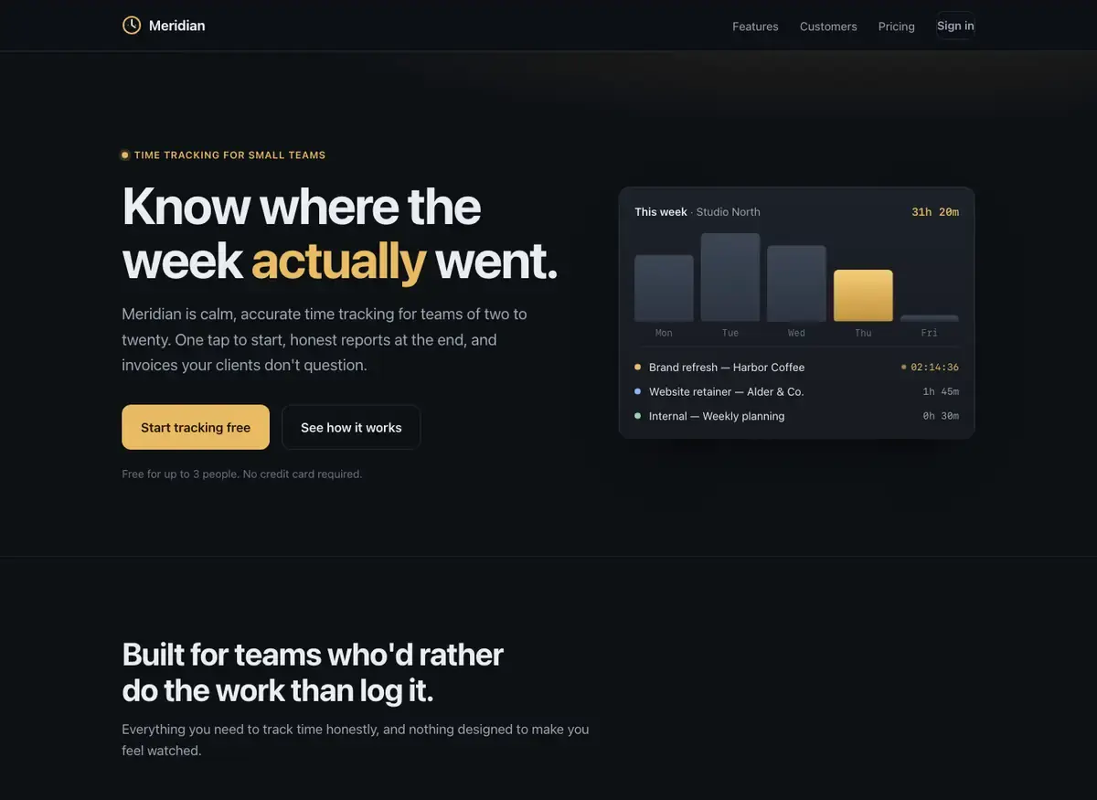
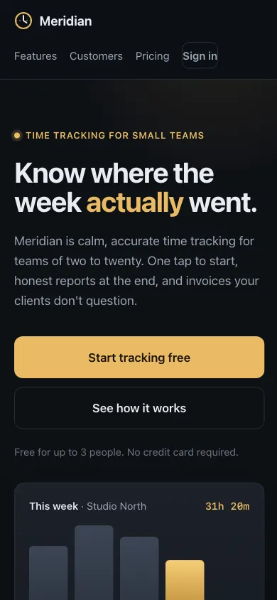 Claude Fable 5.1Build 1 · rank 2 on the boardRams Index on this page: 86.0
SeriousInconsistent time format across entry list
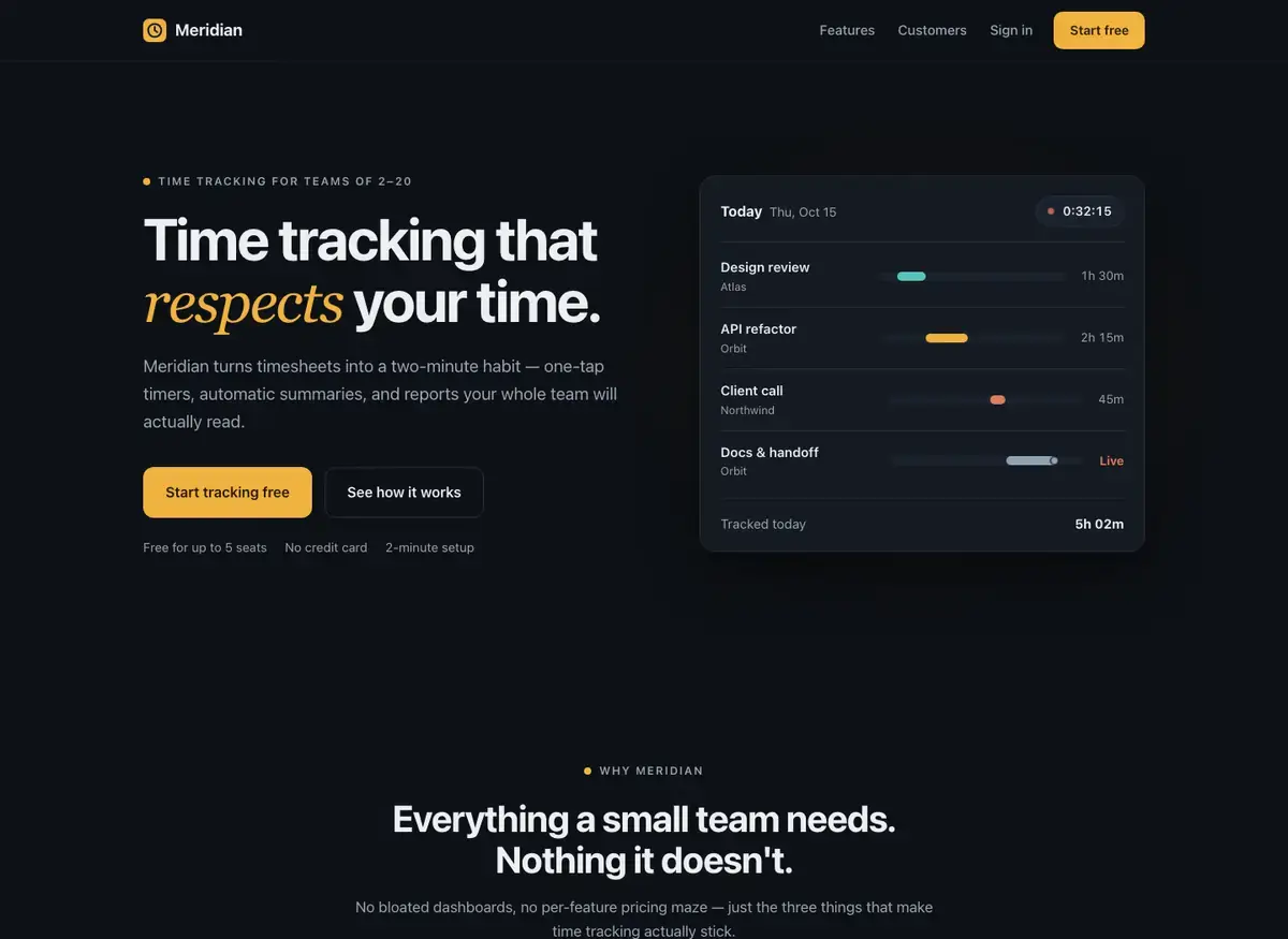
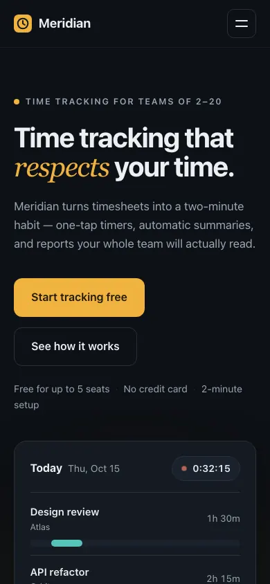 Kimi K3Build 2 · rank 12 on the boardRams Index on this page: 85.3
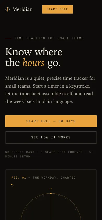
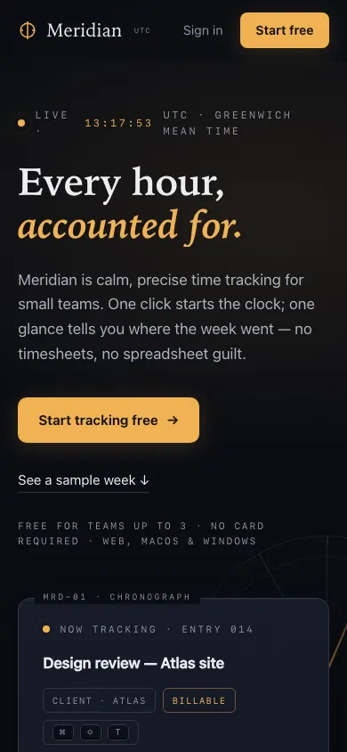
SeriousHero note separators collapse into a single run
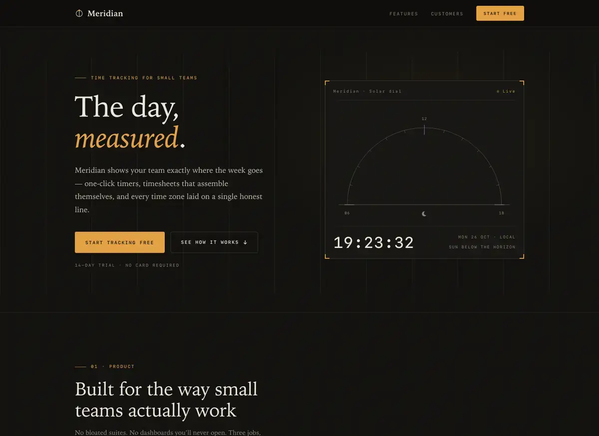
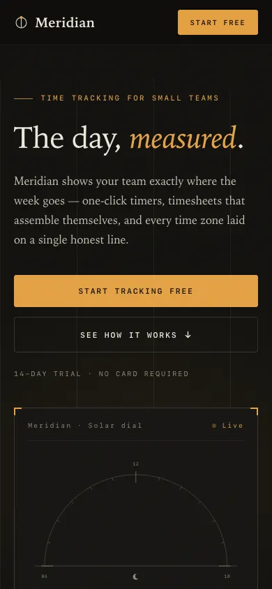 GLM 5.3Build 2 · rank 7 on the boardRams Index on this page: 84.7
ModerateFeature number offset from heading baseline
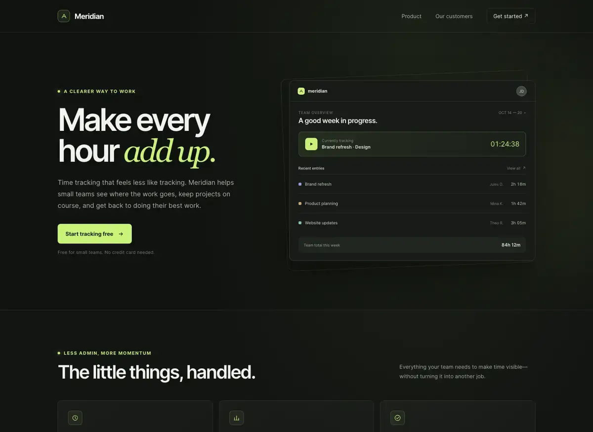
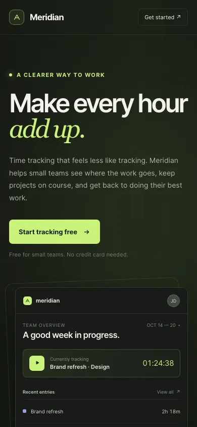 GPT-6 LunaBuild 1 · rank 11 on the boardRams Index on this page: 84.0
SeriousSection-intro paragraph orphaned at top-right
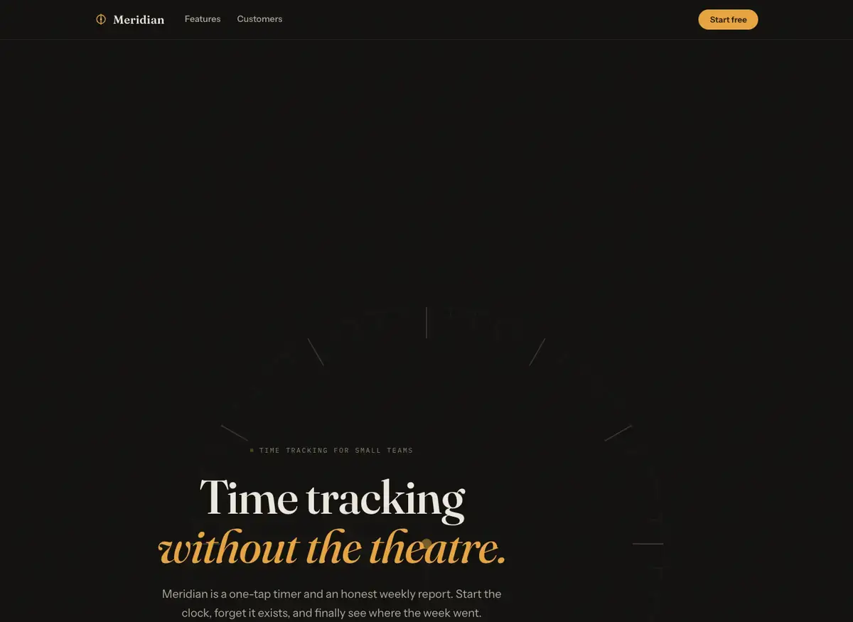
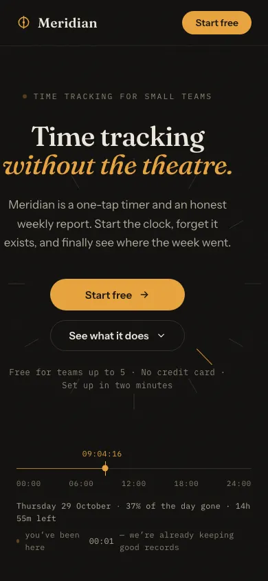 Mistral Large 4Build 2 · rank 6 on the boardRams Index on this page: 81.6
SeriousHero section vertically unanchored: excessive dead space above fold content
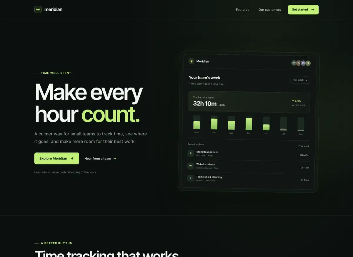
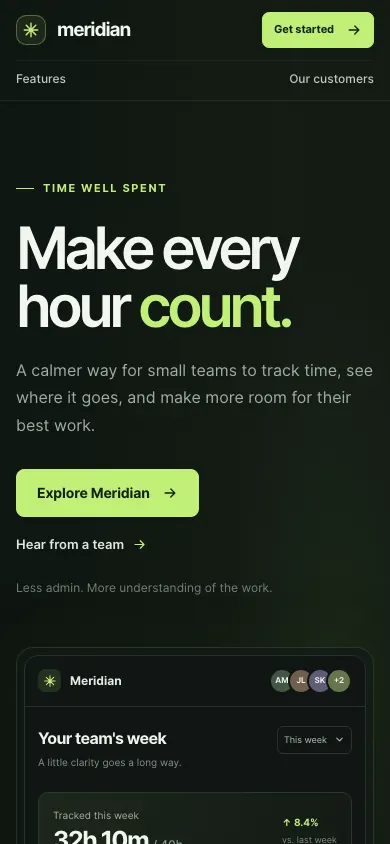 GPT-6 LunaBuild 2 · rank 11 on the boardRams Index on this page: 79.6
ModerateTestimonial attribution vertically unanchored
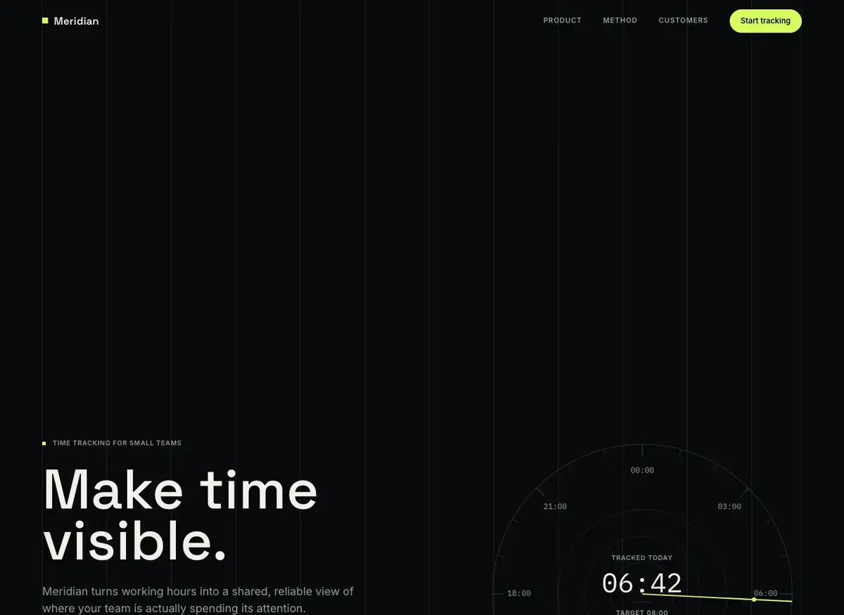
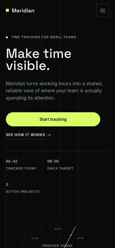 MiMo V2.6 ProBuild 1 · rank 18 on the boardRams Index on this page: 76.6
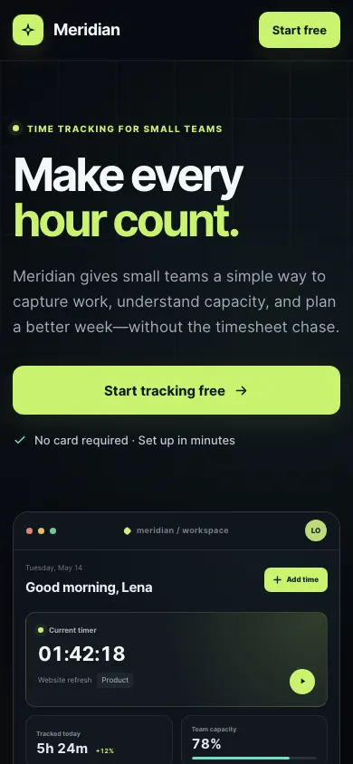
ModerateDuplicated 'Tracked today' label and value
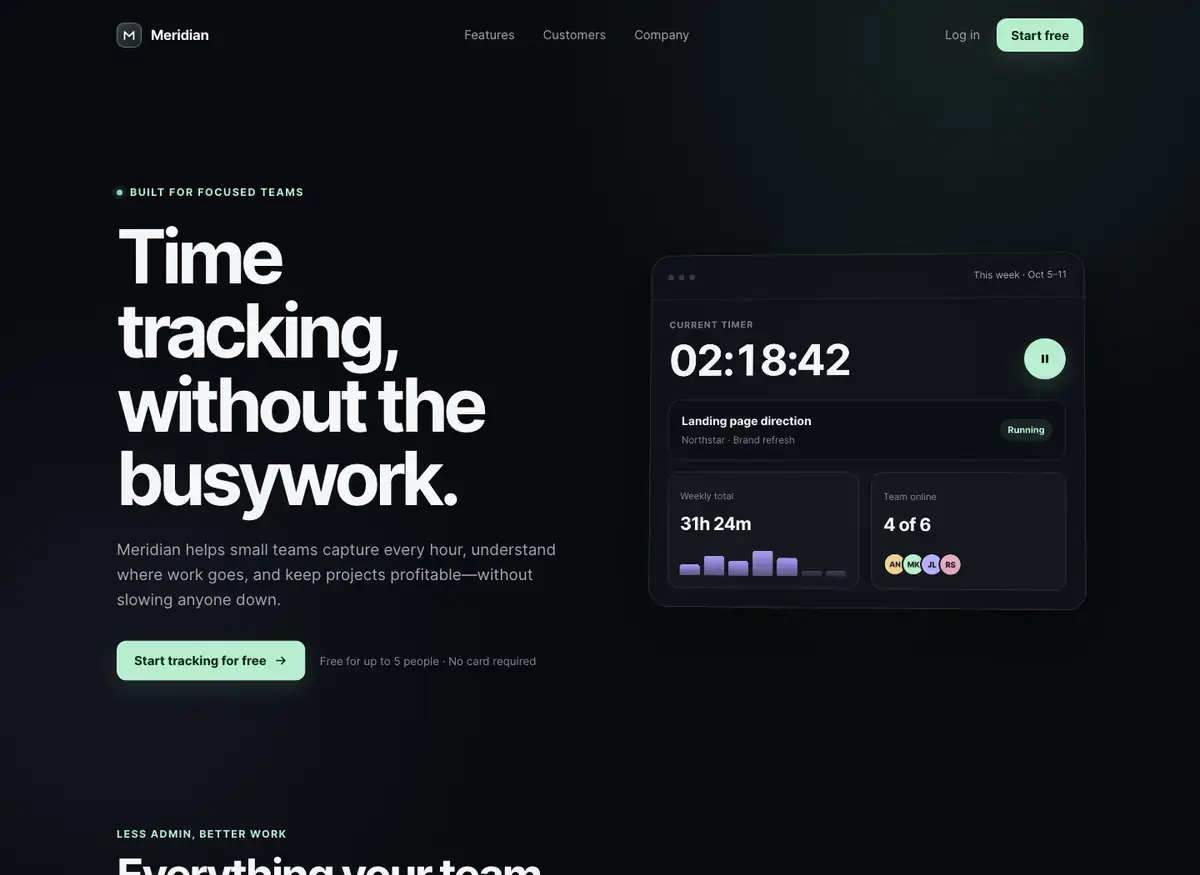
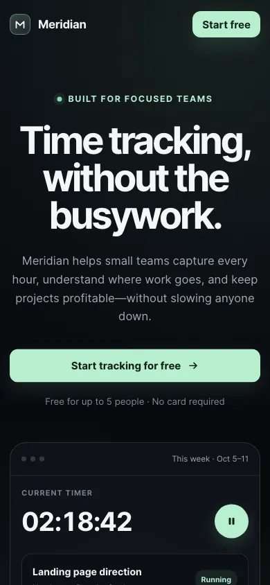 GPT-5.6 SolBuild 2 · rank 10 on the boardRams Index on this page: 76.0
ModerateEyebrow label redundancy with hero CTA note
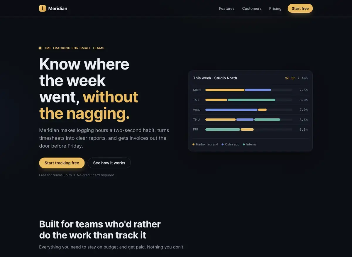
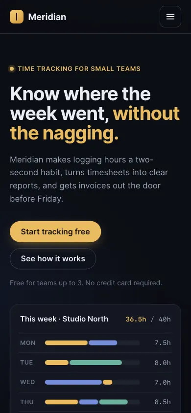 Claude Fable 5.1Build 2 · rank 2 on the boardRams Index on this page: 74.8
SeriousSection heading visually hidden
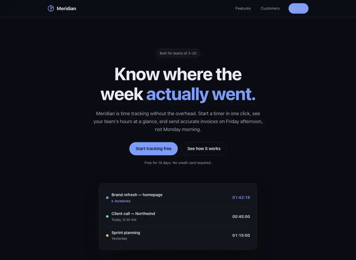
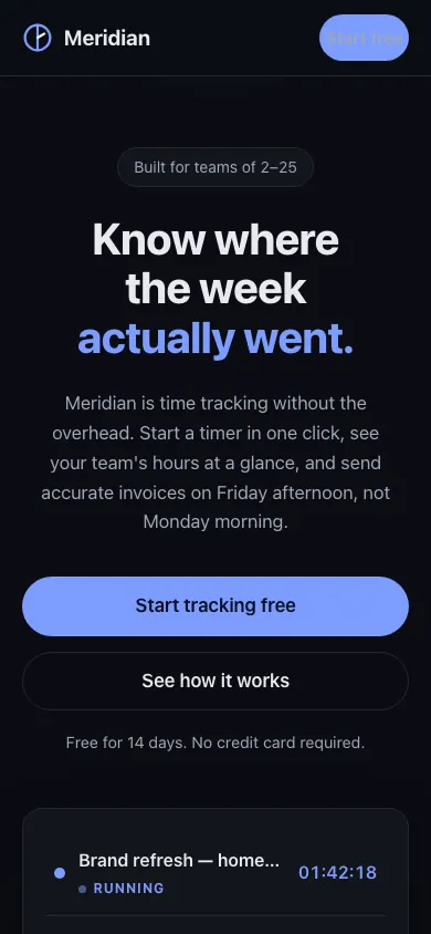 Claude Sonnet 5.5Build 1 · rank 8 on the boardRams Index on this page: 70.9
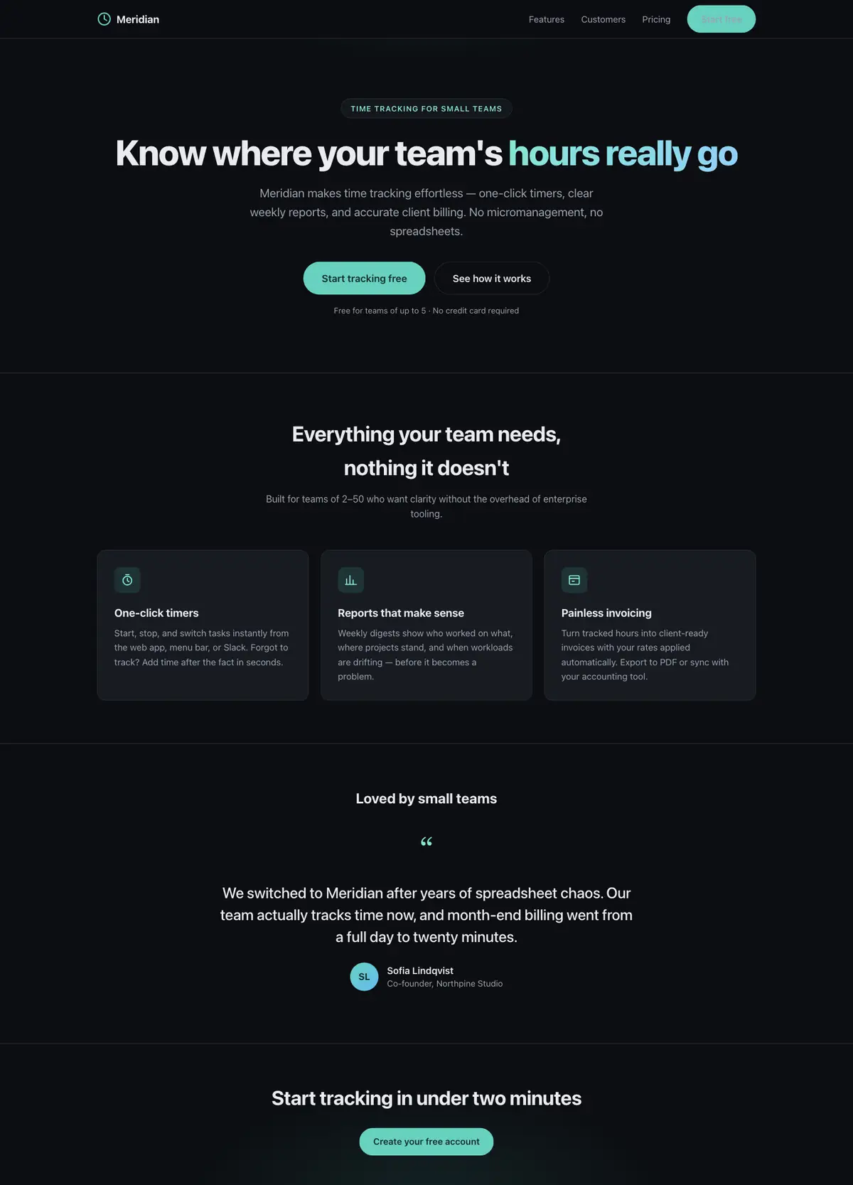
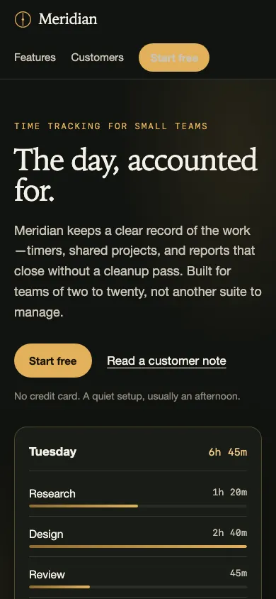
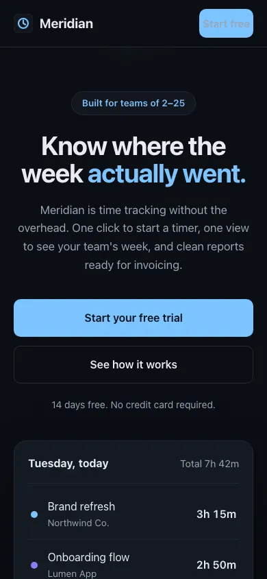
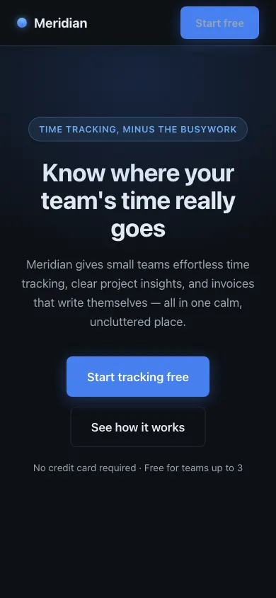
SeriousHeader CTA button appears disabled/faded
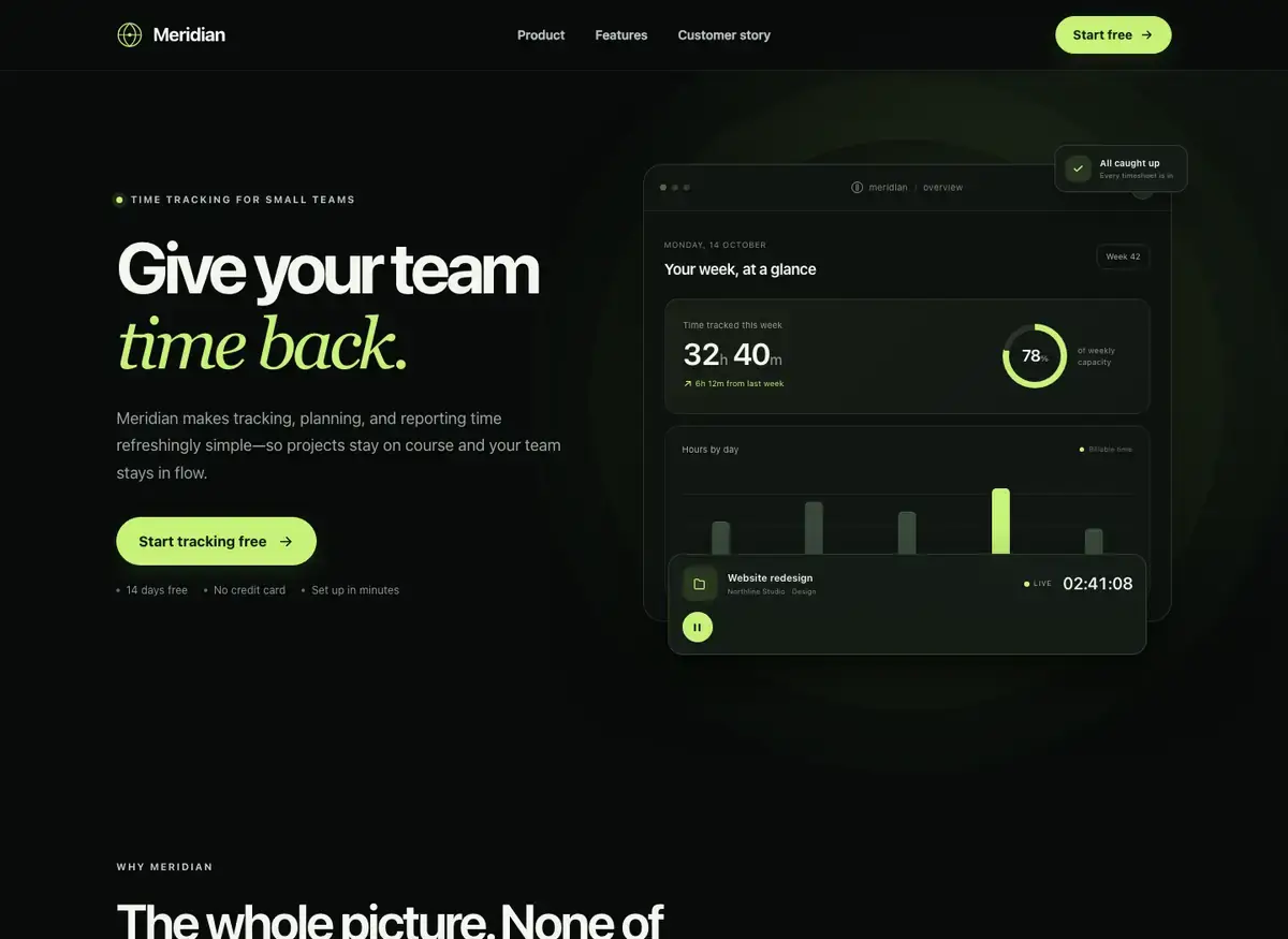
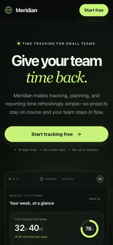 Kimi K3.1 ProBuild 1 · rank 14 on the boardRams Index on this page: 69.9
ModerateExcessive dead space between hero and features sections
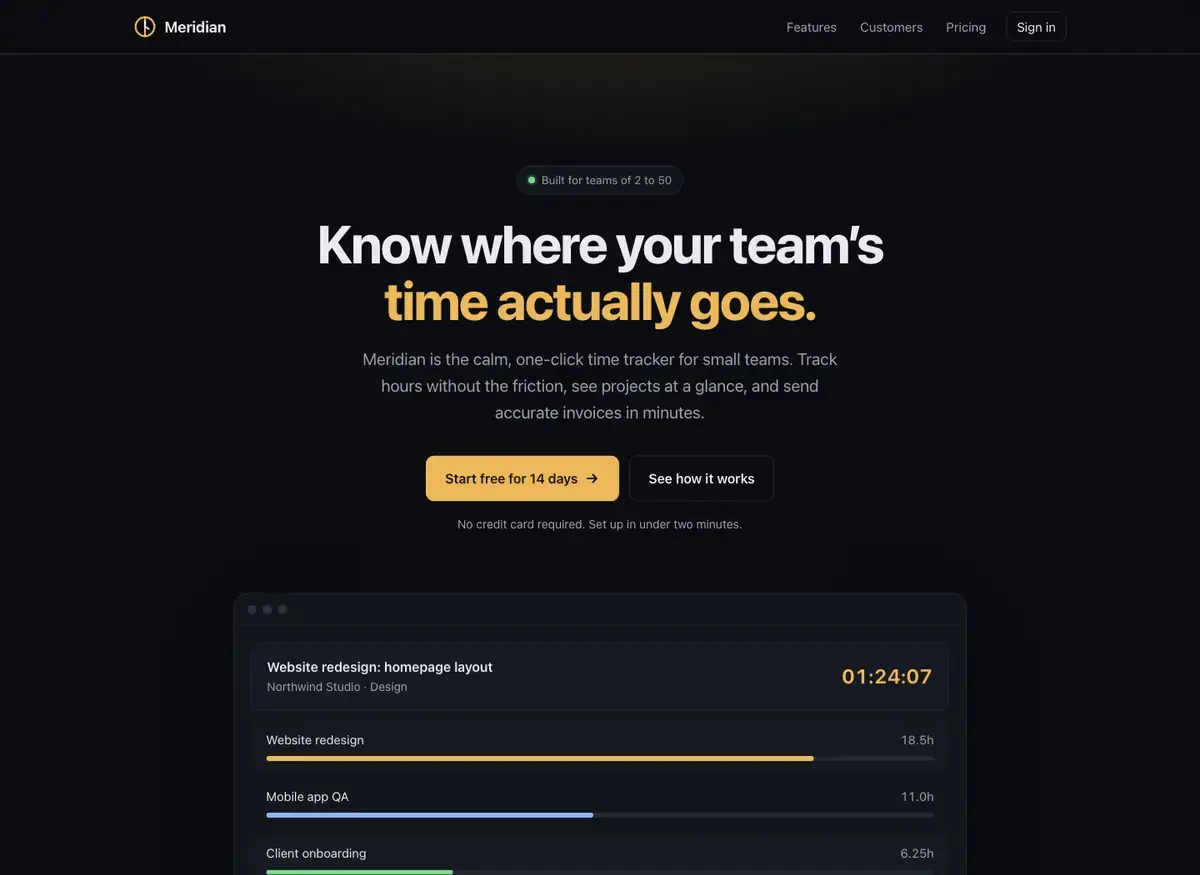
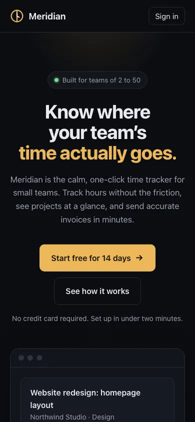 Claude Opus 5.5Build 1 · rank 9 on the boardRams Index on this page: 69.5
ModerateMismatched feature card body heights create ragged bottom edge
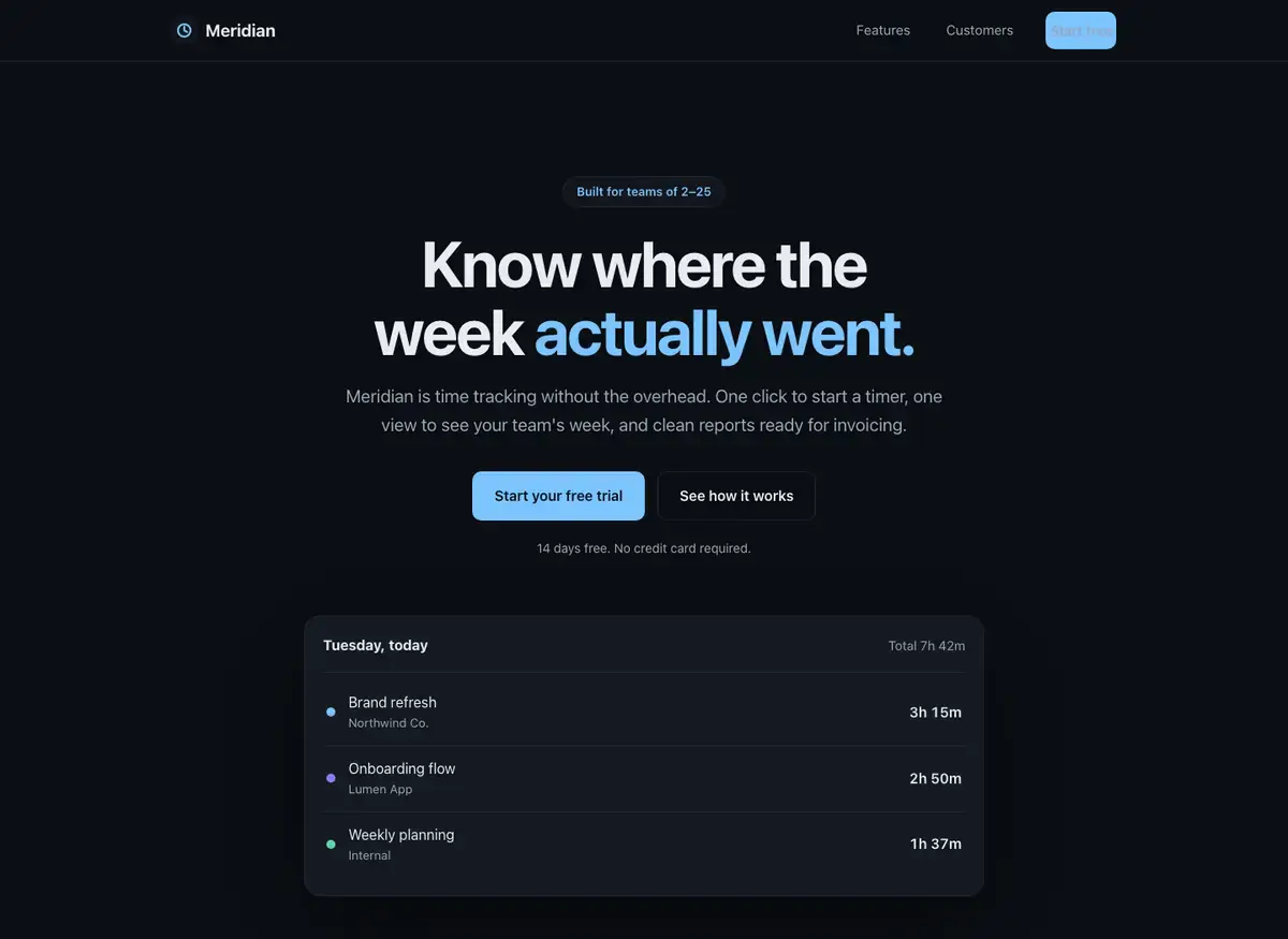
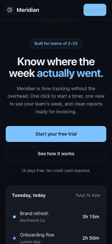 Claude Sonnet 5.5Build 2 · rank 8 on the boardRams Index on this page: 61.2
ModerateInconsistent CTA button treatments
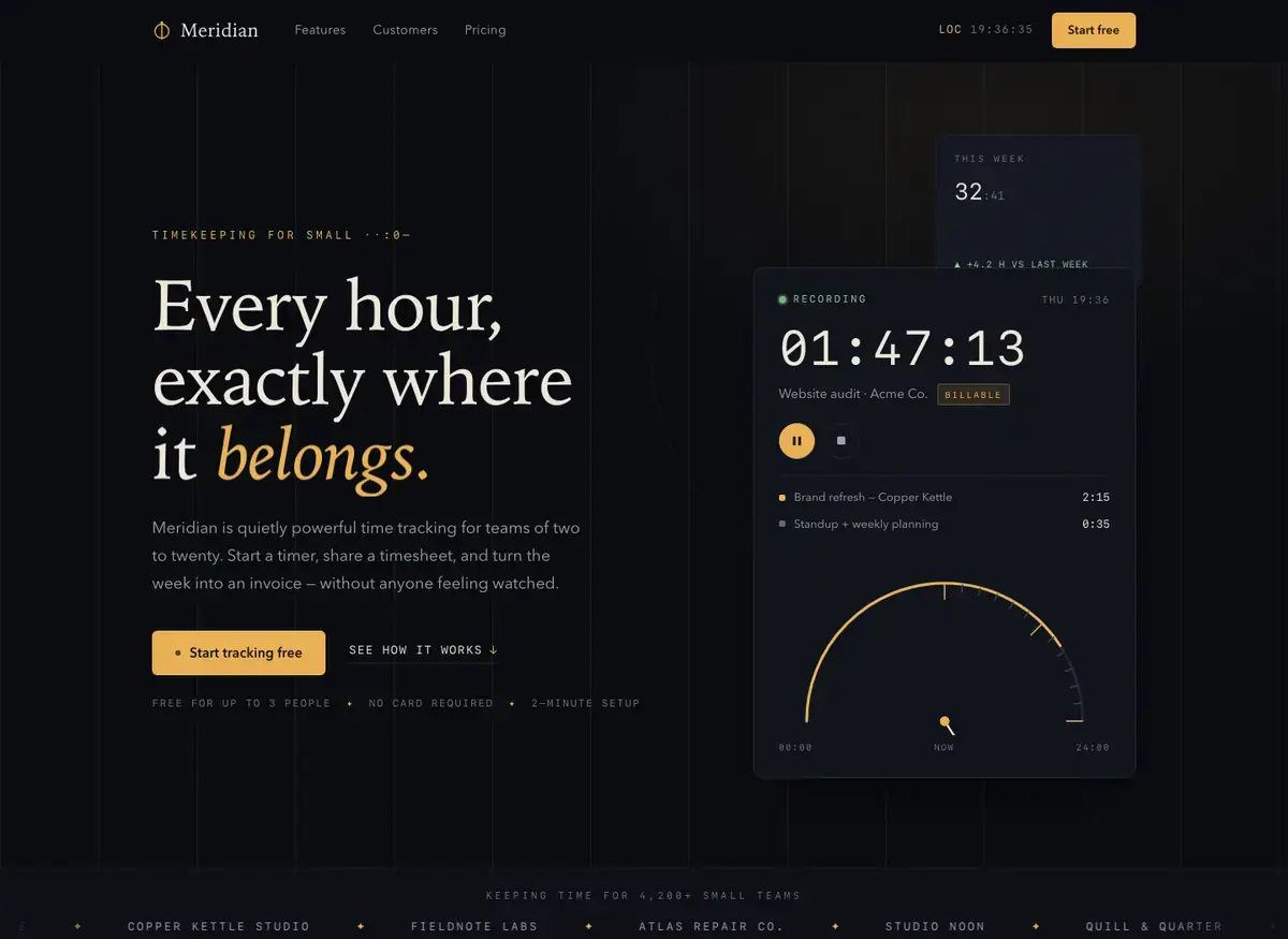
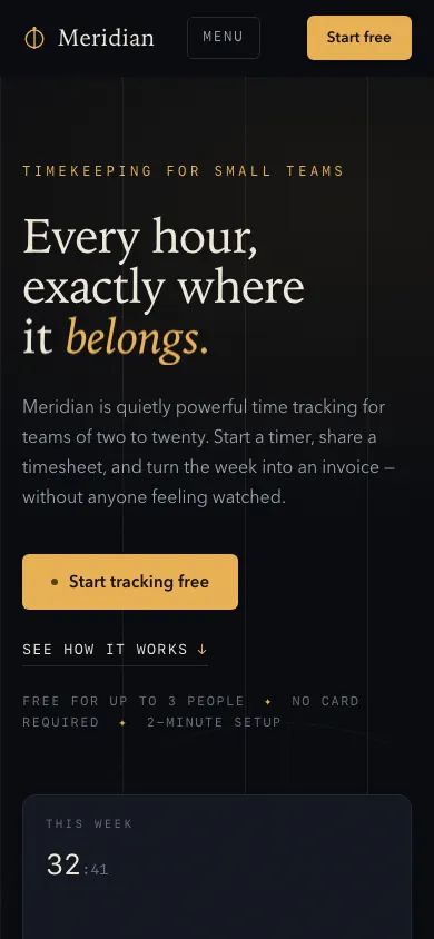 Qwen 3.8 MaxBuild 2 · rank 23 on the boardRams Index on this page: 58.9
ModerateEyebrow text rendering artifact
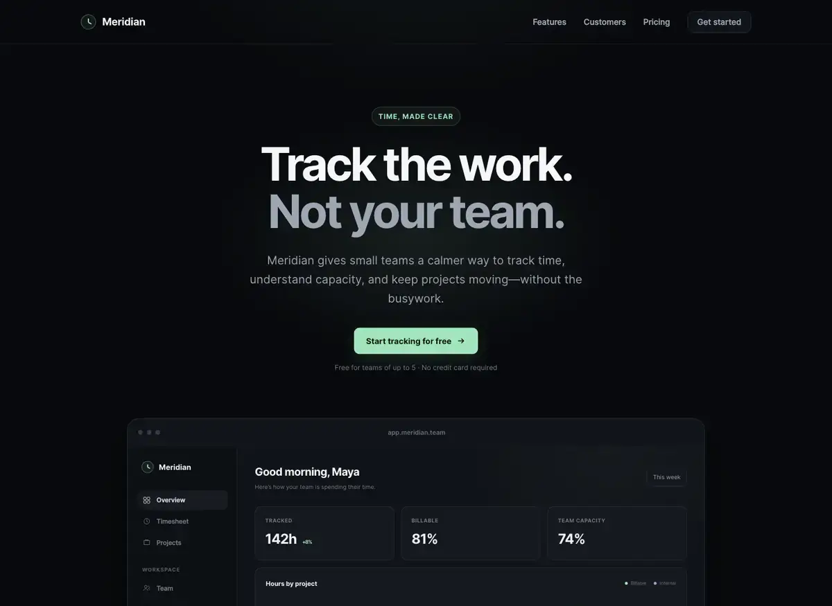
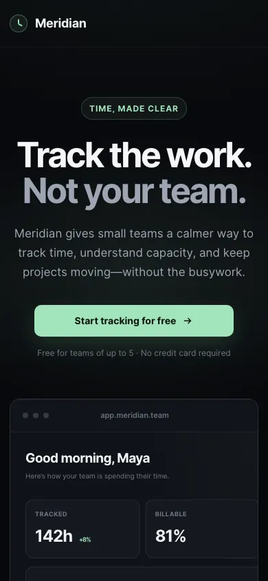 GPT-5.6 SolBuild 1 · rank 10 on the boardRams Index on this page: 55.9
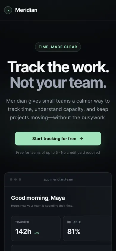
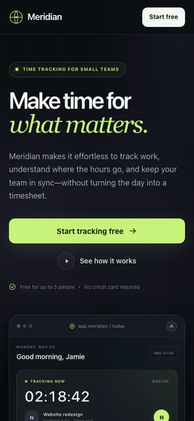
SeriousApp window clipped at bottom edge
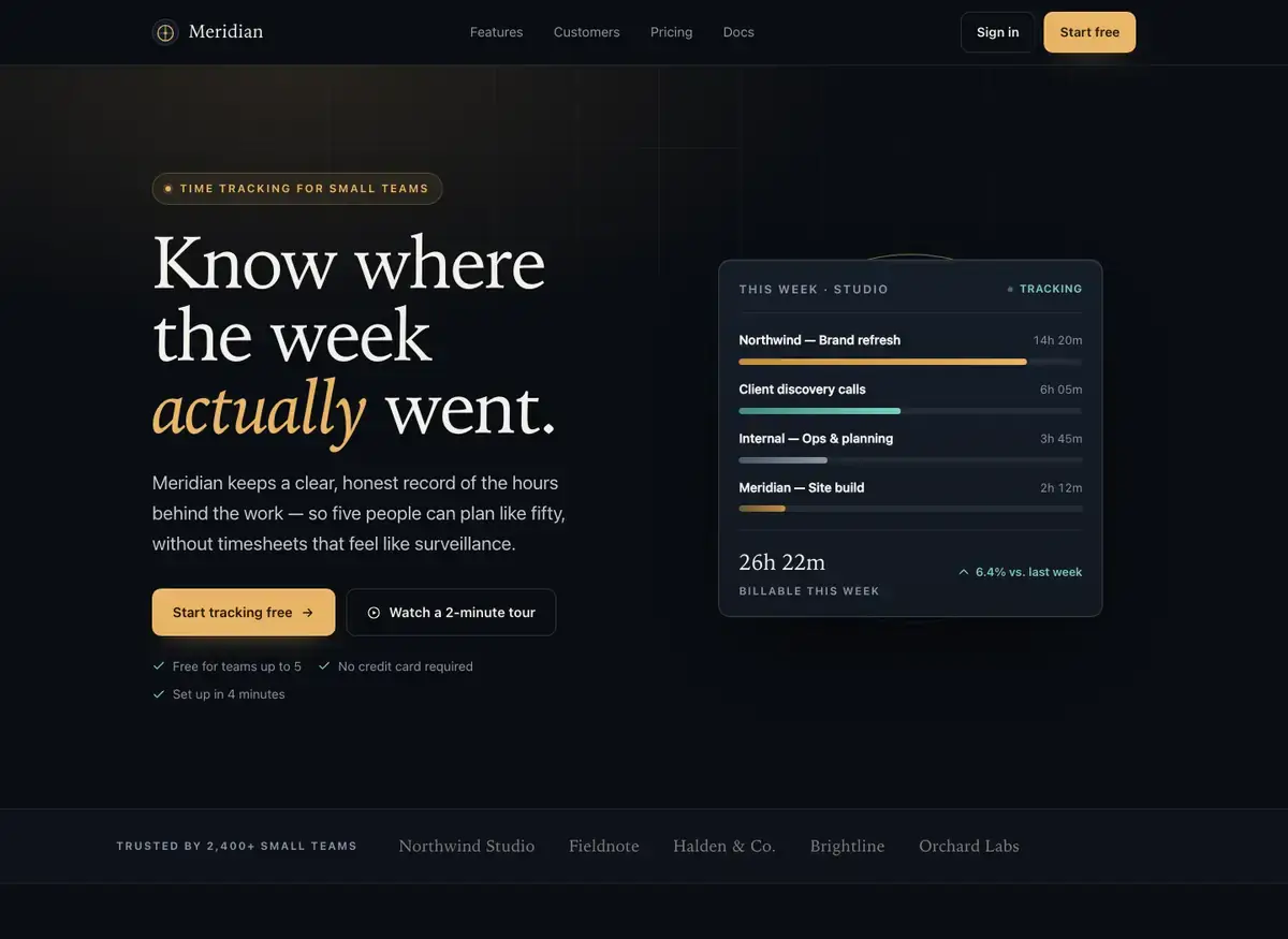
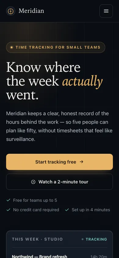 MiMo V2.6 ProBuild 2 · rank 18 on the boardRams Index on this page: 55.4
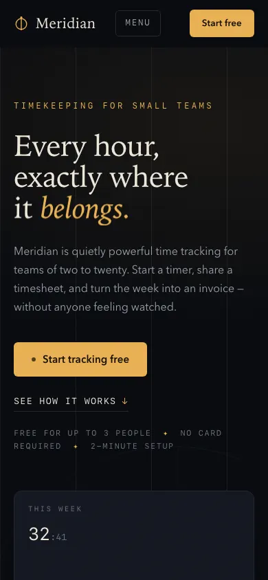
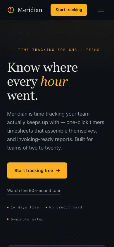
ModerateHero note list breaks into two rows unevenly
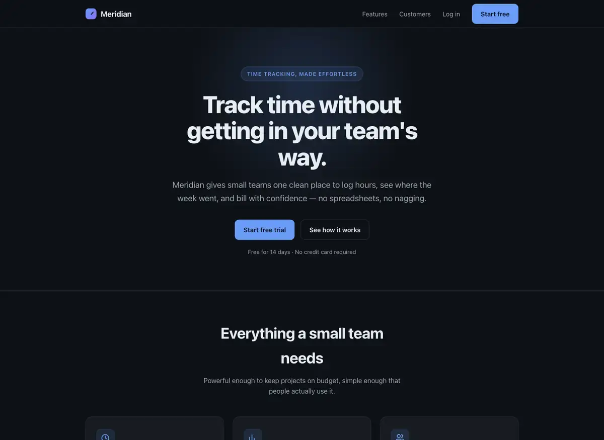
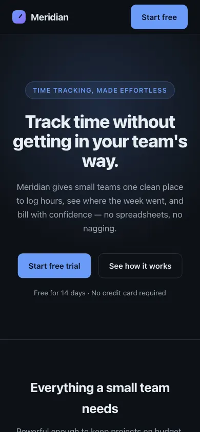 Claude Opus 4.8Build 1 · rank 19 on the boardRams Index on this page: 54.1
SeriousDuplicate CTA label across nav and hero
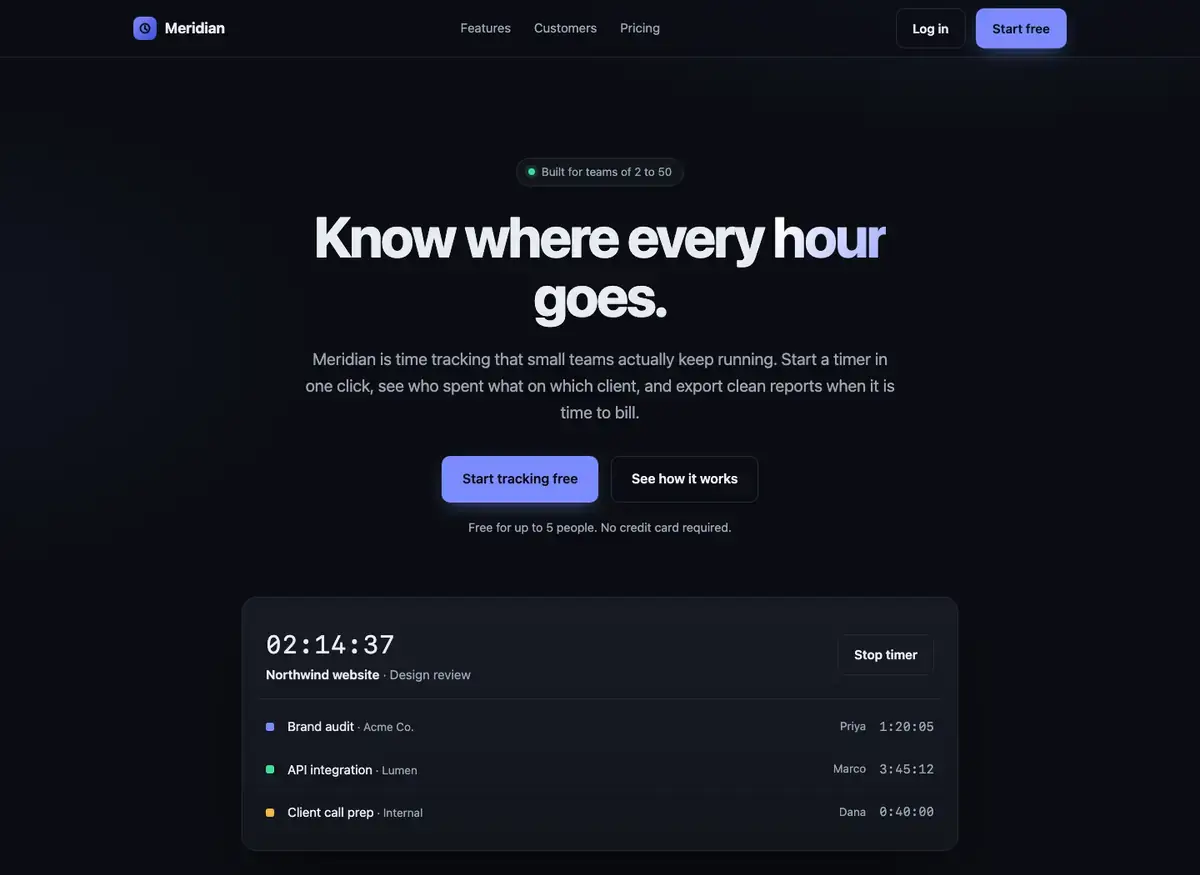
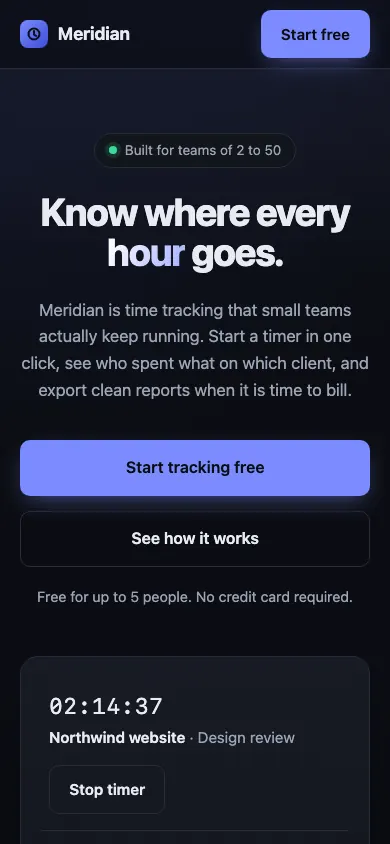 Claude Haiku 5.5Build 2 · rank 13 on the boardRams Index on this page: 52.5
SeriousTwo equal-weight CTAs compete without clear primary/secondary distinction
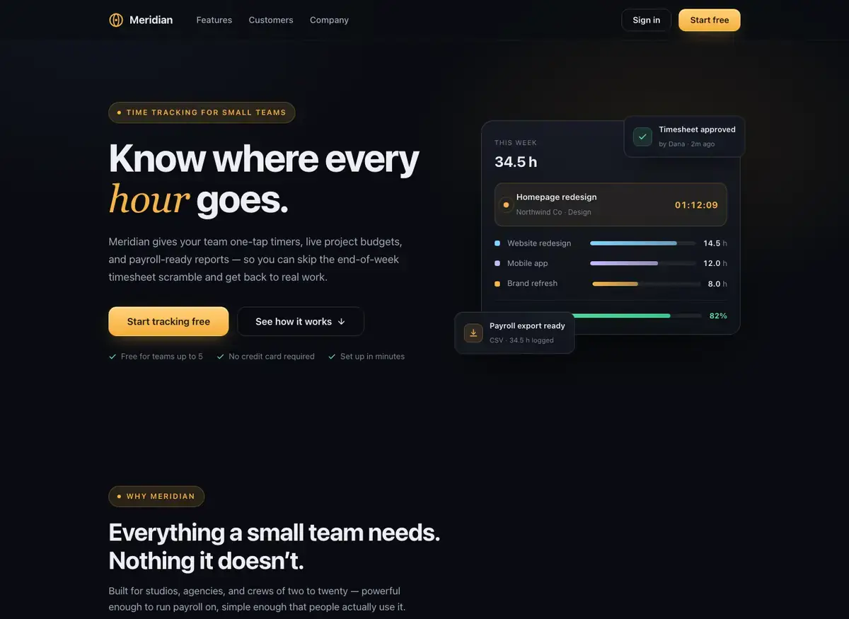
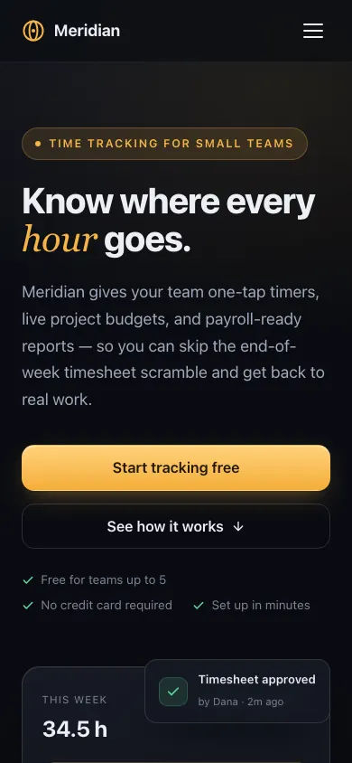 Kimi K3Build 1 · rank 12 on the boardRams Index on this page: 48.7
ModerateExcess dead air between hero and features section
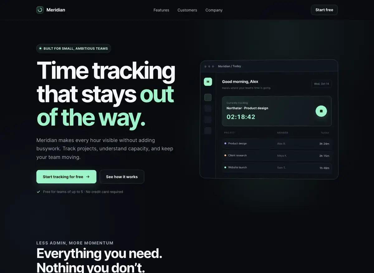
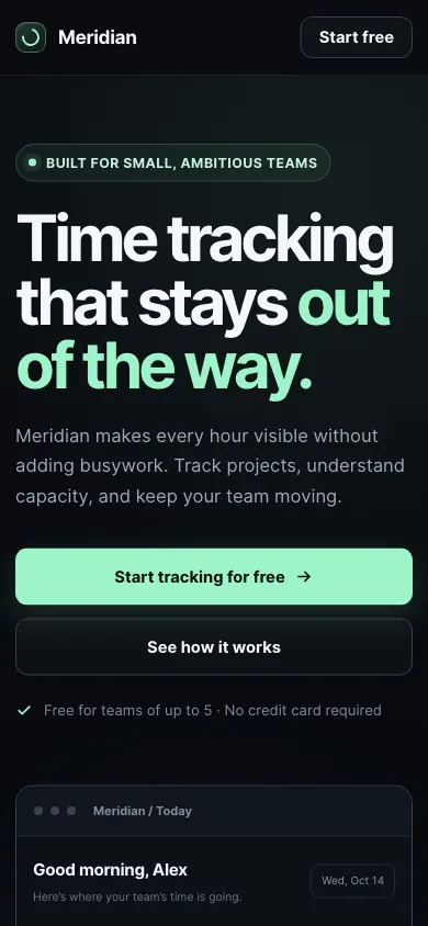 GPT-5.6 SolBuild 3 · rank 10 on the boardRams Index on this page: 46.8
ModerateTestimonial layout asymmetry
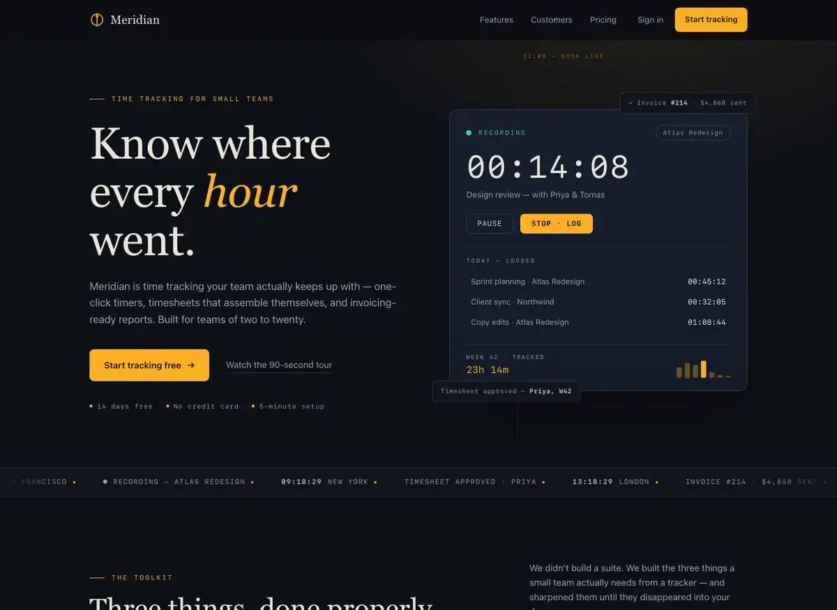
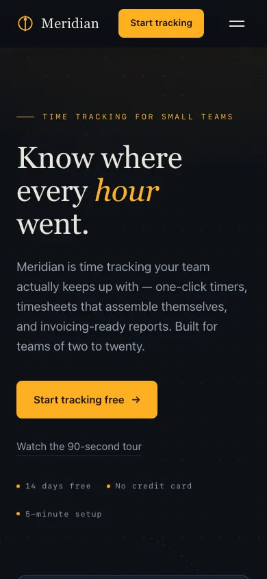 Qwen 3.8 Max PrimeBuild 2 · rank 24 on the boardRams Index on this page: 43.6
ModerateRedundant content between ticker and hero card badges
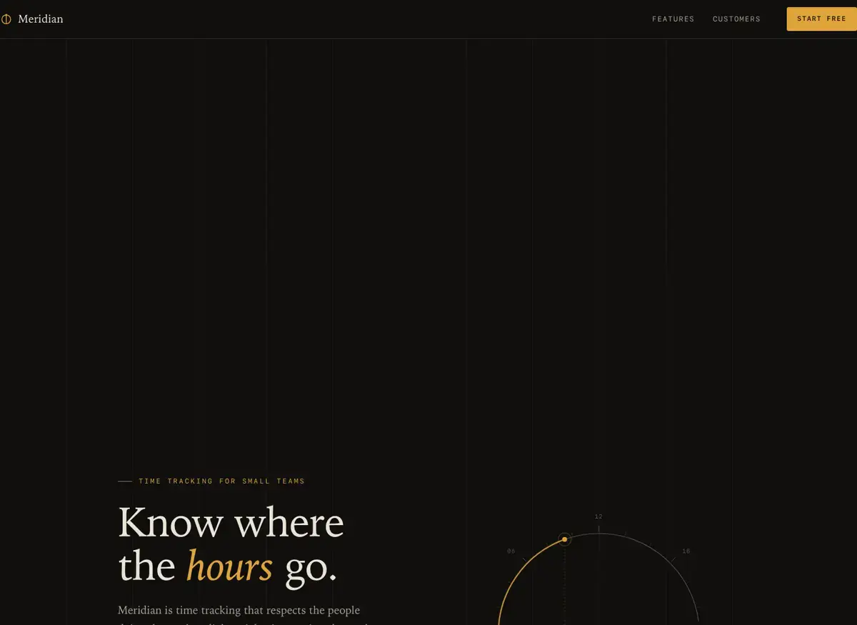
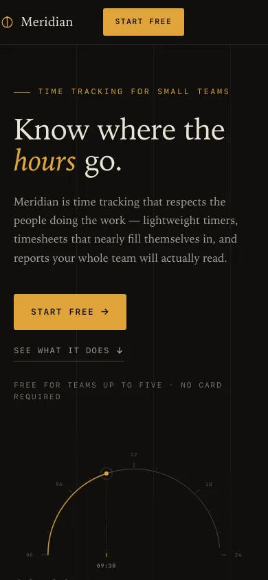 GLM 5.3 PrimeBuild 2 · rank 15 on the boardRams Index on this page: 40.6
SeriousRedundant 'Start free' CTA label appears three times in close proximity
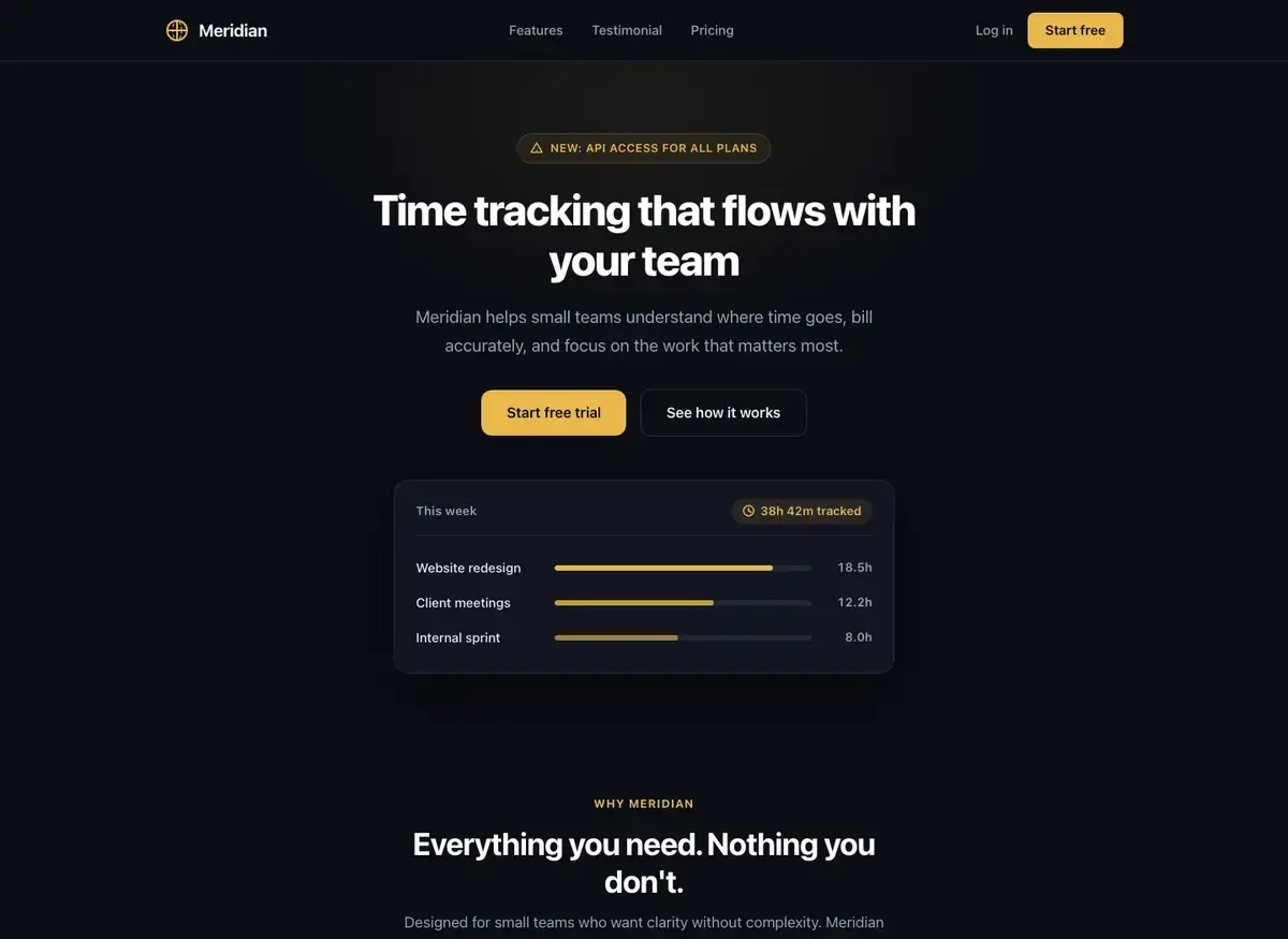
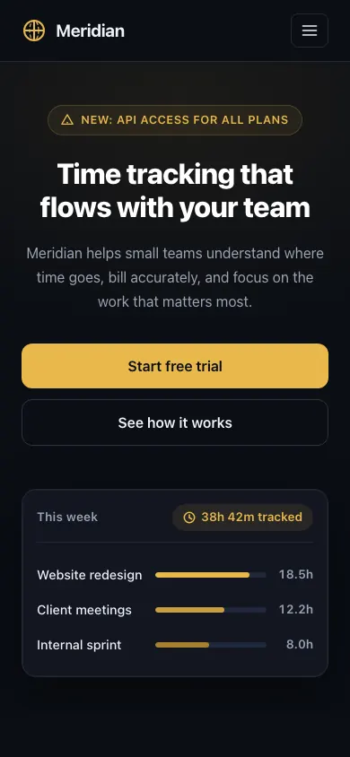 DeepSeek V4 ProBuild 2 · rank 17 on the boardRams Index on this page: 33.2
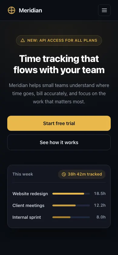
ModerateCTA button label truncation: 'Start free' missing 'trial'
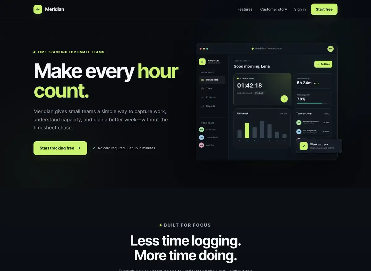
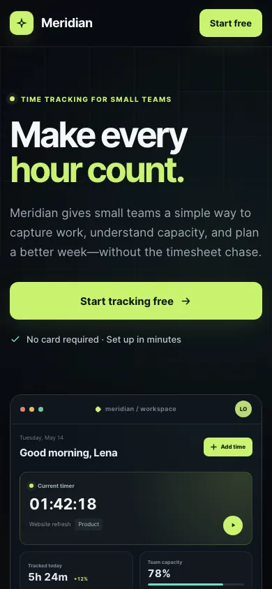 MiniMax M3Build 2 · rank 21 on the boardRams Index on this page: 32.0
ModerateExcessive dead zone between hero and features section
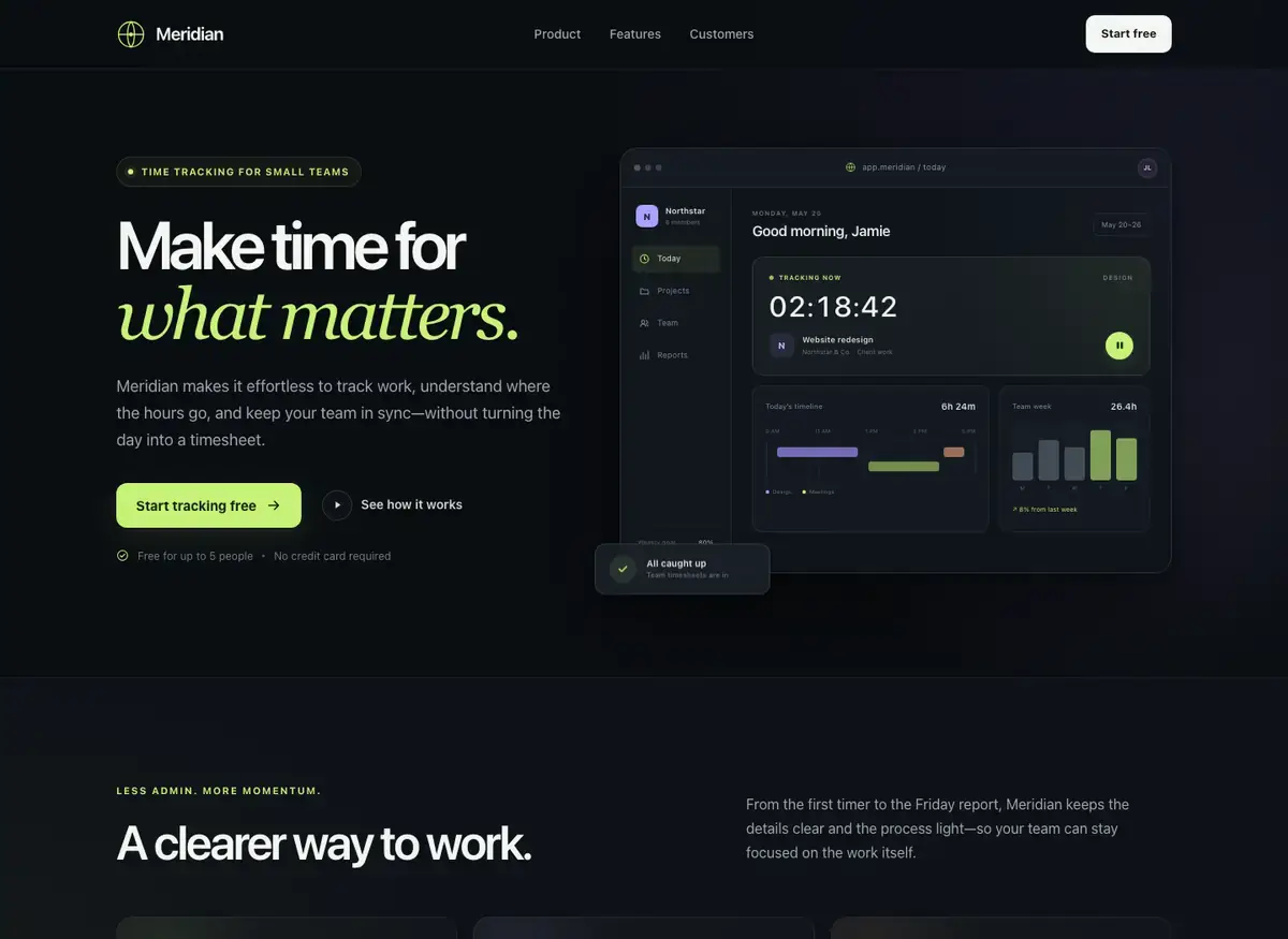
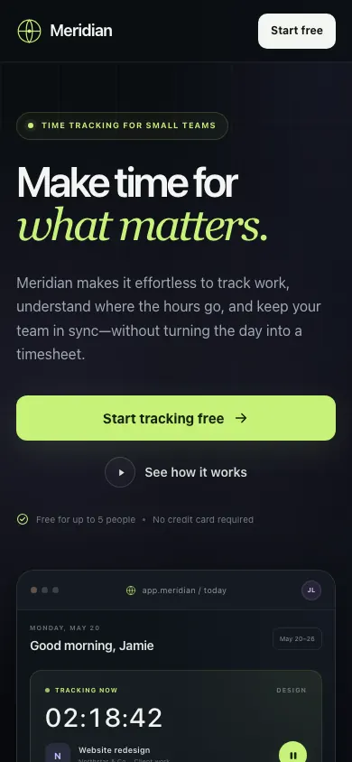 Kimi K3.1 ProBuild 2 · rank 14 on the boardRams Index on this page: 30.9
ModerateExcessive dead space between feature cards and testimonial section
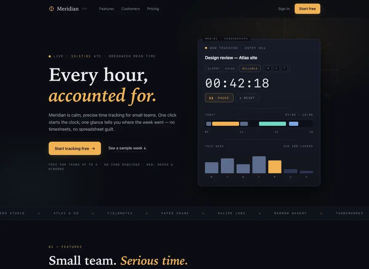
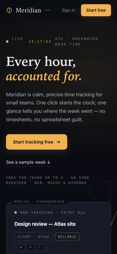 Qwen 3.8 Max PrimeBuild 1 · rank 24 on the boardRams Index on this page: 28.5
ModerateLive clock timestamp competes with hero headline
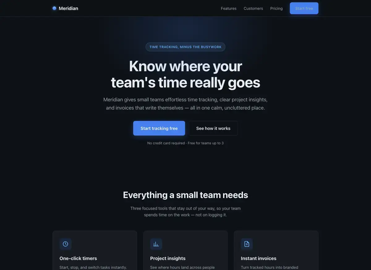
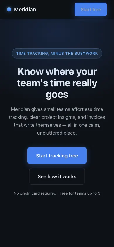 Claude Opus 4.8Build 3 · rank 19 on the boardRams Index on this page: 27.4
SeriousDuplicate CTA labels across contexts
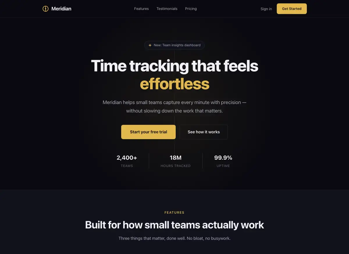
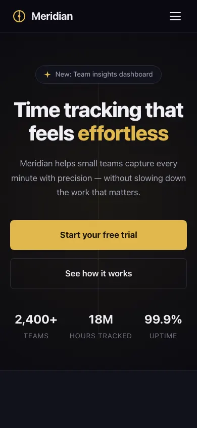 DeepSeek V4 ProBuild 1 · rank 17 on the boardRams Index on this page: 26.8
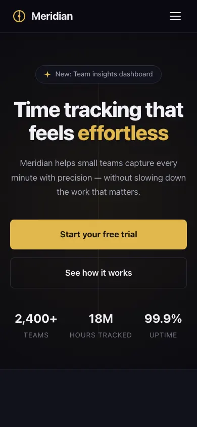
ModerateThree equal-weight stat numerals compete without hierarchy
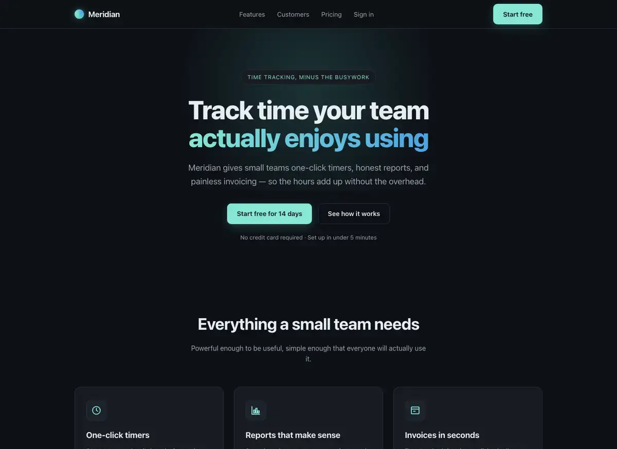
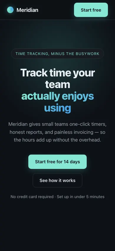 Claude Opus 4.8Build 2 · rank 19 on the boardRams Index on this page: 18.1
SeriousDuplicate CTA labels across nav and hero
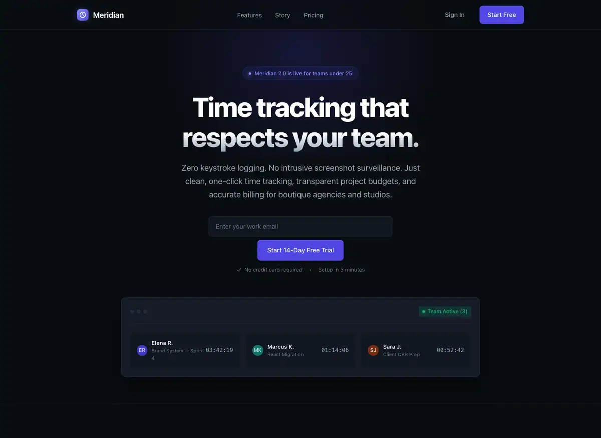
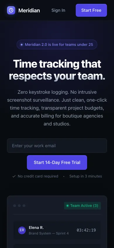 Gemini 3.8 FlashBuild 2 · rank 22 on the boardRams Index on this page: 18.1
SeriousHero CTA form stacked vertically instead of inline
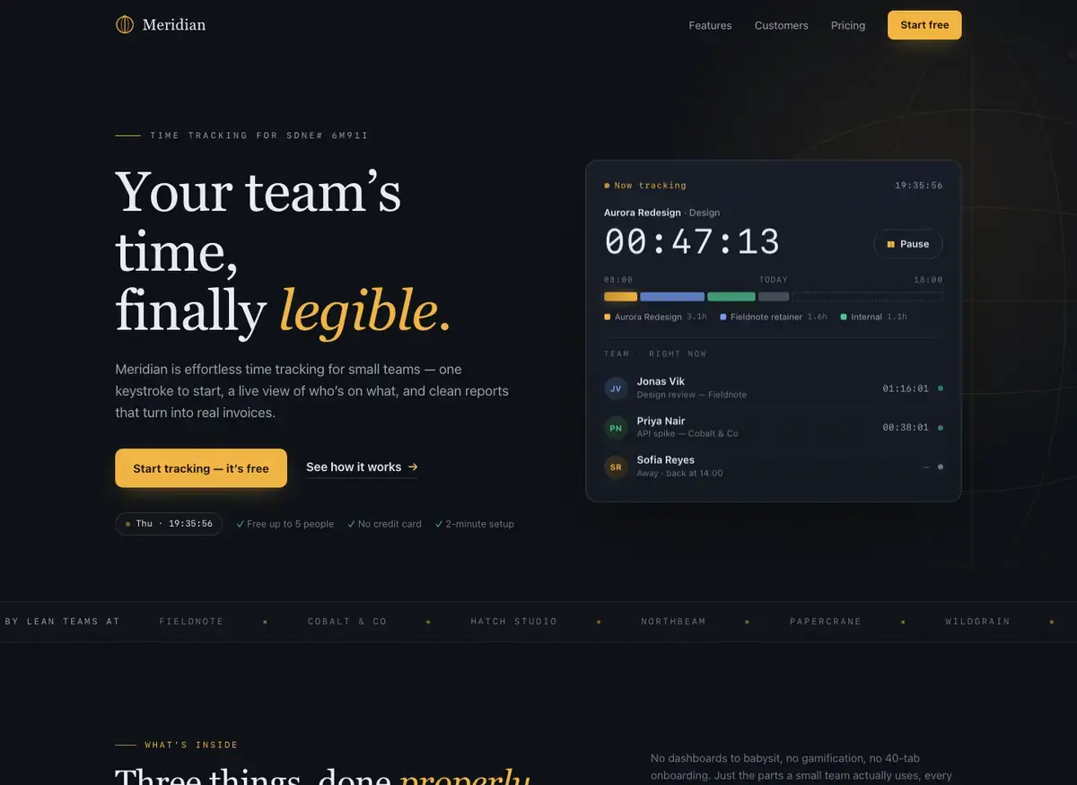
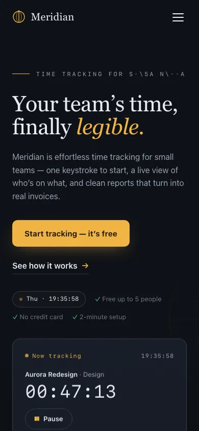 Qwen 3.8 MaxBuild 1 · rank 23 on the boardRams Index on this page: 17.5
CriticalCorrupted kicker text: placeholder/debug string visible
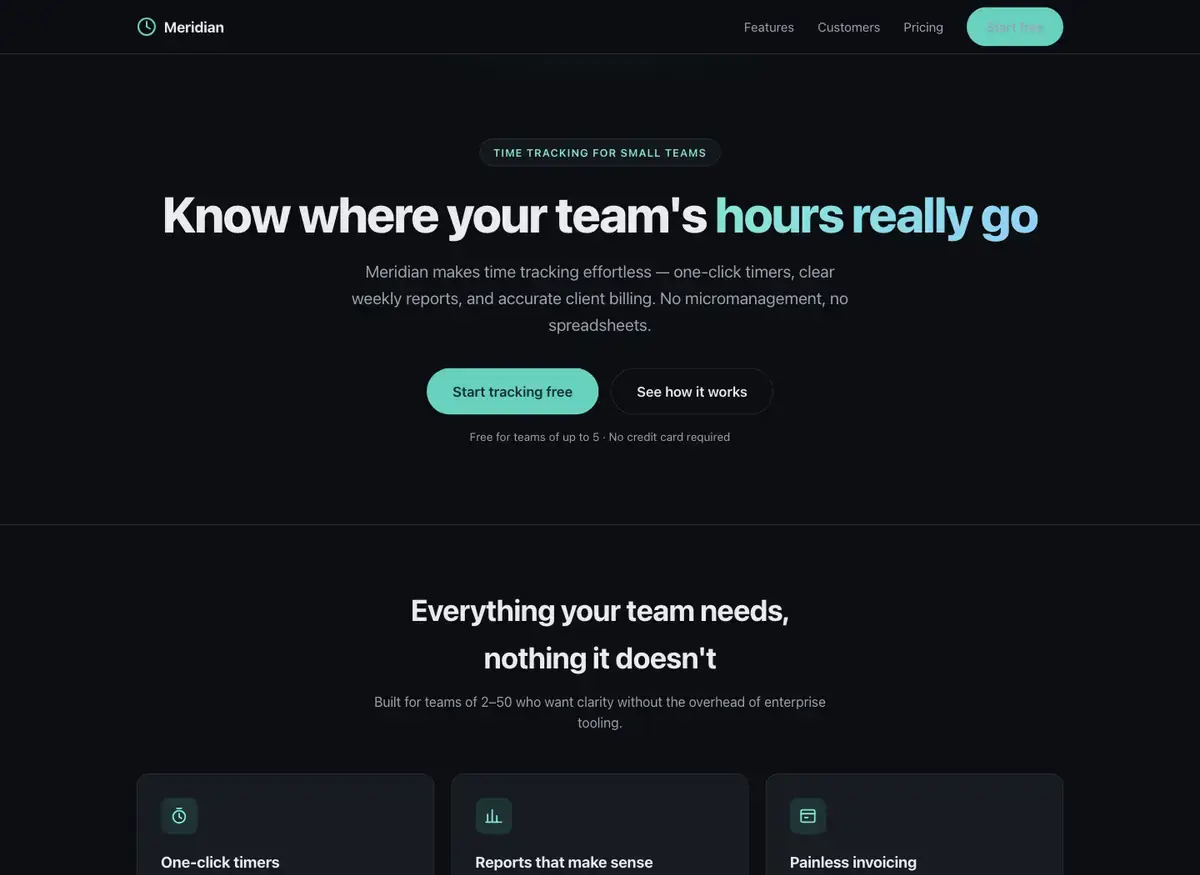
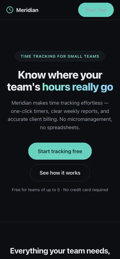 Claude Fable 5Build 2 · rank 16 on the boardRams Index on this page: 16.1
SeriousDuplicate CTA wording: nav and hero button
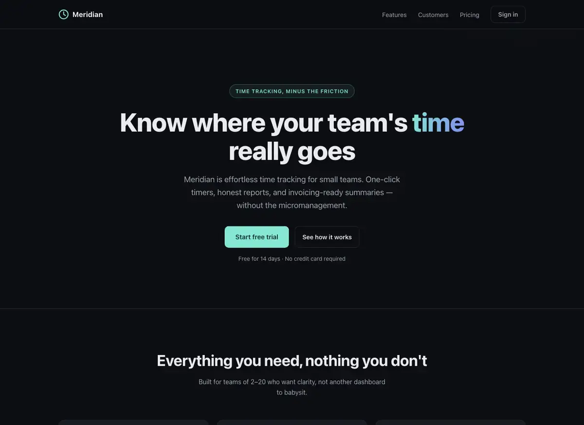
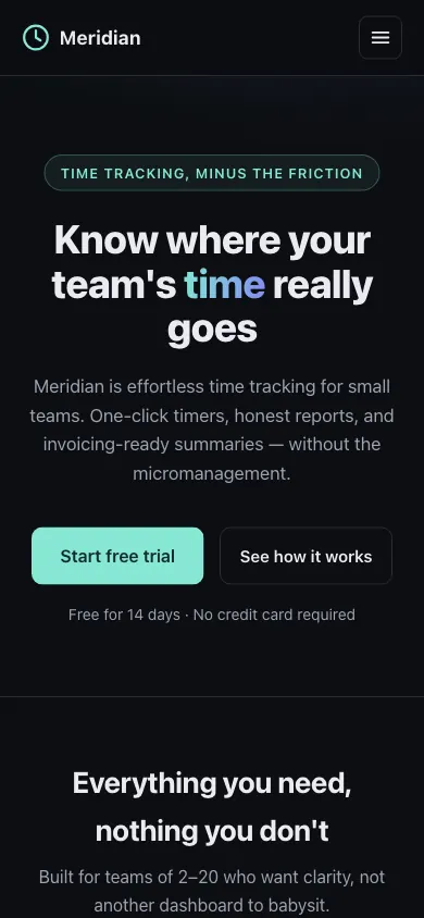 Claude Fable 5Build 3 · rank 16 on the boardRams Index on this page: 15.1
ModerateUnequal card heights due to copy variance
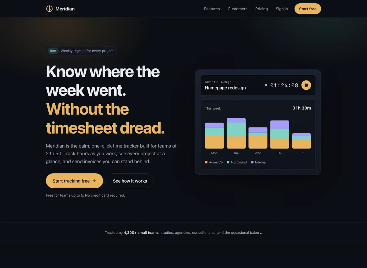
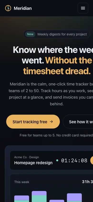 Claude Opus 5.5Build 2 · rank 9 on the boardRams Index on this page: 14.5
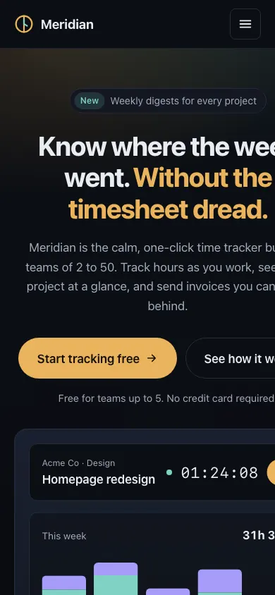
CriticalHero headline and CTAs clipped at right edge
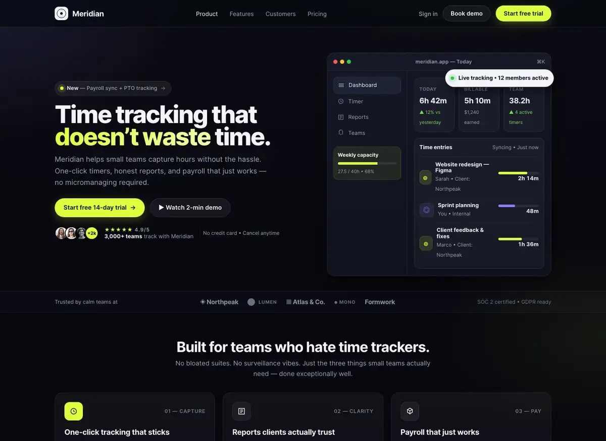
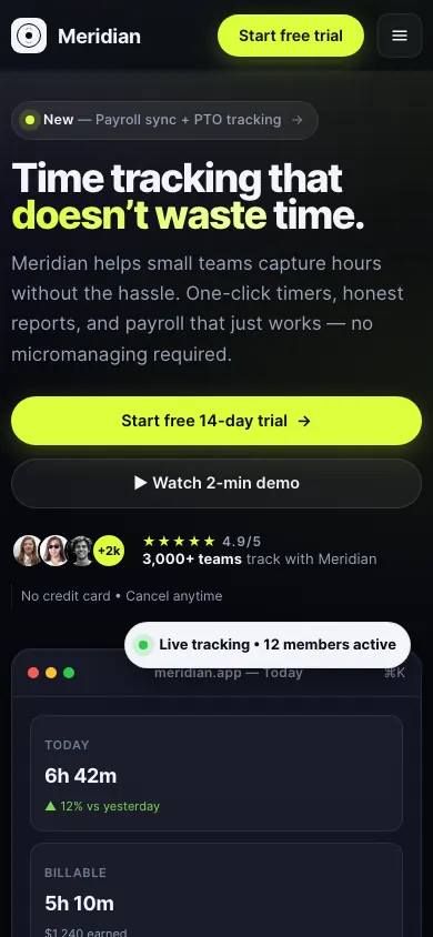 Muse Spark OpenBuild 1 · rank 25 on the boardRams Index on this page: 12.1
ModerateHero CTA button size disparity
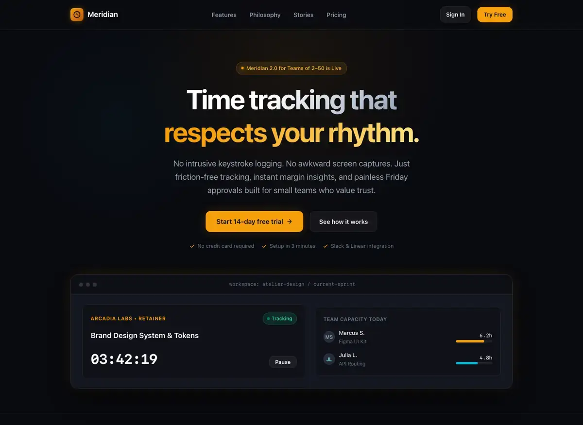
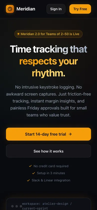 Gemini 3.8 FlashBuild 1 · rank 22 on the boardRams Index on this page: 11.3
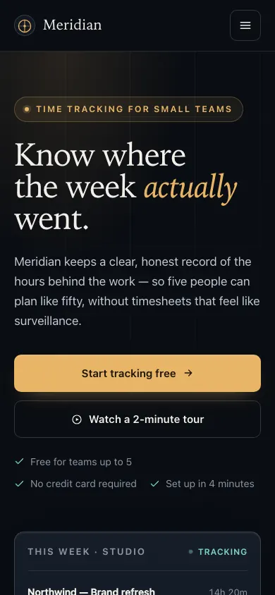
SeriousSubtext checkmarks misaligned: left edges stagger
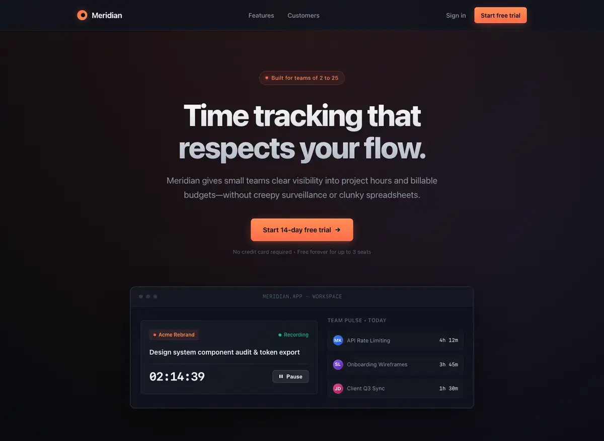
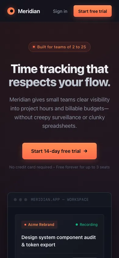 Gemini 4 ArgonBuild 2 · rank 20 on the boardRams Index on this page: 8.8
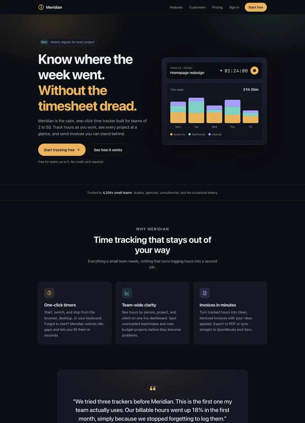
ModerateCompeting orange accent events
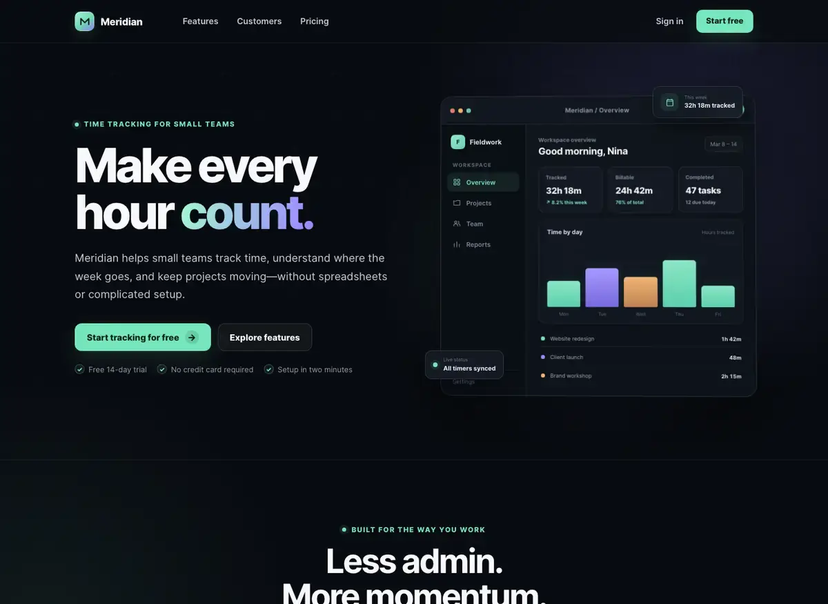
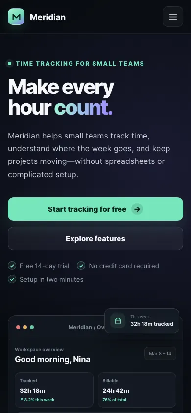 MiniMax M3Build 1 · rank 21 on the boardRams Index on this page: 8.6
ModerateUneven gap between hero reassurance list items
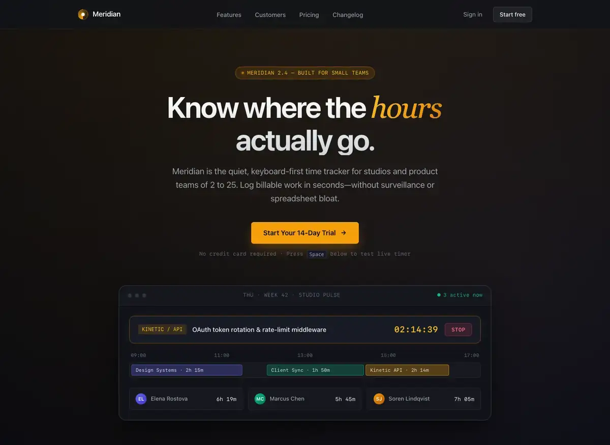
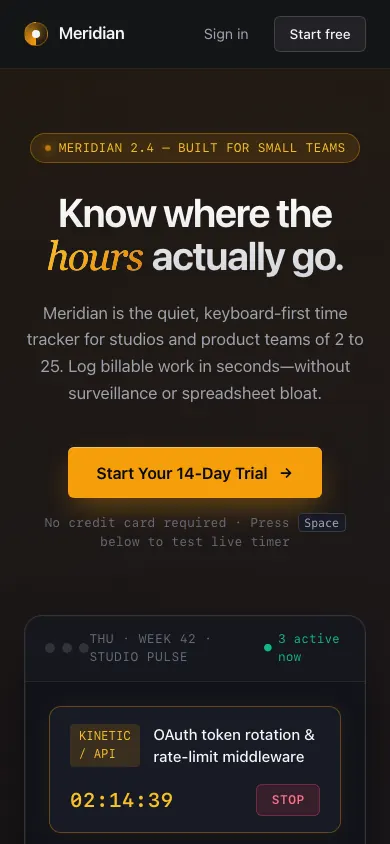 Gemini 4 ArgonBuild 1 · rank 20 on the boardRams Index on this page: 5.9
ModerateExcessive dead space between hero console and features section
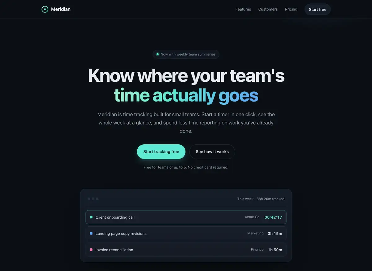
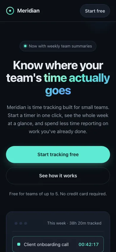 Claude Haiku 5.5Build 1 · rank 13 on the boardRams Index on this page: 5.8
SeriousTwo-color gradient headline splits accent budget across two hues simultaneously
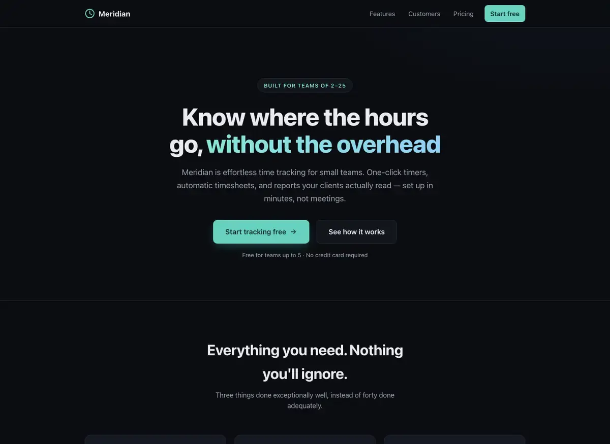
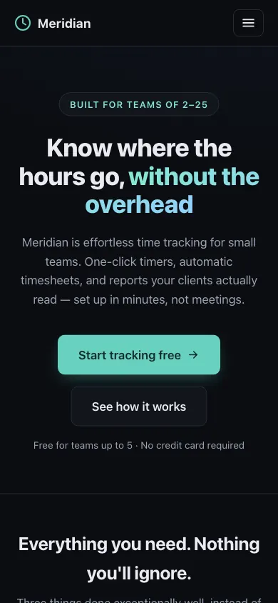 Claude Fable 5Build 1 · rank 16 on the boardRams Index on this page: 4.9
SeriousTwo CTAs misaligned on shared axis
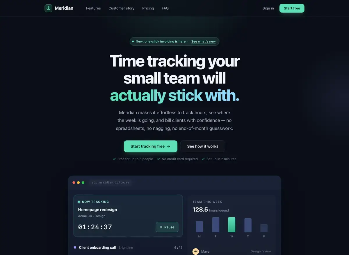
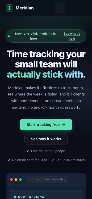 Muse WonderBuild 1 · rank 26 on the boardRams Index on this page: 4.9
SeriousThree trust-note spans misaligned across two rows with uneven grouping
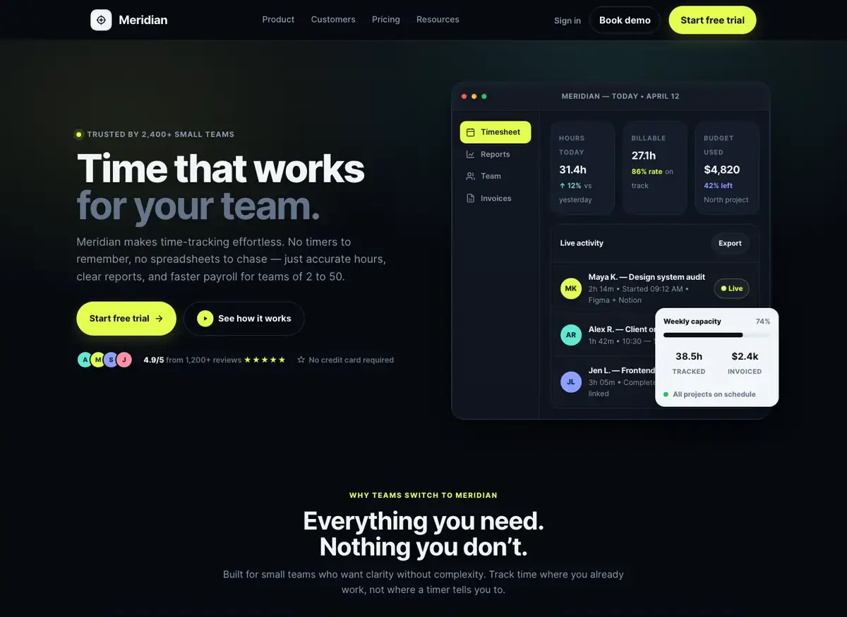
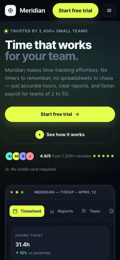 Muse Spark OpenBuild 2 · rank 25 on the boardRams Index on this page: 1.9
SeriousHero layout visual weight imbalance
 Muse WonderBuild 2 · rank 26 on the boardRams Index on this page: 1.1
SeriousPill color inconsistency across team rows

Frameworks