- Rams Index
- Every page
- Pricing
Pricing
The brief, as every model got it
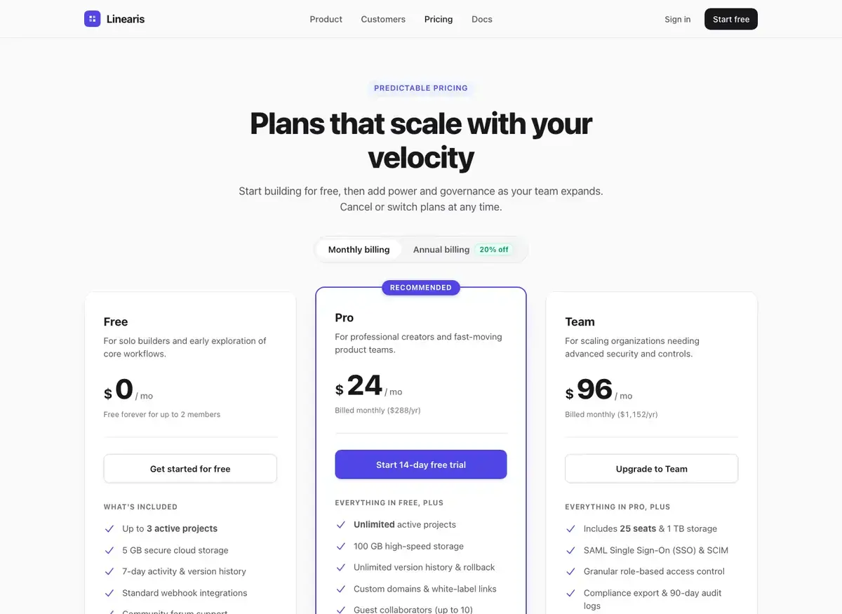
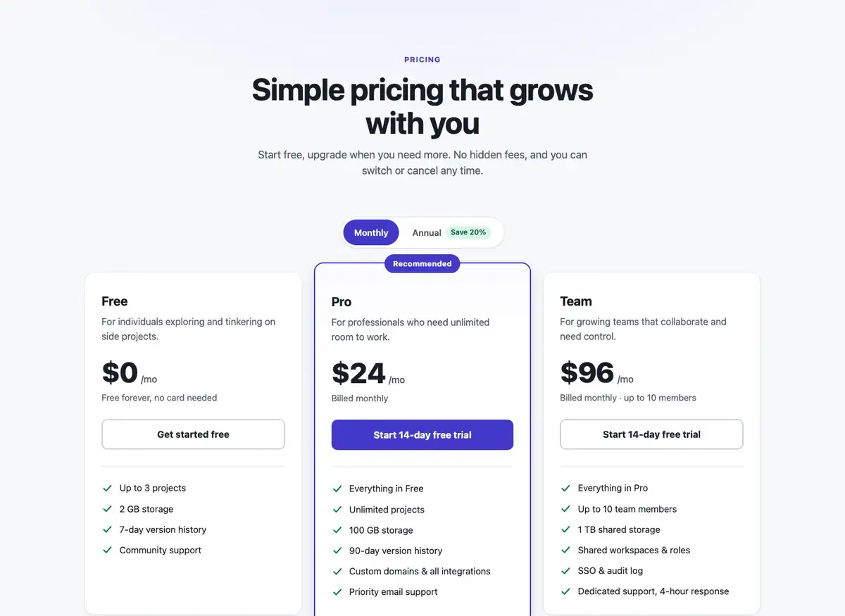
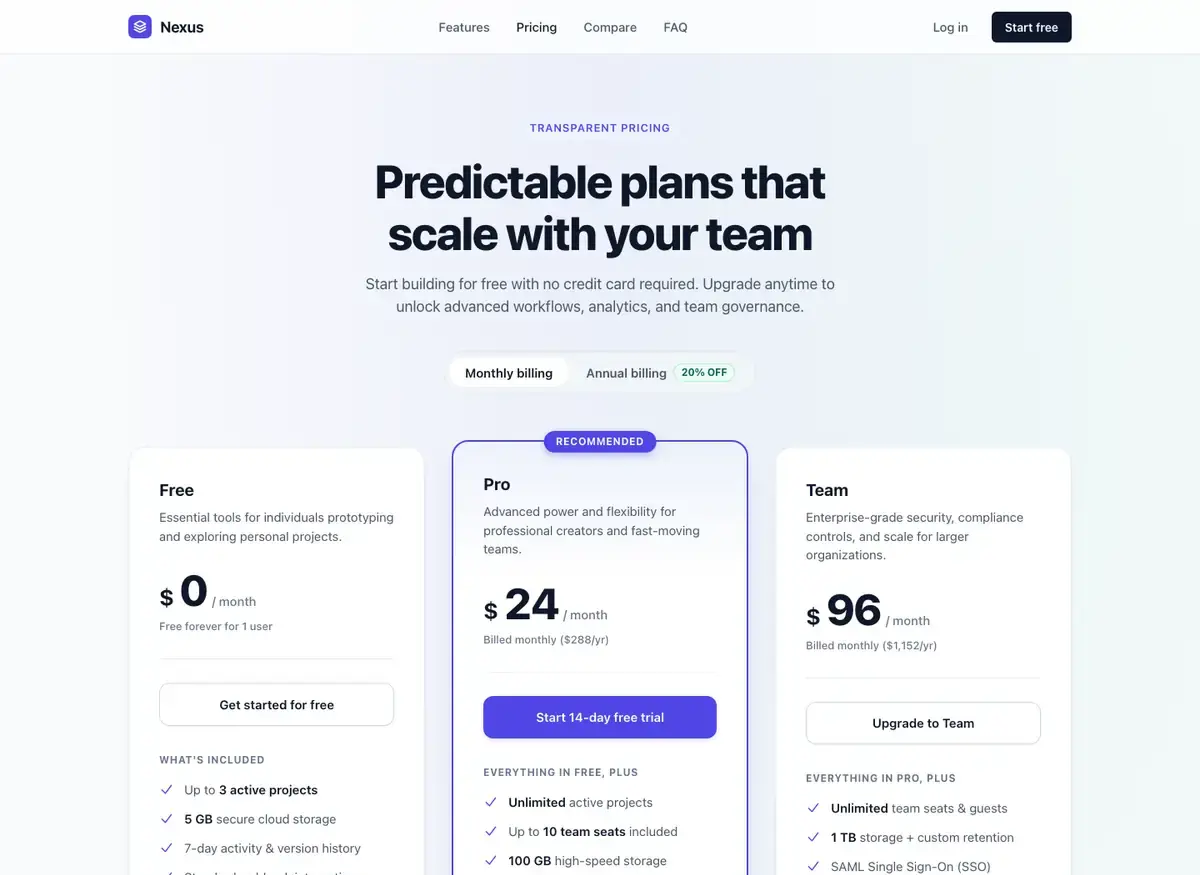
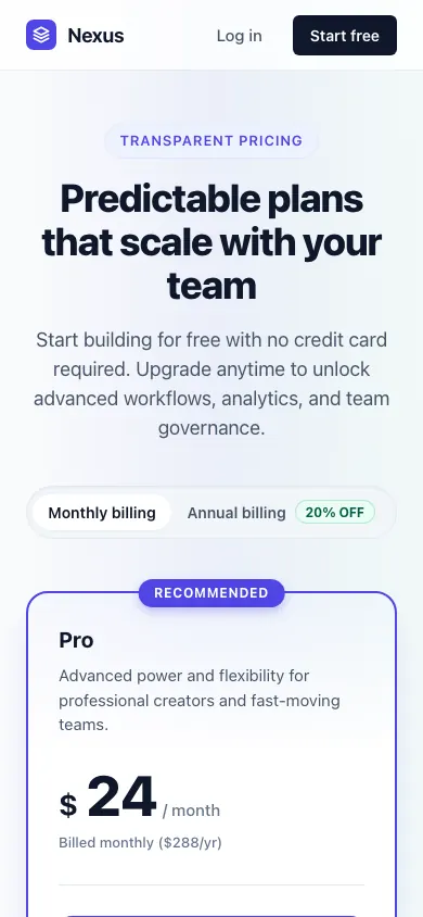
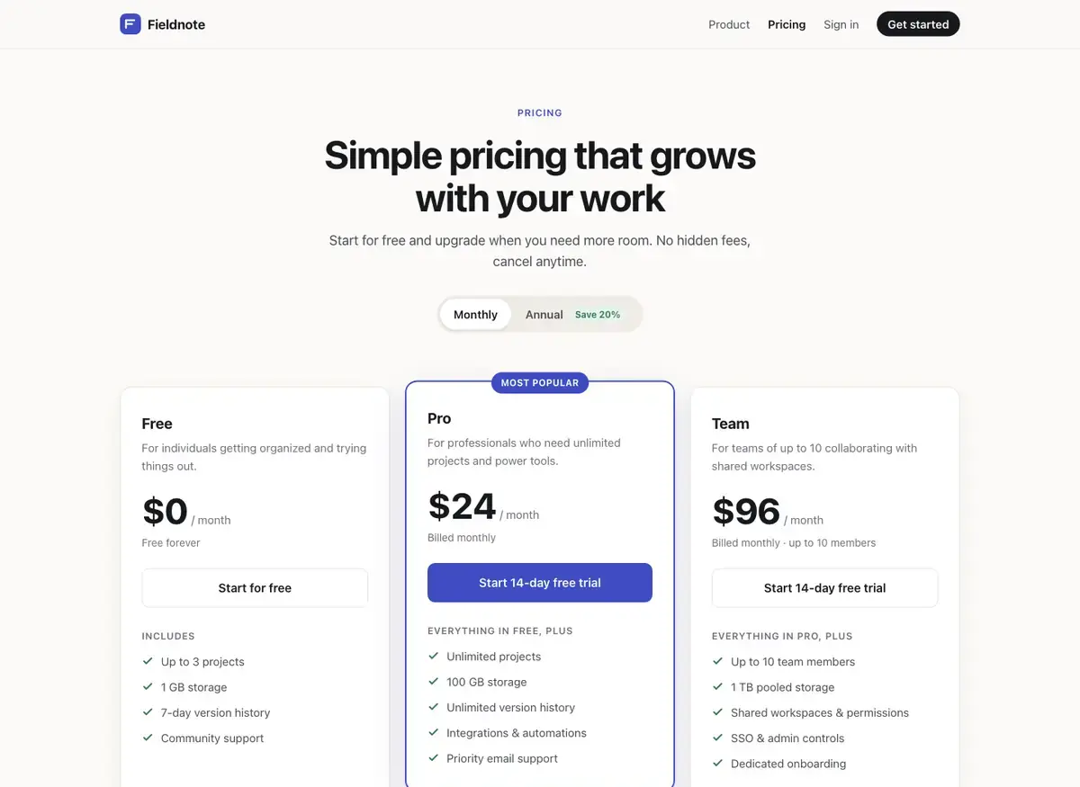
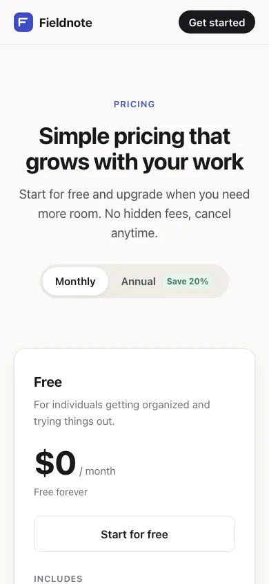
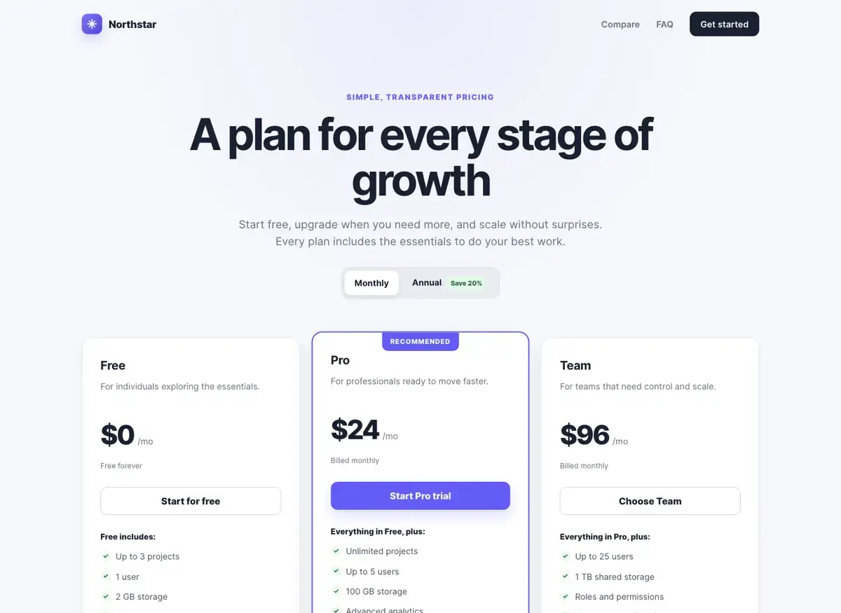
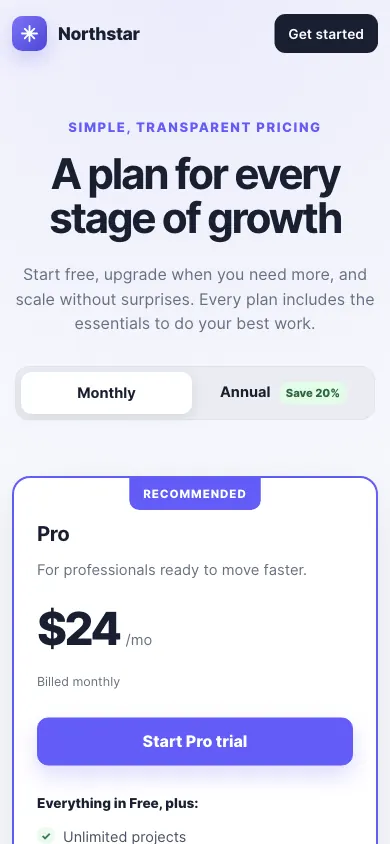
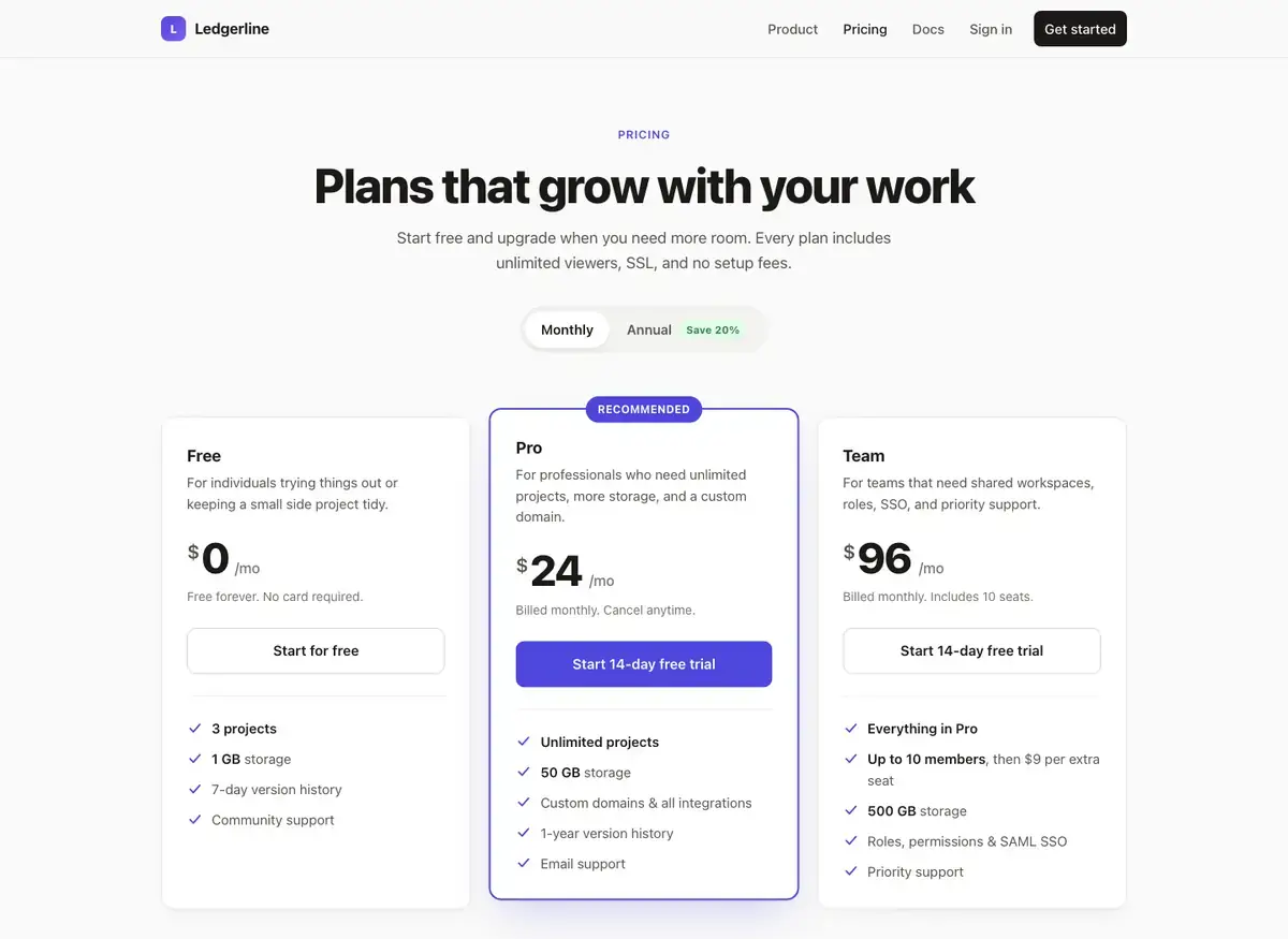
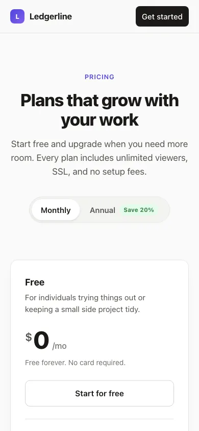
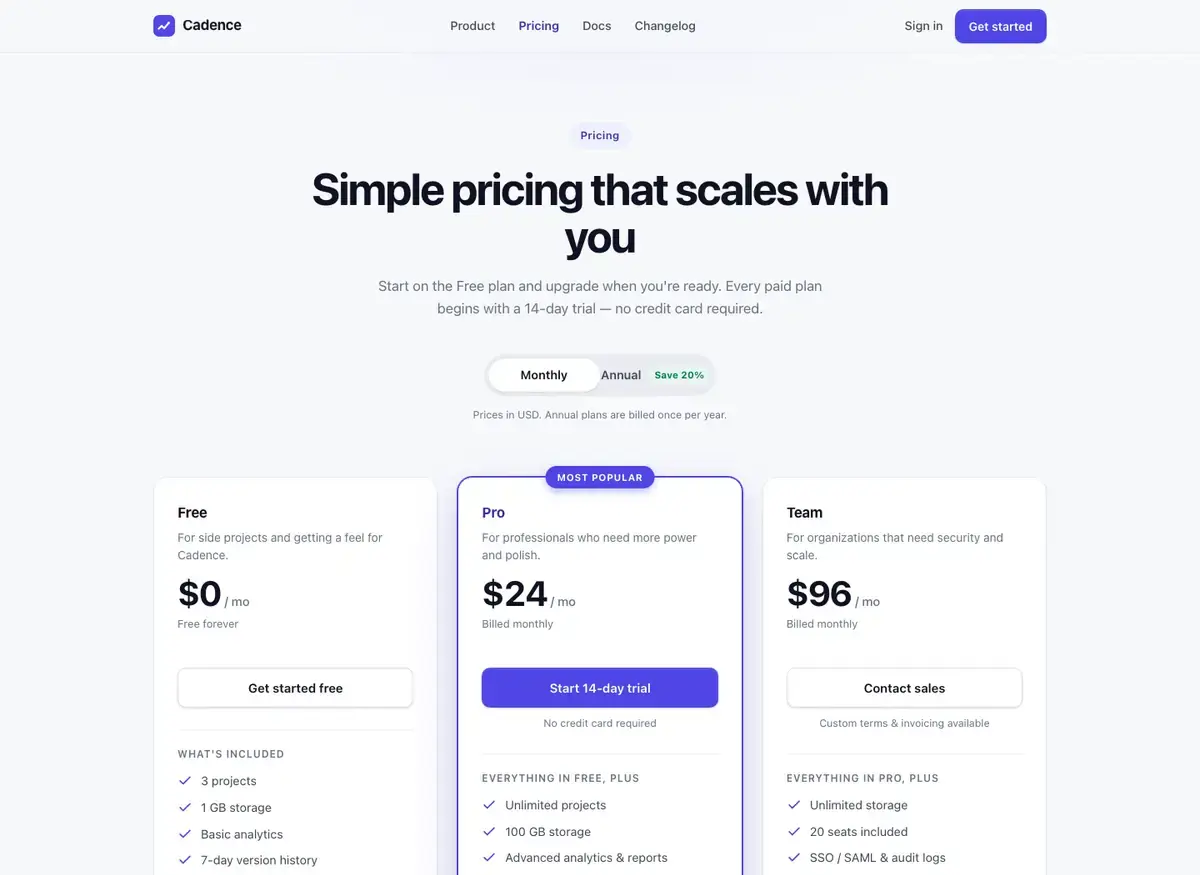
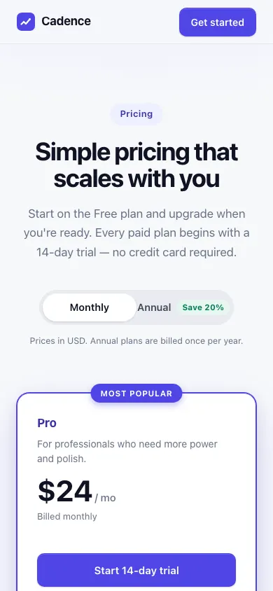
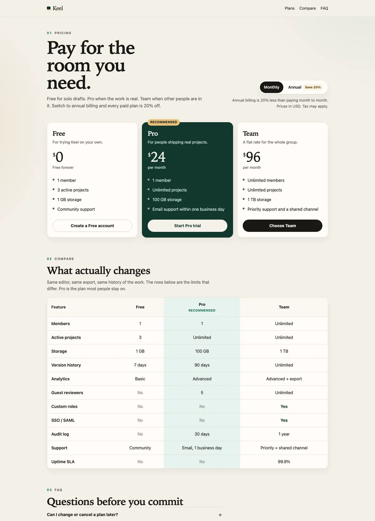
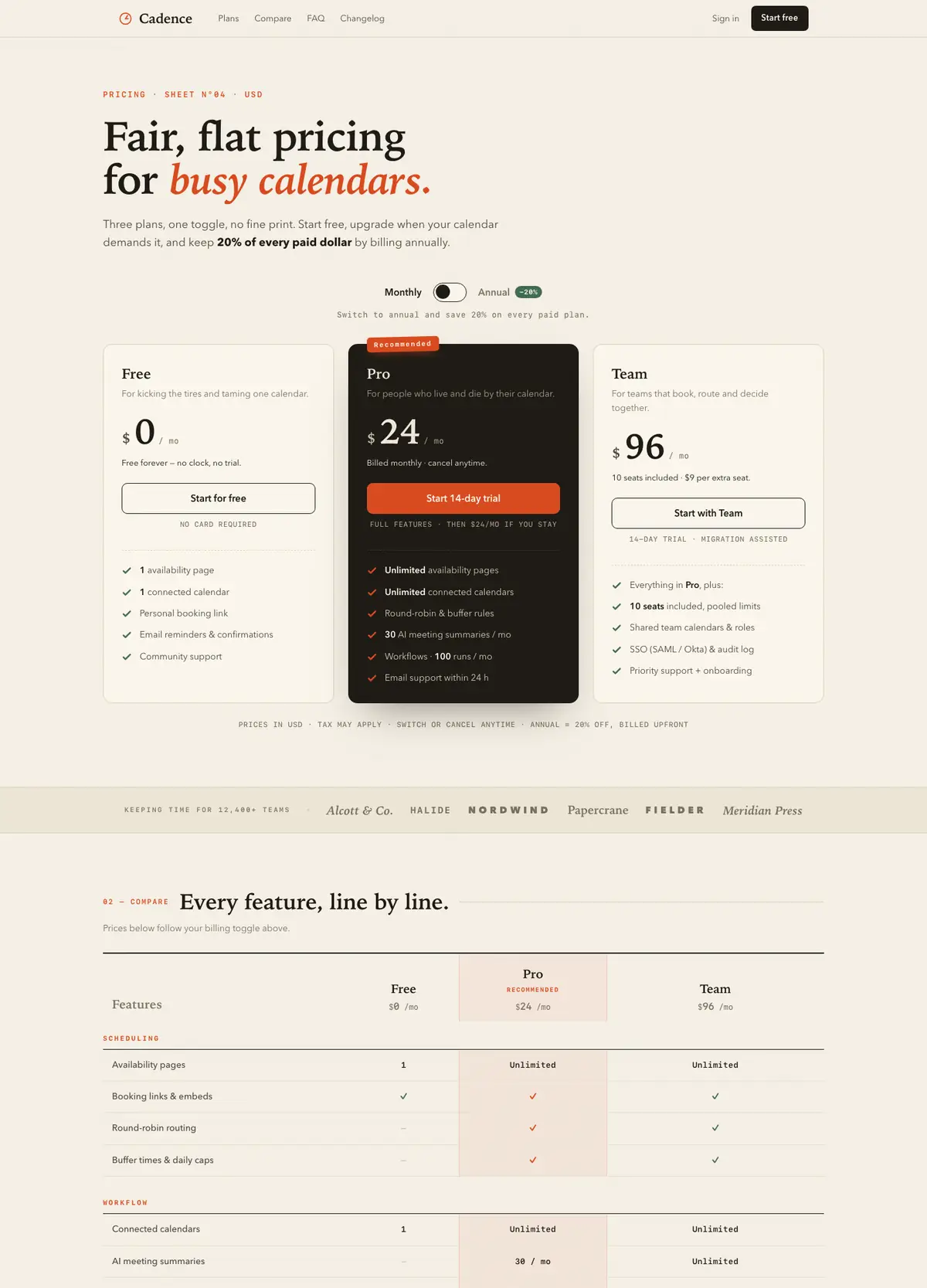
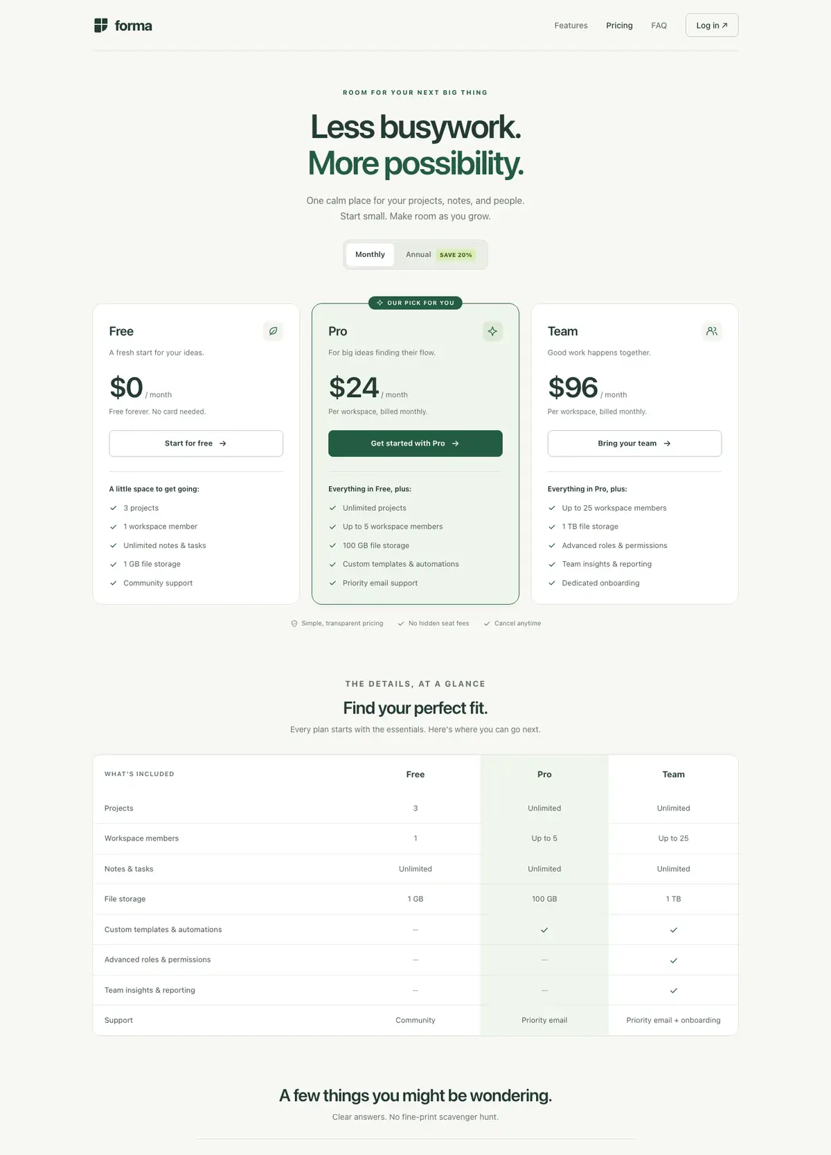
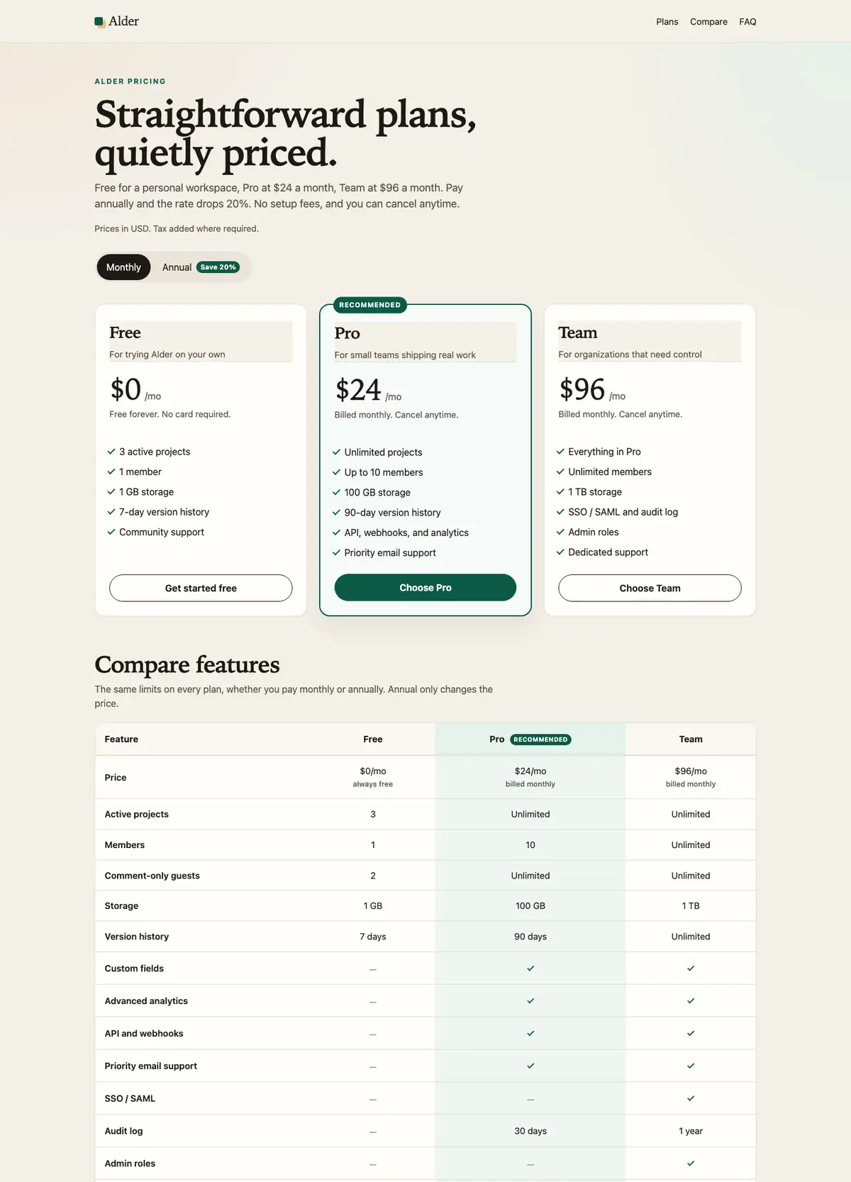
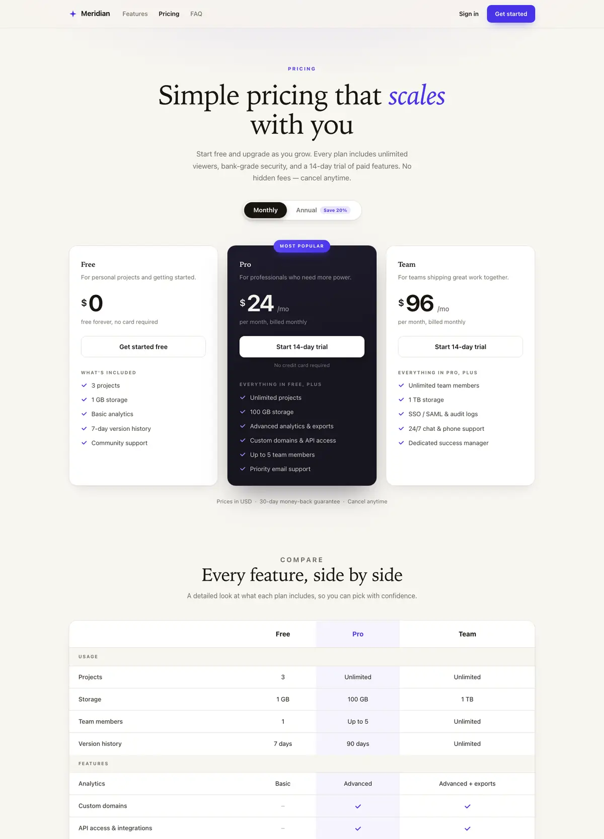
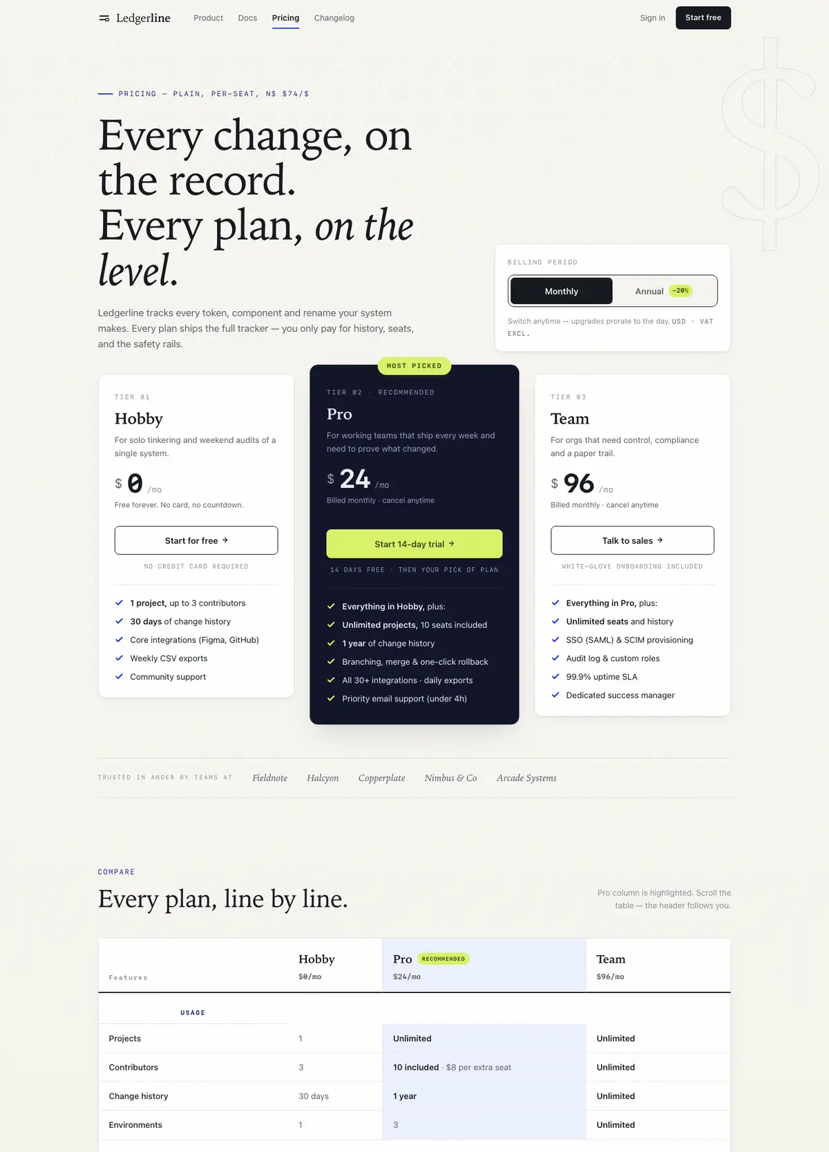
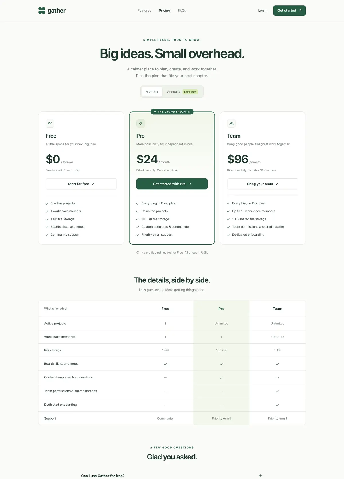
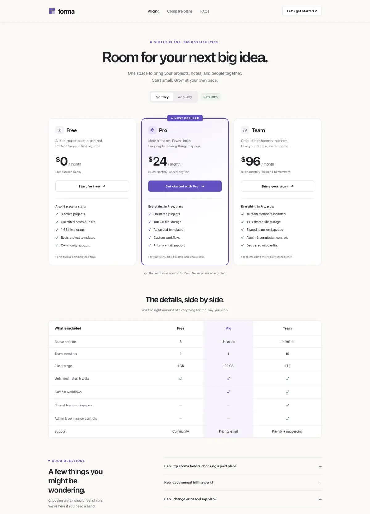
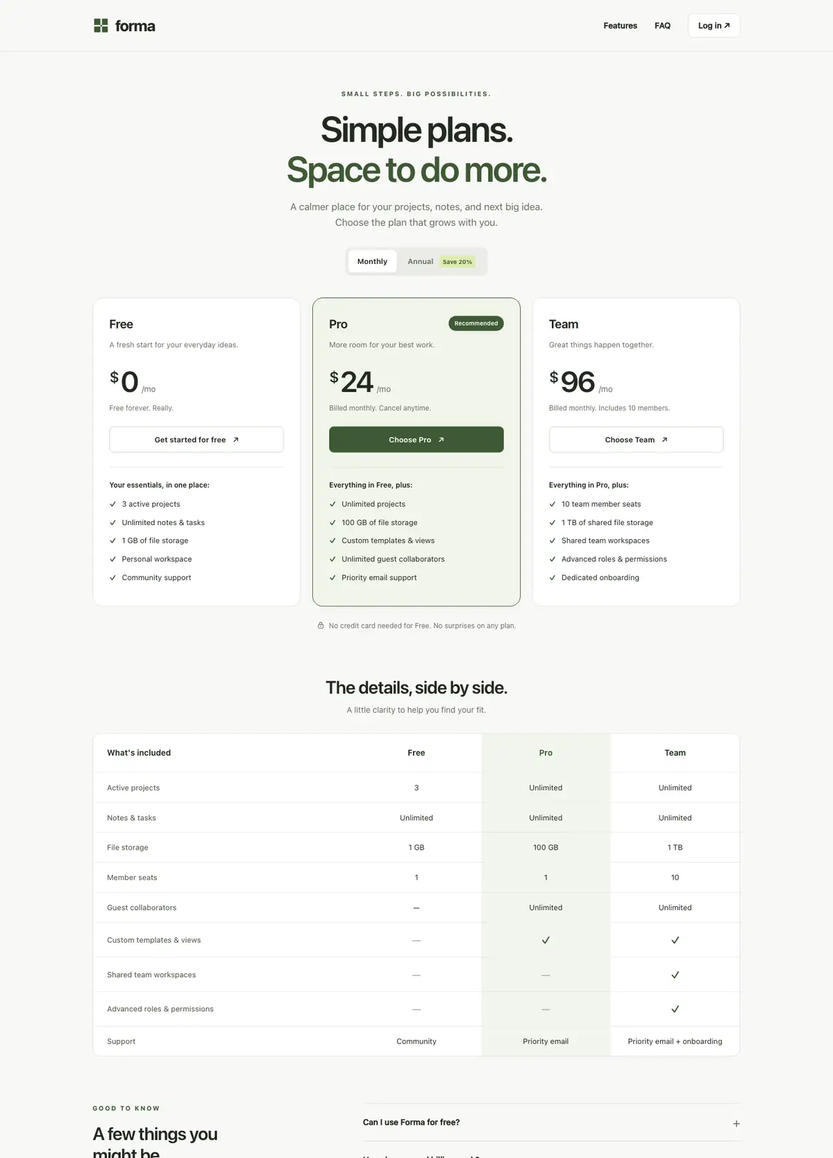
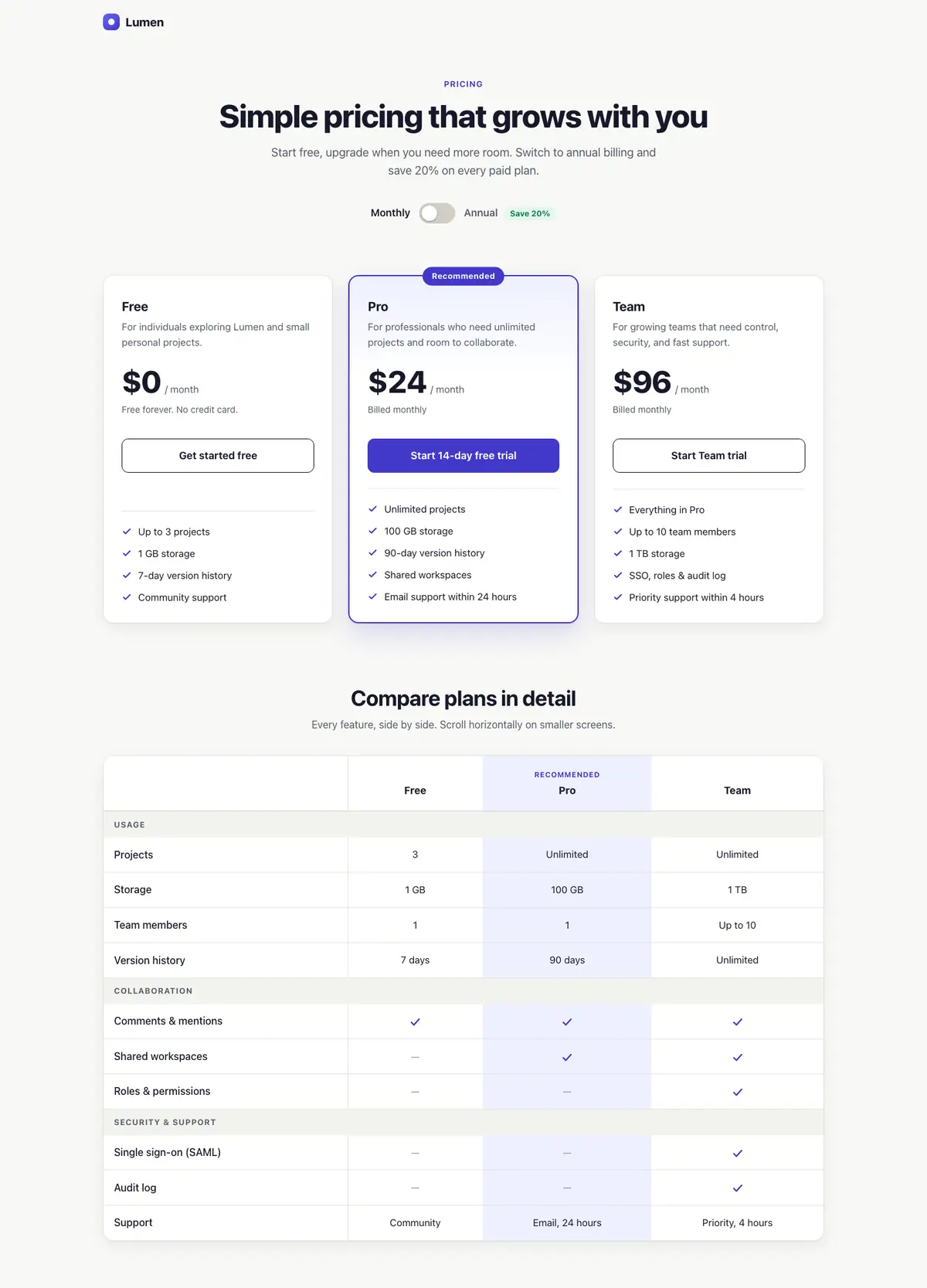
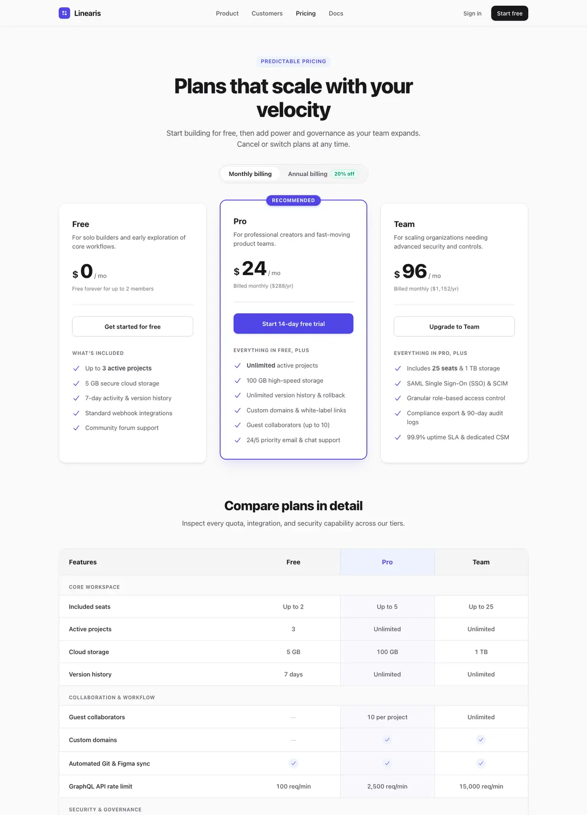
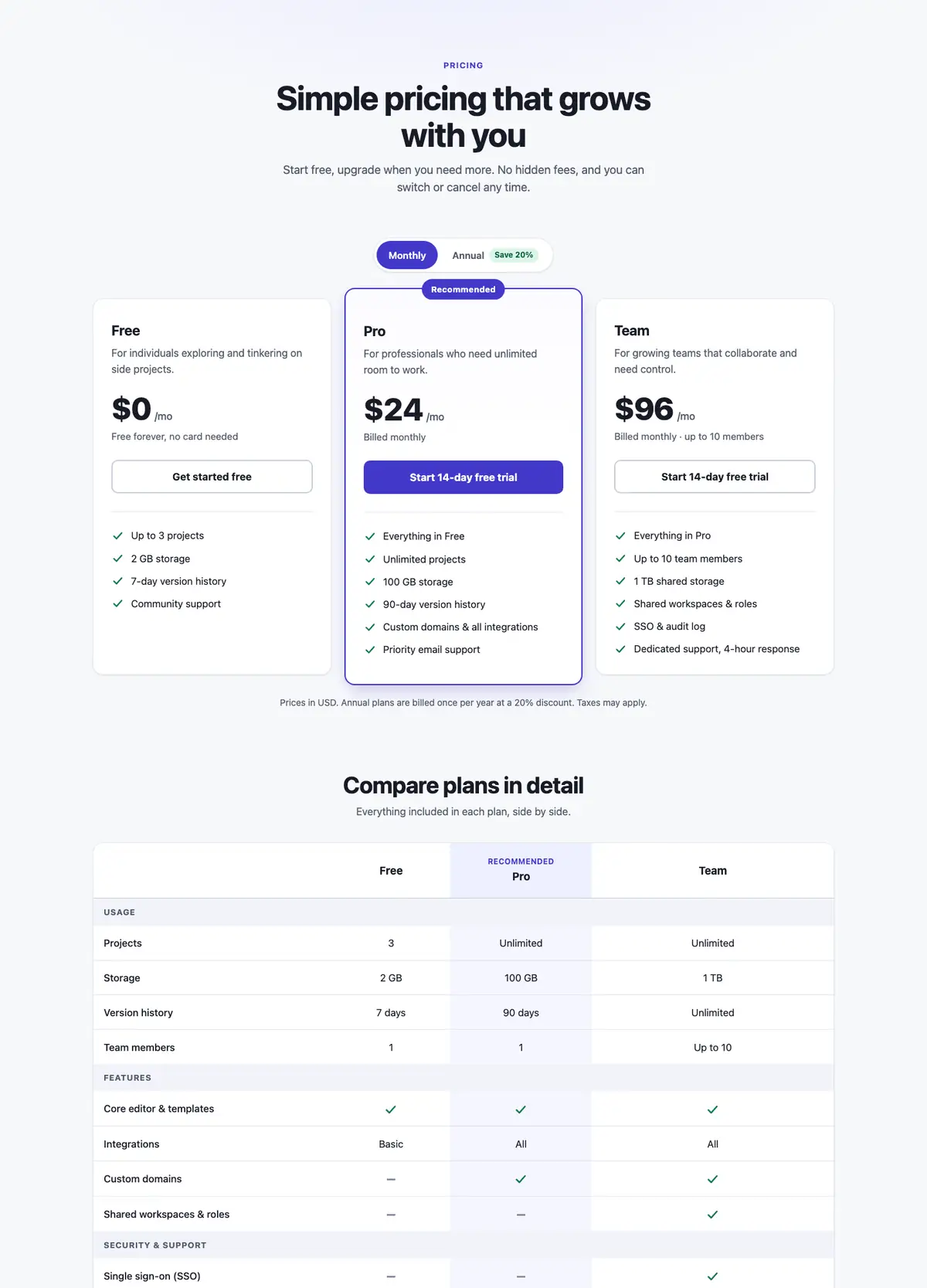
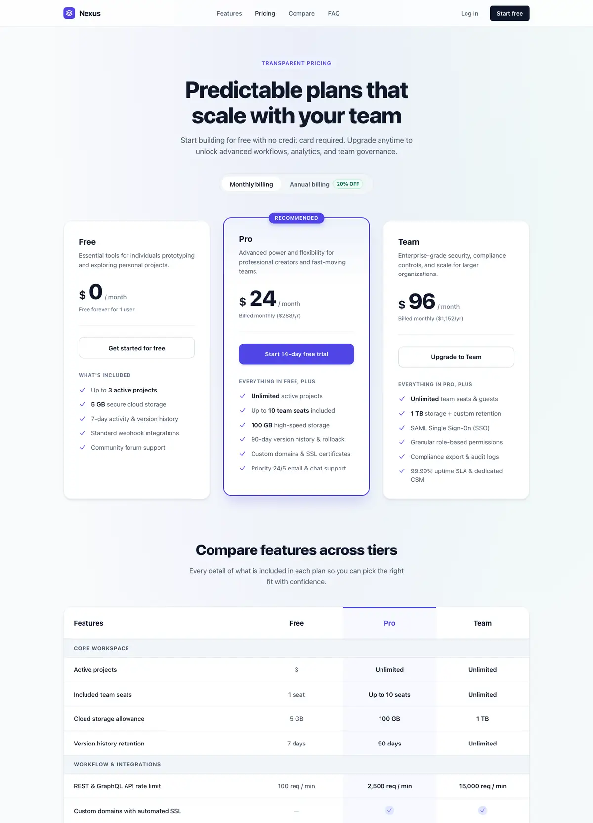
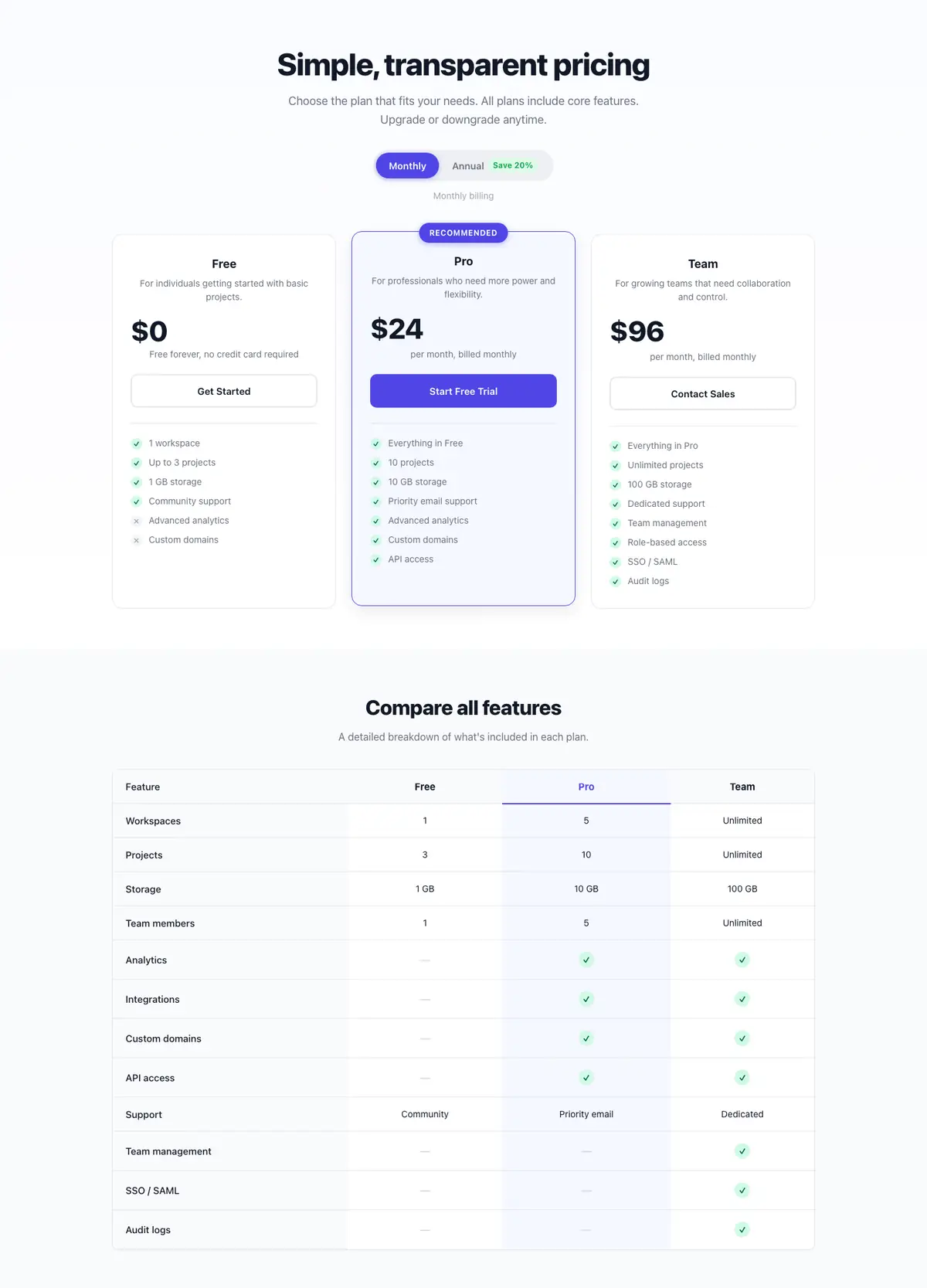
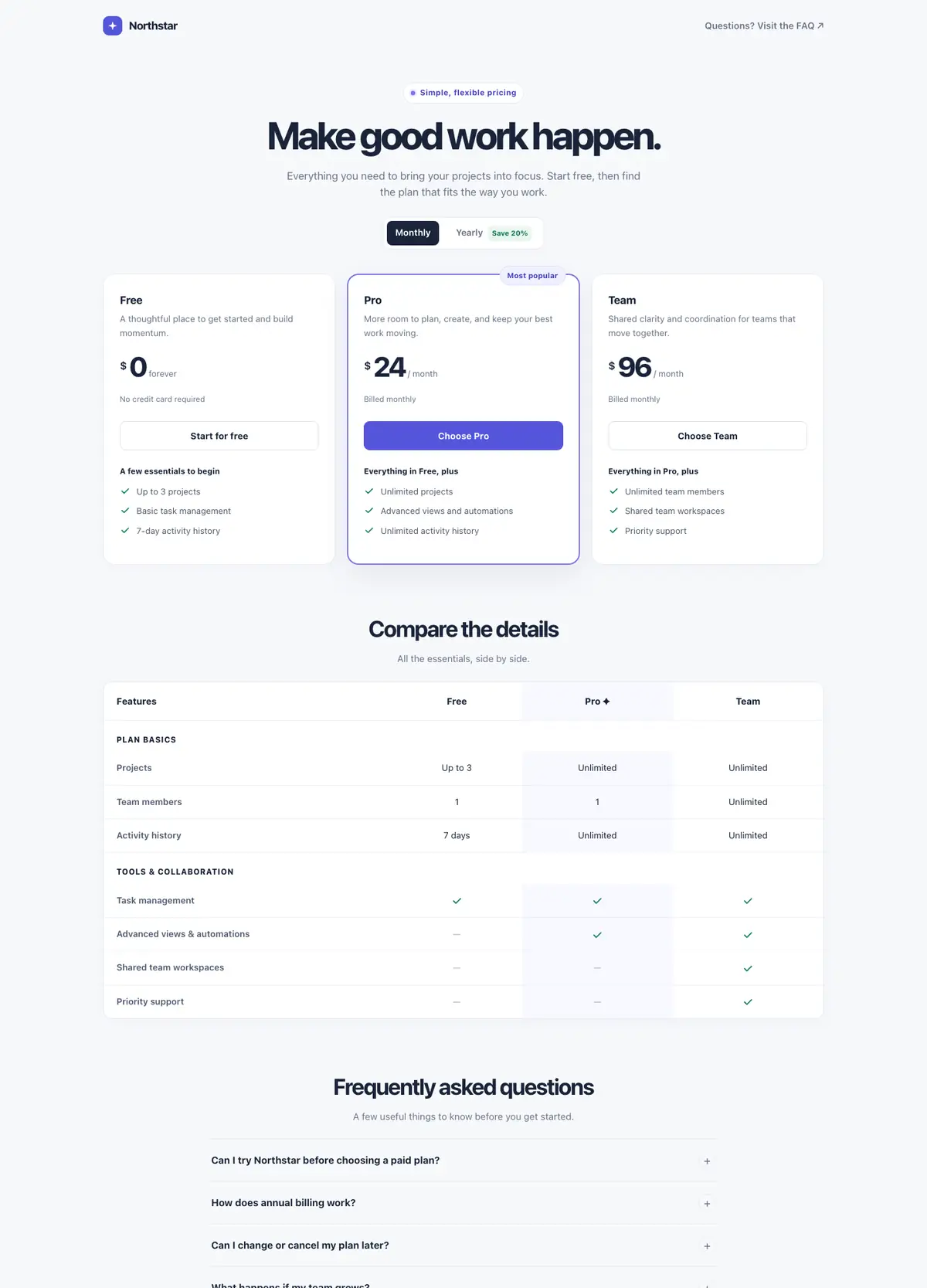
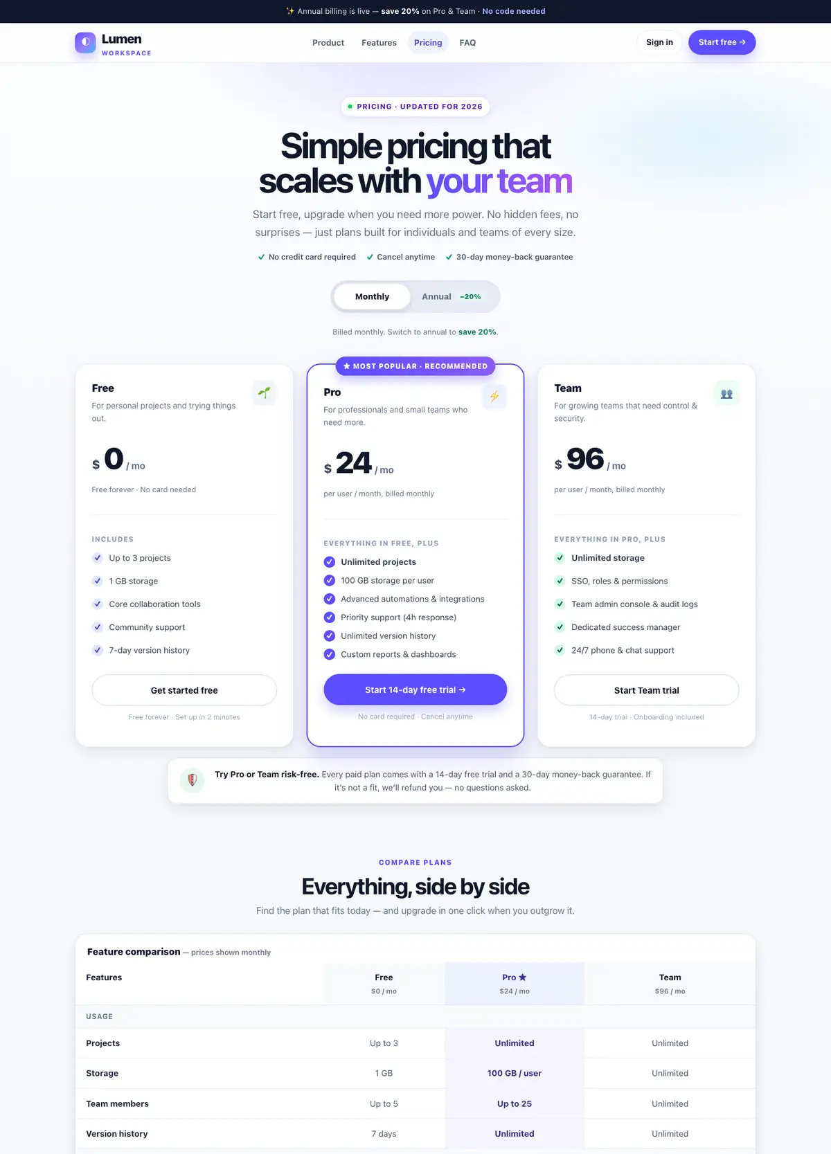
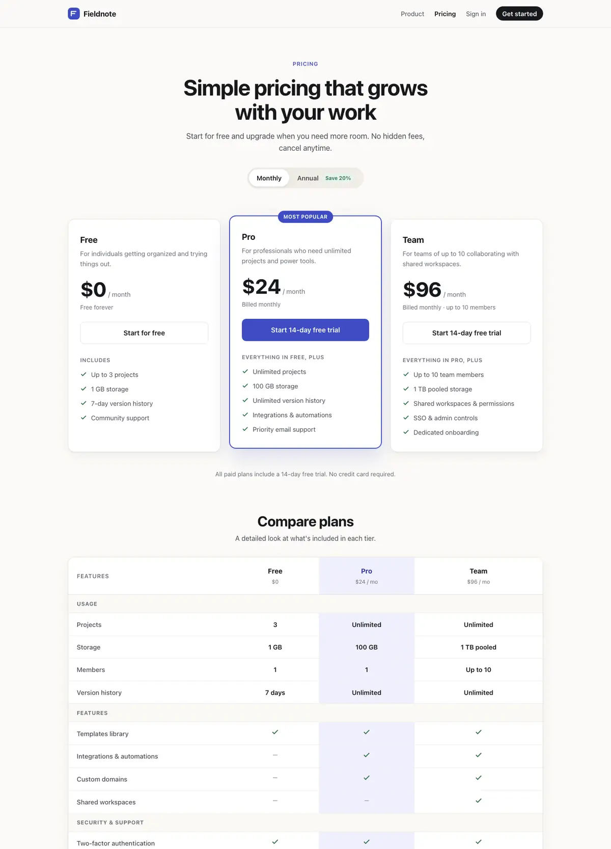
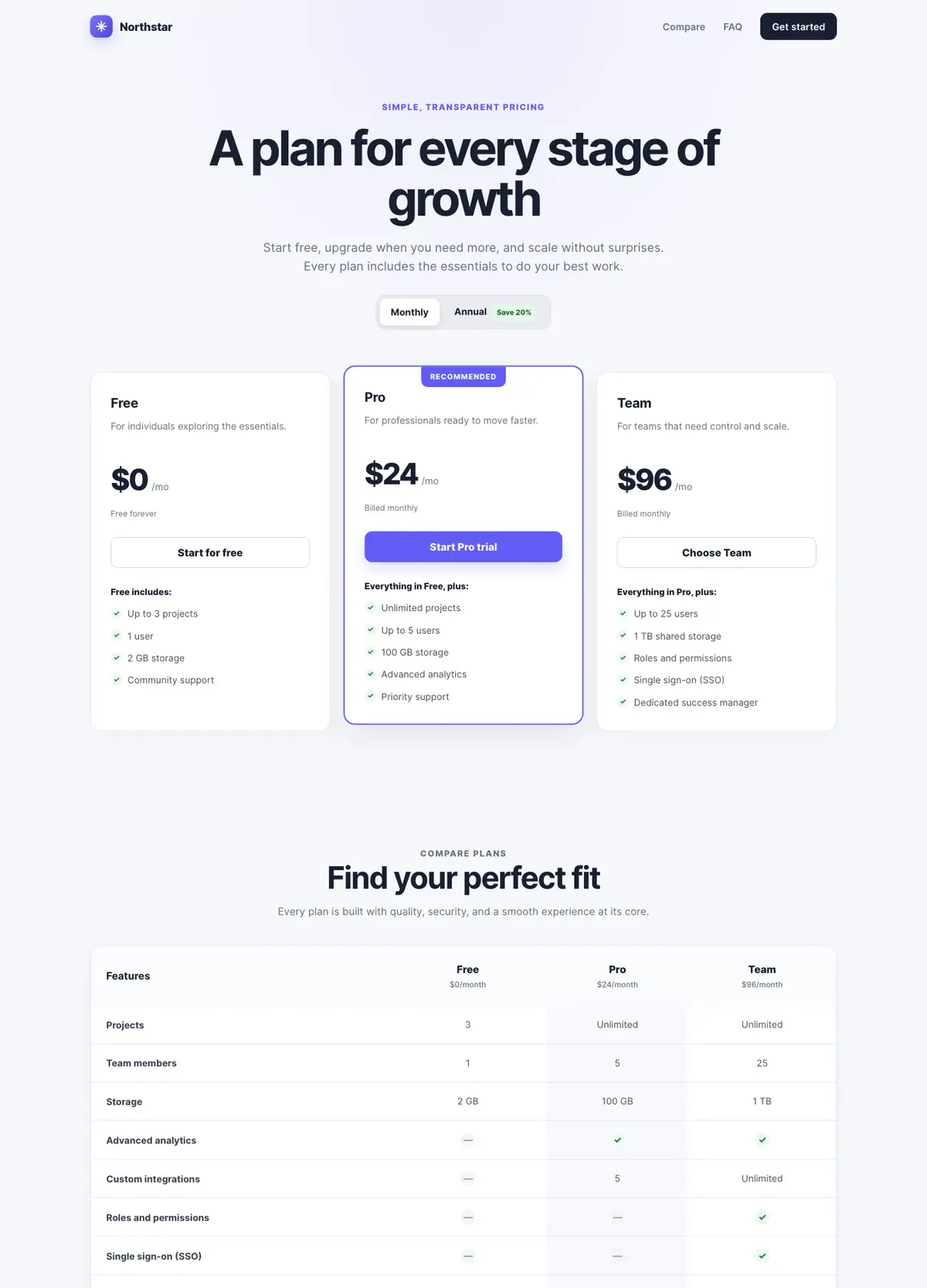
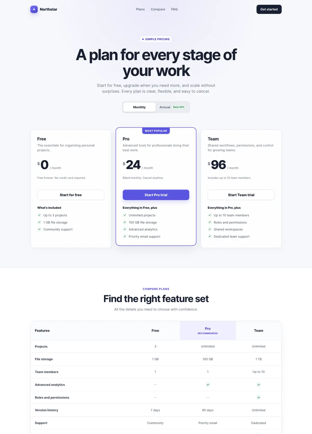
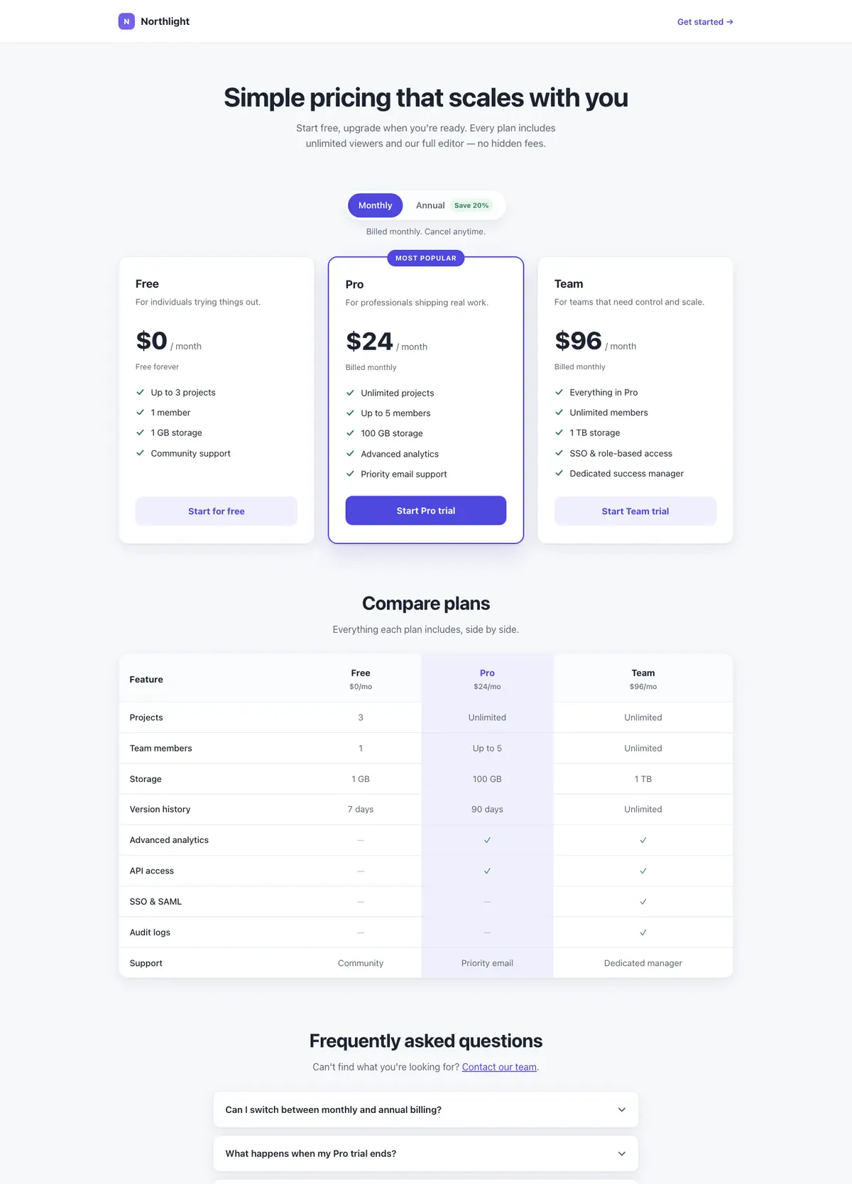
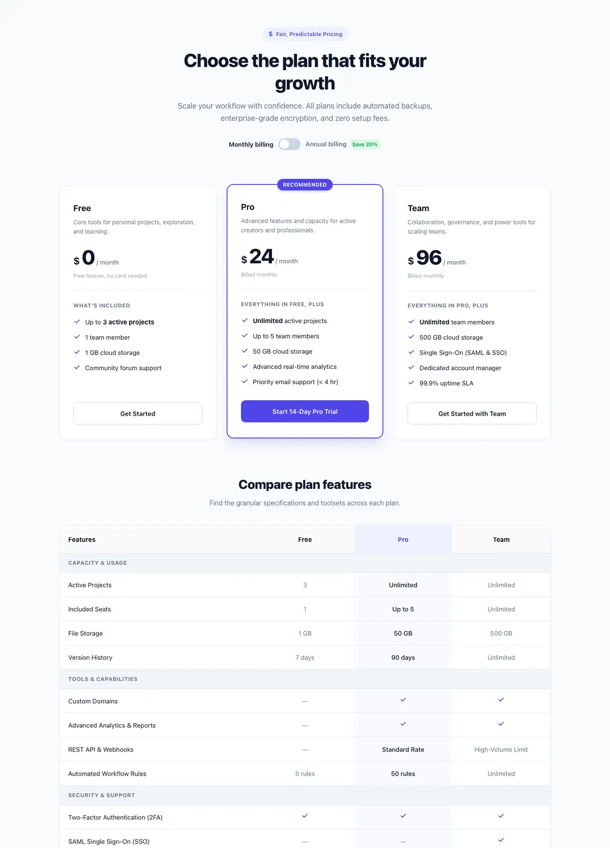
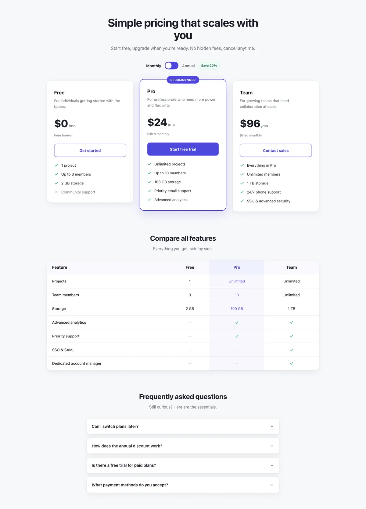
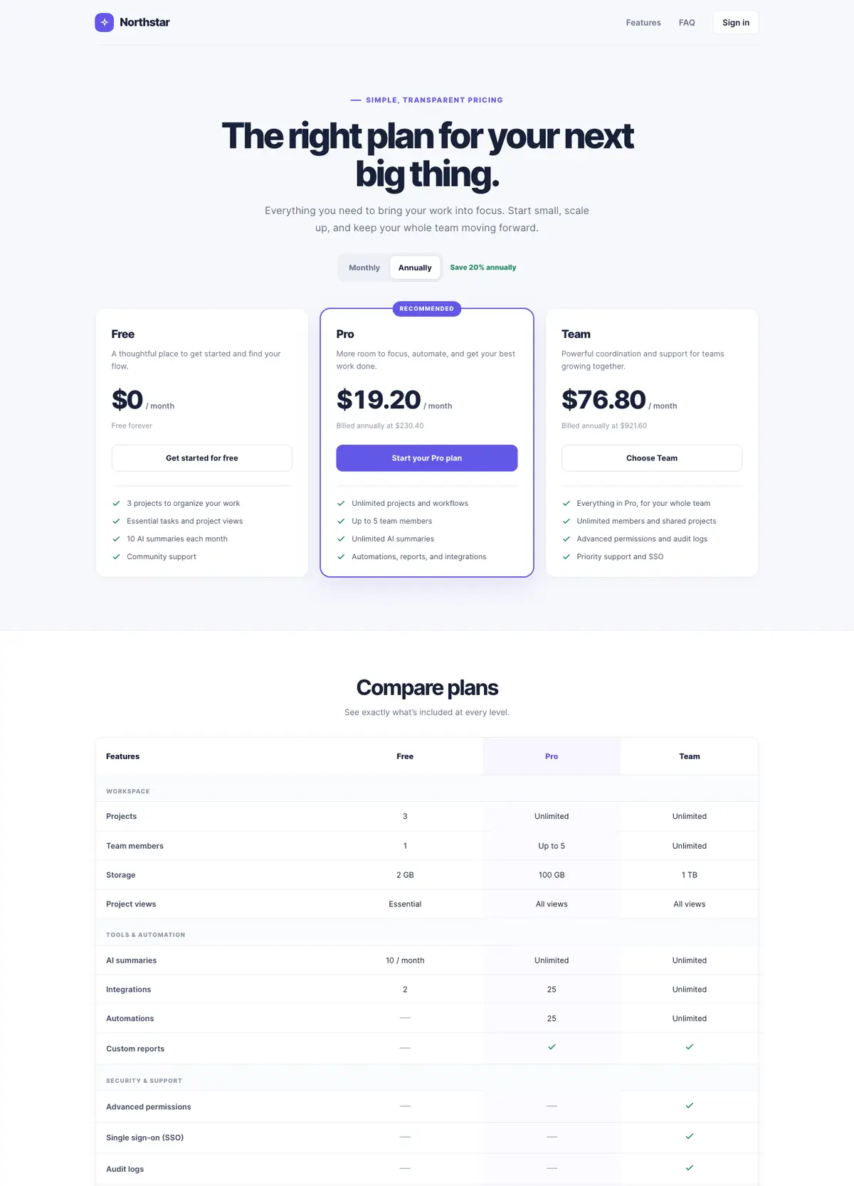
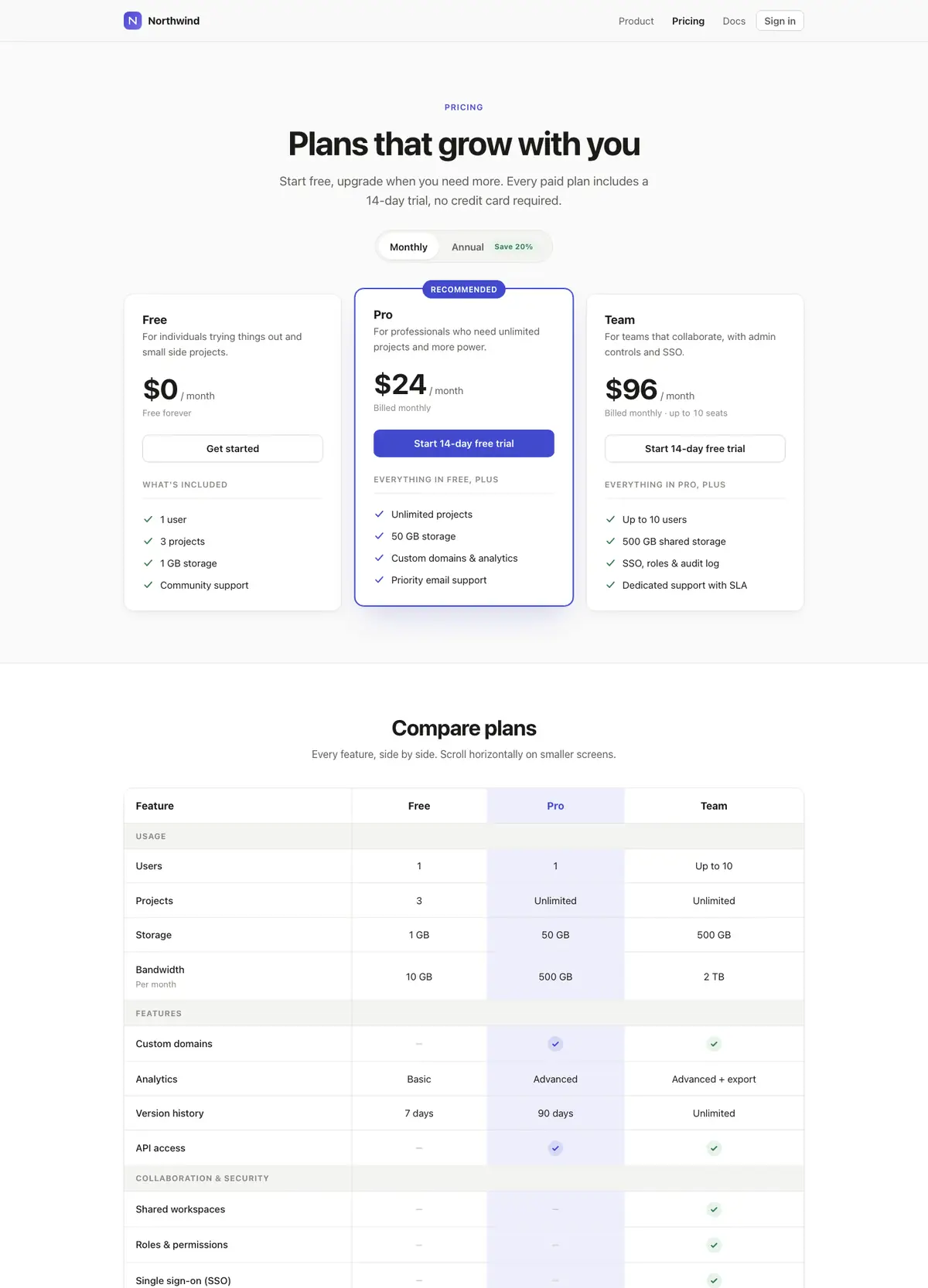
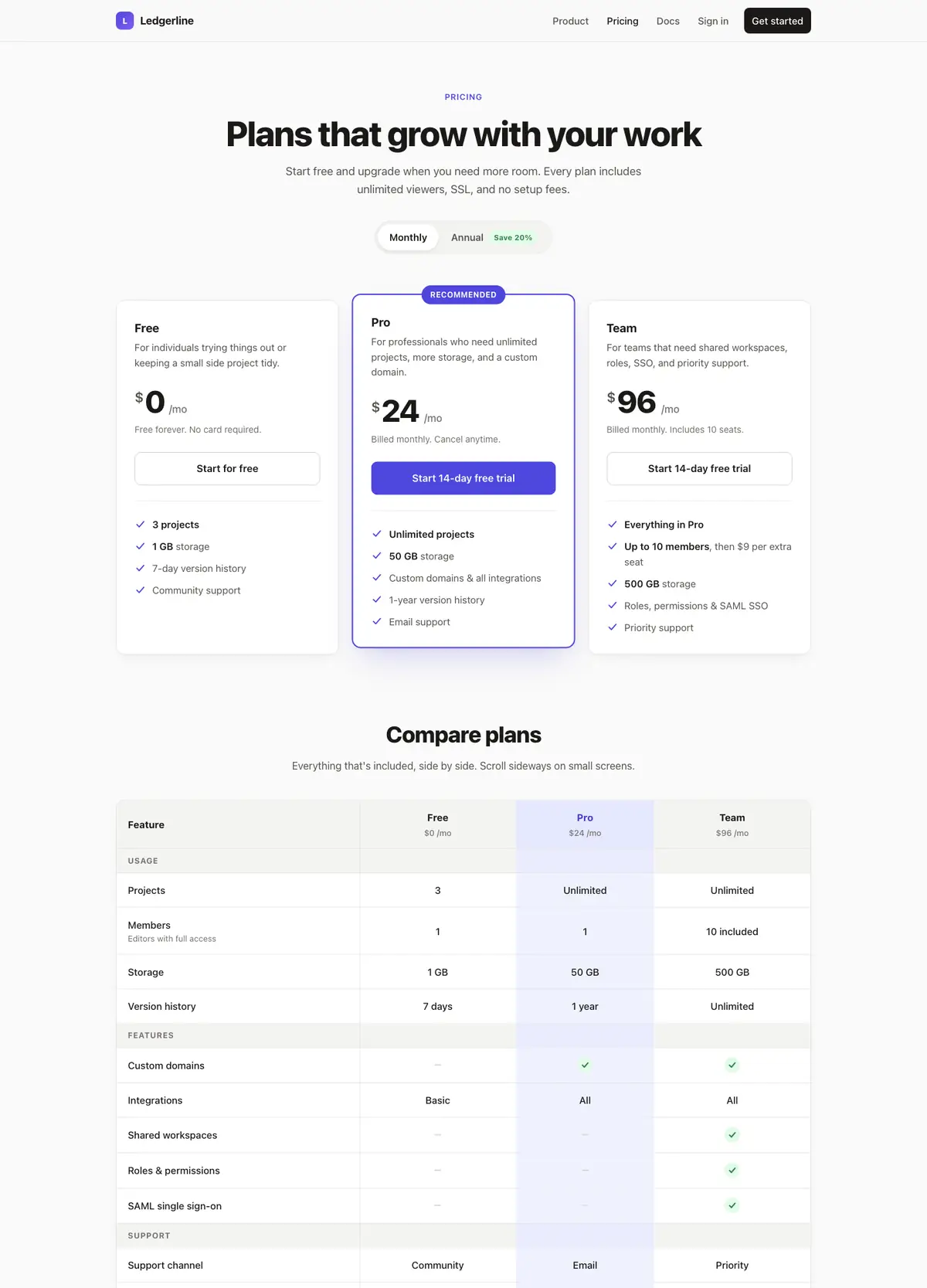
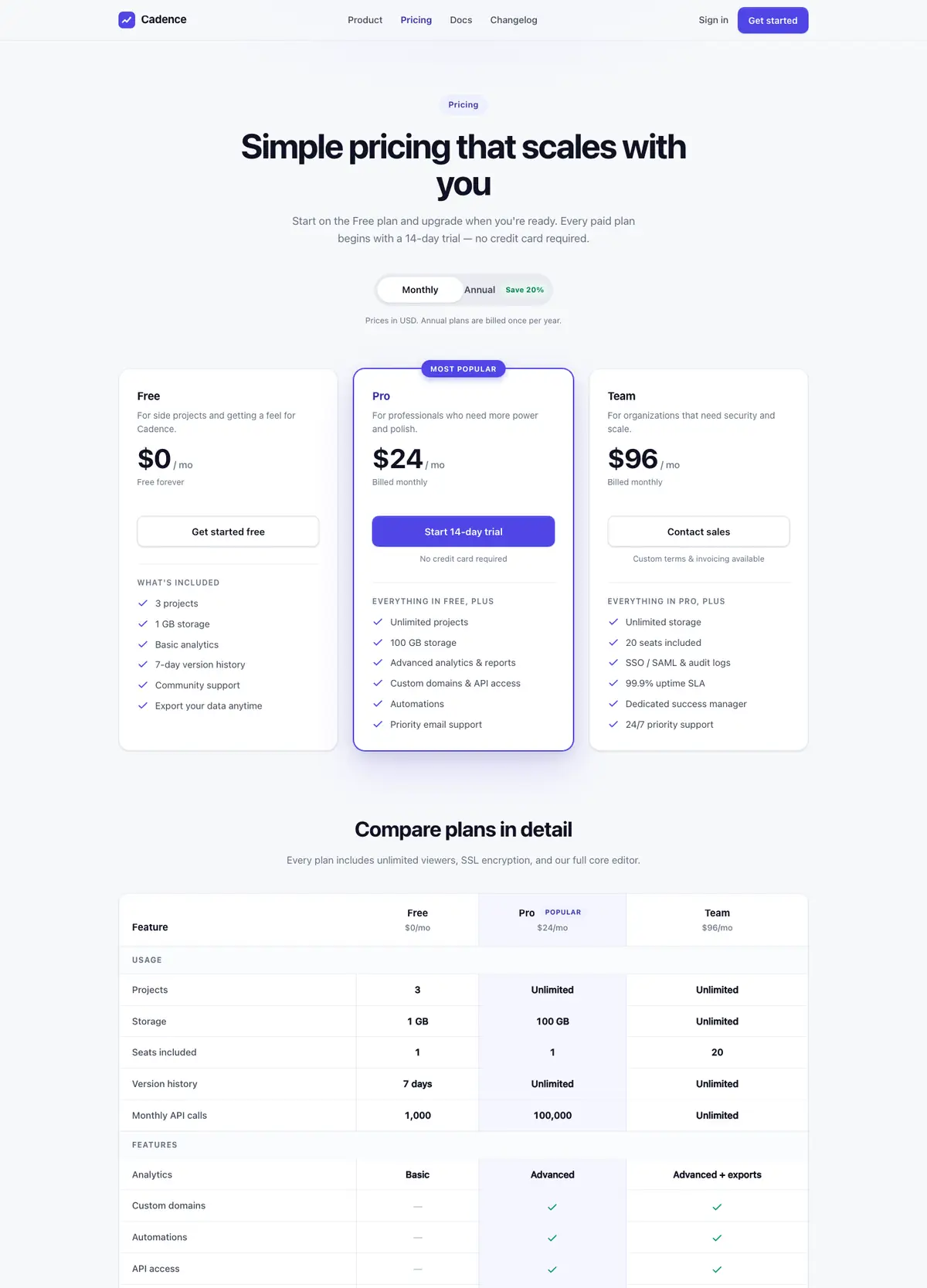
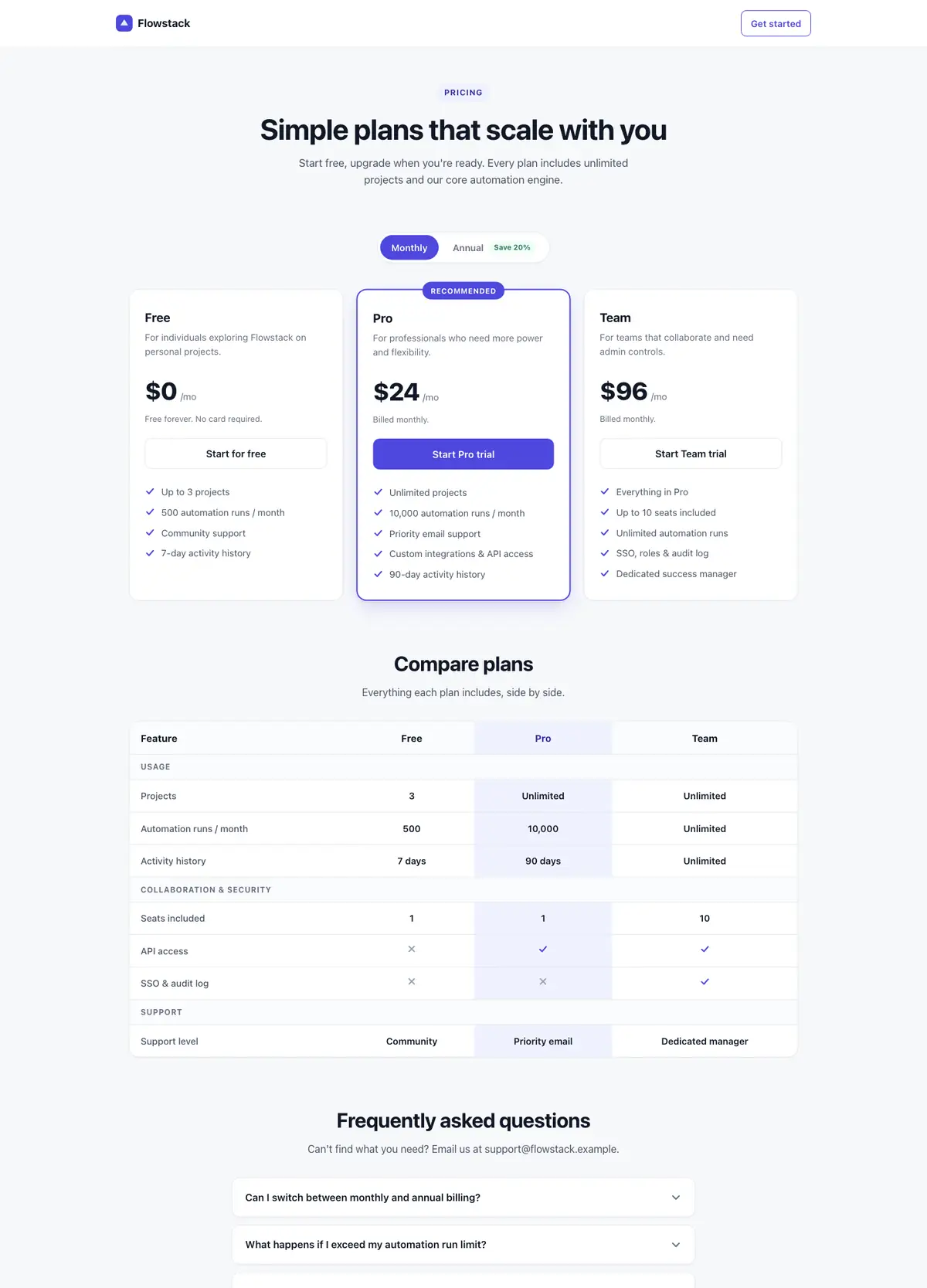
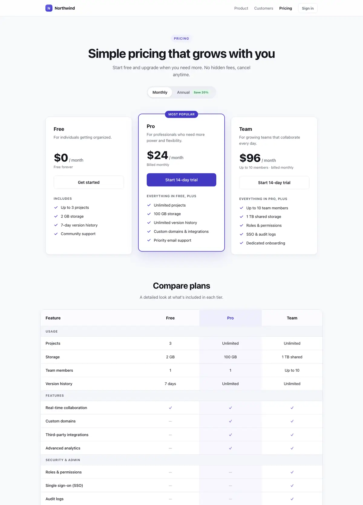
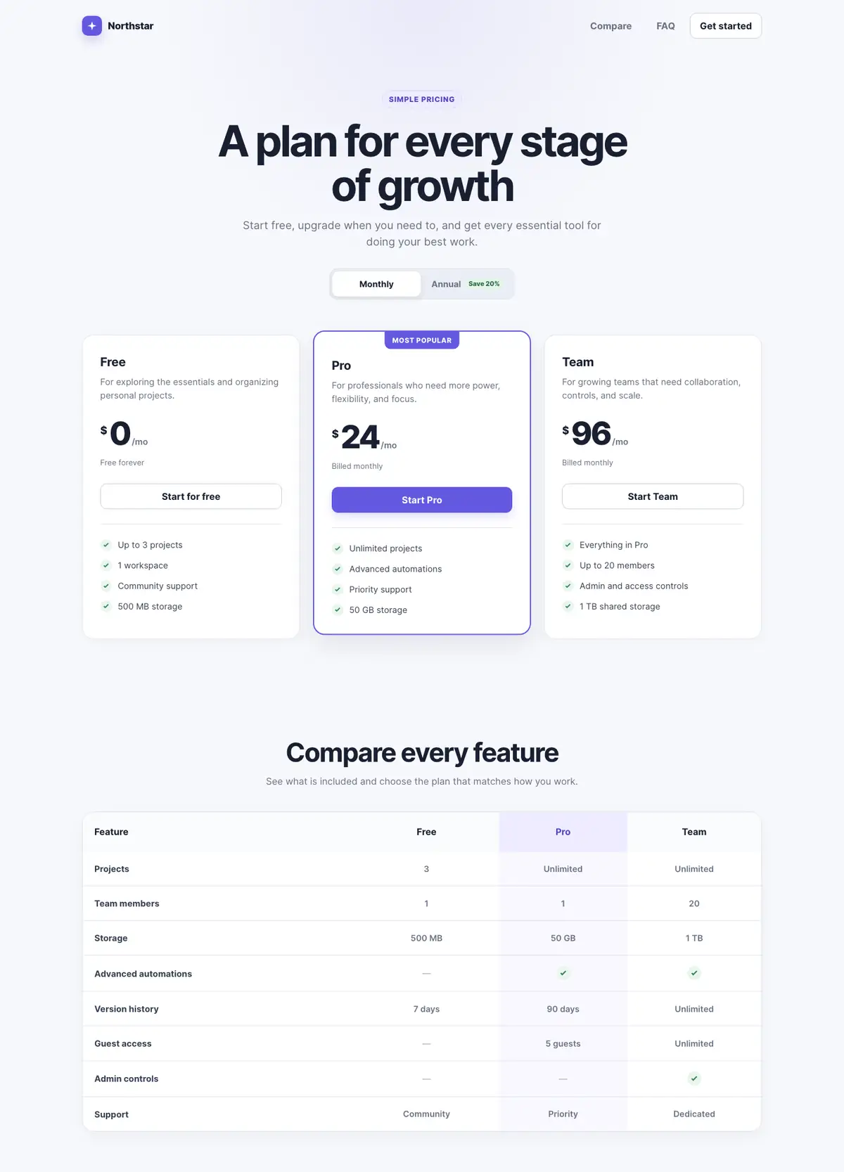
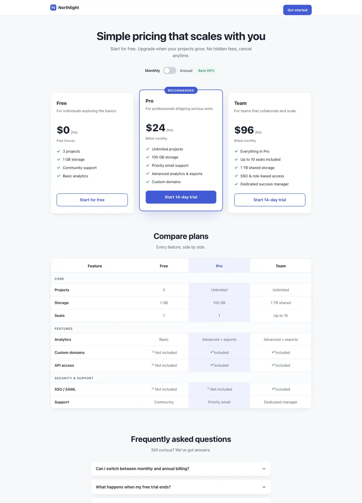
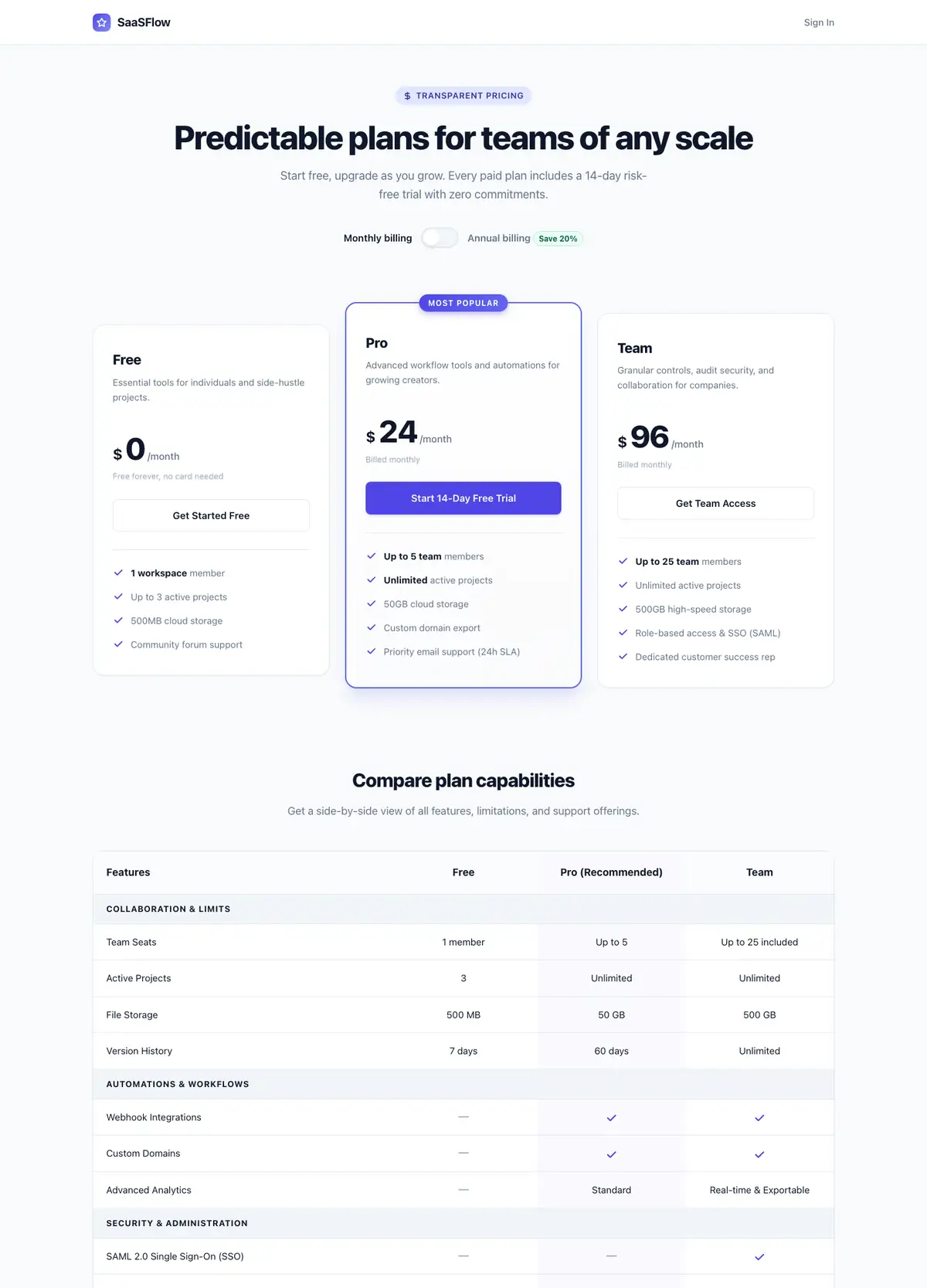
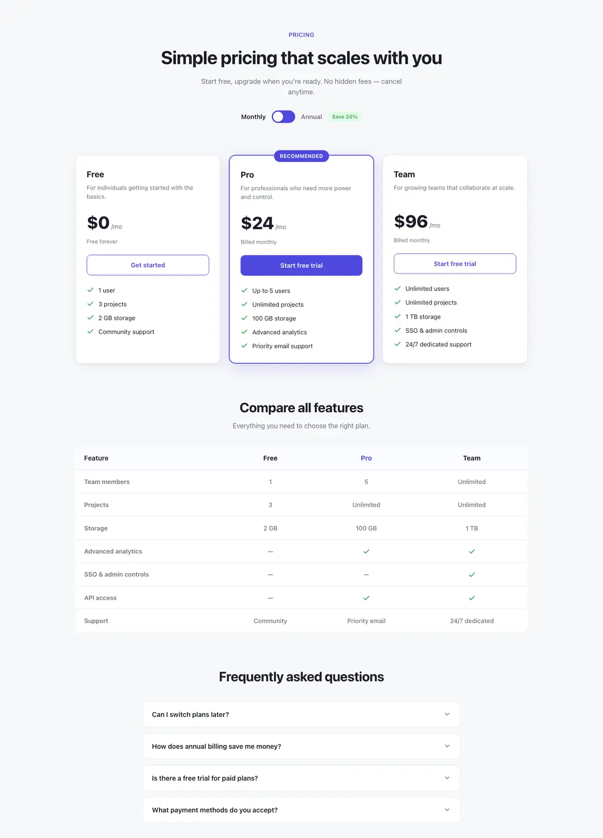
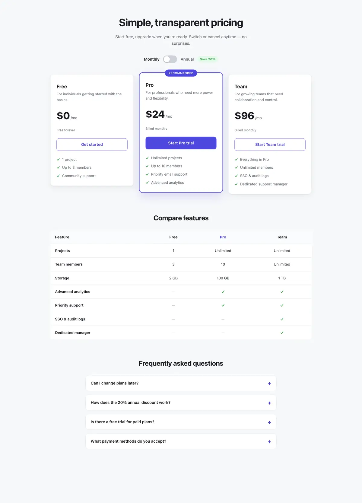
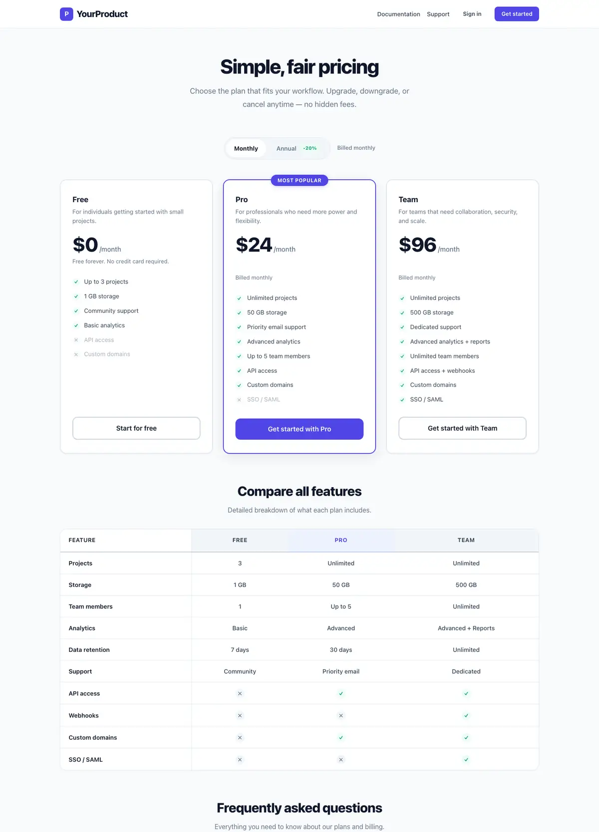
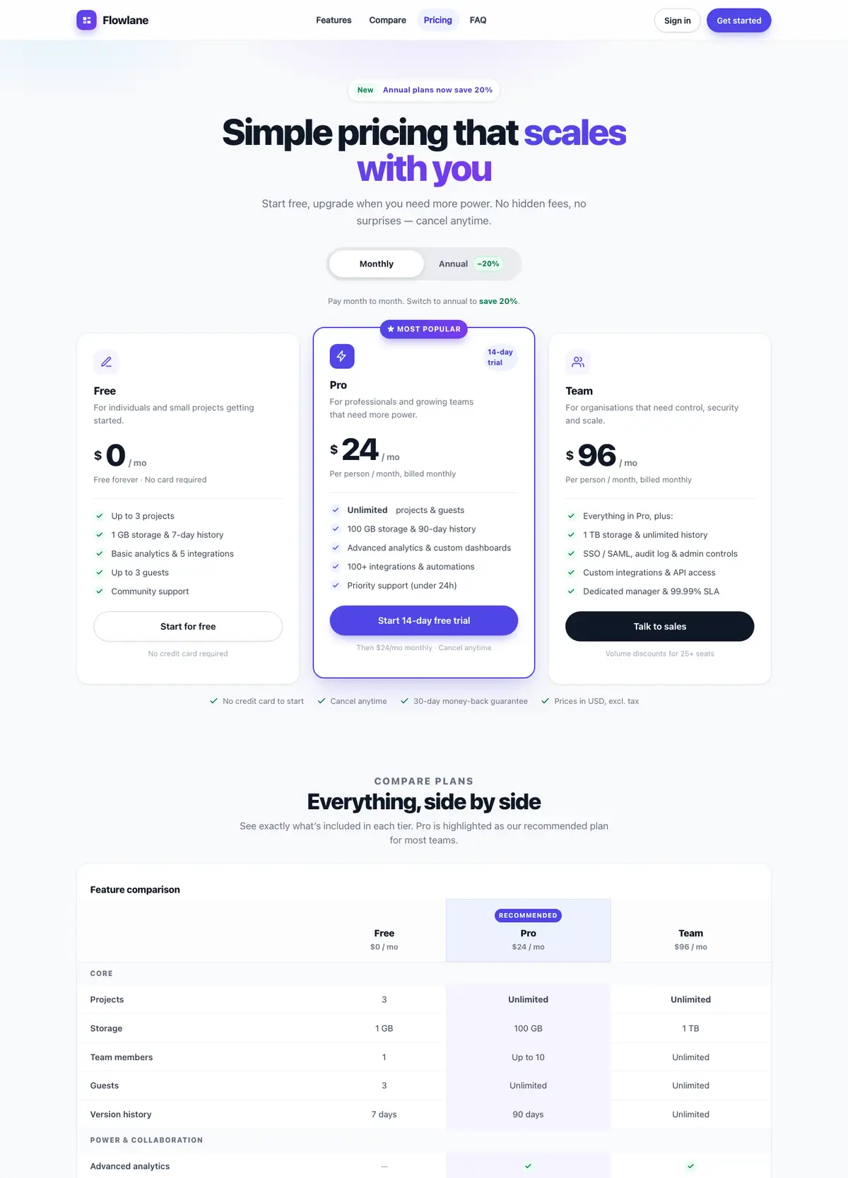
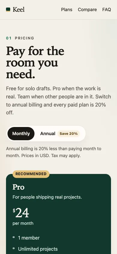
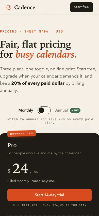
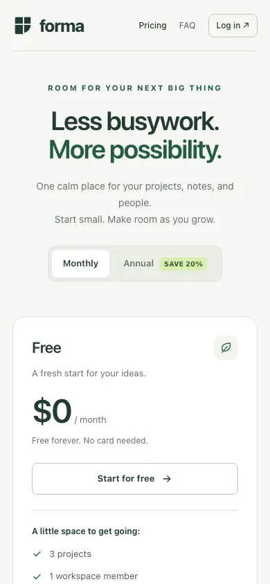
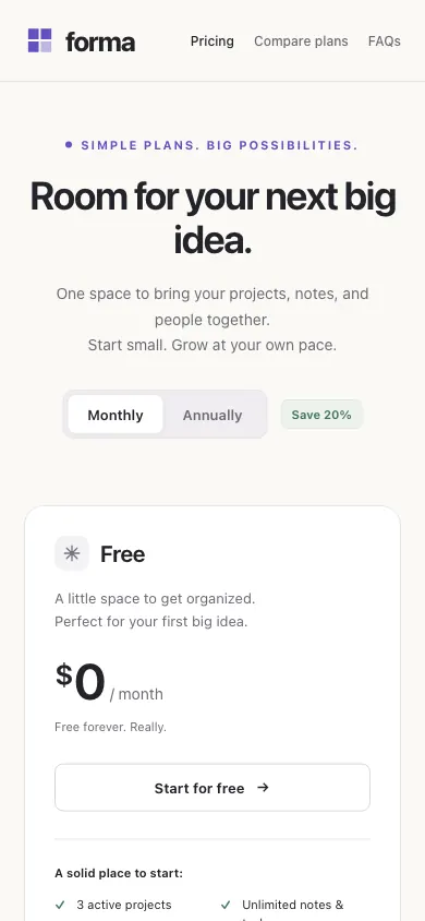
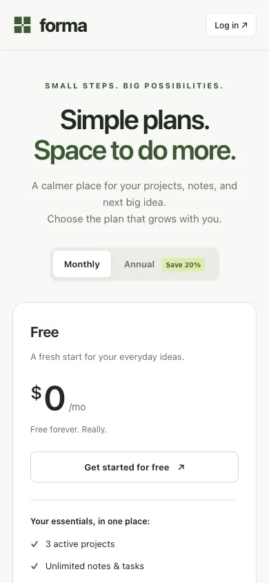
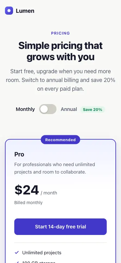
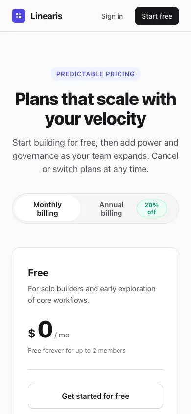
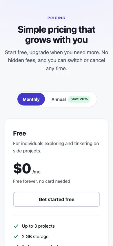
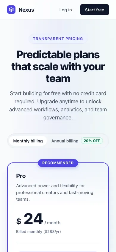
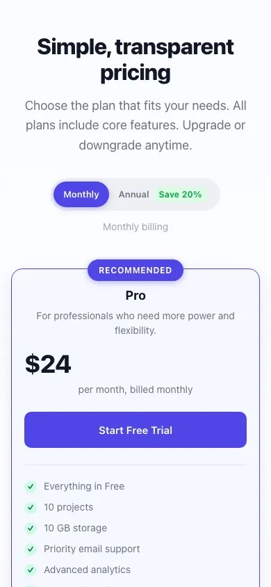
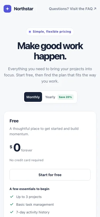
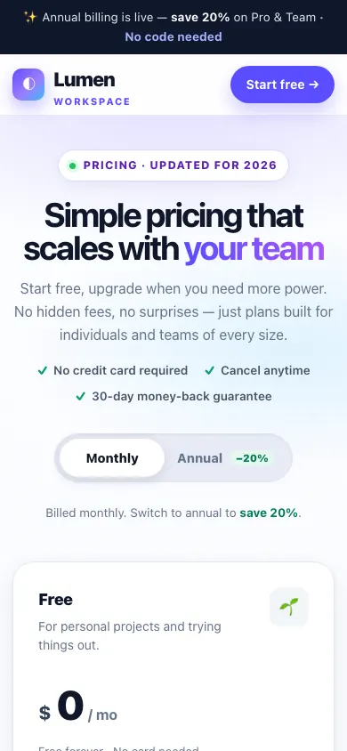
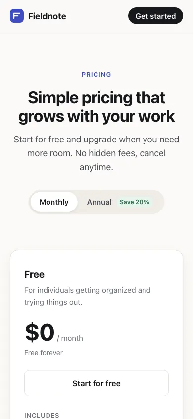
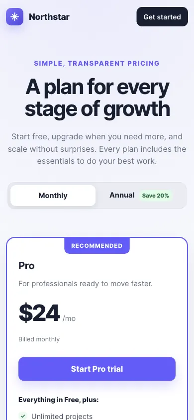
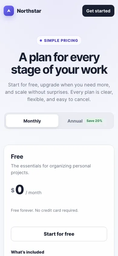
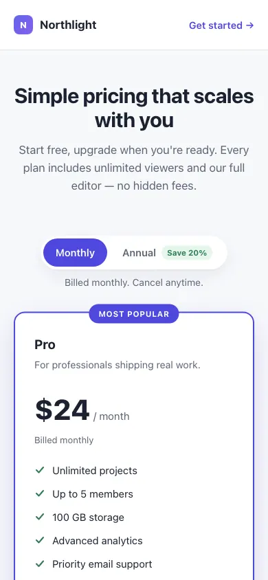
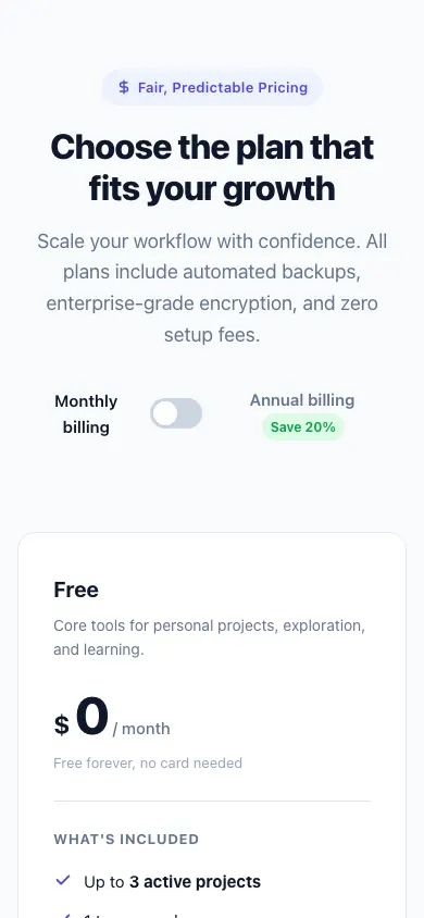
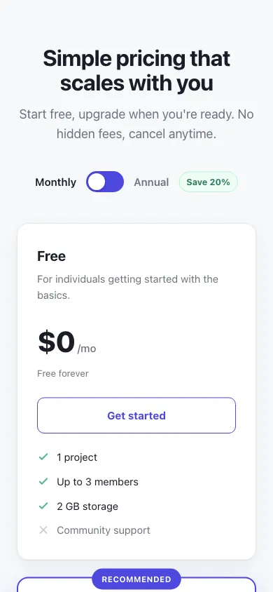
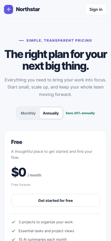
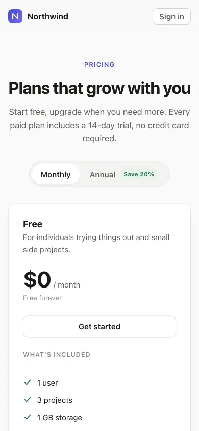
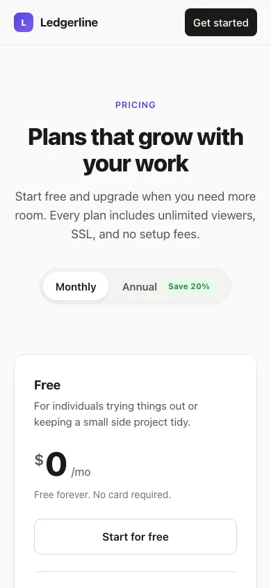
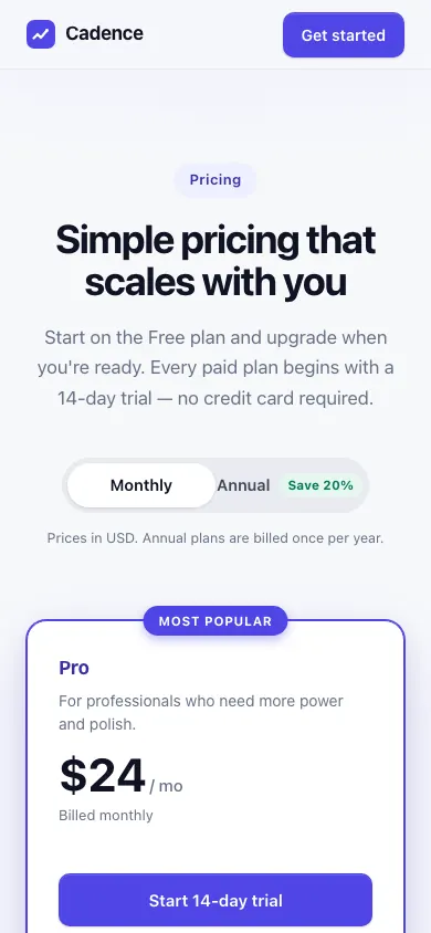
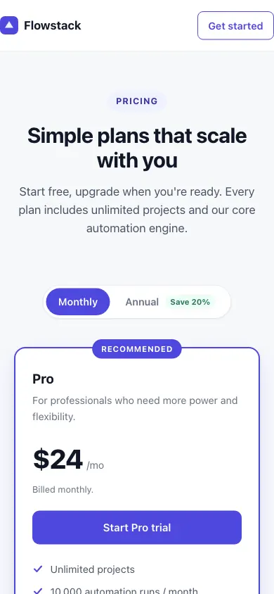
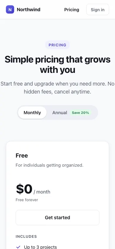
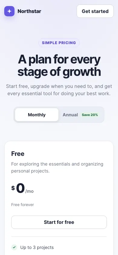
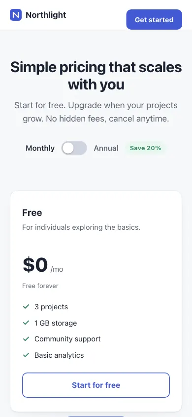
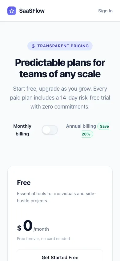
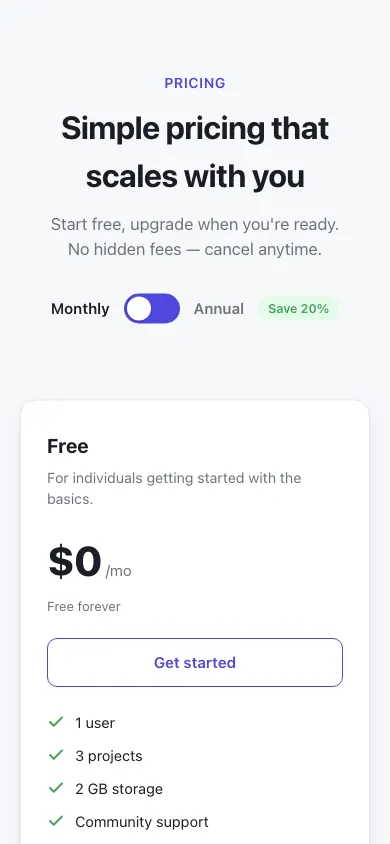
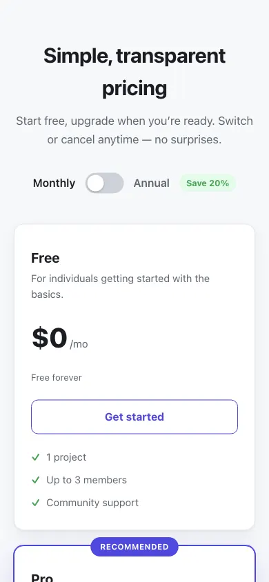
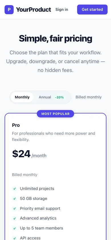
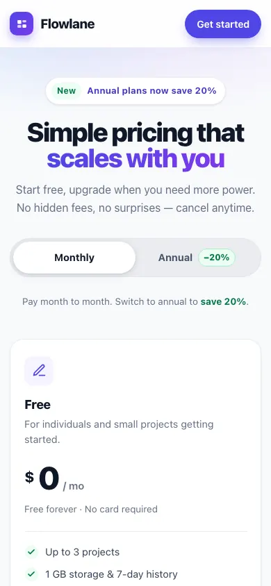
Pricing page with three tiers (Free, Pro at $24/mo, Team at $96/mo), monthly/annual toggle showing annual at 20% off, a feature comparison across tiers, one highlighted recommended tier, and an FAQ of four questions. Light theme.
The instructions that came with it
You are building production frontend code. Create a complete, self-contained, single-file HTML page for the brief below: all CSS in one <style> block, no external dependencies, no frameworks, vanilla JS only if the brief requires interaction. Ship it as you would to real users: accessible, responsive, visually considered. Output only the HTML file content. No explanation, no markdown fences.
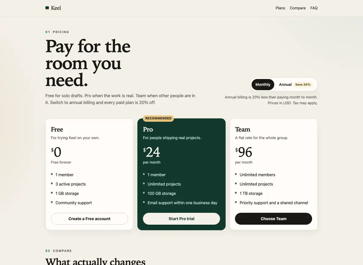
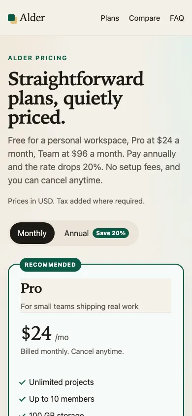
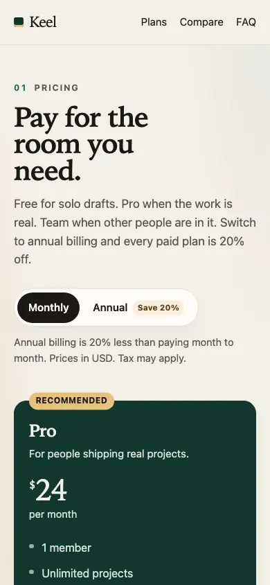 Grok 4.7Build 1 · rank 2 on the boardRams Index on this page: 69.6
ModerateBilling toggle and hint text sit orphaned in hero
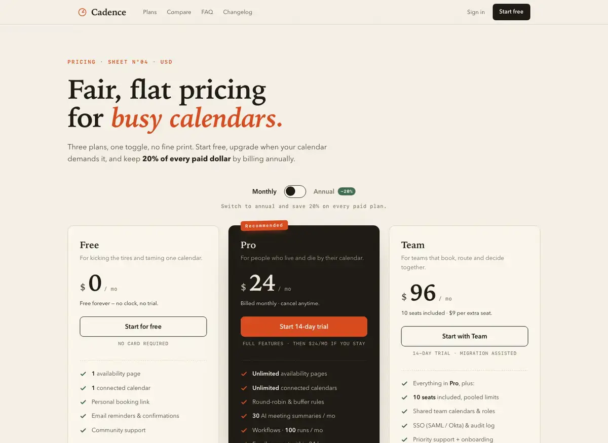
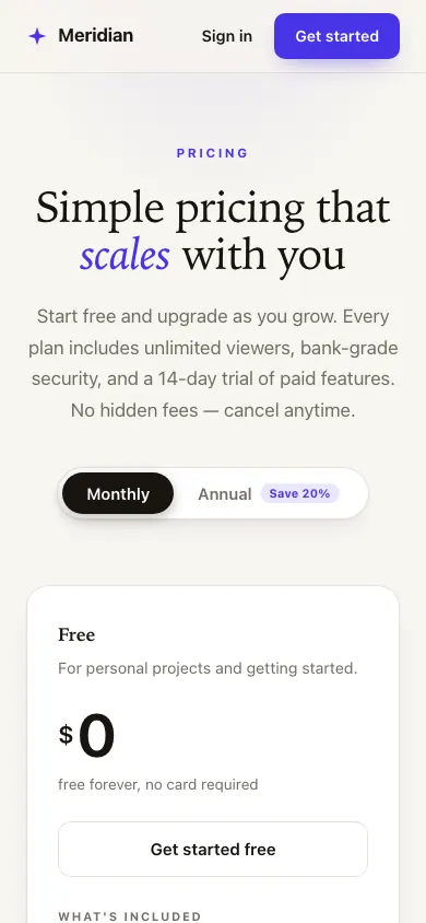
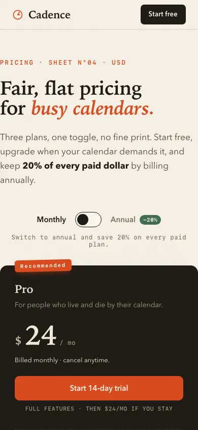 Qwen 3.8 MaxBuild 1 · unrankedRams Index on this page: 69.6
ModeratePrice baseline misalignment across plan cards
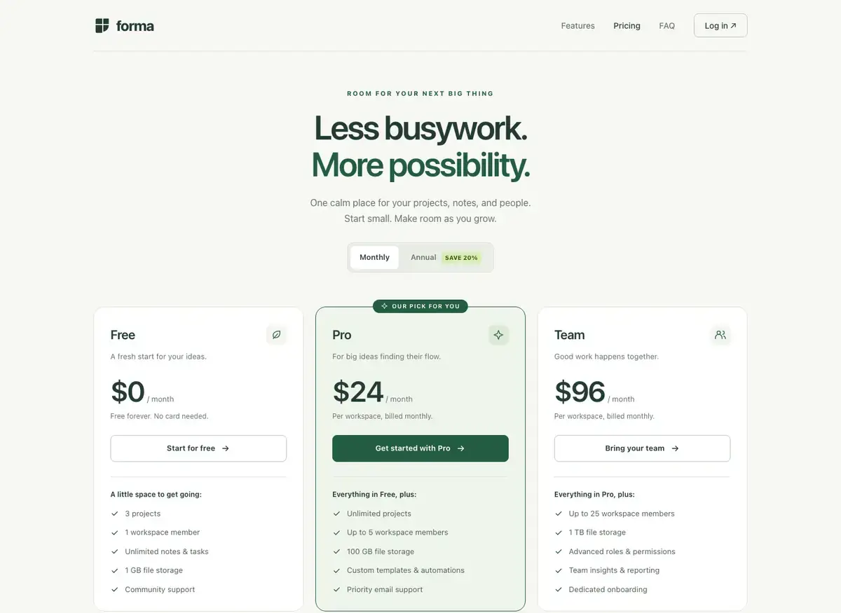
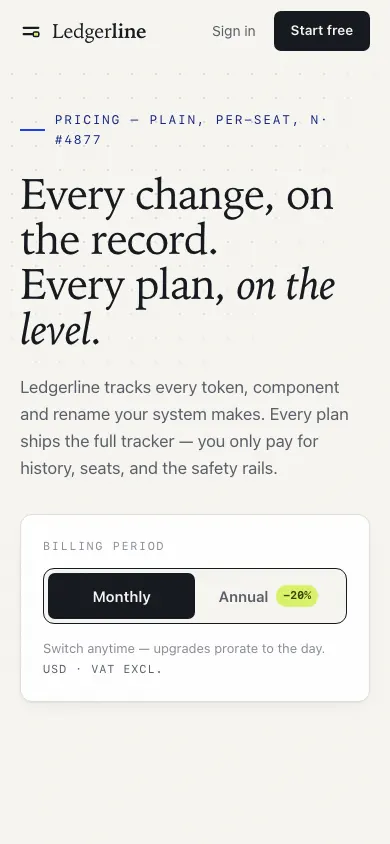
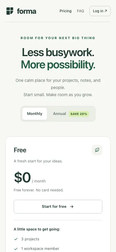 GPT-6 AstraBuild 2 · rank 1 on the boardRams Index on this page: 67.9
ModerateThree price numerals compete at equal weight
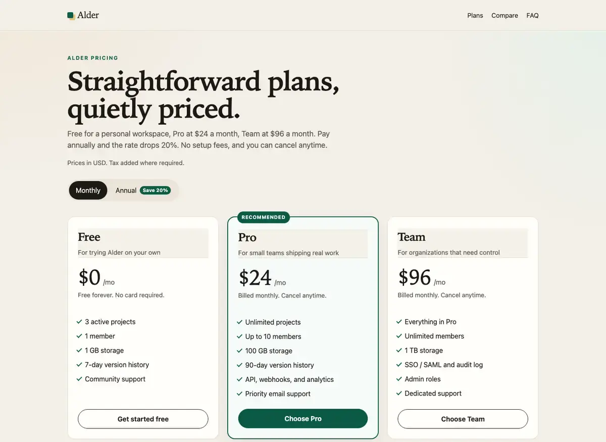
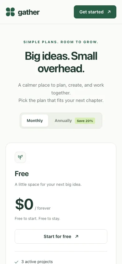
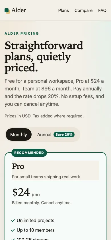 Grok 4.7Build 2 · rank 2 on the boardRams Index on this page: 67.9
SeriousInconsistent CTA button treatment across tiers
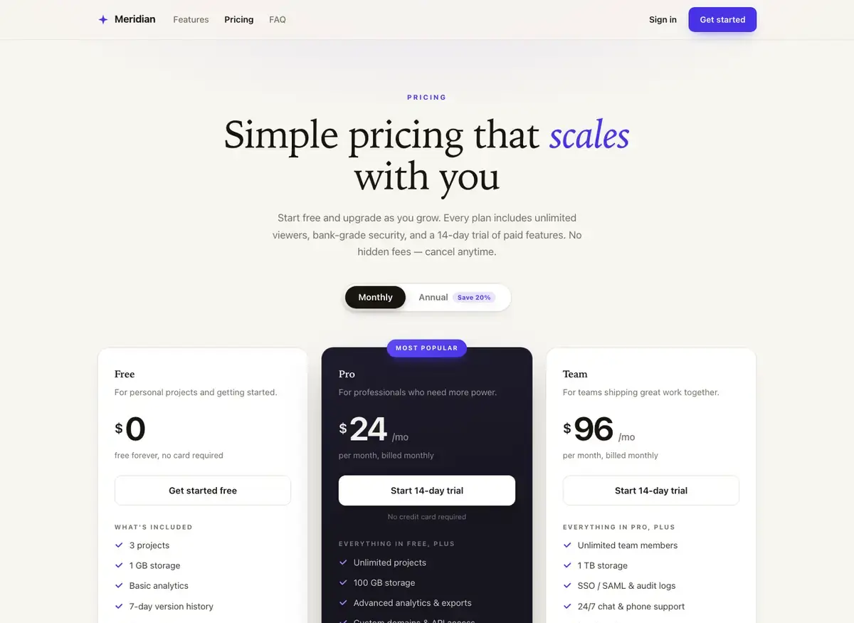
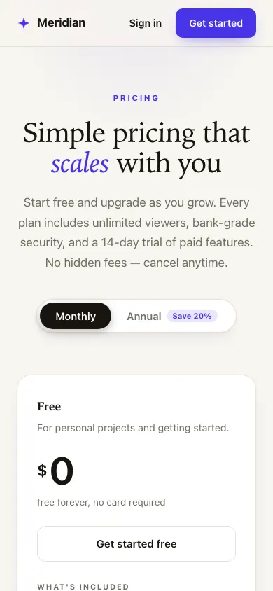 Kimi K3Build 1 · unrankedRams Index on this page: 67.9
SeriousToggle button asymmetry: pill extends only rightward
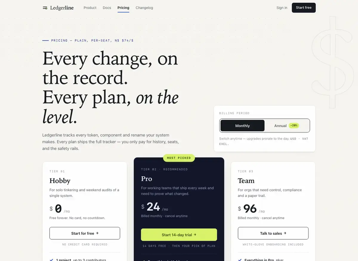
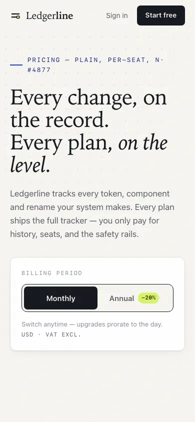 Qwen 3.8 MaxBuild 2 · unrankedRams Index on this page: 66.1
SeriousEyebrow copy contains raw placeholder text
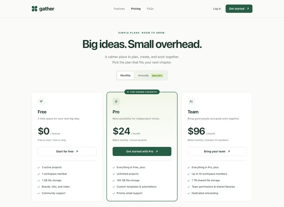
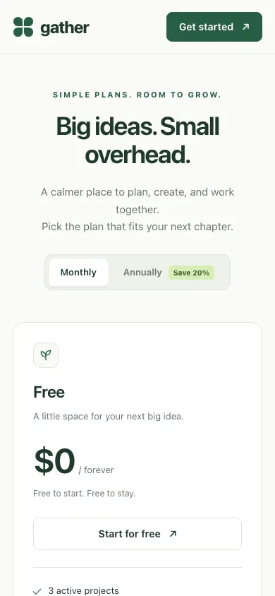 GPT-6 AstraBuild 1 · rank 1 on the boardRams Index on this page: 62.5
ModerateThree price numerals share equal visual weight
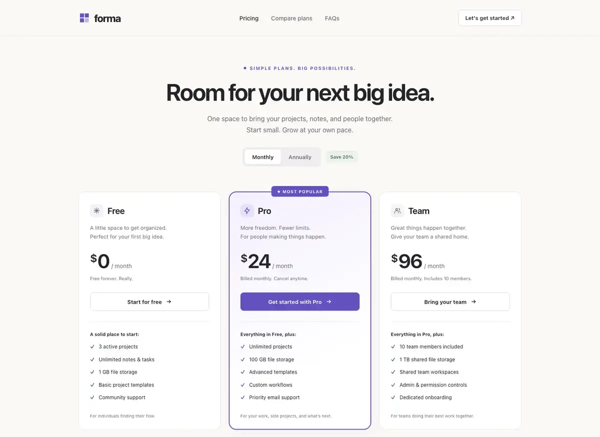
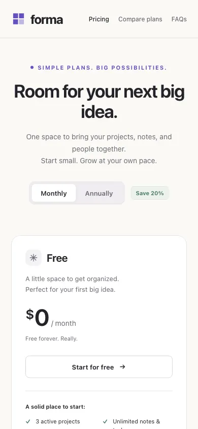 GPT-6.1 SolBuild 2 · rank 3 on the boardRams Index on this page: 62.5
SeriousBilling toggle and 'Save 20%' badge misaligned vertically
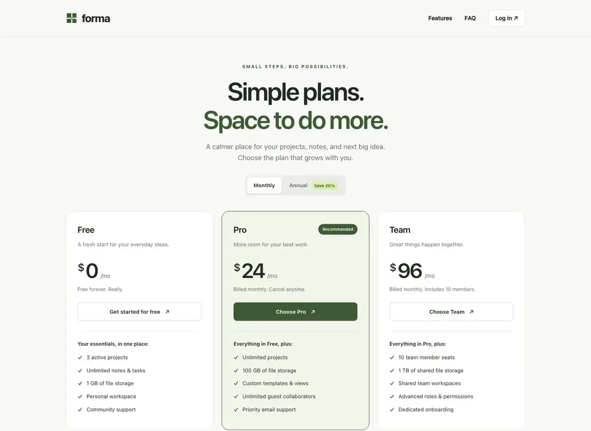
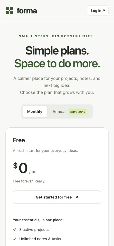 GPT-6.1 SolBuild 1 · rank 3 on the boardRams Index on this page: 60.7
SeriousBilling toggle: two competing active states
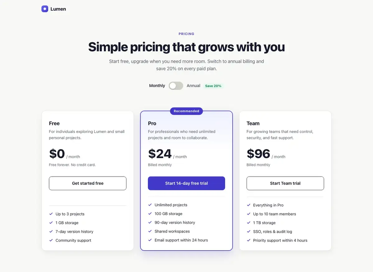
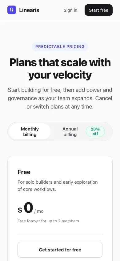
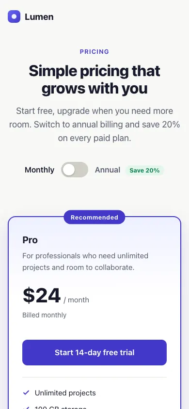 Claude Sonnet 5.5Build 1 · rank 4 on the boardRams Index on this page: 57.1
SeriousInconsistent CTA button treatments across plans
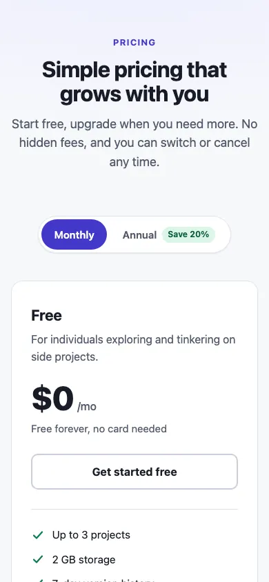
 Gemini 4 ArgonBuild 2 · rank 6 on the boardRams Index on this page: 57.1
SeriousInconsistent CTA button treatment across pricing cards
 Claude Sonnet 5.5Build 2 · rank 4 on the boardRams Index on this page: 55.4
ModerateInconsistent CTA button treatments across plans
 Gemini 4 ArgonBuild 1 · rank 6 on the boardRams Index on this page: 55.4
SeriousInconsistent CTA button treatment across cards
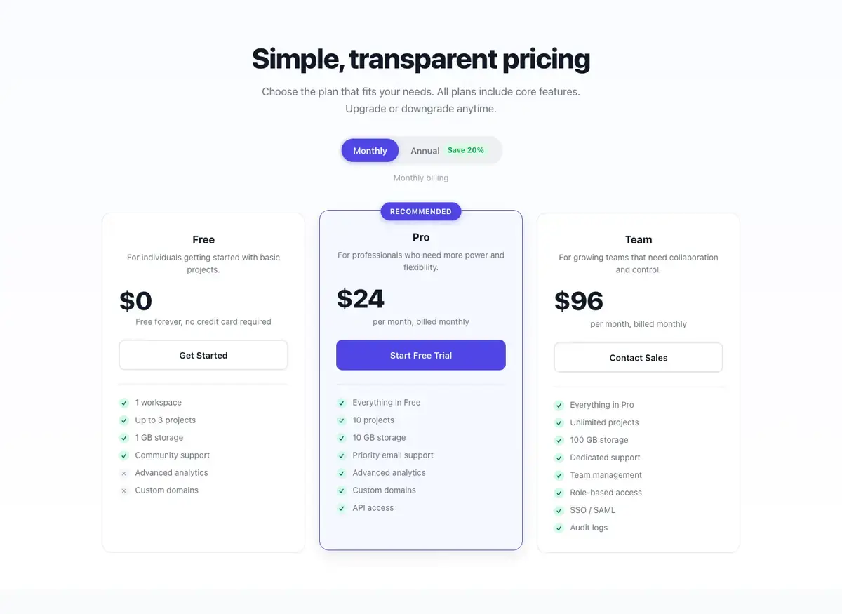
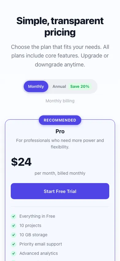 DeepSeek V4 ProBuild 2 · rank 13 on the boardRams Index on this page: 55.4
SeriousCard height inconsistency: Free card bottom misaligns
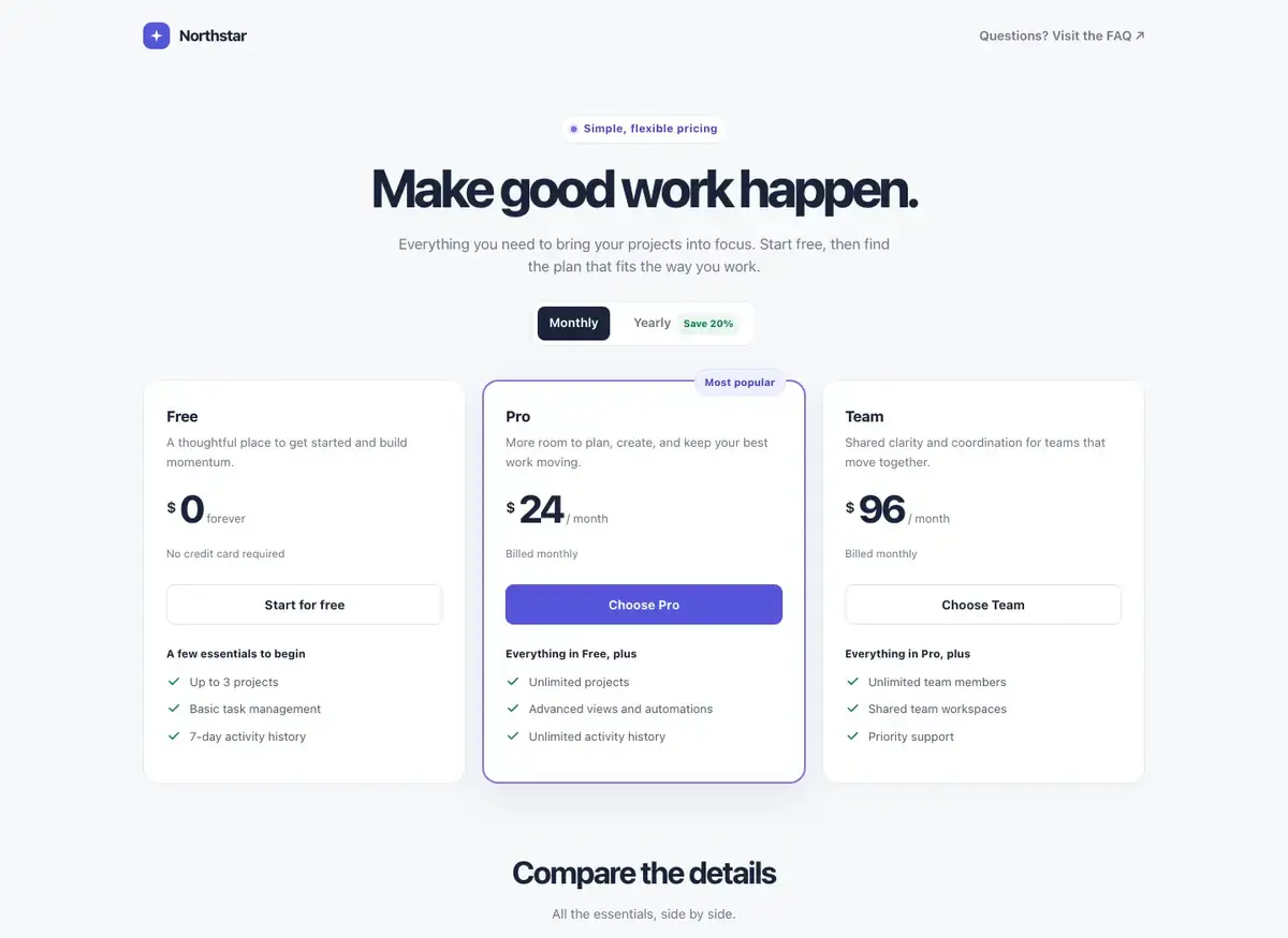
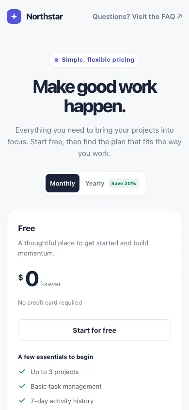 GPT-6 LunaBuild 2 · rank 5 on the boardRams Index on this page: 53.6
SeriousComparison table overflows viewport width
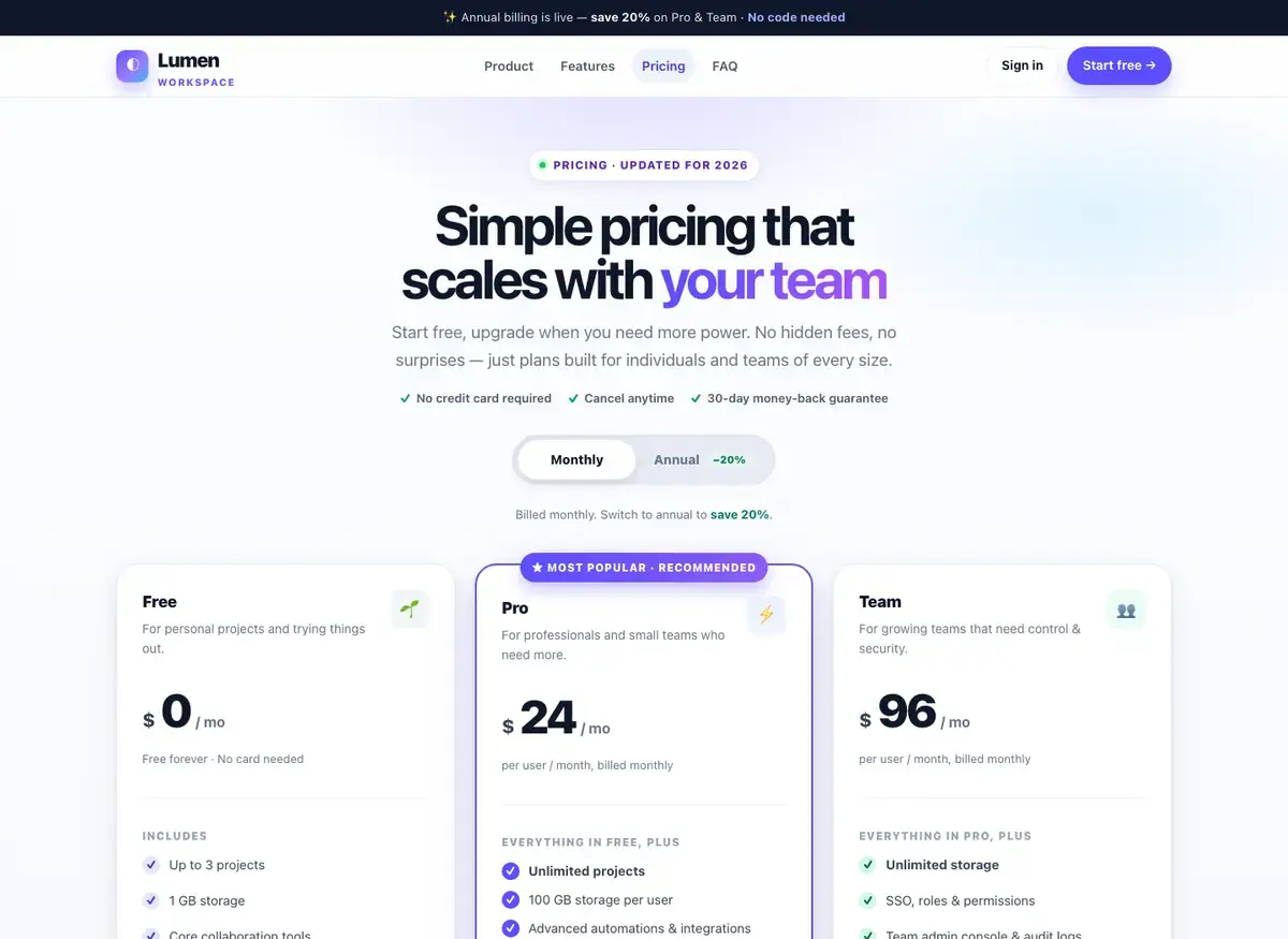
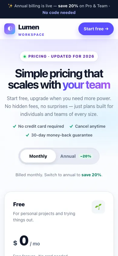 Muse WonderBuild 2 · rank 7 on the boardRams Index on this page: 53.6
SeriousRedundant badge label: 'Most popular · Recommended'
 Claude Opus 5.5Build 2 · rank 8 on the boardRams Index on this page: 53.6
SeriousInconsistent CTA button treatment across plan cards
 GPT-5.6 SolBuild 1 · rank 9 on the boardRams Index on this page: 53.6
SeriousInconsistent card baseline alignment across pricing tier cards
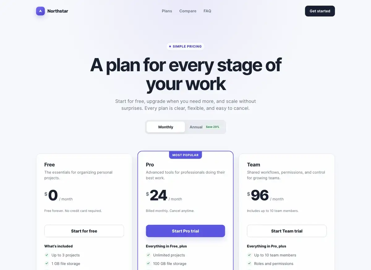
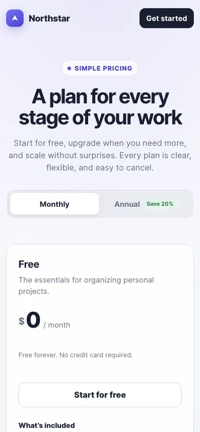 GPT-5.6 SolBuild 2 · rank 9 on the boardRams Index on this page: 51.8
SeriousInconsistent CTA button treatments across plan cards
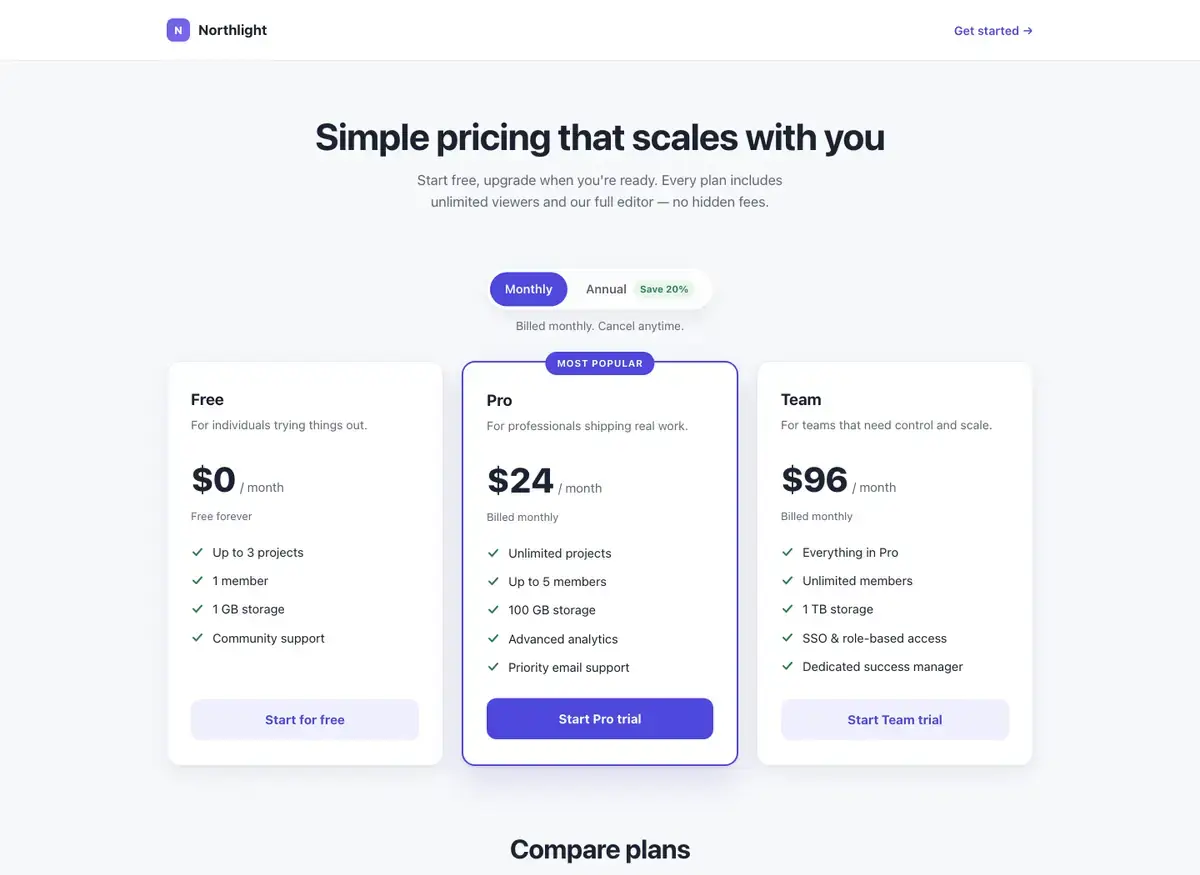
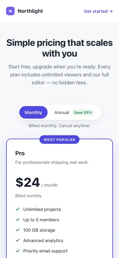 Claude Fable 5Build 2 · rank 11 on the boardRams Index on this page: 51.8
SeriousInconsistent CTA button treatments across three sibling cards
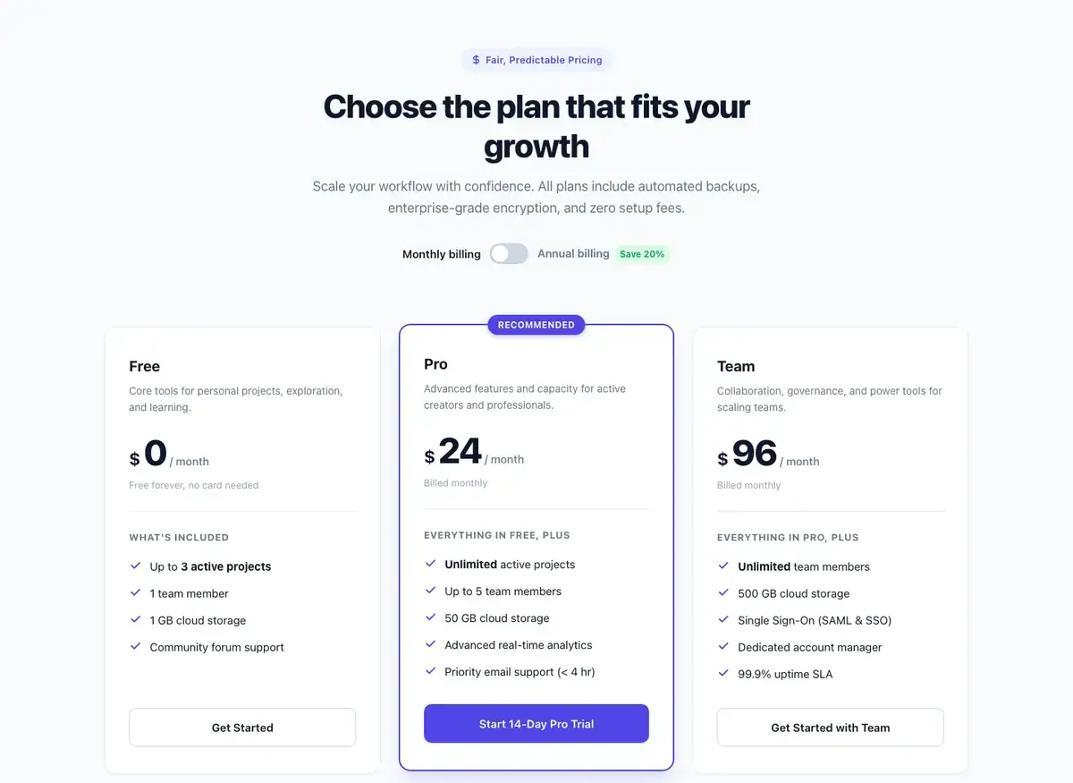
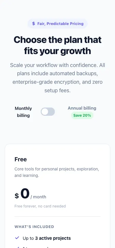 Gemini 3.8 FlashBuild 2 · rank 12 on the boardRams Index on this page: 51.8
SeriousExcessive dead space between toggle and first pricing card
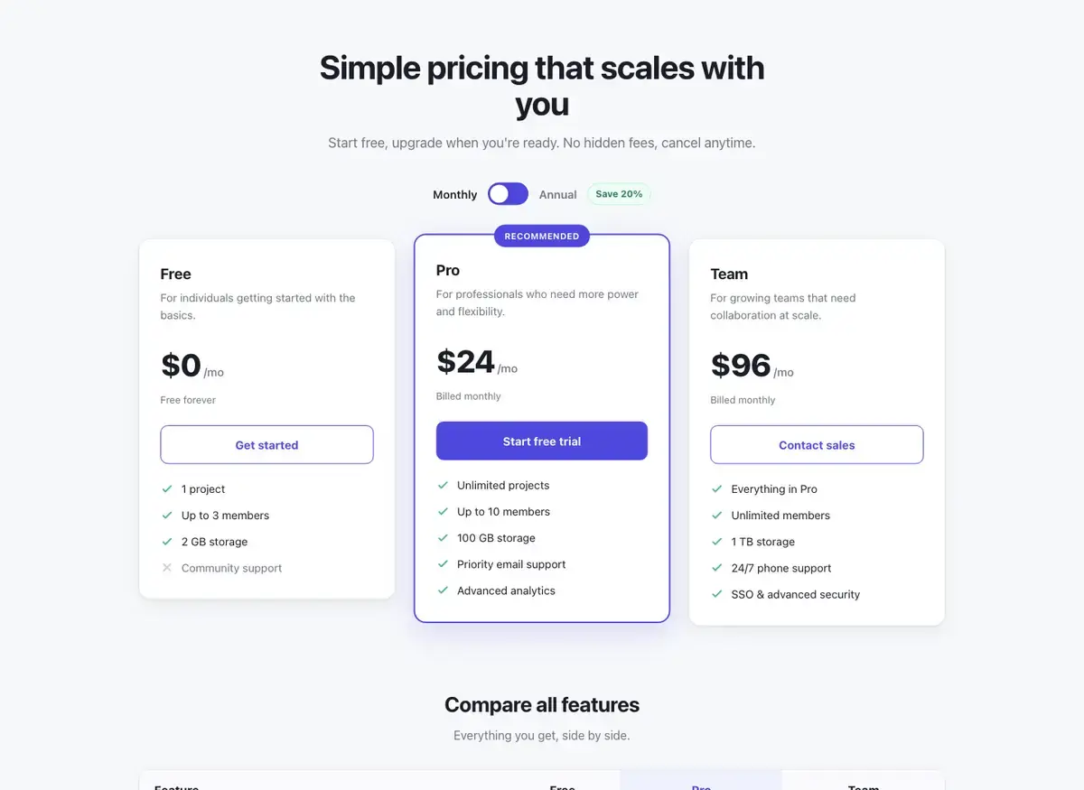
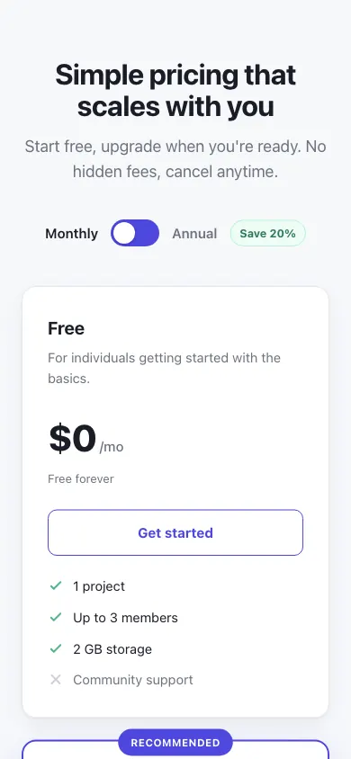 Claude Opus 4.8Build 1 · rank 14 on the boardRams Index on this page: 50.9
SeriousInconsistent CTA button styles across tiers
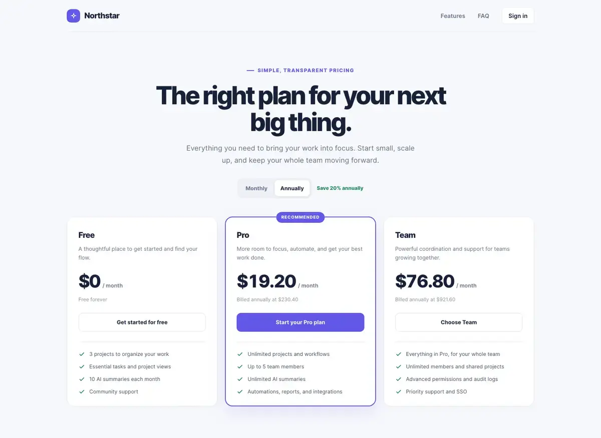
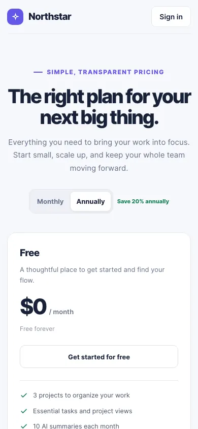 GPT-6 LunaBuild 1 · rank 5 on the boardRams Index on this page: 50.0
SeriousBilling toggle save-note vertical misalignment
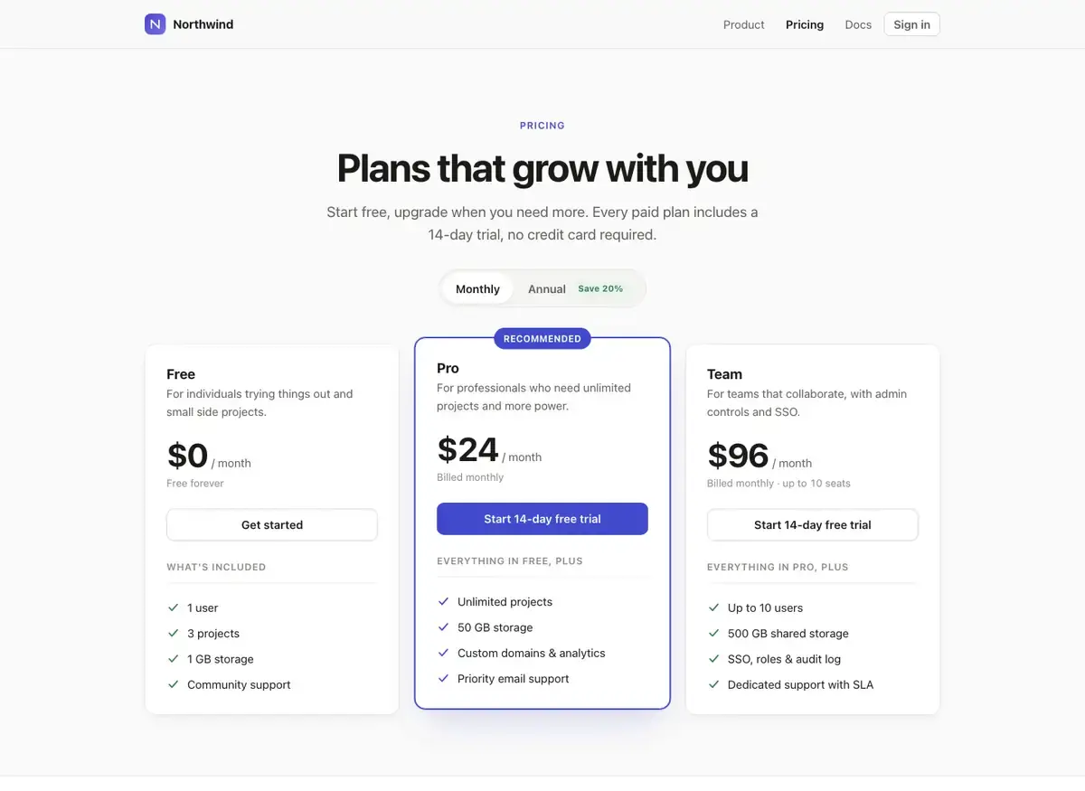
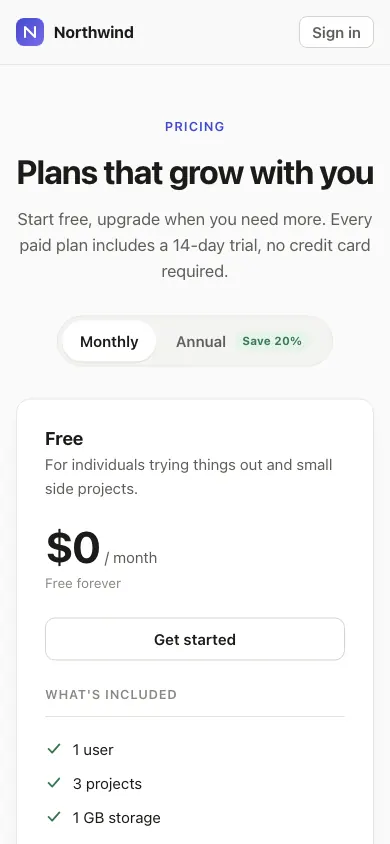 Claude Fable 5.1Build 1 · rank 10 on the boardRams Index on this page: 50.0
SeriousInconsistent CTA button styles across plans
 Claude Fable 5.1Build 2 · rank 10 on the boardRams Index on this page: 50.0
SeriousPro card description causes vertical misalignment of price and CTA rows
 Kimi K3Build 2 · unrankedRams Index on this page: 50.0
ModerateFree plan CTA lacks visual parity signal
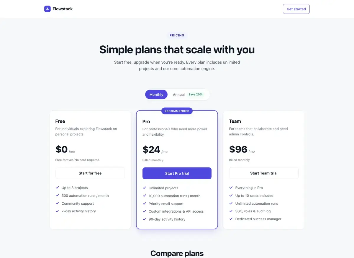
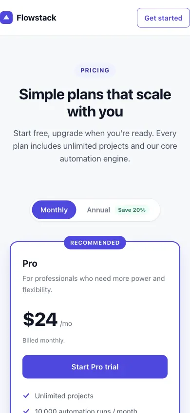 Claude Fable 5Build 1 · rank 11 on the boardRams Index on this page: 49.1
SeriousToggle 'Save 20%' badge bleeds into Annual button label
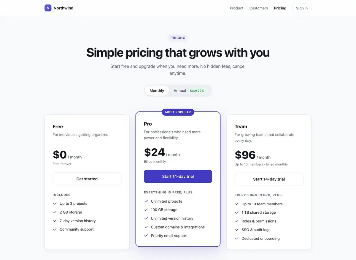
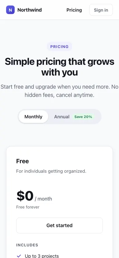 Claude Opus 5.5Build 1 · rank 8 on the boardRams Index on this page: 48.2
SeriousLede text clips at right edge
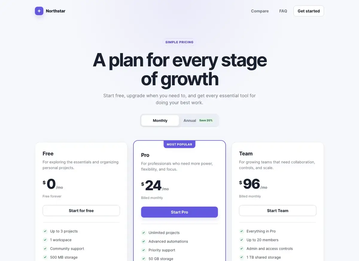
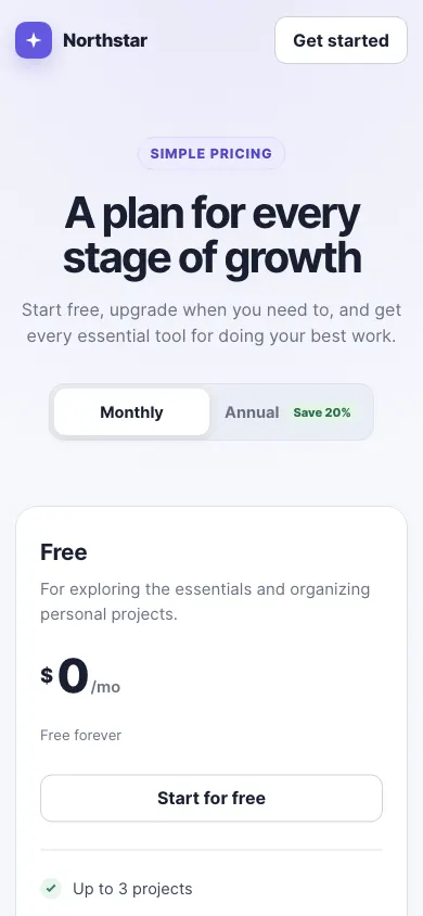 GPT-5.6 SolBuild 3 · rank 9 on the boardRams Index on this page: 48.2
SeriousThree price numerals compete as equal heroes
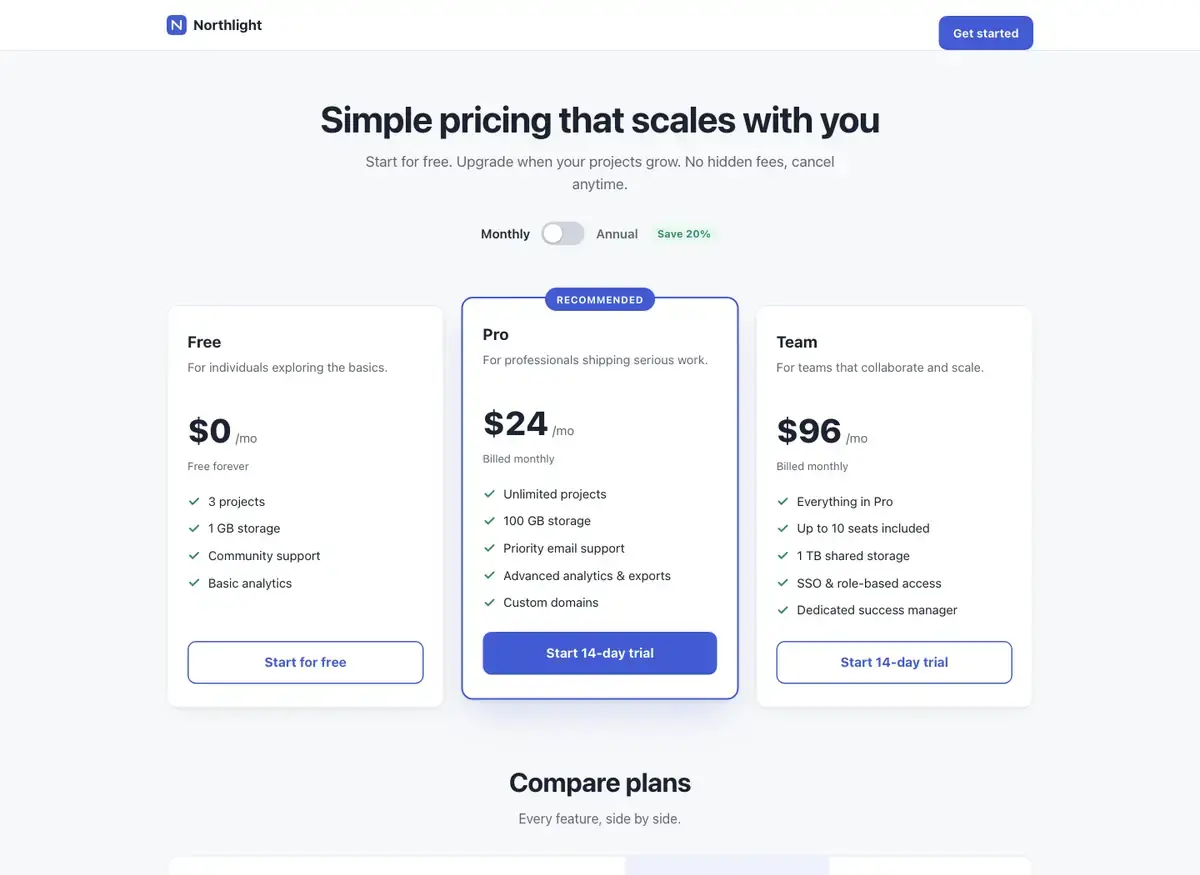
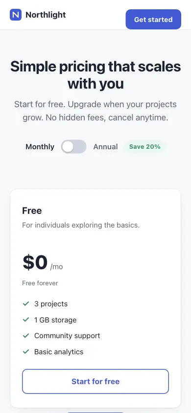 Claude Fable 5Build 3 · rank 11 on the boardRams Index on this page: 48.2
SeriousInconsistent CTA button treatment across tiers
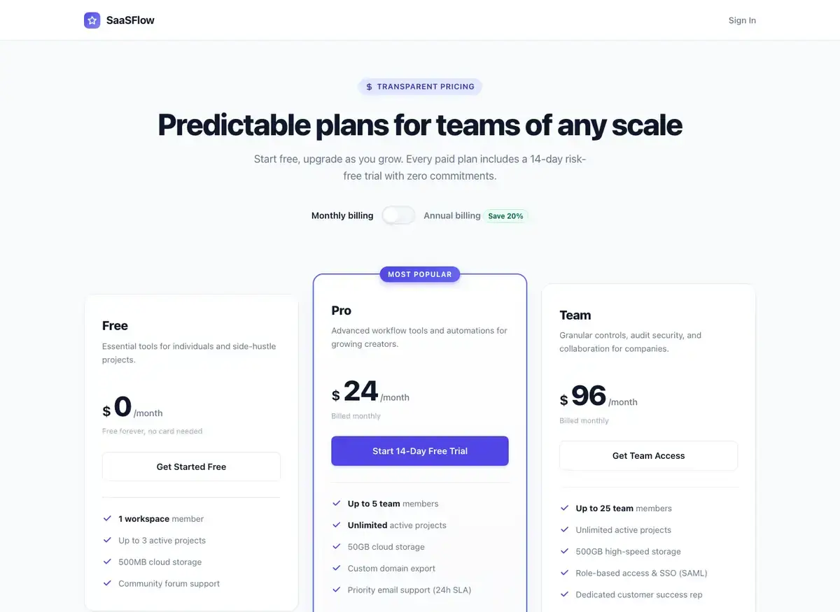
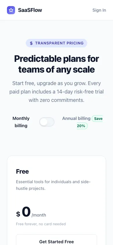 Gemini 3.8 FlashBuild 1 · rank 12 on the boardRams Index on this page: 48.2
SeriousComparison table redundantly labels Pro column 'Recommended'
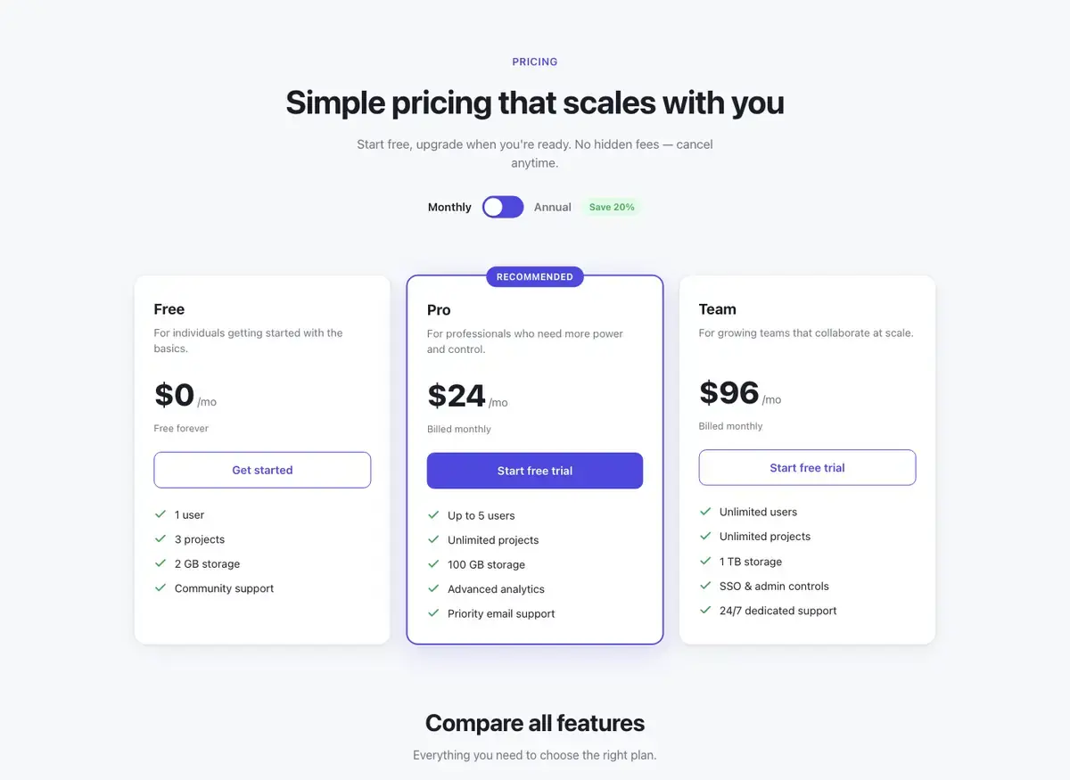
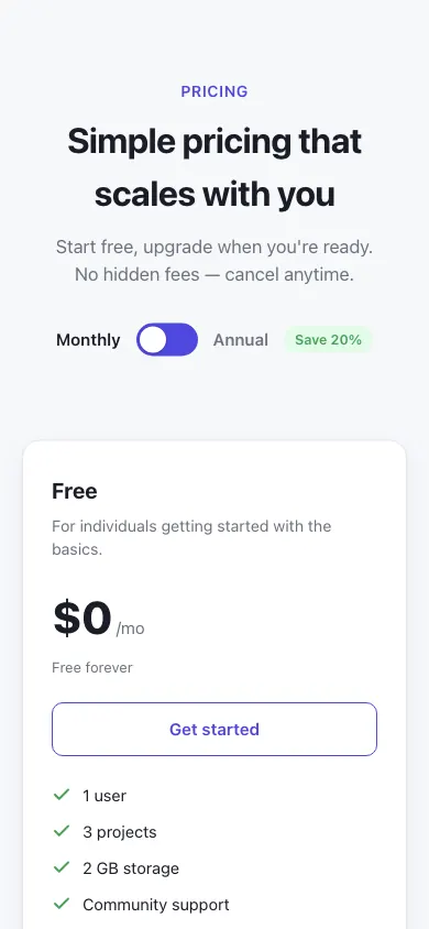 Claude Opus 4.8Build 2 · rank 14 on the boardRams Index on this page: 48.2
SeriousInconsistent button treatment across sibling tier cards
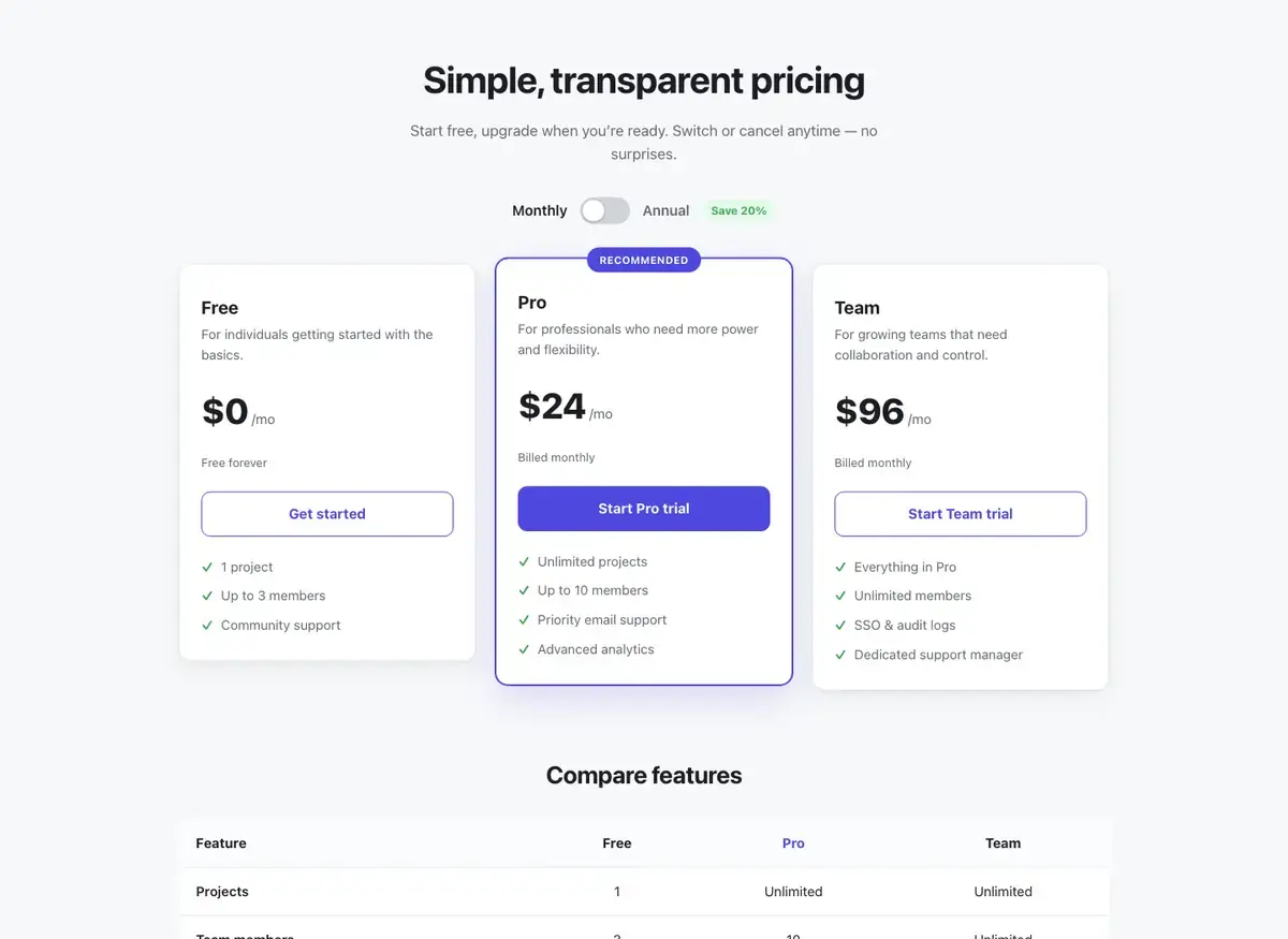
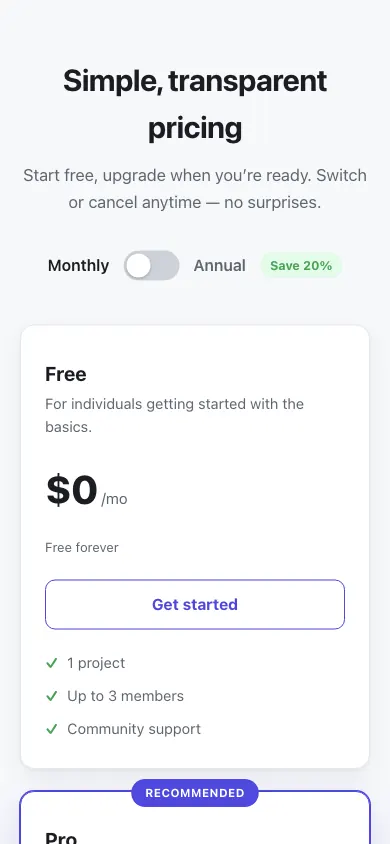 Claude Opus 4.8Build 3 · rank 14 on the boardRams Index on this page: 48.2
SeriousFree card vertically shorter than Team card
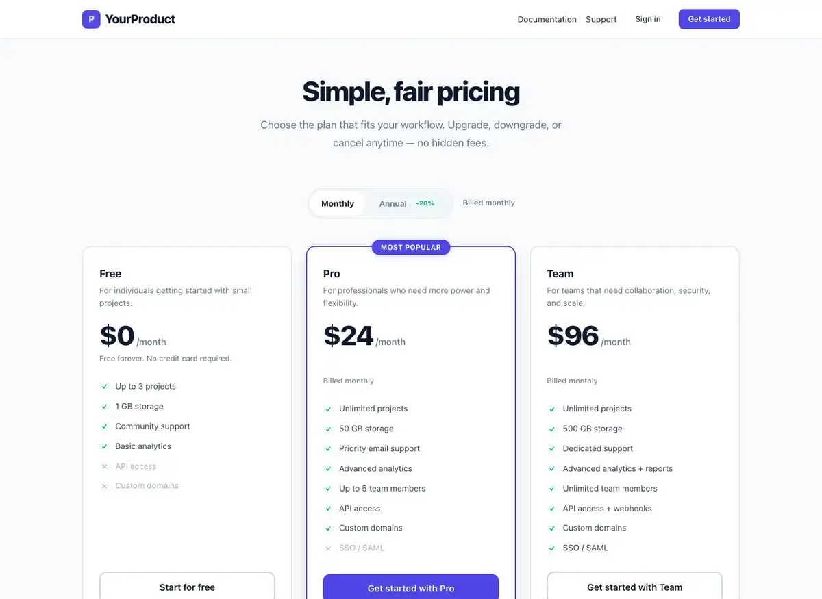
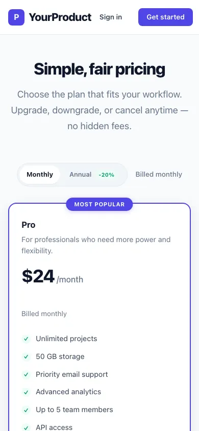 DeepSeek V4 ProBuild 1 · rank 13 on the boardRams Index on this page: 46.4
SeriousPricing card CTA vertical misalignment
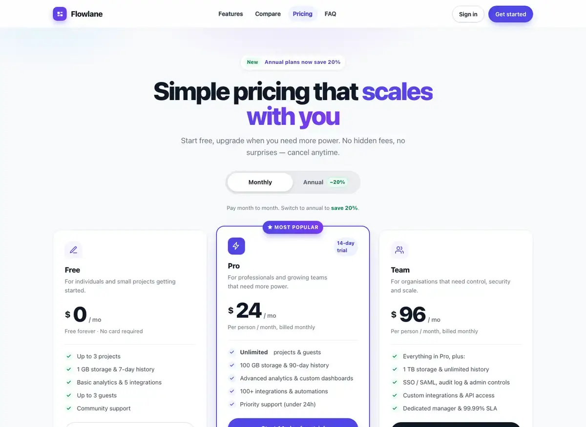
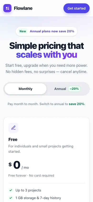 Muse WonderBuild 1 · rank 7 on the boardRams Index on this page: 44.6
SeriousRedundant 'no credit card' message
- No pageThe model spent its whole 32k output budget reasoning and returned no page. It counts as broken and is not scored.GLM 5.3Build 1 · unrankedNot scored
- No pageThe model spent its whole 32k output budget reasoning and returned no page. It counts as broken and is not scored.GLM 5.3Build 2 · unrankedNot scored

Frameworks